Paper Wireframes
Before creating anything digitally, I drew out 20 boxes roughly the size of a desktop screen and tried out different layout approaches.

This allowed me to cover as many options as possible and get all my ideas down. Every idea did not need to be good which took the pressure off and allowed me to be more creative. Using a thicker pen made me focus on the layout and not get distracted by small details or colour. I enjoyed using this method as it encouraged me to try different approaches and not just go for my first idea.
After doing this, I took a few of my favourite ideas and drew them bigger with more detail:
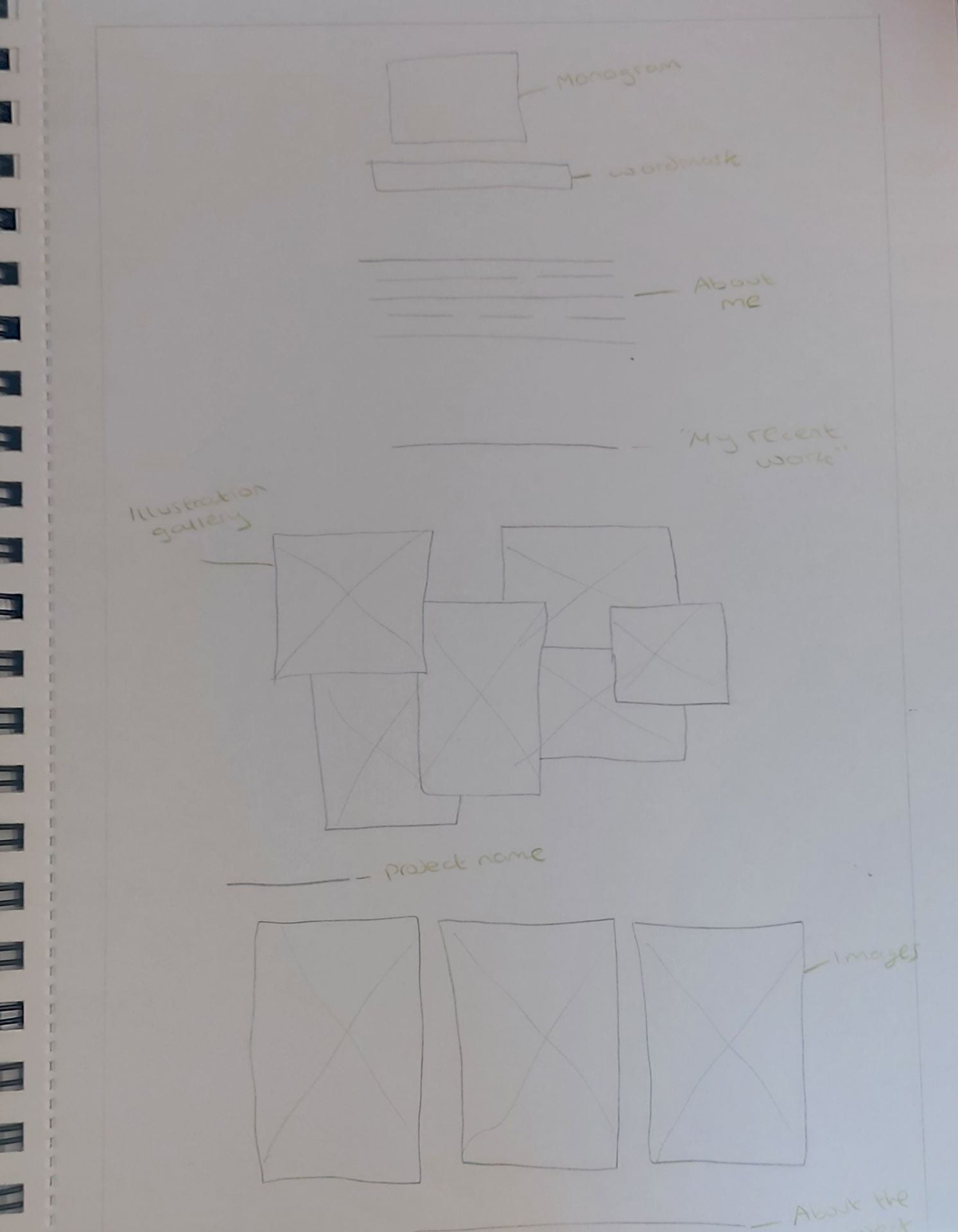

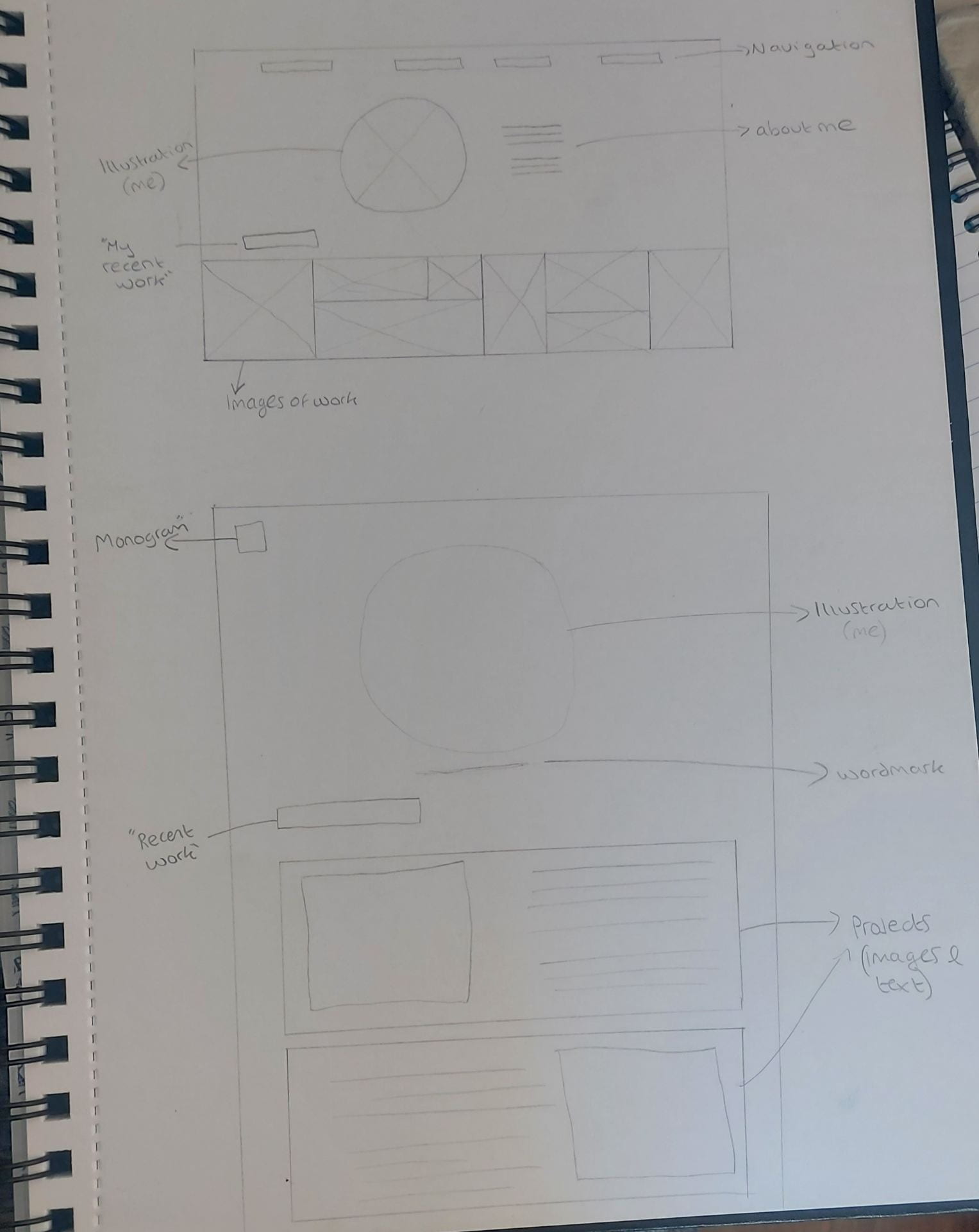
With these, I tried a few different approaches such as, having the images in a grid and then in a gallery style. I also tried different layouts that were text-led versus image-led. Doing this allowed me to see what worked and what I felt tied in with my brands tone of voice.
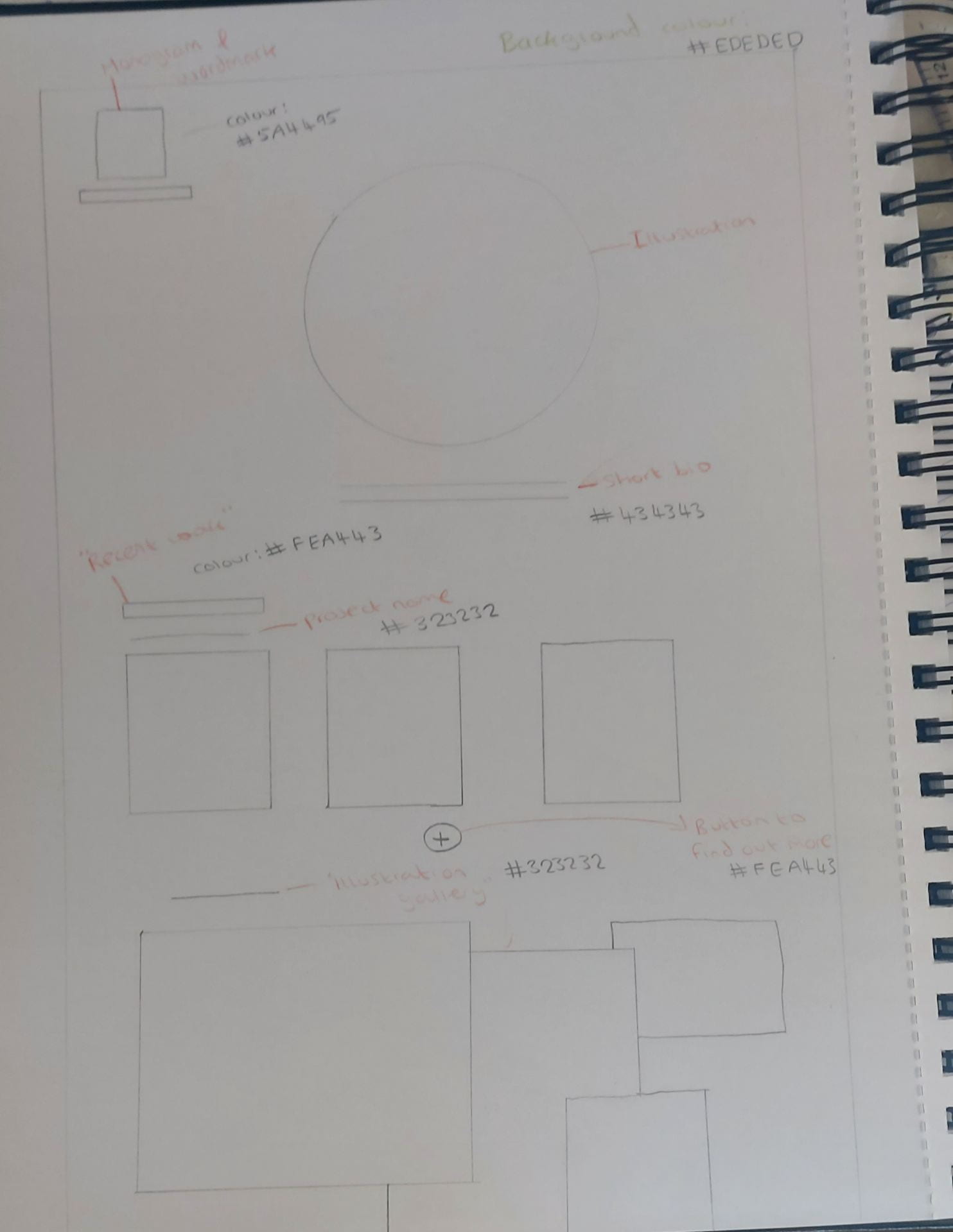
I then took different aspects that worked well from these wireframes and created a final one with more detail.
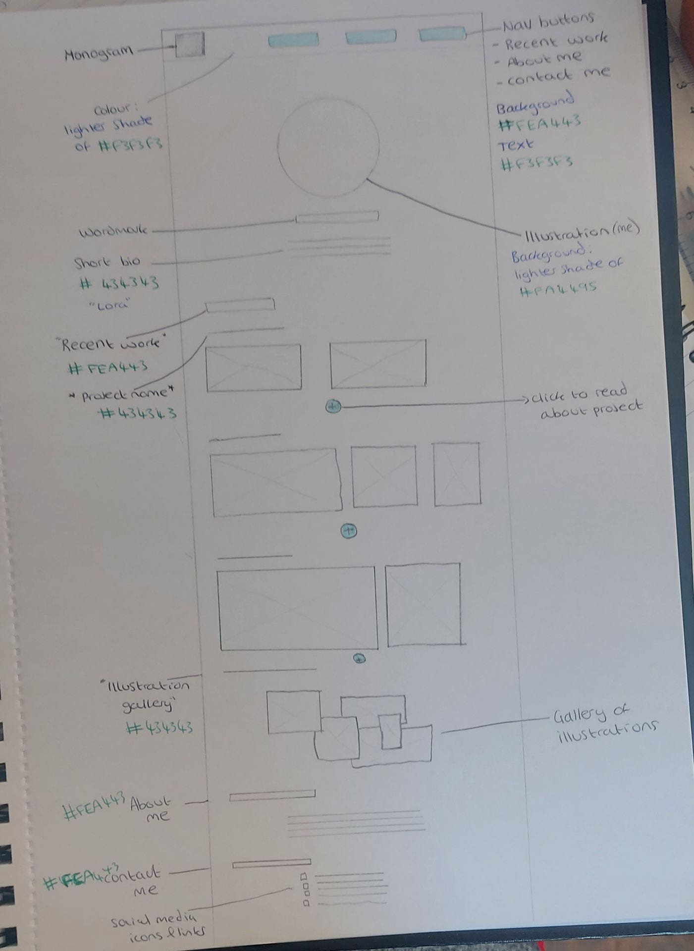
One thing I added to this one was buttons for navigation. I did this because my website is one page, so it is quite long. Drawing it out again allowed me to see if my original idea would still work with buttons along the top. Having buttons makes it easier for users to find what they are looking for and it gives them an idea of what to expect as soon as they open the website. As the user scrolls down, the buttons will stick at the top of the screen, again making it easier to navigate. There is also now an area for “More about me” and “contact me”. For this wireframe, I used some colour and text to describe what each part was. I also included what colour each thing would be and the typeface of the headings and text.
Digital Prototype
Next, I took this into Figma and created a digital prototype. This allowed me to add colour, typography, my monogram, and images. I could then see a more realistic version of how the final product would look and to make any changes needed before writing up the code.

I added some prototyping on my wireframe to further plan how different elements would work. As shown below, the text changes colour on the navigation when hovered over. Also, when you hover over the plus icon, text appears saying “read more” so the user knows to click on it. All the buttons are the same colour for consistency and to make it more obvious to users that they are clickable. The links at the bottom of the page are purple so it is easier to know that they are links, they also change colour when hovered over.

This is the colour pallet I used which I took from my brand guidelines I made. This kept everything consistent and brought my brands tone of voice into the website.
Having solid black text on a pure white background can cause eyestrain and makes text harder to read. Therefore, I opted for an off-white with grey text. Purple can be seen throughout for the monogram, wordmark etc. as this is my main brand colour. The orange colour is used for buttons and main headings as it stands out and compliments the purple.

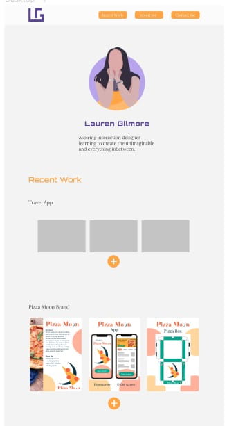
The first thing you see when you enter the website will be the illustration of me. I think this is effective as it shows my personality, style, and illustration work. It is also visually appealing and eye catching. From the picture I used to create this, I changed the colour of my clothes to orange as it ties in better with the websites colour pallet.

Beneath this I have my wordmark and a short bio about myself. The text throughout the page is left-aligned for readability but it is in the center of the page. I kept the line width quite short and the text in small chunks, so it is easier to read.
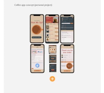
After this, it jumps straight into my work. I didn’t want to have much text as this would only take the focus away from my work. I will always have my most recent project at the top, so users see the most up to date and relevant work. My “Travel App” will be at the top and I will add these images once completed.
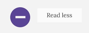
When scrolling on the website, I didn’t want to have text explaining my work as a default. This is because it would take up space unnecessarily and again, take the focus away from the images. Instead, I designed a “+” icon which users could click on if they wanted to know more. There is then also the option to get rid of the text again by clicking a “-” icon. You can see an example of what this will look like on the “Follow the Rhythm” project. These are in colours which stand out and they will have text explaining what they do when you hover over them.
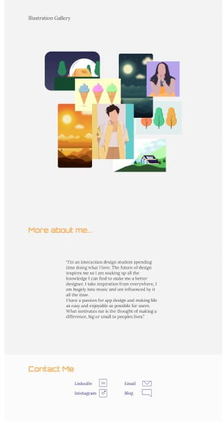
After you scroll past my projects, there is a gallery of my illustrations. This was inspired by Kate Moross. I thought it was nice having them all in one place because they don’t require more text explaining them. As well as work I have done for university, it will also have illustrations I have done in my free time. I think this brings my personality across more, makes it more unique and shows I have a passion for what I am doing.
At the bottom I have my “about me” section which has more detail than my short bio at the top, but it is still short and to the point. I then have a “contact me” section. This will have links to my social media, LinkedIn, email etc, providing an easy way for people to see my other work and contact me.
I have found that thoroughly planning my portfolio has allowed me to be creative and gives me a good idea of how I want it to look. My next step is to get feedback and make any final adjustments before I begin coding.