As I am going to be building a portfolio website, taking some points from this book on web usability would be beneficial. The book puts you in the position of the person using your website and it gives some great tips.

“Don’t make me think”.
The first law of web usability is “don’t make me think”. This means the site is self-explanatory and anyone understands how to use it, even if they don’t have much experience with the web. The user should be able to look at the page and not have any questions. For my website this means, making the navigation clear, having a clear layout, and making clickable components obvious. If I were to not consider these things, users may get distracted or even leave the site. “…competition is always just one click away, so if you frustrate users, they’ll head somewhere else”. I think this is a very important point, especially for a portfolio website because if the user is spending too much time thinking about things that don’t matter to them, it can zap their enthusiasm.

How we really use the web.
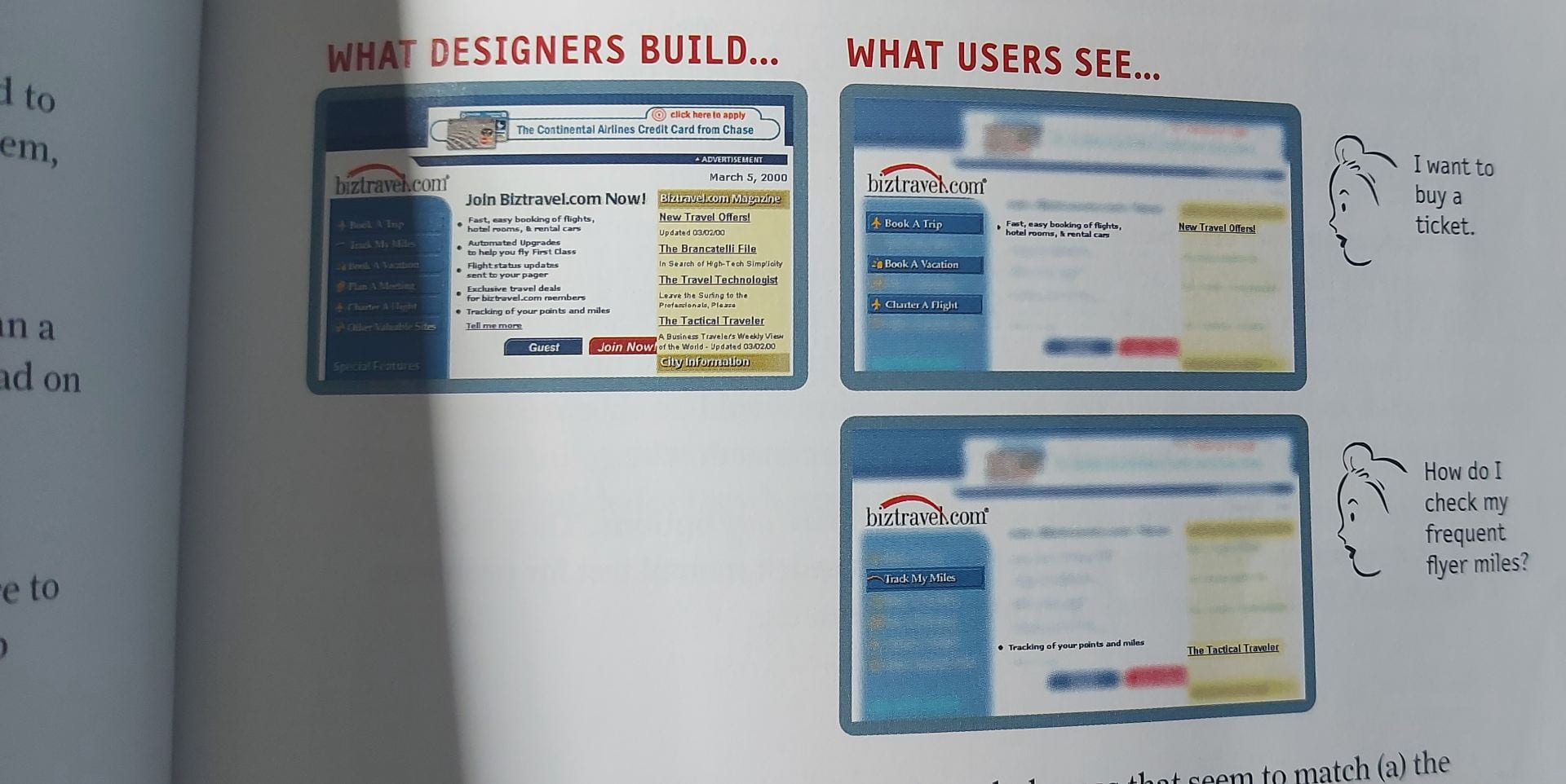
We don’t read pages, we scan them. This is because users are looking for what is important for them. Therefore, I am going for an image-led approach for my portfolio and keeping the text to a minimum as its unnecessary.
How to make sure users understand your site.
- Visual hierarchy: The more important something is e.g., headings, the more prominent it should be. For example, surrounded by more white space, in bold and a different colour. Things that are similar should be displayed the same, such as, all headings the same size.
- Web conventions: Conventions offer familiarity to a site as users have seen them before and know how they work. For example, designers can now use a shopping cart icon and people will know what it is without needing an explanation.
- Break pages up into clear sections: This allows users to make quick decisions on what areas they want to focus on.
- Make clickable components clear: Users should be able to distinguish between what is and isn’t clickable at a glance. This is done by changing its appearance from the rest of the site.
- Minimise noise: Keep busyness to a minimum and use white space.
Writing for the web
When writing for the web, a sentence should include no unnecessary words and a paragraph should not contain unnecessary sentences. Removing unnecessary words is important because its likely no-one will read them anyway and it has benefits:
- Reduces noise level on the page.
- It makes important content stand out more.
- The page becomes shorter, and users can see more content at a glance without scrolling.
Try to avoid “happy talk”. Happy talk is introductory text that welcomes you to the site. It is usually along the lines of “Hello! Welcome to…”. However, this is unnecessary, takes up space and time and isn’t useful or necessary for users.
Navigation
“People wont use your website if they can’t find their way around it.”
The purpose of navigation is to allow users to find what they are looking for, know where they are and to tell them what the site contains.
Tips:
- Navigation should look and work the same on every page.
- Keep it at the top, that is what people are used to.
- Make it stand out and obvious that it is clickable. For example, changing colour when hovered over.
- Have a home button. This can be comforting to users as no matter how far into the site they go, there is the option to reset.
- Have a search box. This can be more convenient if a user knows exactly what they are looking for instead of spending time browsing. This is something I will consider for my site, but it may not be necessary as my site wont be very complex.

Overall, I found this book very informative. I will take all that I have learnt into consideration when building my portfolio site to make it as user friendly as possible.