To get an idea of what direction I wanted to go in for branding a pizzeria, I wanted to benchmark some competitors.
Pizza Hut
Pizza Hut is one of the largest pizza companies in the world. They are all about quality and being different from others “making sure each meal…is delicious, bold and one of a kind”. I think pizza hut would be considered one step up from fast food. This is because they believe that “pizza night should be special”. “We don’t settle for anything less than food we are proud to serve”. Customers know what kind of experience to expect with Pizza Hut due to the language they use as well as their reputation. Customers can expect quality food and a nice dining experience.

They use a lot of red in their branding. The psychology behind this is that it triggers people’s appetite. It is also bold and grabs people’s attention. They also use yellow which symbolises happiness and friendliness. They use the same colours throughout their restaurants, advertising etc. which provides consistency.
Dominoes
Dominoes pizza used to be seen as cheap and poor quality. However, after multiple marketing campaigns, they managed to change people’s views on it and surpass pizza hut in being the largest pizza chain in the world.
In 2017 they did an advertising campaign stating that they were the “official food for everything”. This statement shows confidence which makes people more likely to buy from them. This shows that they want people to think of them in every situation whether it’s a big celebration or just a night in. I think this has benefitted them as they aren’t limited to one category.

Like pizza hut they use red in their logo and branding. They also use blue which can be viewed as trustworthy and dependable. Again, these colours remain consistent throughout the company.
Their logo is effective as it includes an actual domino which can be used as a shorthand for their name. It is also simple, which makes it more versatile, when it is reduced in size it can still be recognisable. As well as this, the shape allows it to be enlarged and placed nicely on their pizza boxes.
NKD Pizza
NKD are a growing pizza brand with over 750 stores. They have a few stores located across some parts of the UK. Unlike many other pizza brands, they advertise themselves as being healthier. I think this is a good way to attract customers who want to enjoy quality pizza without feeling guilty about eating unhealthily. They use a lot of words like “fresh” and “natural”.
Across their platforms, they express their story of how they came about. They started off in New Orleans using local ingredients and from their they built their company. I think this gives them a personal touch, making them come across as trustworthy and welcoming.

They use a lot of green in their brand. This reinforces their tone of voice and makes people view their food as fresh and healthy.
Nando’s
Instead of just looking at pizza brands, I wanted to look at branding from another company’s angle to get a new perspective. I decided to look at Nando’s as I like their branding and they have a good reputation. They are known for their quality and amazing flavours.
They use a lot of vibrant colours on their website, restaurants, advertising etc. This style was influenced by Southern African design which is where their first restaurant opened in 1987. The font they use is unique as a south African sign-writer created it for them. This gives them a welcoming, homely feel and adds personality to their brand, making it more trustworthy.
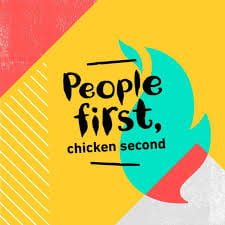

Peri-Peri red became their brand colour which is very bold and confident. The use of black also symbolises power and quality.