We were given 6 different fonts to choose from for this project and I decided to design a Type Specimen Screen for Times New Roman, arguably one of the most basic and apathetic fonts there is. I thought it would be an interesting challenge to see what design concepts I could come up with for such a boring font.
Research
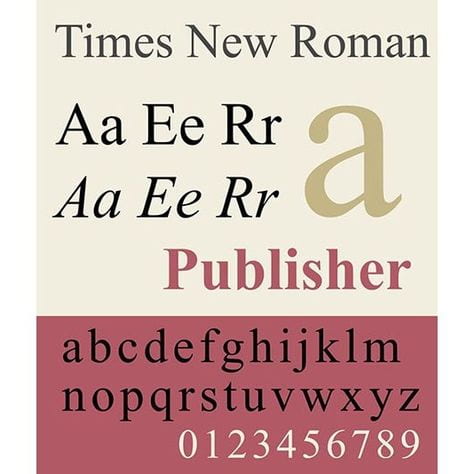
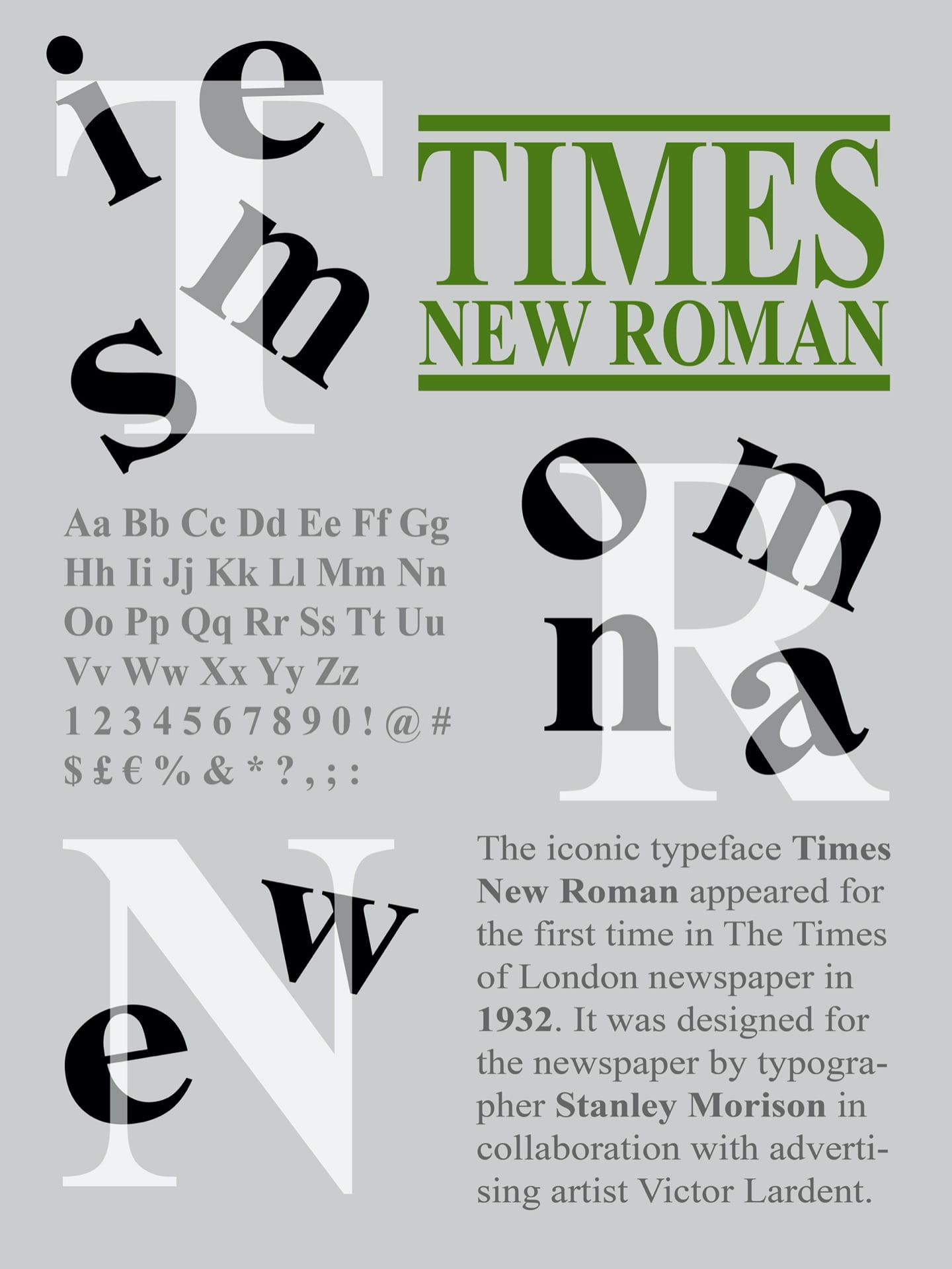
The font was designed by typographer Stanley Morison in collaboration with Victor Lardent (who drew the letterforms) in 1929 for The Times newspaper (the British newspaper). As it was used in a daily newspaper it quickly became a popular font among printers of that time. Since then Times New Roman has always been one of the first fonts made available for new devices.
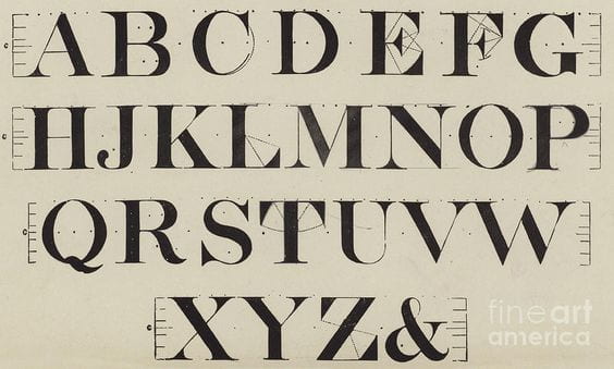
The font was designed for use in a newspaper, so it’s a bit narrower than most fonts as newspapers prefer narrow fonts as they can fit more text on a line that way. Theres nothing all that interesting or special about the font even in its bold and italic styles but it does the job it’s meant to do so that’s okay.
It’s not nearly as well loved as other popular fonts and I found a great explanation for this from this source: https://typographyforlawyers.com/a-brief-history-of-times-new-roman.html
What they say is that when it appears in a book, document, or advertisement, it connotes apathy (a lack of interest, enthusiasm or concern). Using the font shows you chose the path of least resistance. Times New Roman more of an absence of font choice than a font choice. They said that “To look at Times New Roman is to gaze into the void”. I found that interesting and I kinda want to have at least one of my design concepts feature a black background to sort of emulate the dark void of space.
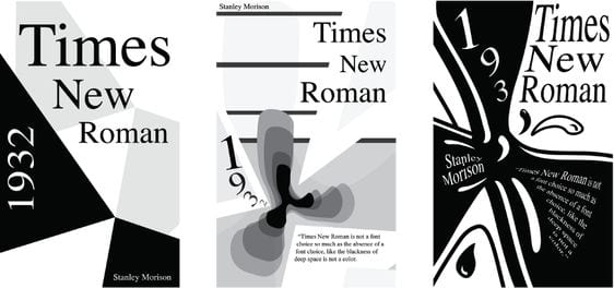
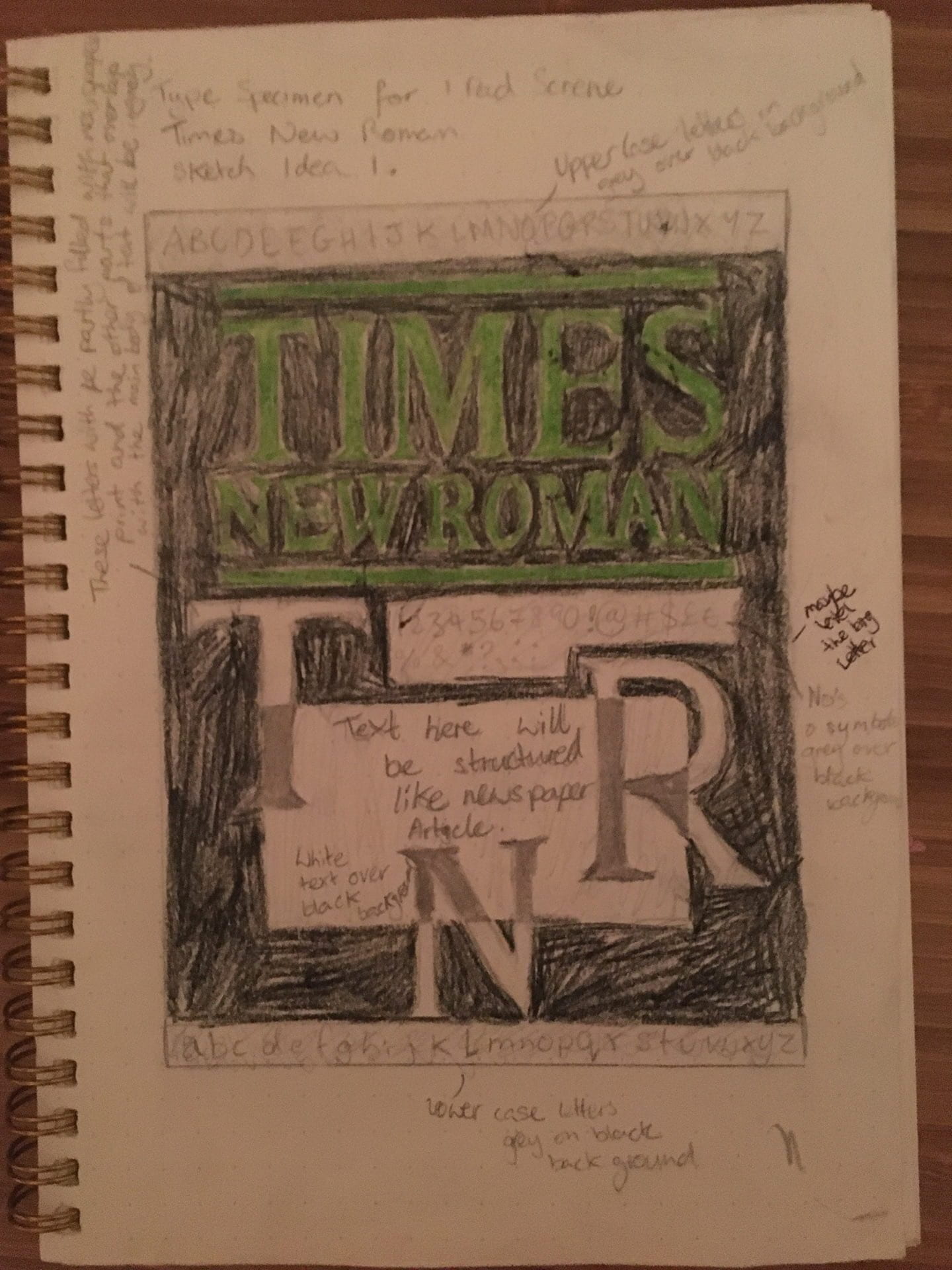
 Alright so after doing some research about the history of the font I went and looked for different references to help me come up with my 3 Type Specimen design concepts. I first had look at the traditional use of the font to draw inspiration from. I decided that I would format the information on the font to look like a newspaper article.
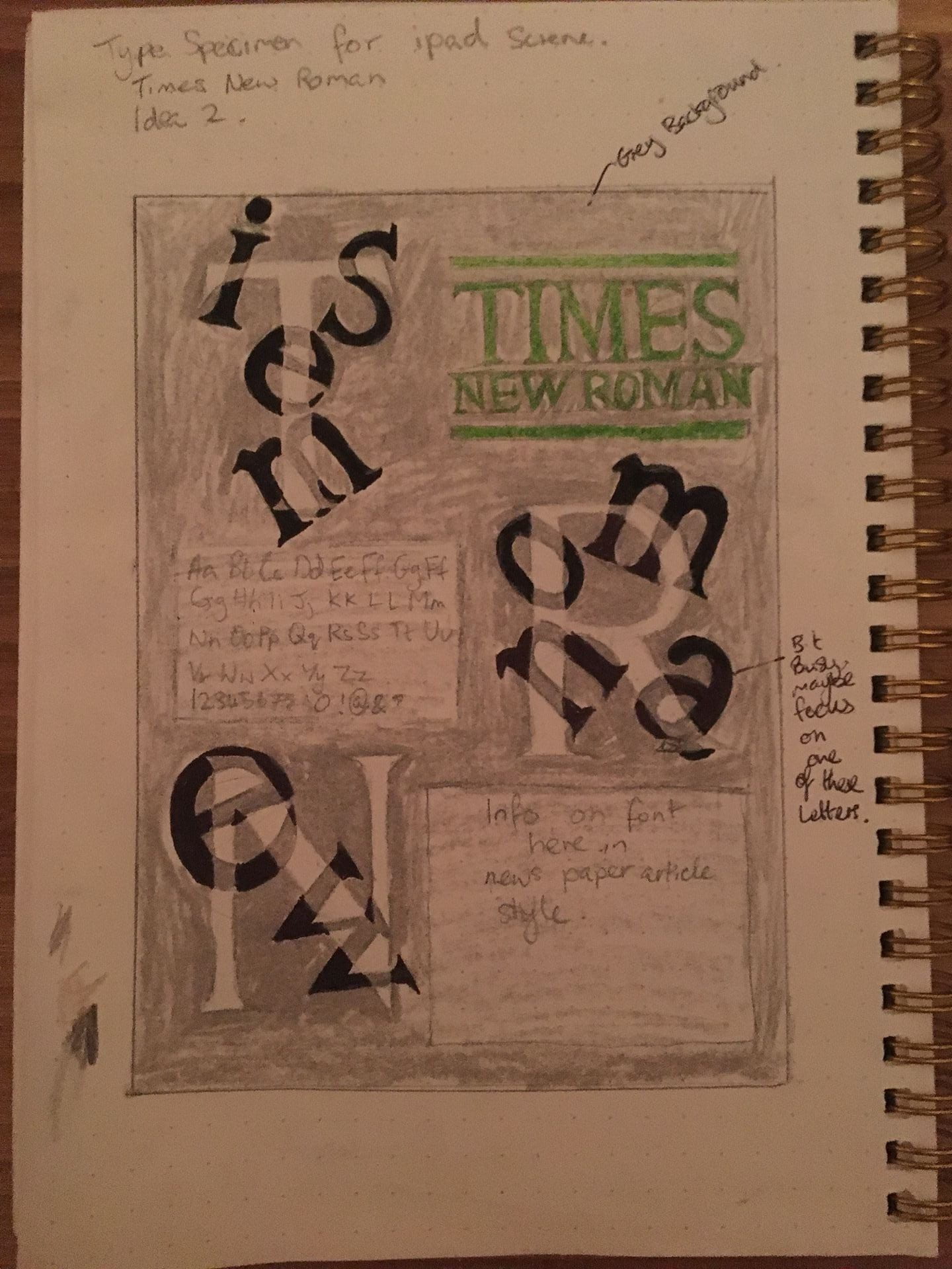
My idea is to have the info in a classic newspaper article style but then create a bit of contrast by taking a more modern approach to the rest of the design, so I then started looking at different modern looking Type Specimens for this font to help inspire me and give me ideas as how to mould my own together. Here are some great ones I found on Pinterest.


Initial Sketches
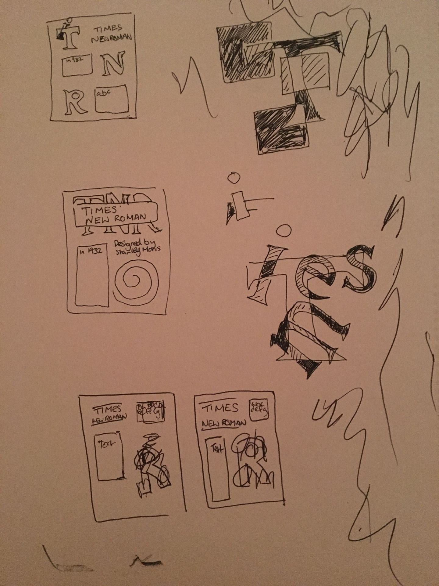
I started out by make quick little thumbnail sketches of potential layouts.


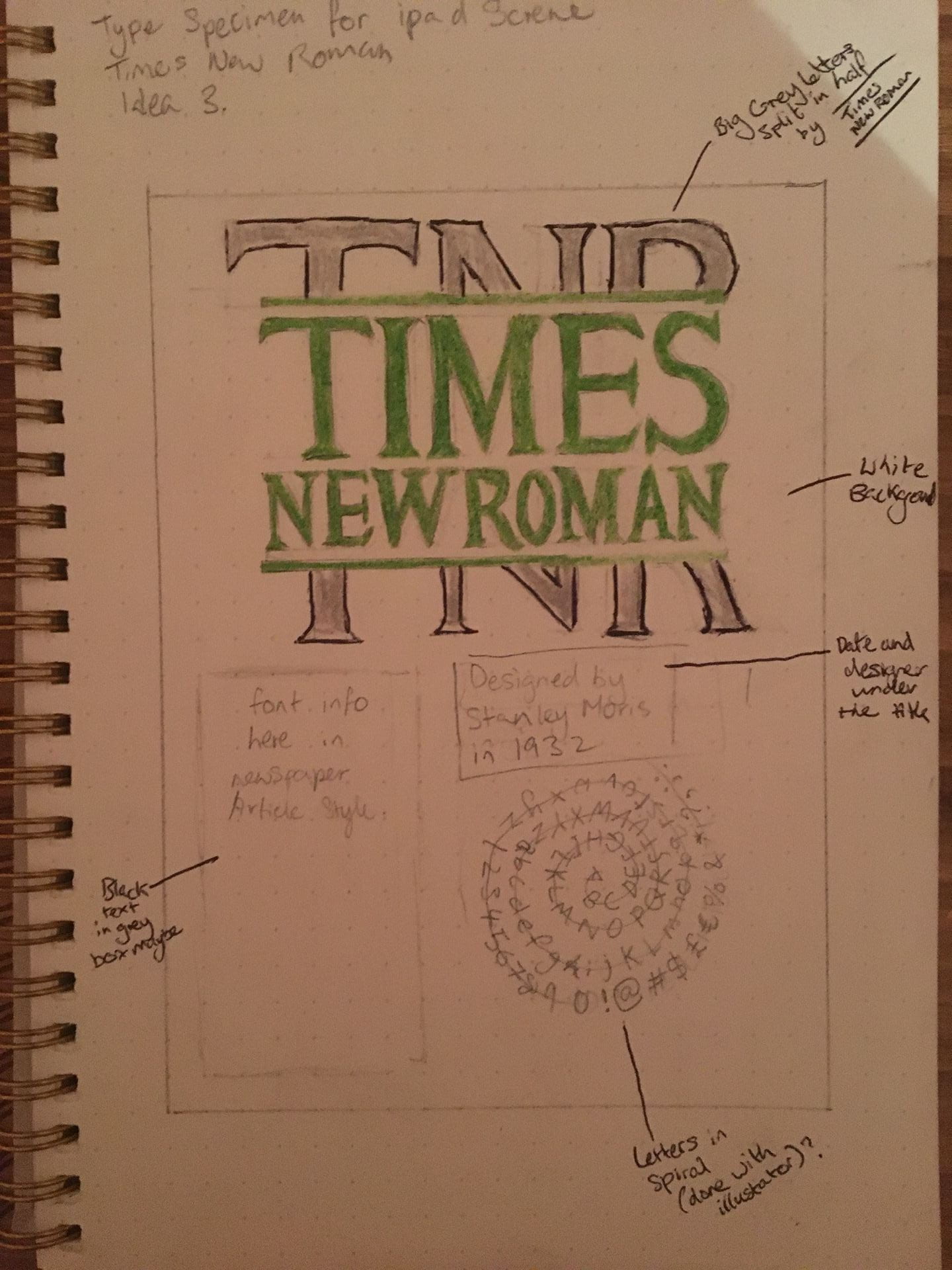
I picked my 3 favourites and then drew more detailed sketches of them. I wanted to keep the colour scheme mostly monotone by only using black, white and various shades of grey. I thought this would fit the typeface well but I decided I would add a pop of colour by have the typeface name (which is designed to look like a newspaper title) in green on each type specimen design.
Digital Designs
I then made my 3 type specimens in illustrator based of my sketches but with some changes.

Final Choice
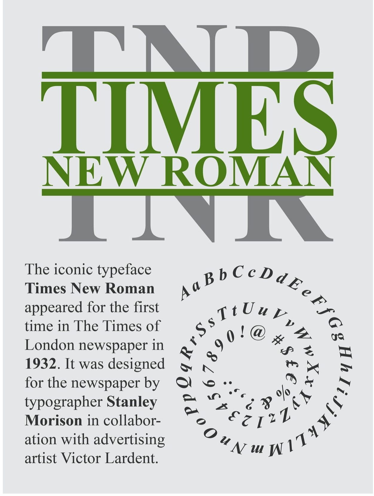
After coming up with 3 different designs we had to pick the best one for critique during Fridays online class in Week 4. The lecturers suggested I go with the second design.
I then made some further changes to this design based on the critiques I received from the lecturers.

As you can see I made quite a few changes. I joined the T N R together in a diagonal line running from top left to bottom right across the screen, this brings the focus to the typography and makes the screen feel less segmented than it was previously I think. I made the body of text (with info on the typeface) a lot smaller as suggested and moved it to the bottom left corner. I kept the green title in the top right but made it smaller. I kept it in as I feel that it balances out the composition. I got rid of the sample I had in the left as I couldn’t figure out where to put it without making the design too busy. With this new layout I was able to have a bit of negative space on each side that wasn’t there previously.
#101
