IxD104 – Designing an Infographic – Process the Data
Our Task…
With a focus on raw data, facts and figures, our second project for this module is to create an infographic / data visualisation focussing on a subject specific to the world around us. As with every project we researched the subject of data visualisation and infographics thoroughly before starting our own piece. With a lot more background knowledge from experienced designers and the help of some infographic/data visualisation books, I now feel fully equipped to design my own infographic. This is the project I have been most looking forward to completing. I love how it allows you to simplify a topic which might come across as complicated.
I started researching different elements such as human population, global warming etc. However I decided I wanted to start with a more focused topic to begin with… Sleep! Something we all need and majority of us tend to lack. Paul’s advice was to keep a note of everything… I have pages of information written down and a collection of links. Here are a list of the main websites I was able to gain the most important and reliable information from.
Sources…
- https://www.bbc.co.uk/news/uk-scotland-23811690
- https://www.betterhealth.vic.gov.au/health/HealthyLiving/teenagers-and-sleep#effects-of-teenage-sleep-deprivation
- sleep
Another very important step in planning your infographic, is ensuring that your sources are reliable which I ensured to do. BBC and BetterHealth are very reliable sources.
When narrowing down into the important information, so that my infographic would not end up over-populated and cluttered with irrelevant information, I decided to choose a focus audience. I wanted to focus purely on teens.
For visual inspiration I always look towards pinterest…
https://pin.it/26ch9K3
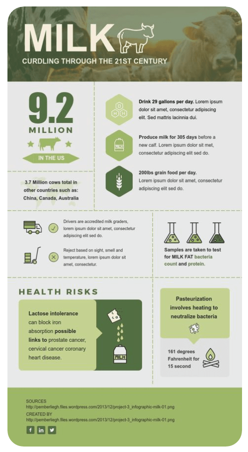
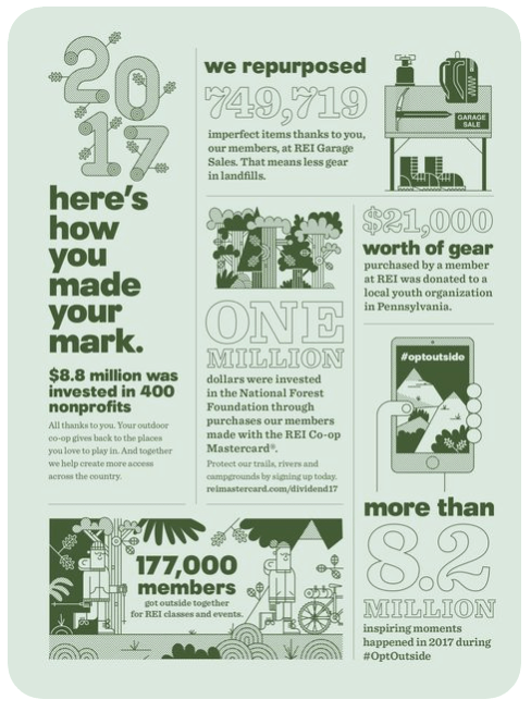
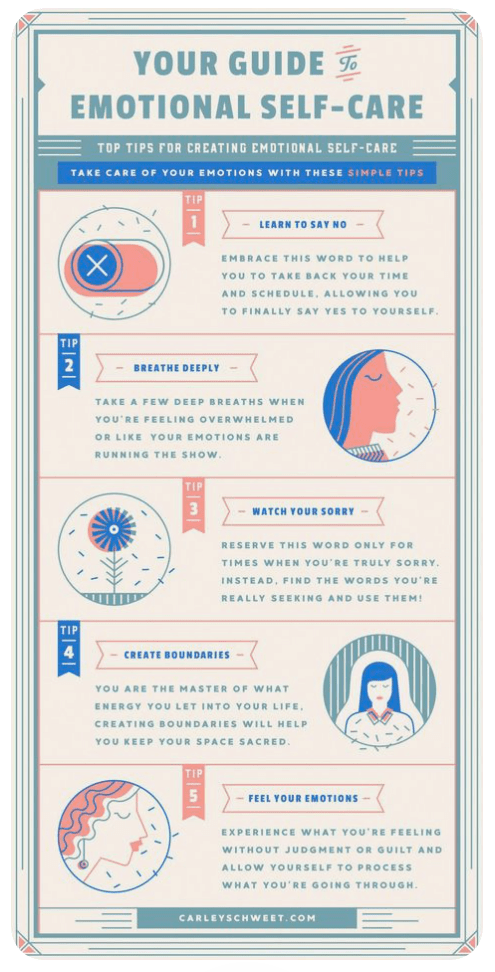
Here are the ones that inspire me the most. I really like how they are broken up, especially the first one. I like how they all have very focused colour scheme and the date is simple but easy to interpret from each of them. I want to ensure I use negative space to my advantage as I can see the great effect it has on these 3 examples.
My Inspiration for my chosen topic and story…
Living with a 16 year old girl! My little sister is now 16 and going through a stage, most of us can probably relate to. Staying up way after midnight, waking up when it’s nearly time to go to bed again, finding it hard to fall asleep and using your phone and binging the latest series when you should be getting the ever so vital shut eye. We have all been there, and at the time, you think you’re invincible and don’t even realise the profound effect that sleep deprivation might be having on your body. Teenagers being teenagers, majority would not be bothered to read many articles or books on why sleep is so important or may not realise that it’s possible for them to train themselves to change their bad habits. I know myself that if I had have had better sleep back in the day, my performance at school would’ve been much better, I would’ve had more energy to be more positive about school, work, social life, etc. and I also think I would have been less stressed.
Knowing my target audience makes it easier for me to focus the style of design and ways in which I present my data and facts. As it’s a younger audience, I think bold easy to read writing will be good, but minimum text will be the aim. I want to include some stylish, but simple icons. I think a nighttime theme for my background and colour scheme will work best… Time to get wire-framing!
Plans and Sketches…

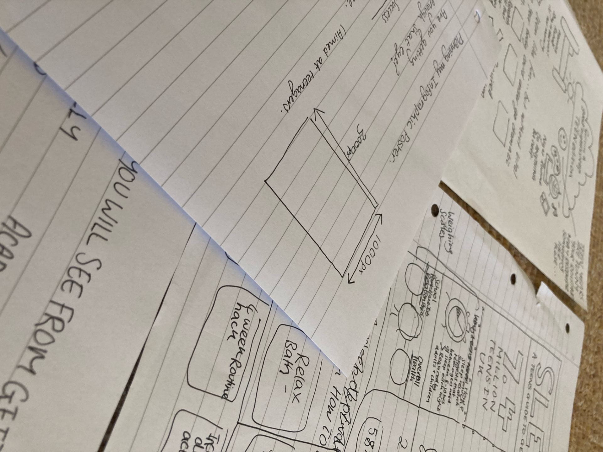
I find it very useful to start with random sketches of things that might be relevant to my topic. I think it helps ignite ideas and the style I want to capture.
I accumulated a lot of pages of sketches before getting into the digital side of my infographic. I think this will really help me when it comes to designing my final infographic, as these sketches have allowed me to see what’s relevant and not, what works and doesn’t and they’re also so quick and fun!


Here is my digital wireframe which I created using miro. I find it quite difficult visualising what my infographic will turn out like as a lot of it is based on the sizing of the type and colours etc. however this digital wireframing exercise was definitely helpful for allowing me to workout a better layout that the ones on my paper prototypes.
Below I sketched out the illustrations I wanted to design for my Infographic. I know that I want it to be majority imagery based, as I think that will be the best way to communicate with teenagers, over vast paragraphs of text and even overcomplicated graphs.

Choosing Typography…
Type choice is a vital stage in designing your infographic as you want the text that you have deemed relevant, to stand out, be easily read and match your chosen area of interest. When choosing my fonts I always use google fonts as they have a great selection and also help with pairing two fonts together.
I decided to choose a font named “Francois”. I decided that I might pair it along with another font named “Merriweather”, however I think Francois on its own might be really nice as I feel it’s very youthful and will be easy for my target audience to resinate with.


Choosing Colour…

For my chosen colour scheme, I always like to go for a very minimal palette as I think it always looks a lot more professional and more organised. I decided to choose blue tones as it is an infographic on sleep, blue is a very calming colour, one which is also associated with night time.
Reflection…
With all of my background work coming together, I am really looking forward to beginning my infographic. I feel quite well organised for this task and can feel myself being more passionate about this than any other work I’ve completed so far. I think that’s a good sign that data visualisation might be a good area of focus for me. I find the data and information side of it very interesting. Looking forward into completing the infographic, the main thing I need to remember is utilising the space wisely and still leaving negative space to let icons breathe. I’ve been researching the size of other infographics and I am going to begin with 1ooopx x 3000px which could extend vertically if I feel the imagery is becoming to cramped.
Keep posted to see how it turns out 🙂