Data Visualisation Research
Data visualisation is an interdisciplinary field that deals with the graphic representation of data. It is a particularly efficient way of communicating when the data is numerous as for example a Time Series.The ability to see patterns, make sense of data and also create beautiful works of art is a skill.
One pressing issue ongoing in our world today is climate change. I have a particular interest in this topic and have always found that the best way to see the impact of climate change is through data visualisation.
Through researching many different data scientists who look at these issues, I stumbled. across the work of Ed Hawkins.
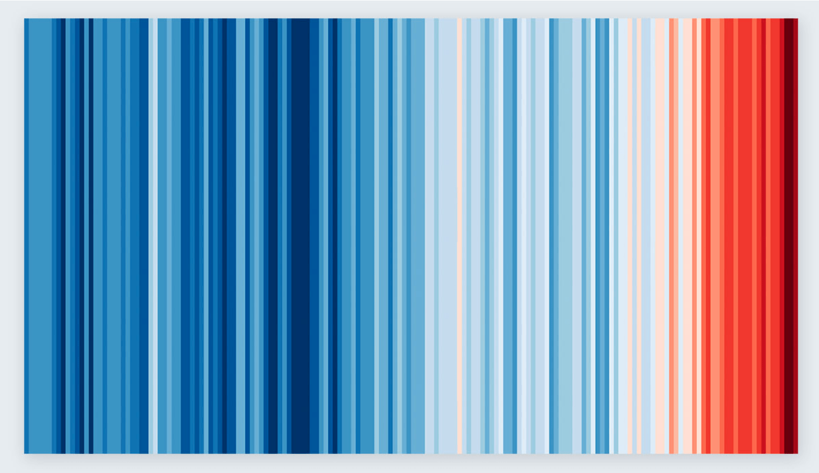
His approach is very minimalistic, with no numbers or figures on show. This beautiful climate change data visualisation has taken the world by storm. It’s been turned into wall art and even neck scarves. I think it is so stunning and with the urgency of red towards the right, it has a message of the negative impact we in the 20th and 21st century have had on the planet.
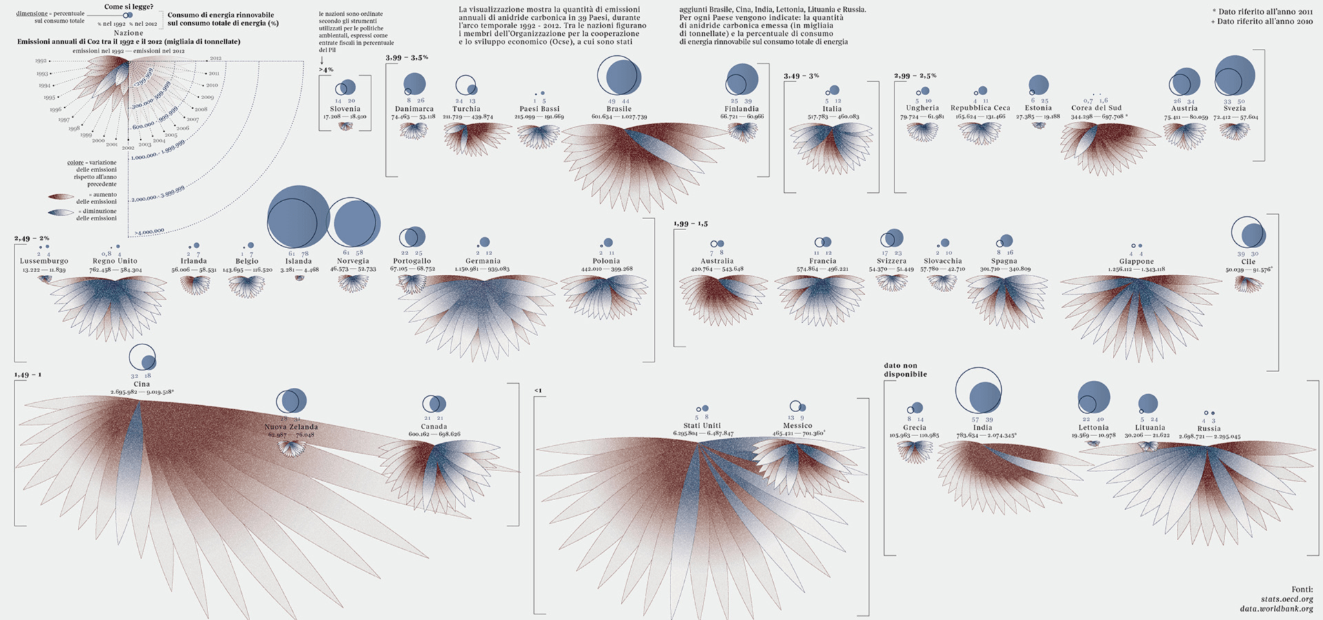
Another one which caught my eye was the delicate work of Federica Fragapane a data artist/ information designer. Here we can see her data visualisation of Carbon dioxide emissions. This one was specifically created for media outlet Corriere della Sera – La Lettura. The visualization on climate change facts demonstrates the amount of annual carbon dioxide emissions in 39 countries between 1992 and 2012. Her particular style of data art makes any information look beautiful and interesting.
To conclude, data visualisation is definitely something that interests me and I will definitely be trying to develop skills to help me create works such as the ones seen above.