IxD101 Semester One, Interaction Design Fundamentals
This blog post is a summary of almost everything I have learned, found interesting and been inspired by from the Interaction design fundamentals section of our course, that we complete every Monday with Paul. I have included links to other blog posts to create a simpler way of seeing my progression, through my first semester as an interaction design student.
Week 1
The Foundations
Today, Paul gave us a brief run through what we will be learning this year. He explained the importance of research and the power of using other peoples successful work to inspire your own. He also told us of the importance of reading, something that I intend to get a lot better at.
Paul presented our first project to us, which is to write a manifesto. He stated that, ‘A manifesto should be a battle cry to inspire you when things get tough.’
“Manifesto” – a public declaration of policy and aims, especially one issued before an election by a political party or candidate.
Paul also shared his knowledge on where ideas come from and how to keep your ideas original. We completed an Icon Challenge on Figma, where we had to create a Play, Stop, Pause, Fast Forward and Rewind Icon. I created the set of icons very quickly, but here they are anyway…
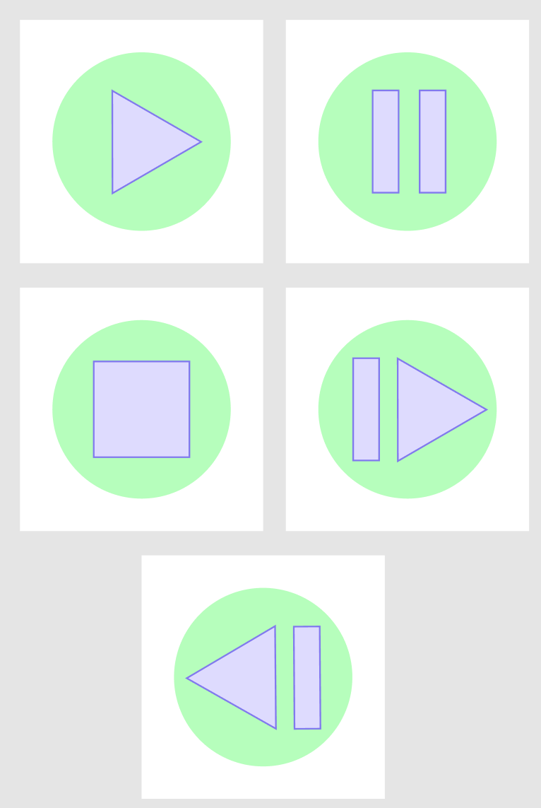
Paul then asked us to consider how we would alter the icons if they were to be used and recognised by elderly people. I think by including wording, still ensuring that the picture is clear and big, positioned in a good place, elderly people would be able to use the icons above as well. This was a great exercise to help us consider user experience and our target audience.
I really enjoyed our first week of work. We set up a lot of accounts, such as LinkedIn, twitter and even Slack, which will help me communicate and learn from other designers. I shall now get stuck in to thinking about a manifesto this week.
Week 2
Point, Line, Plane
It’s like learning your A, B, Cs, only I’m a trainee designer. Point, Line and plane consume the entire world and as designers we should be aware of their whereabouts and live by it.
We completed many projects this week, both on paper and digitally. Here is the link to the blog I created showcasing all of my experimentation.
[ https://blogs.ulster.ac.uk/emmg/2020/09/29/point-line-and-plane/ ]
We were given a group project, where we had to collaborate to create a board on Pinterest, with 100 images of our chosen topic. I think this is a great way of us getting to know each other a bit better, during these testing times.
My group decided to base our theme of point, where we would look at food which comes in point form. Below is the pinterest board we created, which includes a large variety of fruit and donuts…
{ https://www.pinterest.co.uk/lgilmore401/group-project/ }
I began following Jessica Hische on instagram, after Paul recommended we looked at her work. I love it and will definitely be taking advantage of her inspiring skills.
Week 3
Core Principles
Today Paul explained a broad range of the core principles of design, including the Fibonacci sequence, the rule of thirds and Gestalt’s design principles.
I found Gestalt’s 7 principles to be particularly interesting. Known as the principles of visual perception, they detail how our brains create structure by default, in other words, how psychology should influence design.
Today our tasks were to use typescale to fix our manifesto scales. We had to choose three of our favourite apps and create their layouts on AdobeXD, I found this quite interesting as mine all turned out to be quite similar. This links back to Gestalt’s principles of similarity.
I also continued to work on my final 9 images which I created using my photography and inspiration from the 100 iterations project. I decided to do some illustrations. They can be seen in my 100 iterations blog post.
(https://blogs.ulster.ac.uk/emmg/2020/10/08/the-principles-of-design-and-how-they-are-used-in-ixd/)
Week 4
Typography and Colour
“95% of the information on the web is written language. It is only logical to say that a web designer should get good training in the main discipline of shaping written information, in other words: Typography.” taken from the article written by Reichenstein.
(https://blogs.ulster.ac.uk/emmg/2020/10/15/typography-and-colour/)
Pocket Profile – Josef Albers
Week 5
Introduction to User Interface Design
Todays lecture introduced us to UI design…
User Interface (UI) Design focuses on anticipating what users might need to do and ensuring that the interface has elements that are easy to access, understand, and use to facilitate those actions. UI brings together concepts from interaction design visual design, and information architecture.
We looked at many websites of companies who share their human interface guidelines. My favourite to look at was the Apple Developer website. All of their work is so fluent, throughout all of their appliances.
Paul also got us to begin using Markdown. I decided to go for Brackets and I’m excited to see if I will be able to use it, as I’ve never used anything like this software before.
Week 5 tasks… (https://blogs.ulster.ac.uk/emmg/2020/10/25/introduction-to-ui/)