From observing many different artists and designers over the past few days, I have come to realise that limiting yourself to one element is the most progressive way to make your designs professional. There is no need to overcomplicate.
One example of a UX designer who stick to minimalism is called Josh Worth, who designed ‘If the moon were only one pixel’, which is described as a tediously accurate scale model of the Solar System. It uses a horizontally-sliding HTML page to show how far it is from one planet to another, as well as their relative sizes, based on our Moon being just a single pixel in diameter
.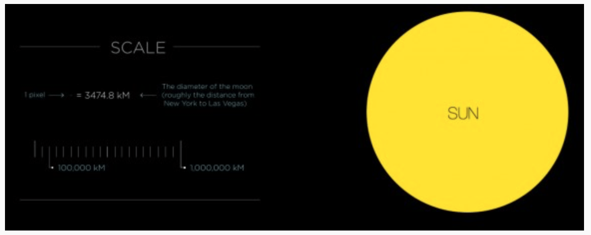
This website only uses the point elements as the planets and as you can see from the picture above, it is the simplicity and clean cut edges which work the best. I also like the contrasting colours and might try to incorporate this style into my own work.
We experimented around on Figma to create grids which are based on either, points, lines or planes. Heres what I came up with…
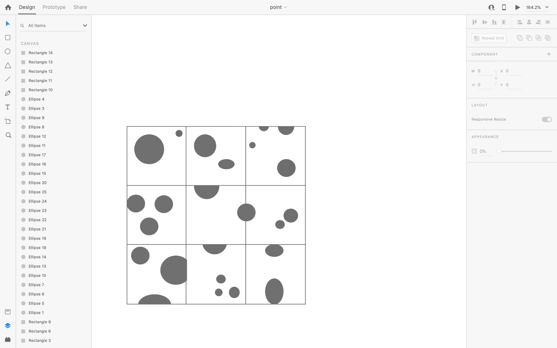
Point
For my Point grid I decided to do the 2, 3 and 5 dots order and tried to make each square unique. I really like monochrome and this it helps to contrast between each square.

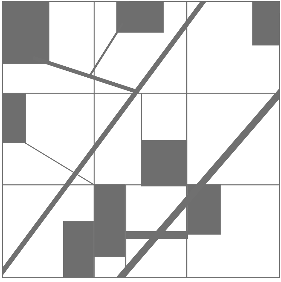
Line
For my line grid I decided to also use the 2, 3 and 5 line guideline, however I tried to use repetition as well. I think it reflects my personal style in a disorganised way. The differing stroke width is really unique and I love the completed look.

Plane

This is my personal favourite. You can tell that I was beginning to become more comfortable with the process and the software. I changed the opacity and rotated the triangles 90 degrees twice. I think it makes for very interesting viewing.