Project 1 – Travel app
Coral Buddy Final Screens – travelapp
Project 2 – Infographic
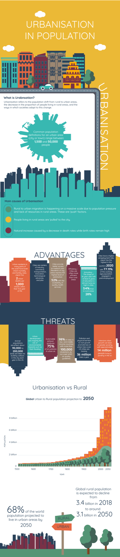
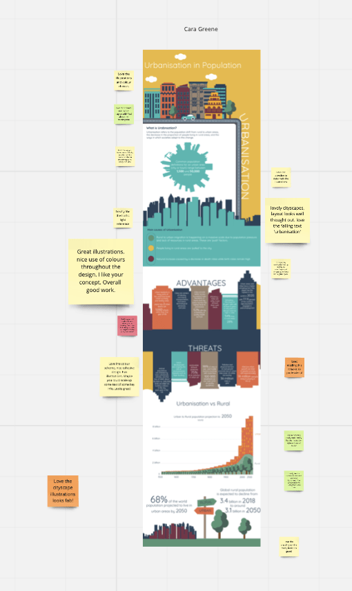
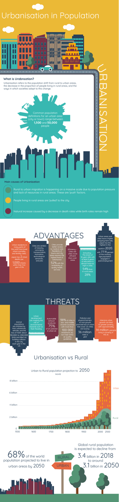
Urbanisation in Population – infographic
Project 1 – Travel app
Coral Buddy Final Screens – travelapp
Project 2 – Infographic
Urbanisation in Population – infographic
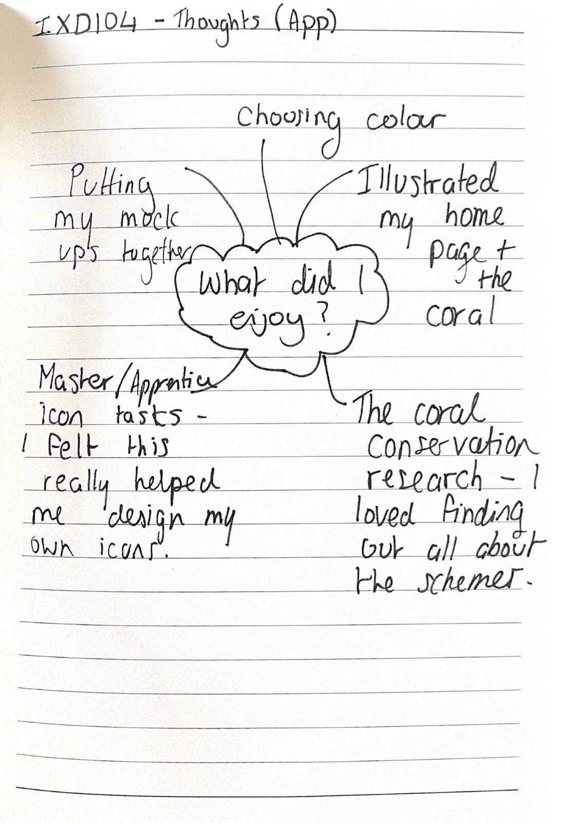
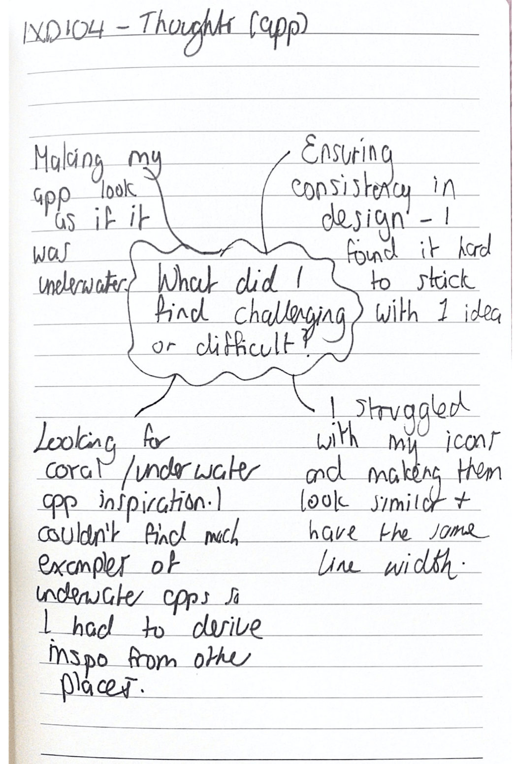
To sum up my experience of this semester I thought it would be a good idea to write a short reflection on how I feel it went and what I learned. I started on paper and made some spider diagrams on what I enjoyed and what I found challenging. The images are below.
Infographic


Travel App
I liked a lot about this semester with Paul and feel like it was one of my favourites throughout the whole year. The main reason liked it so much was the amount of illustrious I got to design. I think that illustration could be a real passion of mine moving forward in the design world because I love drawing as it is. So, this module was really enjoyable for me. The travel app illustrations I made really challenged me because I had to come up with something that looked like it was underwater, and this is something I had never done but seeing the process I had made really made it all worth it in the end. Similarly I feel like in the infographic module I had never made one before and this was my first time trying to turn data into something fun to look at and or read.
The app and the infographic process taught me a lot as a designer and has made a better designer and thinker. I learned that I should trust the process and build on things slowly, tackling one thing at a time for the most successful result. I also learned that research is the most important part, fo example. I had to research so much about coral reef conservations before I started designing because I needed to know what I was designing in the first place. I needed to do research on the coral itself and copy first hand images to try and come up with similar and realistic designs. I also had to research a lot on urban cities because the data in the most important part of the infographic. So research has been a big part of my journey through this term – but I really enjoyed it. I think I enjoyed it because the topics I researched were really fascinating to me and something cared about.
The challenges I faced were similar in each part of this module, in both the travel app and infographic text, sizing and placement were the areas I feel I struggled in. Paul was a great help in all of these for me and advised me on how to place the text, where to place it and what size it should be. Another help was the group critiques, these were a great aid in moving my projects along. I got to receive advise from Paul and other class mates, they got to tell me their opinions on my work or help me in areas that were struggling. I feel like my challenges were over come by help from others and practise, as I kept working on my app and infographic, I found myself placing things better, sizing things correctly and the text fit in better. Proving that practise makes perfect.
Overall creating both the travel app and infographic has sent me on a journey this semester – under the sea and through the cities. I have enjoyed all of it, even my own challenges. I think I learned a lot and am a better designer because of it. I have enjoyed watching myself get better and more skilled at areas and I can’t wait to carry these traits on to next semester.
My final Infographic
The link to the pdf of my infographic is here – infographic
I made all the changes that Paul and the class advised me on which was:
I think it looks much better now and I am really happy with the result, I think it is fun to read through and I especially like my choice of colour. I think the yellow really brightness up the cityscapes and the added detail of cars, trees and clouds really bring it to life.
Challenges
I felt that this project had a few challenges;
What did I enjoy?
I felt like I enjoyed so much of this project that is is hard for my to pick a few favourite things but the main thing I liked doing the most was thinking of the illustrations for this infographic. I had lots of fun researching cityscapes and making them, I then really enjoyed watching them bring my data to life. I think the illustrations really transom an infographic and make it what it is, really fun to look it. I also enjoyed collecting the data, processing it and really narrowing down what wanted to include. I think it was a really satisfying end seeing it all come together.
Thoughts
Overall I think that all of these changes have really made a difference in my infographic end result. I think the process of editing and changing parts really paid off in the end. I think I could still make a few changes but for now I think it is finished. My favourite part is the colour scheme I chose and my illustrations. I really enjoyed making this and think that it has definitely been one of my favourite tasks I have done, I have loved the process and hope that I can make more infographics in the future
Final App Screens
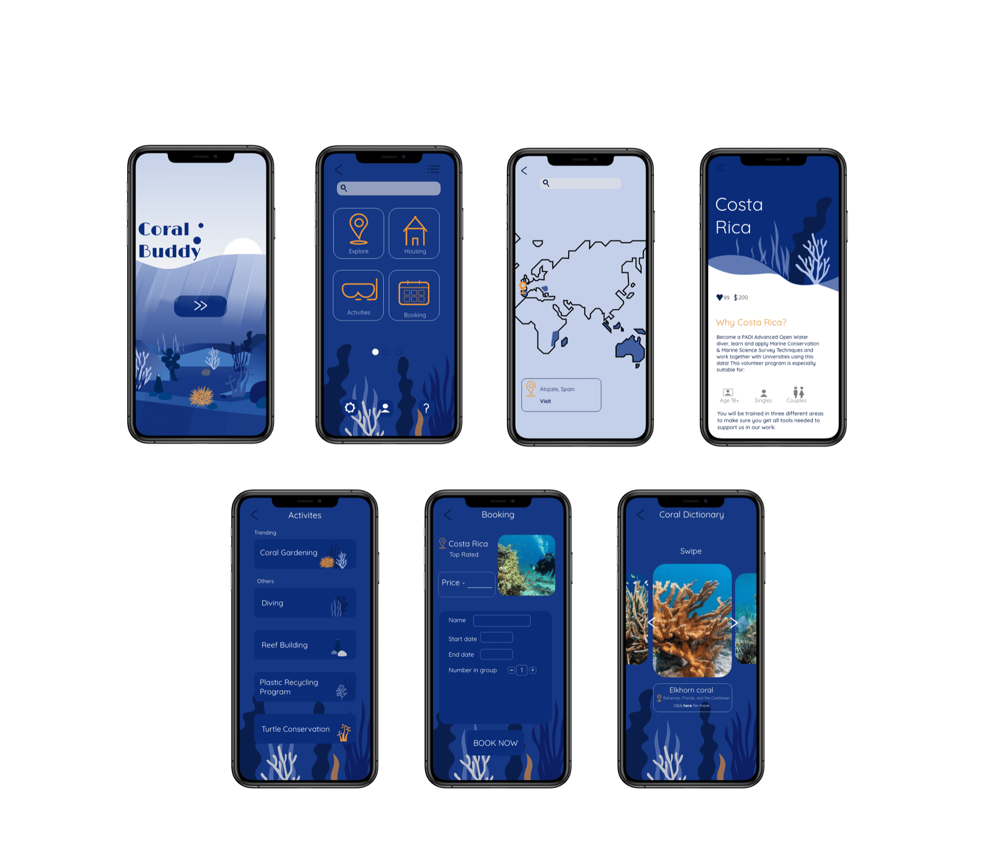
I have finishes my app screens for this module and I am overall really happy with how they turned out. I took on board the feedback from the class and from Paul and made the changes, I then worked on and make a few more screens. I stuck with the under water theme for most of the screens because I wanted it to be consistent. I also chose to add actual images because I wanted it to feel like a real app and a real coral reef conservation app would definitely have images. I think the combination of image and illustration works well, I was scared it wouldn’t but I think the images I found and colour scheme I chose really blend together.
My App Concept
The concept of this whole app came from my interest in the coral reefs and how they are in urgent need of care and help. I spent so long researching all about coral conservations and what they were, I also got lots of inspiration from websites like volunteer world especially, that website had so much information on various schemes and coral reef trips. People can volunteer in real life to spend weeks learning about coral reefs, helping to harvest them, plant them and so many other activities and I thought this would make a perfect app idea. I wanted to make an app that combined all of this information and give coral reef savers a place to go to book their stay, the locations range from all over the world, and there is a section where users can research the different coral there is or what they found. I wanted the theme of my app to stay ocean themed since all users will be going to be spending majority of their stay in the water itself, doing their bit to save the planet.
Displaying my screens

I thought it would be fun to display my app like this on my website, have the mockups underwater. I placed my home screen illustration behind the mockups, only using the top half, to bring the app to life. I think this works nicely and I can’t wait to see this up and running in my actual portfolio website.
Final thoughts
Overall I have thoroughly enjoyed this project, it has been one of my favourites to research and get information on because the topic really interests me. I like excepting projects like this because I think the process which can be long is always worth it in the end. My favourite part was making the illustration and then seeing them come to life on the mock ups. Illustration is a passion of mine and I think creating app ones could be something I want to continue. I was faced with some challenges too, for example, ensuring consistency can be hard for me because I feel like I have lots of ideas and I want to try new things per screen but this wouldn’t make for a cohesive design. I also thought it was hard deciding on layout and finalising it, I feel like layout has to be consistent and right for the app to look perfect and for me this can be hard sometimes. I feel like I have made a good job of it though and have kept it simple yet different.
Today was the last class of the year for Pauls module on digital visualisation. Today was a group critique and we got to see the class’s infographics which was great. At the beginning of the class Paul showed a short slide on how we have come to the end of the year and how we have finished this term, he went through the criteria and submission on blackboard. He also added that next year we should try out Notion for research because some of the older students found it much easier to use so I made a note to try it out myself soon.
The group critique was very useful as I got to show other classmates my work and got to read some of their feedback, I also got to show Paul the changes we had discussed and he added some more I should make to make my infographic more successful. The image below is a screen grab from the Miro board of my work and my class mates comments around it.
Here is what I have to change:
Overall I don’t think I have much to alter which I am happy about. I also got nice comments form the class, Here is what they liked:
Some people agreed that I could scale up some text for effect and also my title could be bigger and better. Overall I was really happy with the feedback and it was great for me to see the peoples progress and how they were executing their own ideas. I also enjoyed giving my opinion on their work and trying to give helpful feedback. I agree with all the feedback from my class and from Paul and know it will make my infographic more successful.
Thoughts
Overall my thoughts on this last class was that I really enjoyed my infographic making process and all that I have accomplished. It has been one of mom favourite modules and I have really seen myself get better and progress throughout the semester. Paul ended my saying that he was proud of the work we have done given the circumstances of this year and he hopes to see us in person next year. At the end of the lecture I was happy with my work and the feedback given so all I have to do now is to fix it up.
Taking on Pauls advice for my infographic during our one to one, I have changed a few things. The images below are screenshots of my infographic and what I changed or added.
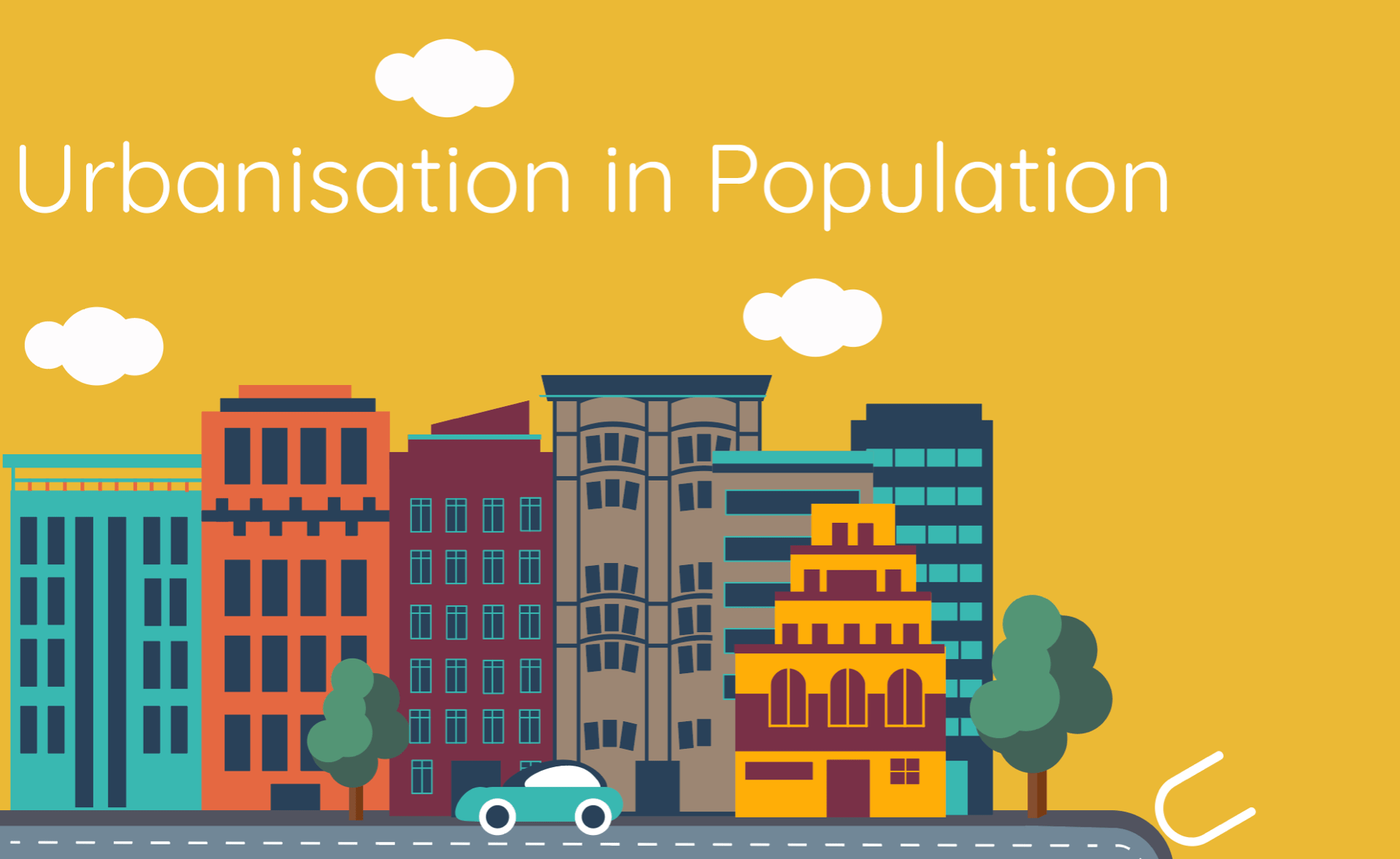
I stared by adding a title like Paul said to do, this would make it clear to an audience on what my infographic actually is. I chose a white text and the same type I used throughout. I wanted the title to be prominent yet subtle because the illustration at the top is very detailed. I also added more details for example the lines on the road, this just made it more clear that it was a road and not just a sidewalk.
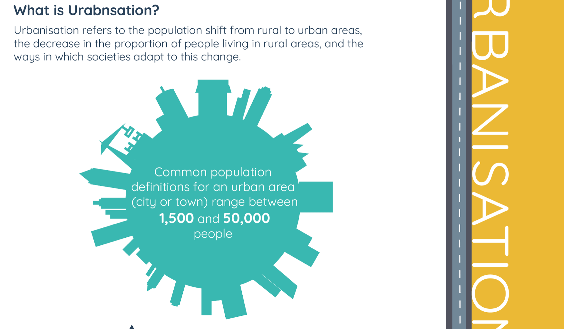
I then changed the thickness and size of figures in my city world illustration. Paul said that making the numbers bigger will make them stand out more and it would look better and more like an infographic. I then changed the colour of text of the ‘main causes of urbanisation’ from navy to white. This made it easier to read and really pop against the turquoise background.
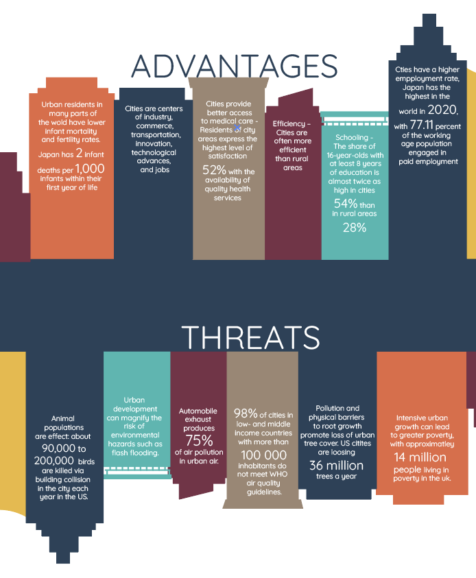
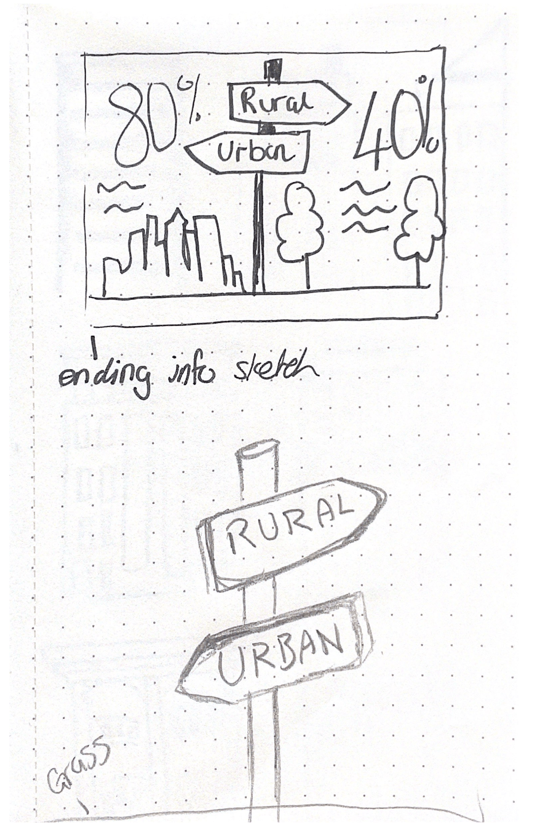
The main thing I had to edit on my infographic was the advantages and threats of urbanisation, the image above. Paul advised that I should add figures to the text. This meant that I had to look through the data I collected and find figures to include. This took a while but it was worth it because I think it looks a lot better. It makes it easier to read and not so text heavy. I think it looks much better and will make my infographic look more successful. I also centred the titles ‘advantages’ and ‘ threats’ to level it out.
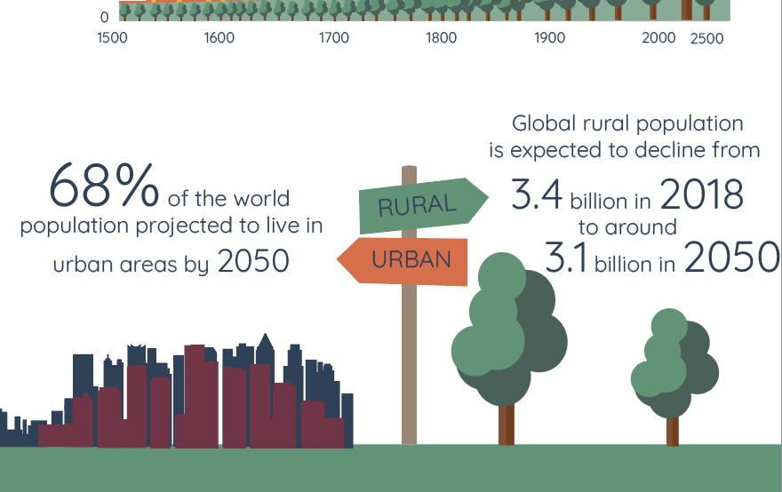
I then added a few figures to the bottom of the infographic, Paul told me that some bold figures would really tie it all together. I wanted to add another section on urbanisation around the world but Paul advised that I didn’t need to because I had enough information. I agreed because I had included some information and statistics on urbanisation around the world already in the ‘Advantages and Threats’ section.
Infographic updated
Thoughts
I think the progress I have made is good but I am excited to see what other class mates have to say about this. I am happy with the changes Paul has told me to make and now all I have to do it finalise after the group crit because I am sure I will have a few more corrections and adjustments to make. I agree with what he has advised and I think that these changes have really improved it but I still feel like I have changes to make.
Today I had a one to one with Paul to discuss my process with my infographic. I have spent a while gathering statistics and information on my topic – Urbanisation in Population. Over the past month I have also been gathering inspiration for my illustrations and colour. Talking with Paul was great because I got to see what he thought, hear his opinions on what I could change and ultimately improve my infographic.
As he was speaking I noted down some of advice, the image is below.

This is the first version that I showed him and my first attempt at making an infographic:
What did he like:
What do I need to work on/add:
All of the point above are what Paul saw and what he thinks I should do to make my infographic more successful, I made notes myself on what I think need work and little areas that I can edit and fix up:
Overall this talk with Paul really helped and I am glad I got his input on things. I am very proud of my first try at an infographic because I actually really enjoyed putting all of the elements together. I also really liked my colour choice and Paul liked it too, I am looking forward to seeing what other members of the class think and hope to get their feedback next week. I think that my research into colour and cityscapes really helped because I go to see different styles and try out a few different ones to see what would work for me – showing that research really does make a huge difference and is very necessary.
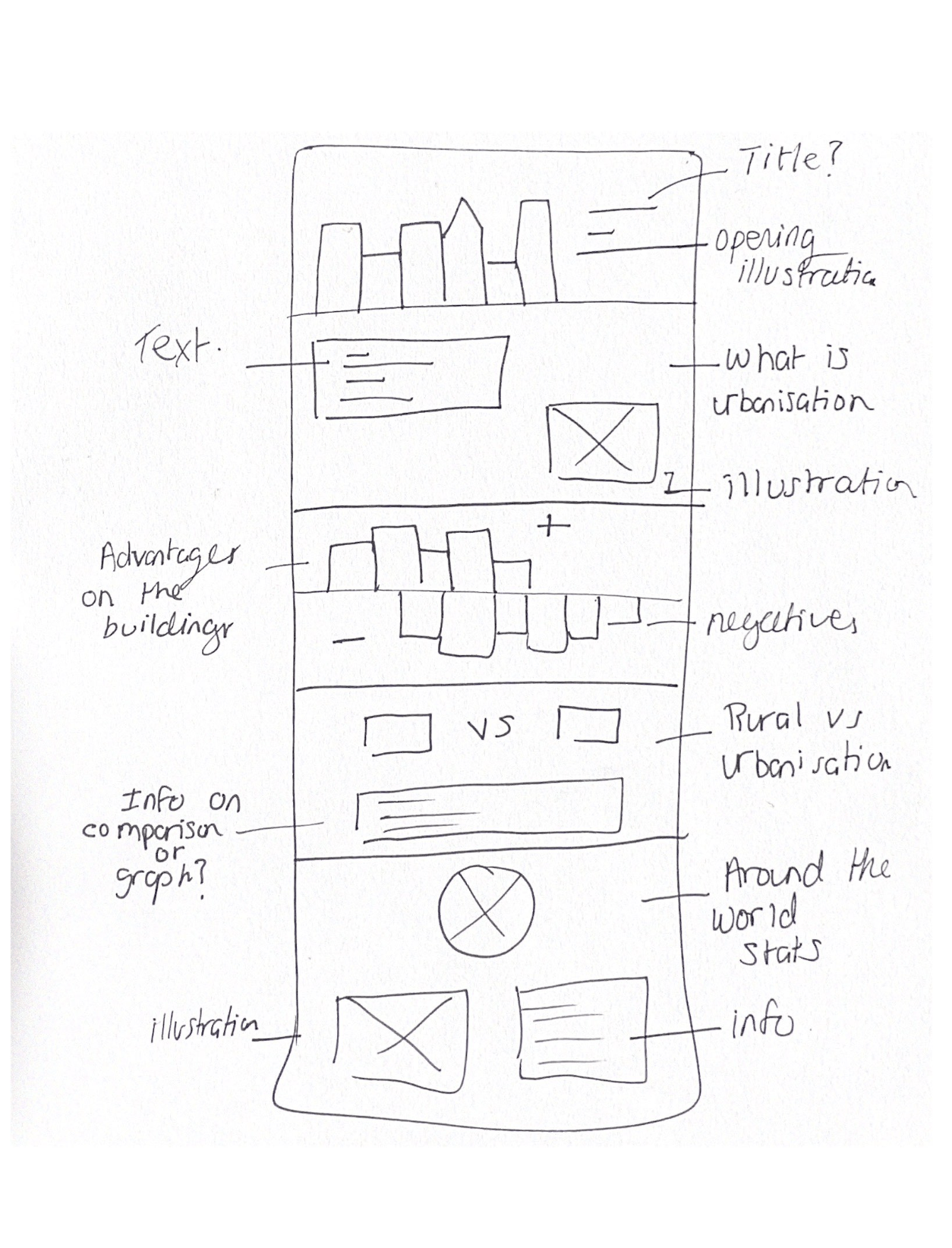
I am now in the process of starting my infographic and the first thing I need to do is to start on paper. I firstly wanted to start with sketching out my illustration ideas before I began the wireframes because this will get my ideas on structure out there first.
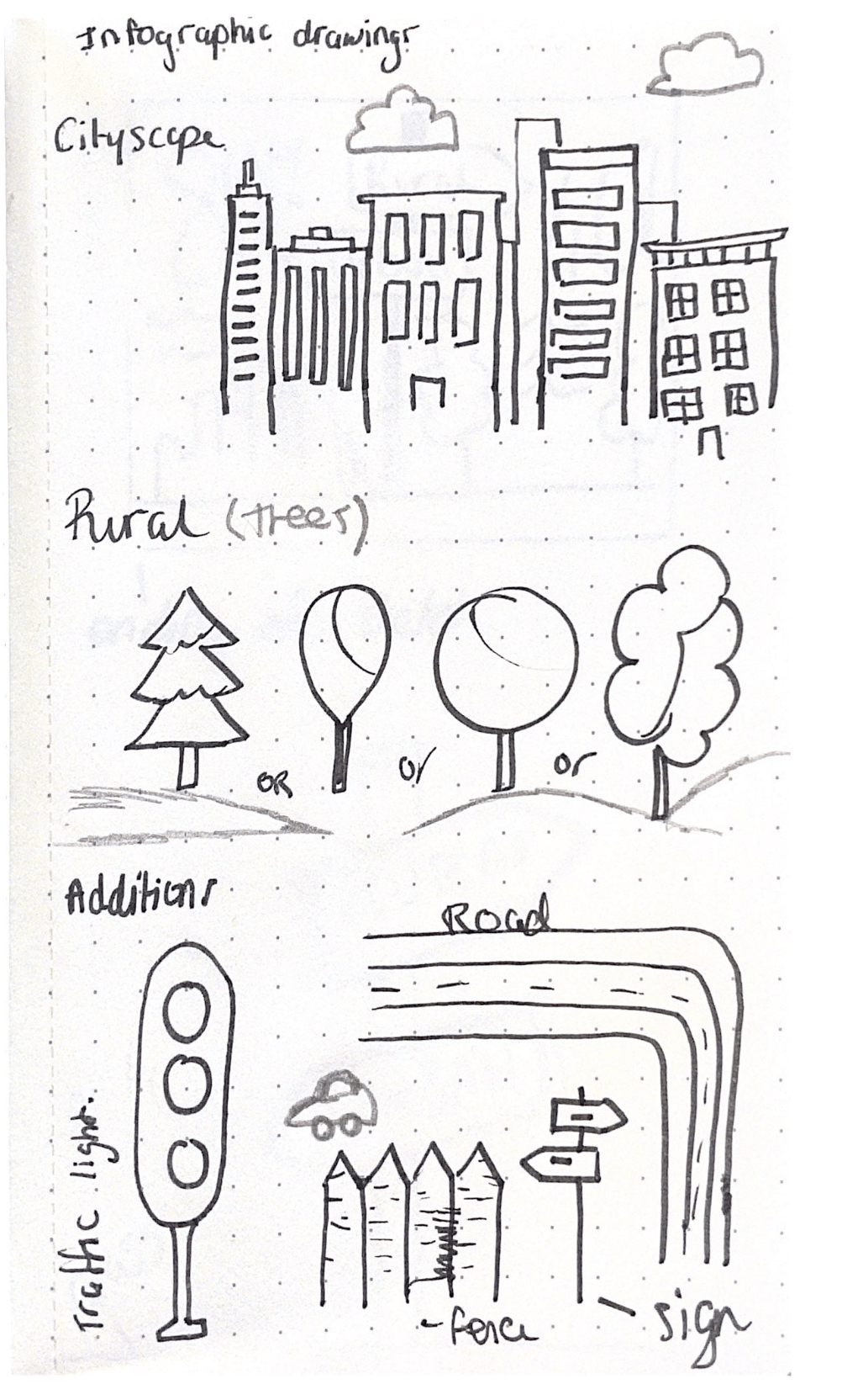


These were my first set of initial sketches, to get me started on some initial forms and shapes.
I then took my illustrations to illustrator to see what worked and what didn’t work, I tried lots of different colours schemes. This was important for me to do because sometimes I feel like I struggle with colour, picking the correct colours that go together. So I wanted to make sure I chose the best ones. Thats why I tired lots of different ones. Here are my starting digital illustrations:
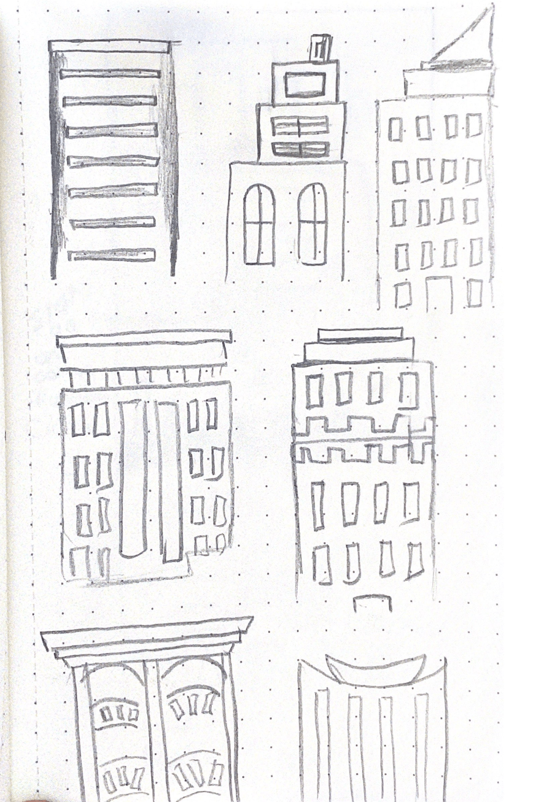
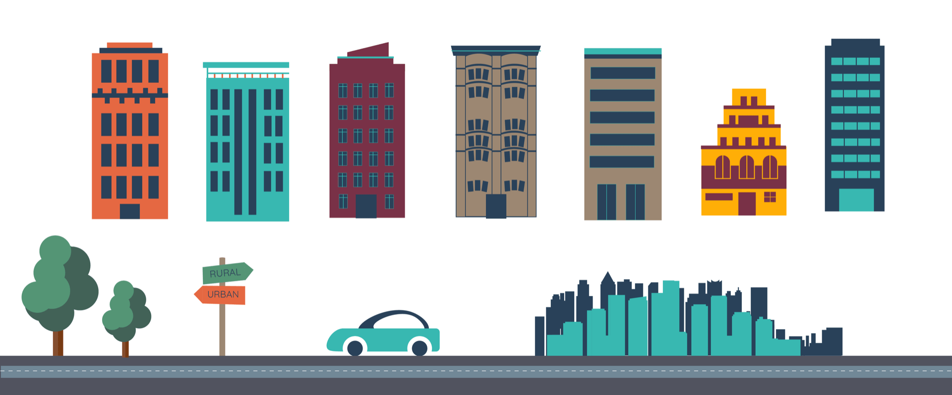
Cityscapes
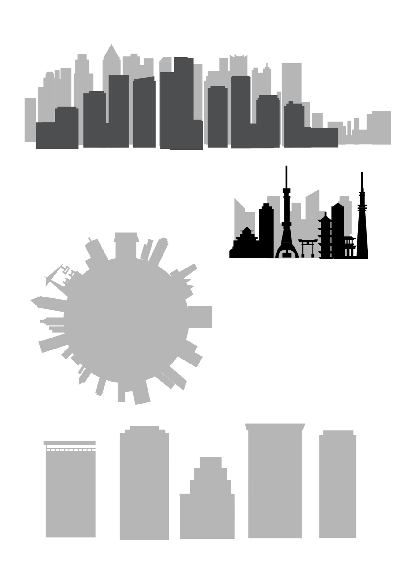
I decided to create a few different types of illustrations because I knew I would need a lots of different styles and shapes of buildings. The bottom five illustrations are strong and standard buildings that I can add detail to to enhance. I also made a small cityscape of Japan because they are the most populated city in the world and I thought I could include this fact in my infographic, I thought that the illustration would go along nicely with it. Overall I think these turned out well, they are solid cityscapes and buildings that give me a strong platform to now work from. I like the top cityscape, I think this would really work as a silhouette in the background of an illustration or maybe could even work with lots of detail as a stand alone image.
Extras

I also decided to make the extras I sketched out because I think these would be a nice touch and really would transform a boring illustration into something someone wants to look at and read. These will obviously be in colour and look a lot more appealing, I just having figured out which colour scheme I want. I used simple circle and geometric shapes to make these, I find this the best method because they look the cleanest in the end result.
Exploring style and colour
I chose a few of the illustrations I had been working on and tried to come up with suitable colour schemes I came up with four main ones that I liked the best, I included a cityscape illustration, blocks of colour and another circular illustration I had been working on:

After coming up with these examples of different colour schemes I favoured the last two, this is because I though the bright yellows and oranges really made the wireframe type reference pop. I places a few blocks of colour in to give me an idea of what the rest of the infographic could look like, this was helpful. I did like the other colours too, for me colour is a hard area, because I like so many options it is always hard to me to pick a final one.
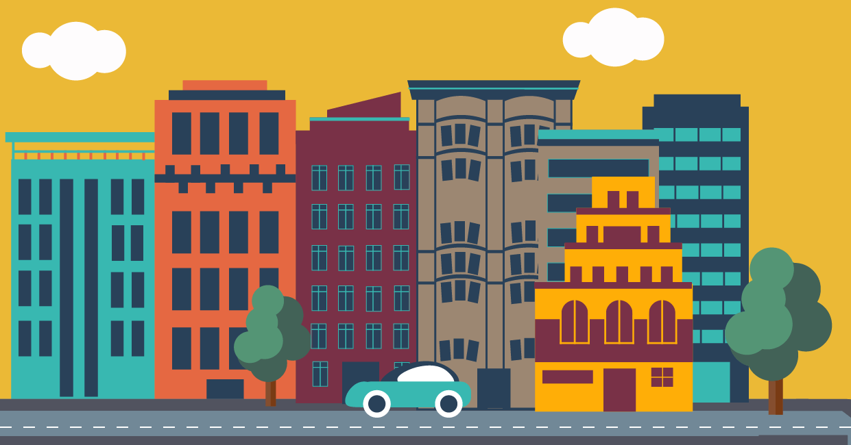
I worked on two different kinds of illustration for the opening Image, the first four are the generic city scape with block colours and windows, this cityscape has little detail and is more of a city illustration. The last example shows a different illustration at the top, I was going for a more wholesome urban city, I was inspired by New York with the big houses and trees on the streets in expensive neighbourhoods. I added extras to this one like trees and a car and this works well in my opinion but still needs a lot of work. I like both options but I have a lot to consider when choosing which to pick.
What do I have to consider?
After thinking about these things I decided to go with the yellow and teal colour combination, the last image. I chose this one because I think the cityscape I made for this one really works and the addition of the trees make the infographic appear wholesome. I also think that the other options do resemble cities but its not the urban city I was going for. I like that I used lots of colours in this option yet they all work together nicely.
Putting all of the elements together
Colour scheme
Final Illustrations

Overall I think the illustration and digitising my illustrations went well. It took a while to get things the way I want them but I think that the time was worth it because I think I have a solid foundation of colour and illustrations for the base of my infographic. Now I can assemble my infographic and combine the data and text etc. I am looking forward to seeing the finished result and to see how these final illustrations look along with data.
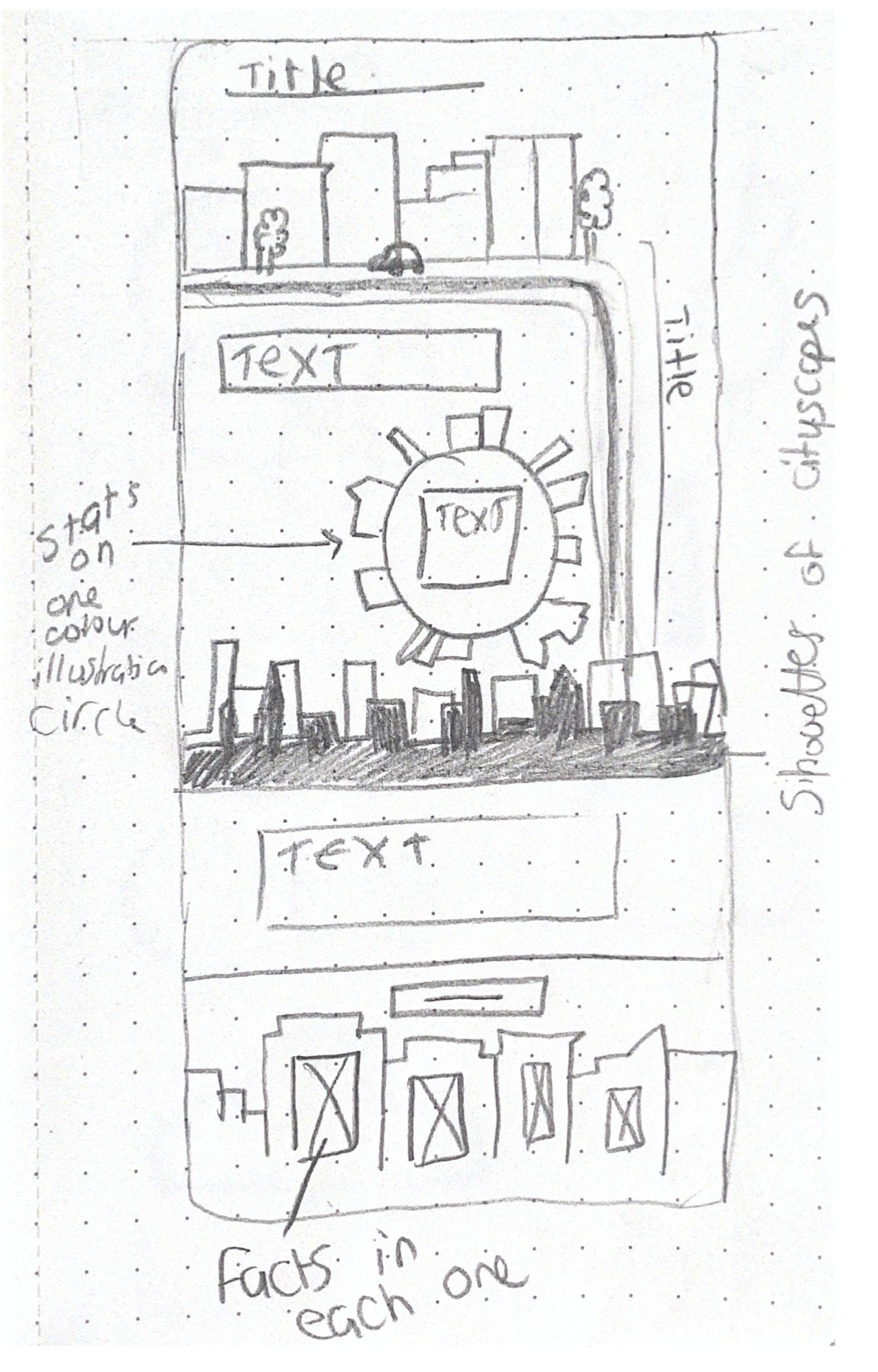
I started my infographic wireframes on paper and tried to create as many different types as I possibly could. I then took the wireframes over to figma and developed some ideas digitally.
The first sketches were on dotted paper, this was a small scale but it allowed me to get out initial ideas and to try a range of possible layouts. The images below are my initial wireframe sketches.


The images above are 8 mini wireframe ideas that were my initial thoughts. This is what came to mind when I started, I always think its a good idea to make lots of small wireframes as soon as pen hits paper, because sometimes the best ideas are the first ones.
First digital wireframes
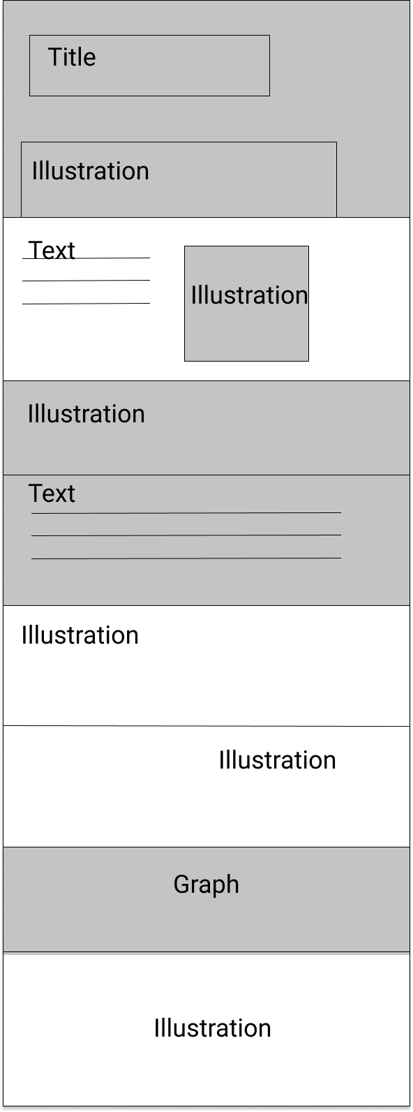
These initial digital wireframes were made so I could get a grasp of what I wanted. I needed to make myself aware of the shapes, the size of text and spacing. I used a range of circular images, illustration boxes and text lines. The blocks of colour are in grey and it was helpful to see where I could possible place them throughout.
Addition of circles

Structured and neat with illustrations centred

Title first (with no text) and varied positioning

These were very basic, I just wanted to get a feel for the basic layout etc. The next thing I did was create wireframes on paper that were including my information and illustrations. These were quick sketches but allowed me to input my actual work, this made me realise where I wanted to place everything – furthermore, leading me to make a decision on what I wanted my final digital wireframe look like.
Illustrated paper wireframes

Doing these more detailed wireframes really helped me move forward in this process, the first ones with shapes were useful in figuring out placement, however now I know what to do now I am moving over digitally. I had to then think about what I am putting into my infographic, each topic I have chosen will require a section within the infographic. This was my next step – to layout a clear plan of what is going on the infographic. Why do this? So it will make making my infographic a lot easier. The image below shows this plan:

Final Digital Wireframe
This is what I am going to follow when I start my infographic, it is a mixture of varied text and image illustrations positioning, therefore taking in all of my previous wireframes. I think that it’s important to vary positioning throughout an infographic because that way it stays interesting. I plan on including data images within the illustrations for example pie charts etc. I also added grey and white boxes to show a vary in colour which I pan on making, I think that its important to make use of white space aswell and I have shown that in the final wireframe.
What is my next step?
In order to make my infographic I had to do a lot of research into urbanisation and that meant I had to try and find lots of statistics and data on the subject. I looked for data on urbanisation, rural living, the future of urbanisation and so much more. I looked at a lot of websites for this data and I am going to list it below.
Sources
I then process all the data and selected what was relevant, below is the list that I ended up with.

I then will take all of this data and put it into the infographic, I will make a graph from the data and place the remaining information all over the infographic. I want to make sure that I include lots, that is why I have made such an extensive list, because in my option the infographic is all about the data.
Why did I choose this data?
I know I will face challenges when doing this, here is what I am worried about:
Overall I feel I have collected a lot of good data and now am ready to turn this processed data into a beautiful infographic.