I am now in the process of starting my infographic and the first thing I need to do is to start on paper. I firstly wanted to start with sketching out my illustration ideas before I began the wireframes because this will get my ideas on structure out there first.
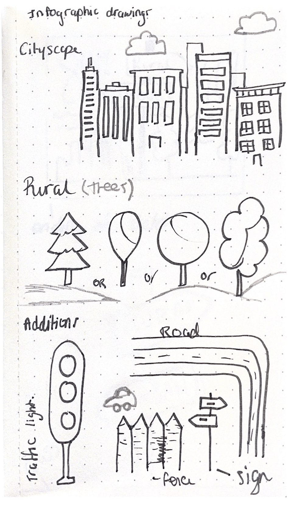
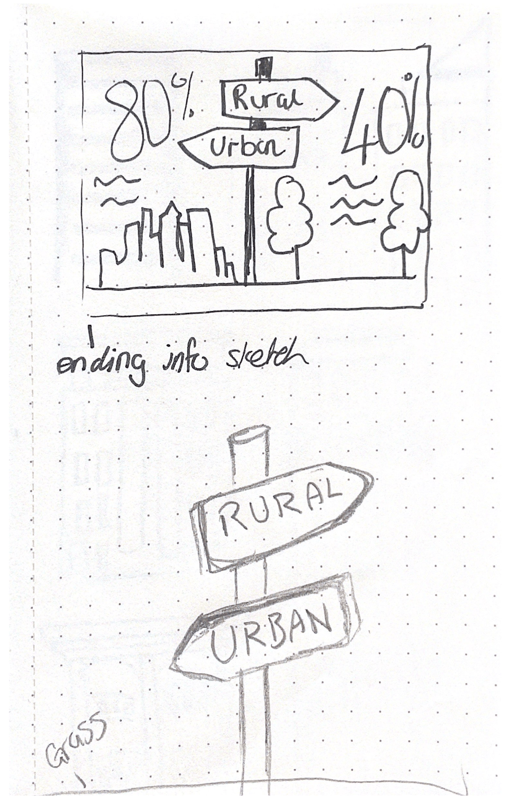


These were my first set of initial sketches, to get me started on some initial forms and shapes.
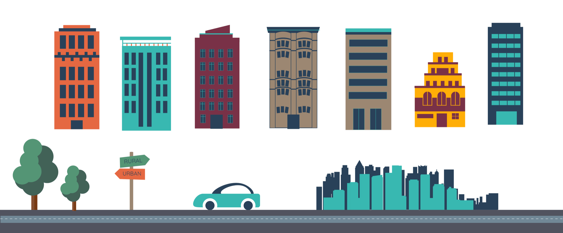
I then took my illustrations to illustrator to see what worked and what didn’t work, I tried lots of different colours schemes. This was important for me to do because sometimes I feel like I struggle with colour, picking the correct colours that go together. So I wanted to make sure I chose the best ones. Thats why I tired lots of different ones. Here are my starting digital illustrations:
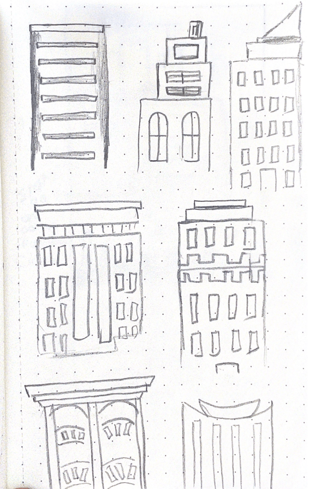
Cityscapes

I decided to create a few different types of illustrations because I knew I would need a lots of different styles and shapes of buildings. The bottom five illustrations are strong and standard buildings that I can add detail to to enhance. I also made a small cityscape of Japan because they are the most populated city in the world and I thought I could include this fact in my infographic, I thought that the illustration would go along nicely with it. Overall I think these turned out well, they are solid cityscapes and buildings that give me a strong platform to now work from. I like the top cityscape, I think this would really work as a silhouette in the background of an illustration or maybe could even work with lots of detail as a stand alone image.
Extras

I also decided to make the extras I sketched out because I think these would be a nice touch and really would transform a boring illustration into something someone wants to look at and read. These will obviously be in colour and look a lot more appealing, I just having figured out which colour scheme I want. I used simple circle and geometric shapes to make these, I find this the best method because they look the cleanest in the end result.
Exploring style and colour
I chose a few of the illustrations I had been working on and tried to come up with suitable colour schemes I came up with four main ones that I liked the best, I included a cityscape illustration, blocks of colour and another circular illustration I had been working on:

After coming up with these examples of different colour schemes I favoured the last two, this is because I though the bright yellows and oranges really made the wireframe type reference pop. I places a few blocks of colour in to give me an idea of what the rest of the infographic could look like, this was helpful. I did like the other colours too, for me colour is a hard area, because I like so many options it is always hard to me to pick a final one.
I worked on two different kinds of illustration for the opening Image, the first four are the generic city scape with block colours and windows, this cityscape has little detail and is more of a city illustration. The last example shows a different illustration at the top, I was going for a more wholesome urban city, I was inspired by New York with the big houses and trees on the streets in expensive neighbourhoods. I added extras to this one like trees and a car and this works well in my opinion but still needs a lot of work. I like both options but I have a lot to consider when choosing which to pick.
What do I have to consider?
- How information and data will look against the colour
- The colour of the type
- What do I want my opening illustration to be
- What type of message do I want to portray and which colour will help me do this
After thinking about these things I decided to go with the yellow and teal colour combination, the last image. I chose this one because I think the cityscape I made for this one really works and the addition of the trees make the infographic appear wholesome. I also think that the other options do resemble cities but its not the urban city I was going for. I like that I used lots of colours in this option yet they all work together nicely.
Putting all of the elements together
Colour scheme

Final Illustrations


Overall I think the illustration and digitising my illustrations went well. It took a while to get things the way I want them but I think that the time was worth it because I think I have a solid foundation of colour and illustrations for the base of my infographic. Now I can assemble my infographic and combine the data and text etc. I am looking forward to seeing the finished result and to see how these final illustrations look along with data.