


Graphic Design work


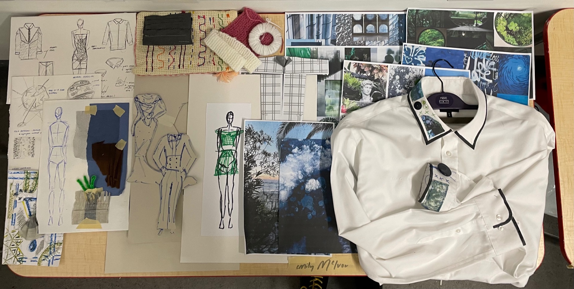
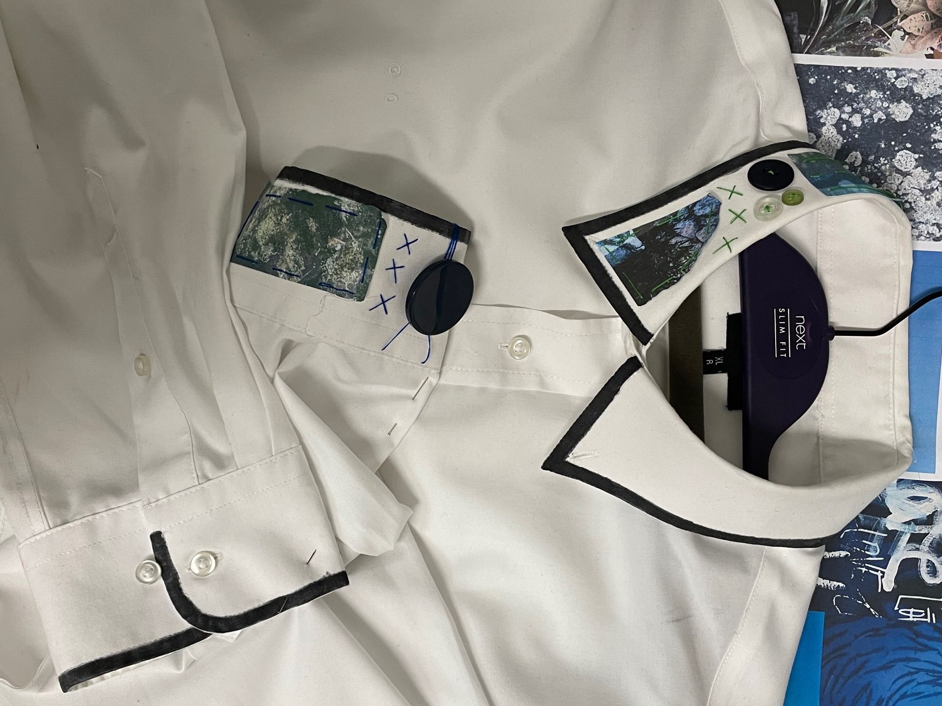
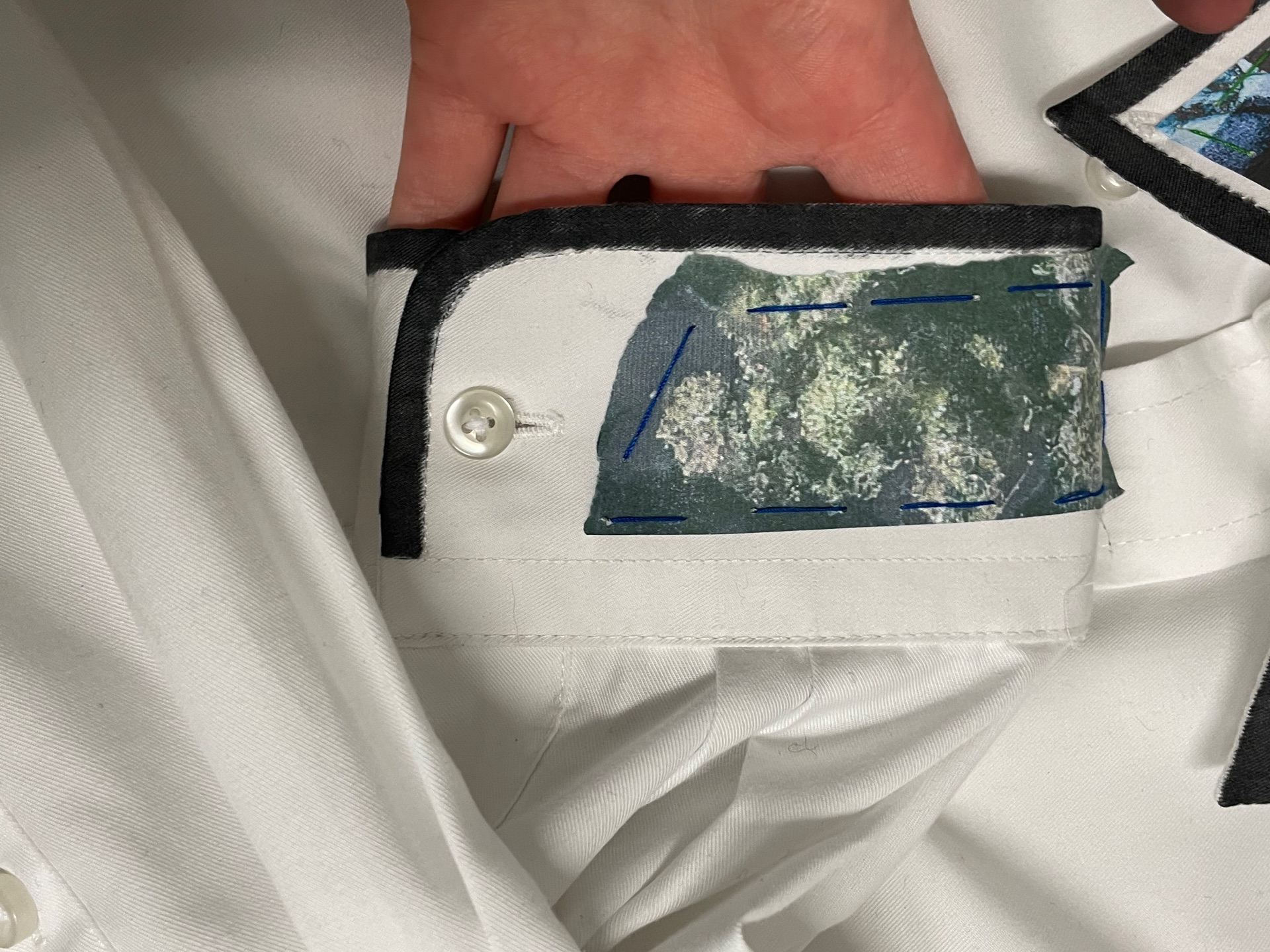
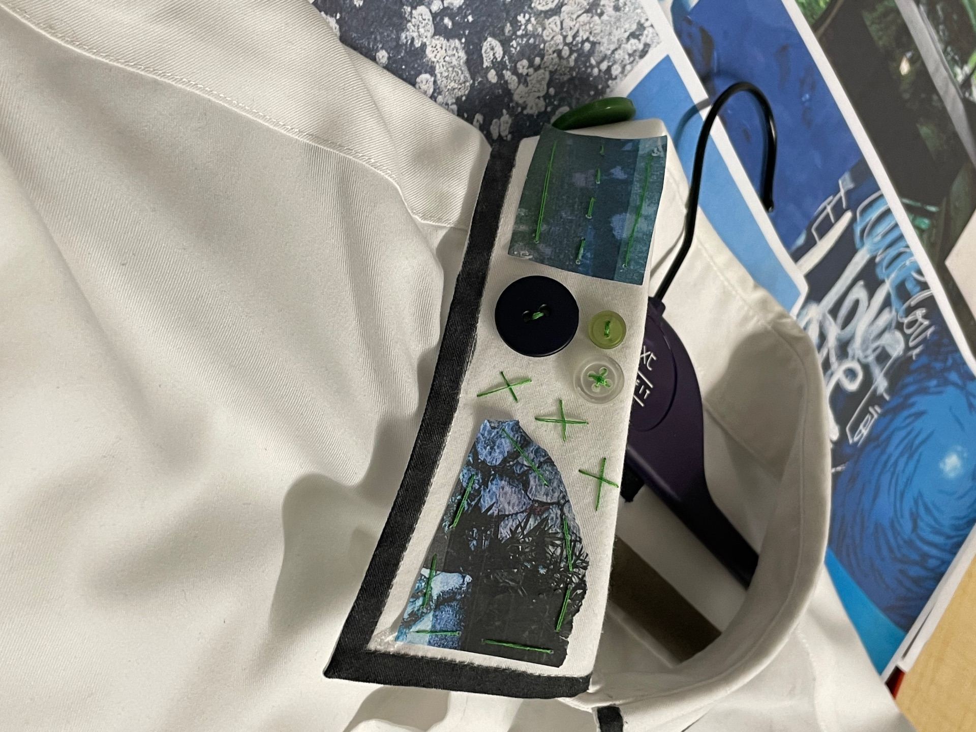
Embellishment challenge
For my embellish challenge I wanted to merge concepts from my collage work and embroidery. Using my own prints, I carefully attached them to both the collars and cuffs of my shirt. I also chose to further decorate with stitch and other add ons such as buttons. I am happy with how my work turned out, I do however wish I had more time to further my design. 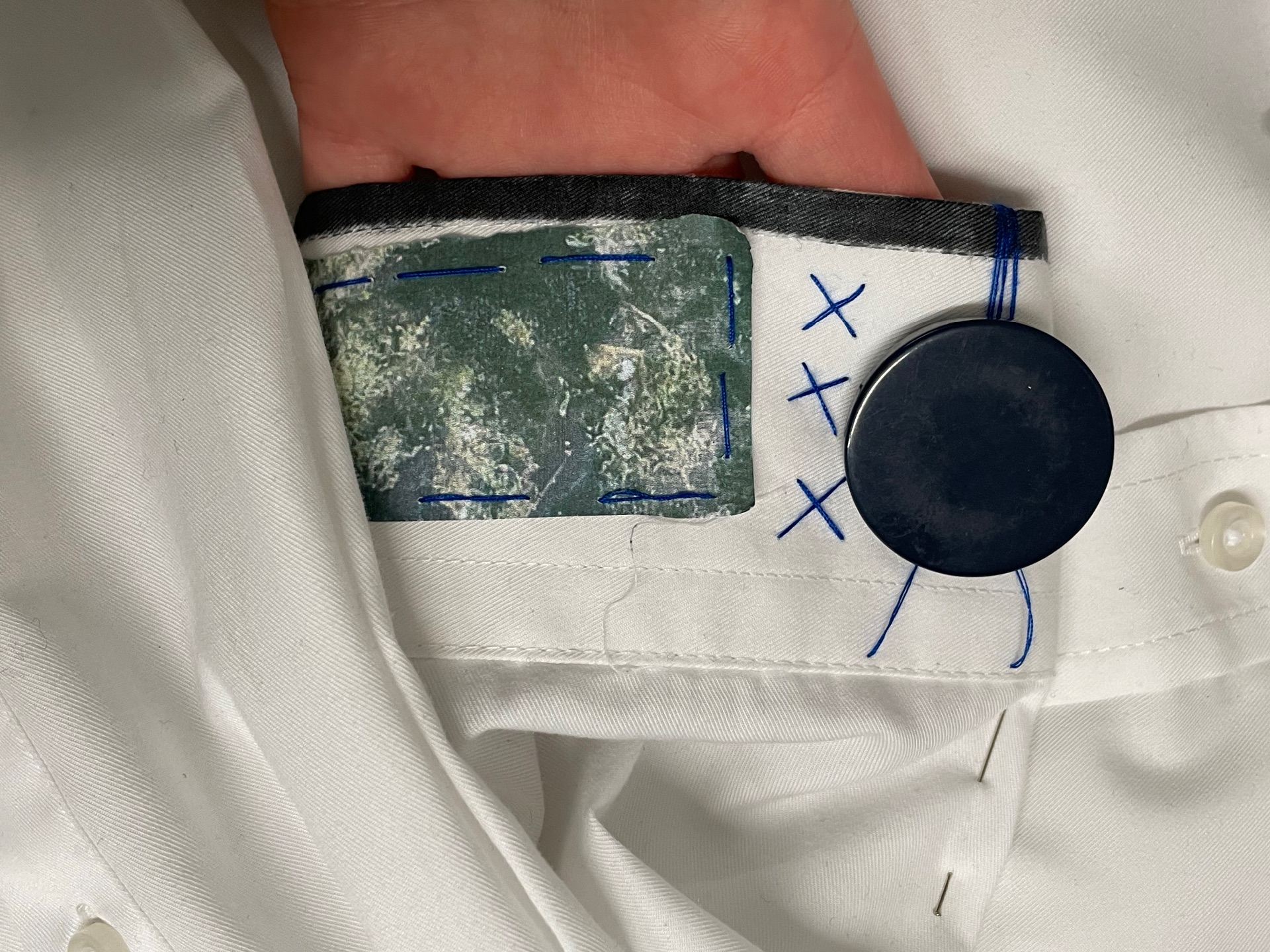

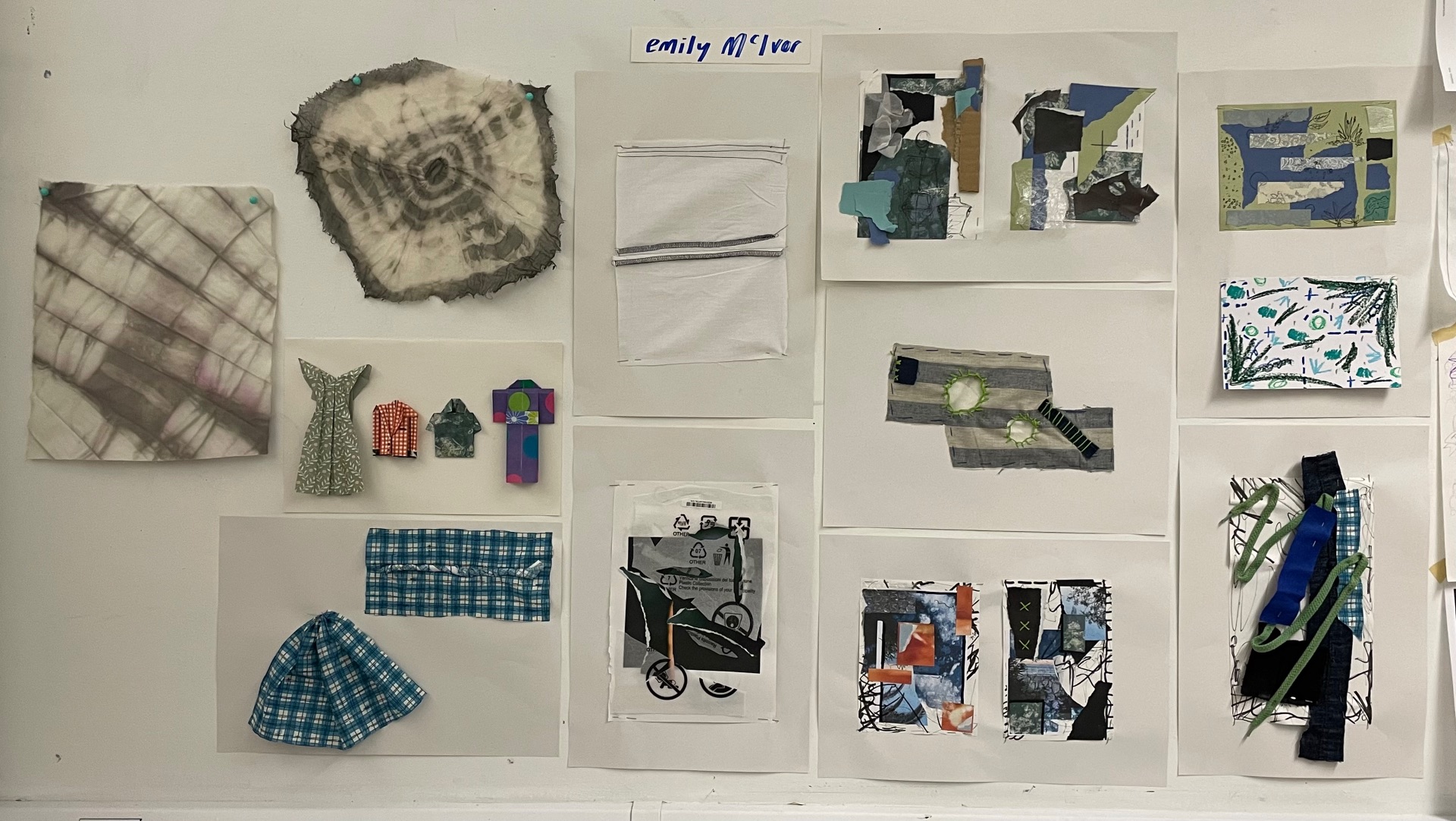
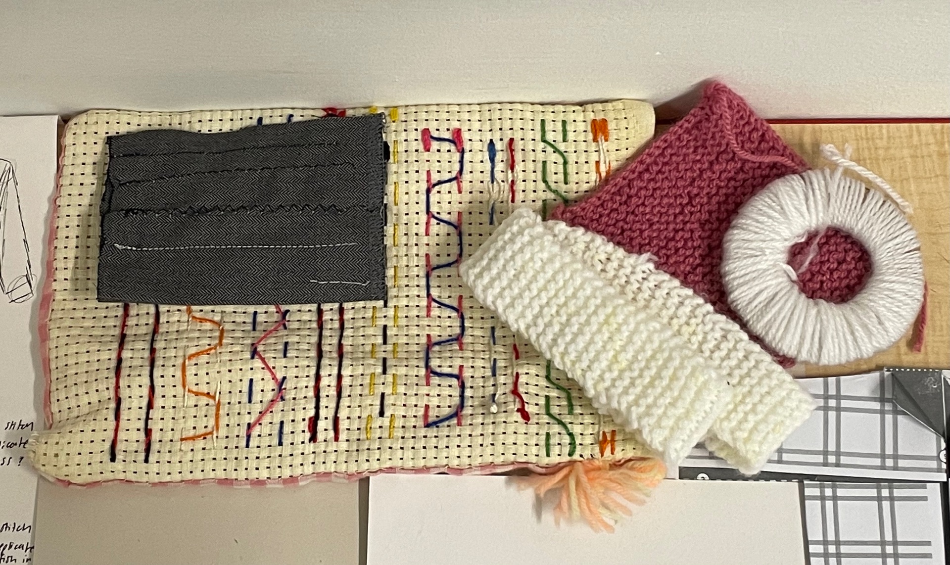
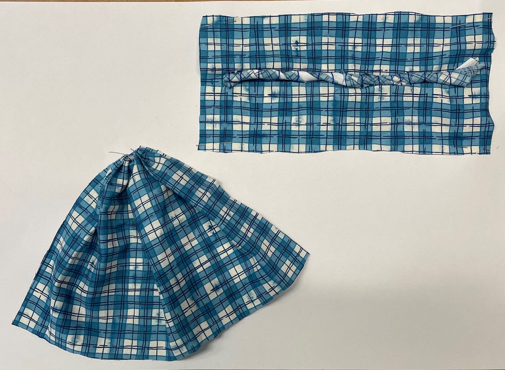
Fabric manipulation samples
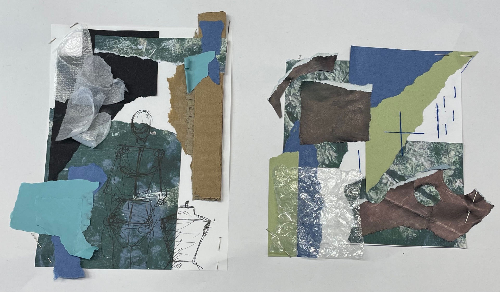
Fabric collages
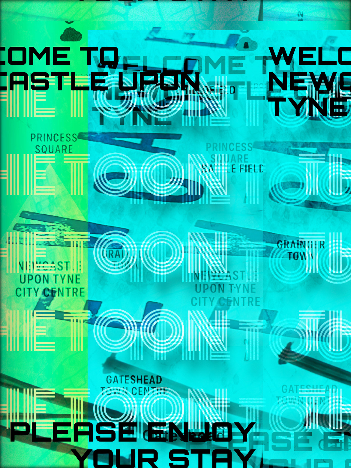
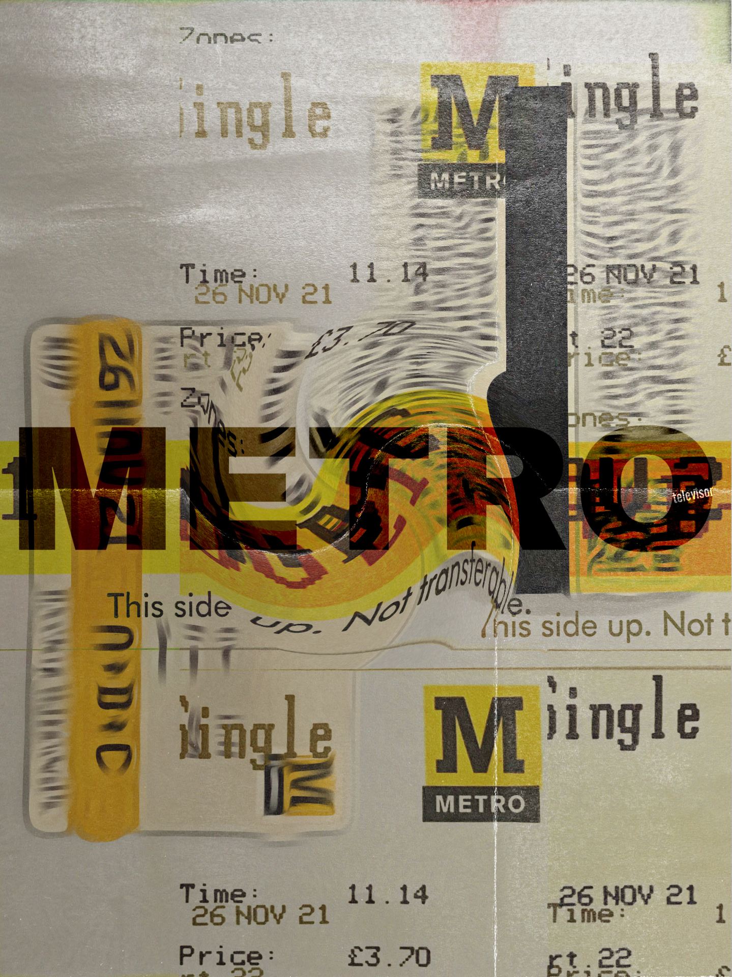
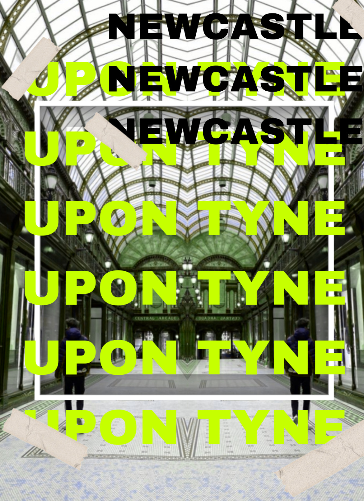
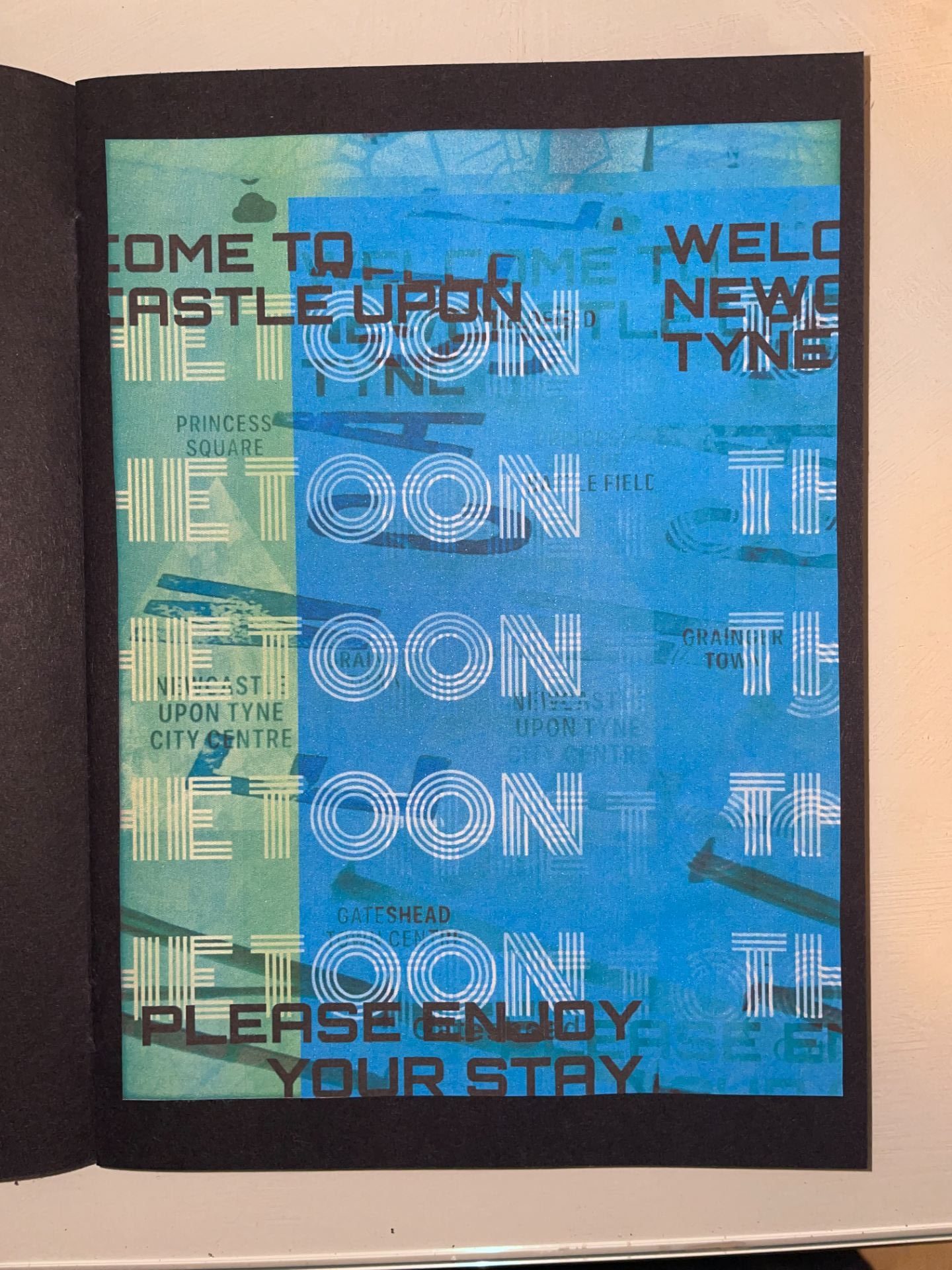
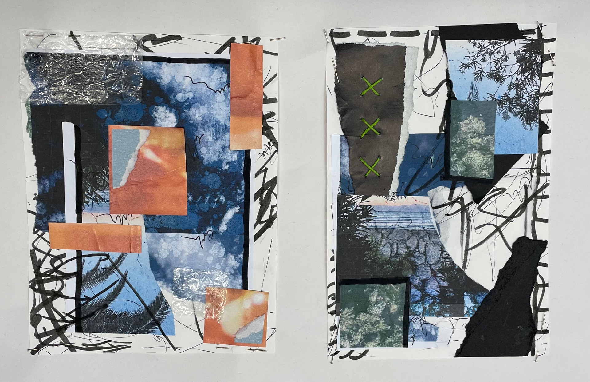
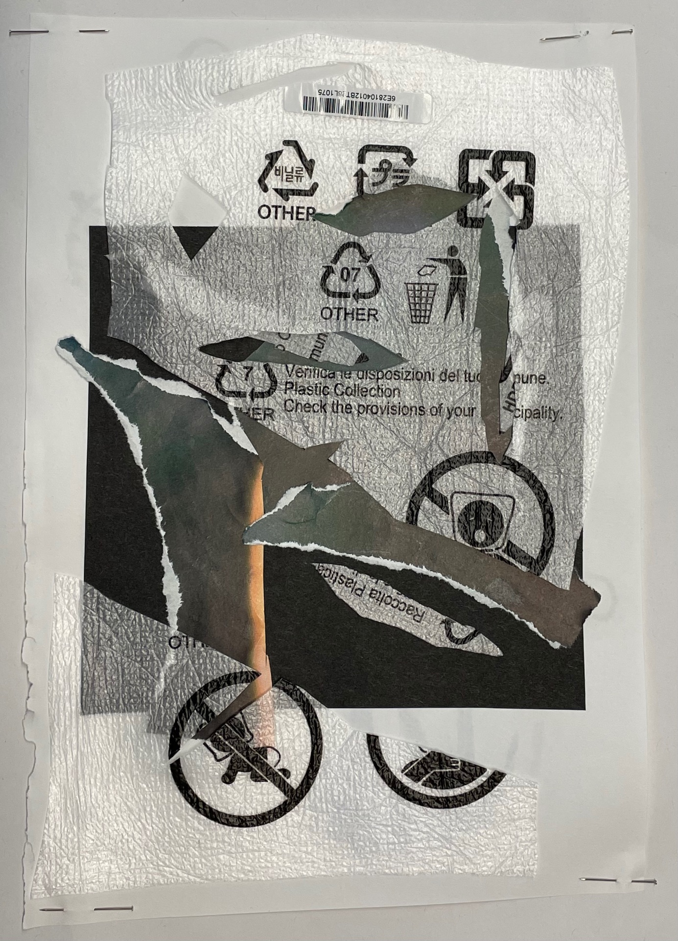
Paper collages

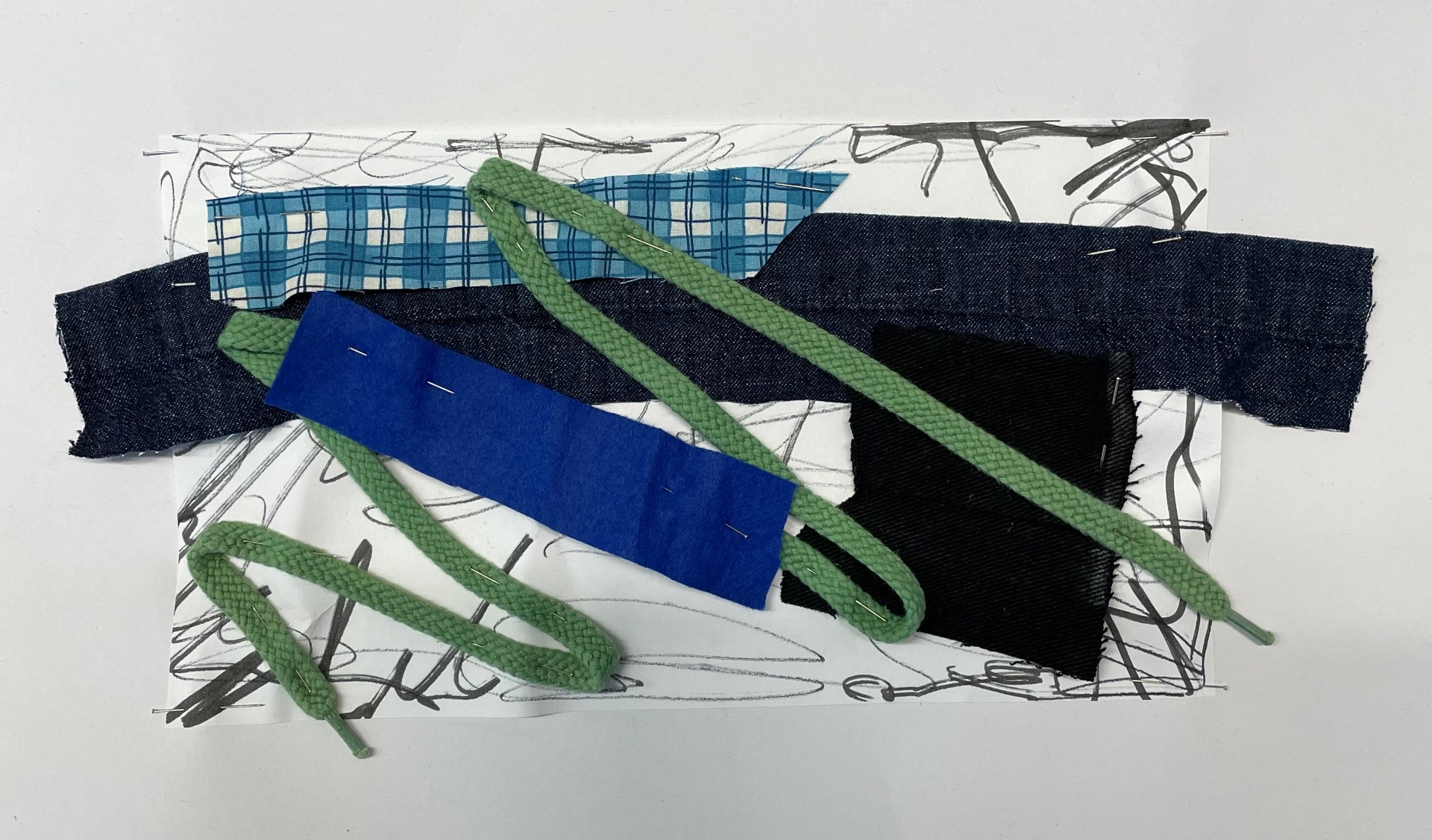
Using industrial equipment
During our workshop, we completed this small sample that consisted of various techniques such as the use of an overlocking machine, sewing machine, and iron. If I had the chance I would have loved to have taken more time to prepare this to ensure my work was neater. 