Research For Final Piece – 18/04/23

jeongmee yoon research

After a few days of being stuck on what I wanted to do for my final piece, I tried to really think about how my overall theme could be expressed in one final project, coming up with very basic keywords of what I associated childhood with. Toy and toys were the ones I kept coming back to, but I was unsure how I could turn this word into a project. I started looking up old toy packaging and started to consider a timeline of toys. I also came across JeongMee Yoon’s photography series ‘The Pink and Blue Project’, of which I have attached research that I did on her. I really loved that she kept all of her compositions in a s square format, as each image was so perfectly balanced and complimented each other, and so I have decided that I would also like to have my final book be in a square format.

I knew I wanted to start with the 1900s, partly because of the evenness of the number, but also when I stumbled across some of the old crayola packaging from the 1900s; it felt like a no brainer. Creating a toy for each year would have been impossible for the deadline, and also very difficult to do, so I settled on one from every decade. Twelve full colour illustrations with accompanying historical info to make a 24 page book that could be a little informational book. I began looking up the most popular toys from each decade, scribbling them down in my sketchbook as I went due to how some websites offered different information. I settled on twelve that I was happy with the idea of drawing, but I did run into a few problems. As the decades passed, technological advancements meant there were multiple influential toys that were considered marvels for their production or electrical capability, and so for the 2000s and 2010s, I decided that I wanted to do two toys that were still incredibly popular, but also had sentimental reasons attached to them as I had started to feel a bit of a disconnect from my project due to the vastness of history. These were some of the images that I had saved during the process. I particularly liked the older toys as they had more detail and in my personal opinion, were more aesthetically pleasing. I felt confident that this was an idea that would work well with my illustration style, and compliment what I have been working on recently, especially as I have already created a colour palette that was vintage-inspired, and had decided to push myself to create a final piece in colour, rather than my preferred black and white. I had also decided to work digitally as it was more versatile due to the fact I would be creating a book in the end, and meant I wouldn’t have to worry about losing quality or colours not matching up, which would have made for a incoherent sequence.

Flat to Interactive – 14/08/23

I personally enjoy doing illustration projects that have an interactive element, even if the actual drawing is flat, or making parts of a drawing more 3D than others by using widths of card underneath. I wanted to experiment with the flat illustrations that I had developed, and turn them into two thing that could potentially become an interactive toy or learning tool for a child.

I created this jigsaw set, using an experimental design that I had done for development purposes during the final colour stage of my original drawing. I wanted this to function as a simplistic jigsaw that would be able to be completed by a child without needing to match patterns or be overly complicated. I created the design by overlaying my line art with a page I had created that showed my colour palette, and used a white solid fill for the recipe items, as I thought it was a good balance of simplistic and engaging, as well as allowing a child to be able to potentially colour in their own version of what they wanted the utensils and other items to look like.

I printed this out using a4 paper and traced around it on a cereal box, which was ultimately smaller than the a4 page, meaning I had to create half my illustration at a time. The cutting was accurate enough for a prototype model for my jigsaw, although if I decide to continue developing this idea for my final piece, I would use thicker cardboard and a laser cutter or get it professionally printed by a custom jigsaw company. I was overall very happy with how it worked, and I enjoyed seeing how this could also be developed further with different designs.

I also included a little recipe card inside, which I made by scanning my handwriting into a .TTIF file, and using my handwriting as a font that I could type with, however if I was to do another handwriting font, I would include punctuation as I had to manually add it later as I had forgotten to add that. I included a lowercase and uppercase version, with the uppercase being cleaner and more even, and better for consistency, and the lowercase a little bit more childish and loose. I also followed a template on how to make a box, and made a quick mockup of packaging in which to store the jigsaw. I ended up liking how it looked, however as I don’t plan on going down the packaging route in illustration, it was good to learn about some of the ways that a product could be developed.

I also made a secondary version with my illustration flat lay, this time with the final flat illustration of my recipe poster. I had extra paper from my print test, and rather than having repetitive posters stuck in, I used the weight of the photo paper to be able to use each element as a little interactive paper toy. It was designed as a little ‘bake with me’ tool, where an adult could follow the recipe, and the child would be able to tell what goes next by laying out the ingredients and equipment that was necessary for each step. This would be helpful if they were not at reading age or found it more helpful to understand instructions through pictures or needed visual aids that they could engage with. I also photographed each element by colour as I wanted to see how they looked without the other colours beside them, and found interesting patterns such as red being primarily supported by yellow, and how light green was pared most often with dark green.

Grid Overlaying Colours – 14/04/23

Exploring experimenting with existing illustrations, changing colour palette slightly by experimenting with an overlay of the exclusion and linear light settings. I wanted to use existing illustrations so that I could change the colour palette’s and decide on which final outcome I preferred in preparation for final piece planning. I used a grid with my original colour palette and layered it in different ways. I wanted to use one of my flashcards as I wasn’t completely happy with the final result before this. The final result ended up reminding me of David McKee’s ‘Elmer’ series, and wanted to explore it with one more illustration.

The Evolution Of Elmer The Patchwork Elephant BBC News | radiomasterdigital.com

I used the same technique of the grid overlay with my stamp-style number flashcards, using two different overlays for the background solid colour without the grid, as I wanted the background to stay a solid colour, like the ABCD flashcards. I was happy with how the inside layers looked, and I think it worked out as effectively as the original stamp colour, as I liked the way the colours merged with the original solid colours. I had to change the background colours a few times, as I wasn’t happy with how it originally looked. I settled on the first design, as I think it forms the most cohesive design.

AAD011 Presentation – 13/04/23

racism in children’s books pdf

racism in children’s books

bibliography presentation

I wanted to include a pdf bibliography instead of just on the slides as I referenced a lot of different sources that I wanted to credit and I had to squeeze into tiny text on the slideshow

presentation research

10 ways to analyse children’s books for racism and sexism


these are the images that I used for my presentation, including the graph that I made and the rough version from where I collected the data.


Stamp Illustrations – 10/04/23

I knew that I wanted to make some stamps, however I wasn’t sure on where I should start. I looked through some early children’s toys and found number flashcards, which I thought could also compliment my earlier ABCD flashcards, and wanted to create a smaller version for numbers on stamps. I found a stamp outline online, where I made some quick mockups of the shapes I wanted each number to occupy in the space. I then looked at some retro children’s toys and began making quick, approximate sketches of what toy I was going to do in each space.

This is the final line art layer with my own stamp border design. I changed the placement of some numbers and shapes as they didn’t work when doing the line art. I was a little unhappy with how some elements looked, but I decided to keep going in the hope that when I added colour it would look better. I wasn’t very happy with the car or the placement of the blocks, but I enjoyed drawing the robots and the marbles, having been inspired by a little robot toy that I keep on my desk. I had to improve the spacing between each stamp as it wasn’t the right shape but i didn’t enjoy drawing the stamp outline, and wouldn’t do it again.

I made a quick colour map with a different pen so that I could colour map each colour more easily, first working on where I wanted the background colours to be placed. If these were cut up, the three and four being red and yellow would have been too repetitive beside the red and yellow of five and six, however as they were separate on the page, I was okay with the distance between them visually. I then worked on the colours inside of the illustrations, trying to balance each colour equally without using the background colour on the inside of the illustration, apart from in the wooden rocket that was supposed to have a cutout section. I tried to use the light green and light blue as minimally as possible as it wasn’t as complimentary for this illustration. I was happy with the final product as the colours were vibrant and although each illustration was small, they are fairly clear and each multiple such as the seven marbles or the five lego bricks were representative of childhood and children’s toys.

Recipe Illustrations – 08/04/23

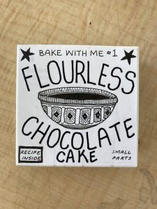
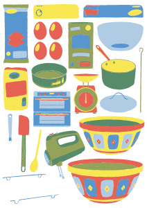
Baking is a strong childhood memory that I have, with many days spent looking at the pictures in recipe books, and excitedly helping my gran when she allowed me to stir whatever it was that she was making at the time (not to mention the part where I got to lick the bowl after!). I had been doing some contextual research and came across Louise Lockheart’s and Jin Kitamura’s illustrated flat lays. I really loved how they both had slotted together all of these different items within an existing theme such as textiles or stationary, and wanted to explore this idea within a baking theme. I chose a recipe from my favourite baking book that I got as a child (the Primrose Bakery Book – such tasty recipes), and chose to do the flourless chocolate cake recipe as I have fond memories of making it for my childhood idol – my flour-allergic art teacher in primary sch0ol. I thought this would be perfect, and I was excited to do it in my own style.

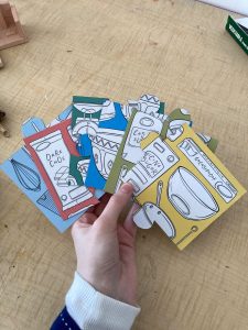
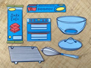
This was my quick sketch where I focused on fitting together all of the elements on to one a4 size page. This was definitely a challenge but it was like a visual and mental jigsaw that I really enjoyed. I wanted each element to be of a similar size so that it was harmonious, but as it was a recipe, I couldn’t add any other space filling elements so it was a good exercise on composition. I did want it to be a visual representation of all the elements in the text, and I think it was spaced out well enough that each element was represented without being squashed. For the sketch I use a consistent width pen as it was quicker, however this will not be used in the final.

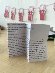
This is the final line art layer, which actually looked quite like a colouring book which I thought was interesting and I might explore that in the future. I used the same pressure controlled brush (if I continue working in digital, I think this will be my go-to line art brush). I wanted to try and keep a fairly consistent outside edge with a mix of closed and opened lines, which was a challenge due to a lot of the curved edges that made stability difficult. I wasn’t able to do the illustrations that I had planned on the right side, as the recipe was too long and making the text any smaller would have made it unreadable, which would have defeated the point. I do quite like the fact that it is separate as it allows the illustration to stand by itself and have the recipe text be readable.

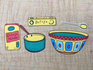
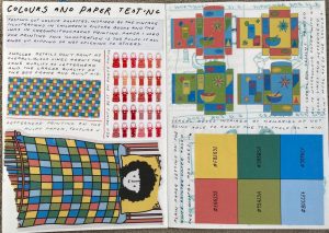
I was really happy with the final version, it looked similar to how I had imagined in my head, and I think that each colour was dispersed well enough that using only six colours was beneficial in creating a well spaced colour map. I had a few certain colour placements, such as the light blue bowl and pot lid, as I wanted to use the light blue to look like glass, and so I began to work around that. As the second page had no illustration, I added the yellow and red stars as they were the brightest colours to create a connection to the illustration. I had used a slightly more cream background colour as the vintage illustrations was on aged paper, and the bright white was too stark. I started experimenting, and will continue experimenting more, with halftone dots. It’s harder to see them on a smaller scale, but I plan on printing it to a3 size. I thought it was a good way to add texture to the illustration through clipping masks and masks, and added more of a retro feel to the illustration. I ultimately decided that the background was too dark and changed it to white, however my version with the dots still has a lowered opacity background that I think works best as a standalone poster.

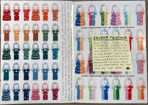
This was the process when I was mapping out where I wanted the colours to go, and seeing if each colour was distributed evenly in a visual sense, across the illustration. As there were two blues and two greens, I included red and yellow as a lot of the packaging detail as there was more visual discrepancy and contrast. Lastly, I layered those colours on to one image, and made a few tweaks to make sure everything worked together, however I’m happy with how this looks, and I’m reminded of many old baking and cookbooks that I used to flip through as a child.

Although I was happy with my final design, I wanted to create a few experimental versions.

  1. I switched some of the colours around, changing red to dark blue and yellow to light blue. The colours weren’t as well dispersed, as the blue and green were almost quite similar, so I prefer my original colour decisions.
  2. I used the inverted text in the recipe for the flourless chocolate cake and a clipping mask to create a mask with words of the recipe overlayed on the recipe items, it was deliberately unreadable, however it just ended up looking like a bad texture effect
  3. The colours of the line art flipped to portrait, with the line art, recipe and title text remaining to create a background, however it was far too disruptive and still unreadable, and too busy in a negative way
  4. The original colour scheme and illustration without the line art, however the colour lines weren’t clean as they were intended to be coloured by the lines. However, I thought it was interesting from further away.
  5. Using the background as my colour palette, and a white clipping mask to still show through the black line art.
  6. Number five reminded me of a jigsaw puzzle, so I drew a quick jigsaw template with a faint opacity for cutting out, as a hypothetical small children’s puzzle for motor skills
  7. Black and whit version of turning yellow, dark green and dark blue into black, with red, light green and light blue into white. I kept the black line art but it ended up looking like a poorly photocopied illustration
  8. I tried to salvage number seven by adding a halftone brush so that there was more texture and more of a grayscale where you could see the line art better, however it would have worked better with multiple grey tones such as a desaturated version of the original and adding halftones to those, but I preferred working in the colour palette.

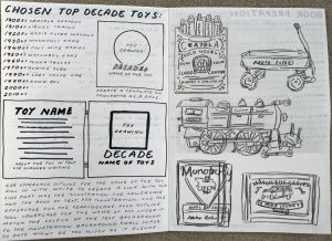
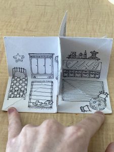
For a-level art we were always encouraged to keep our sketchbooks as neat and clean as possible, but since entering illustration I have really tried to get out of that mindset. I scribble things on sticky notes, print on pieces of paper that would be discarded and stick it down in my book where I have room, not worrying about how the final page looks. This initially worried me in terms of presentation, but we have really been encouraged to not worry about how our sketchbooks look aesthetically and focus more on creating one that works for us. For me, this means, printing a stage of my development and making notes on what I see, what I want to change or figure out mistakes that I’ve made that are hard to spot on a screen. This often means that my notes are all a little bit all over the place, or only make sense to me, but it’s been great to break out of that rigid perfectionism of the must-have-perfect-neat-sketchbook.

Alphabet Illustrations – 06/04/23

I wanted to make a couple example educational flashcards that were aimed towards teaching children the alphabet, with large illustrations so that the child would have the memory of the item as well as the alphabet letter. I gave myself a short deadline, so I was only aiming to get four done. I chose household items as my small concertina of the alphabet had been fun to do, however these would take longer as they were of a larger scale. I had enjoyed the line work of my character designs and wanted to use a pressure controlled brush again. However, for this one I used one that had a smoother finish in order t0 avoid the issues with colour dropping. I decided to use armchair, backpack, candles and door as dice worked better on a smaller scale.

I had some difficult deciding on where to place the colours for these illustrations, as I wanted the letters to be the vibrant yellow of my palette as it stood out the most. I first created the series with a red background, but the blue illustrations looked rather melancholic, and having two blues had caused that. I wanted all the cards to have the same illustration colour, the same colour of the letter and the same background colour, so it was important to create a theme that worked for all. I started again, this time using the yellow to highlight the smaller details and create a connection between the yellow of the letter and the illustration. I originally used the dark green of my palette, however I was unsure if this was too much of a retro look, and was not as visually contrasting as my first one, however I did quite like it but decided to try again. This time, I used the bright blue, and I think it was the most successful. The red and yellow illustration and letter was contrasting against the background, and this time the blue was positive rather than slightly ominous. I was pleased with the final result, and it was a good exercise in working to a deadline.

As these are intended to be flashcards, each picture would be printed separately rather than in a poster design, however I would still like to show what they could all look like together. I really liked how they all looked as a poster, and I think the limited colour palette of primary colours really helps the coherency. If I had to change anything, I would maybe have changed the door to something a little more interesting to draw, however the more plain design helps to complement the more detailed parts of the other illustrations. I have also included a picture of my very very quick drawings for my flashcards, where I wanted to quickly map out composition and was focusing less on a clean, neat drawing and simply used my sketchbook to draw and write ideas before and after drawing/printing.

Child Character Designs – 04/04/23

I had been struggling for inspiration and where to go with my next project, and decided to develop on something I have been putting off – character designing. Although I don’t intend to go down (at this point), a narrative style illustration, I do want to develop and work on a character for my theme of childhood, as a child is important in that. I was looking through Pinterest and books in the library and came across a few sources of inspiration for different reasons. As a child, I had paper dolls that after a few playtimes were ripped and torn, and so I noted that it would have to be printed on thicker paper. I decided to be inspired by the paper dolls rather than creating one due to my perfectionist tendencies working against me, however I did want to use the same face and hair for all. I looked at Julia Donaldson and Rebecca Cobb’s new book “The Paper Dolls”, as the dolls were their own character, rather than an accessory, which I thought would be interesting for a sequential illustration. On Pinterest, I liked the paper characters hanging from a string by Joana Rosa Bragança https://www.instagram.com/joanarosab/?hl=en and paper doll marionettes by Carol W on https://www.flickr.com/photos/machecolle/albums/72157622685859395. I thought I would create a small bunting with the characters, rather than dangling them as I was worried it would look menacing. I didn’t have any circular pins to create the marionette with moving limbs but I enjoyed the idea and the versatility of it.

Below are some of my earlier designs of what eventually formed this character, as initially partly-developed for my gouache illustration. These final illustrations are a lot closer to what I had in my head, although it was important in my process to have already created part of a character for my gouache painting as I knew what I wanted to change and improve.

I started to make a design inspired by photos of me as a child, as I had been looking at photos of some of my favourite outfits and wanted to include them as a subtle way of creating a personal connection to the character that would not disrupt other’s viewings of it, and allow them to make their own connections. I knew that I wanted to create a character with slightly wild curly hair, as I wanted there to be a slight reflection of me as a child. I used the face that I had started to create for my gouache illustrations, as it was simple enough for it to give the childish impression that I was looking for. I created a face and hair template, and drew a swimsuit and rough t-shirt + trousers template so I could create a paper-doll like template to work with.

I wanted to use a pressure controlled digital pen to create alternative width lines so that my illustrations didn’t feel flat, and had some character in their line. Although my first set of six designs was inspired by childhood outfits, I wanted to work on a more sequential illustration for my next set. I started thinking about childhood dress up in outfits of adult jobs, as well as a future project of working with alphabet illustrations, and ended up deciding to do a set of six characters with six different jobs in the letters ABCDEF. I settled on astronaut, builder, chef, doctor, engineer and firefighter. I wanted it still to be clear that it was the same character, however I refined the hair and face slightly as I had found that the hair on the first picture was a little thicker pressure than I intended. This time I also wanted to add accessories to the hair and head such as an astronaut helmet, chefs hat and two helmets.

As I had created these digitally, I was able to add colour easily, however some of my pressure controlled lines were a little thinner, and so the colour drop had to be done manually. I wanted to use the new colour palette that I had created as there were six colours and two sets of six characters. I wanted to use the same colour in each character to create a clear separation that was less clear in the line art. I used the same order for both sets, and noticed an accidental parallel in some of them. The curves on the princess dress echoed the astronaut suit, and the yellow bands on the star child and builder had similar white spaces, as well as the dark green dungarees echoing the shape left of the doctors coat and trousers.

Lastly, I wanted to create some little poster designs for a quick repeat experiment, and created three. I did one with the childhood outfits character and another with the childhood alphabet jobs, as well as one that combined both designs. Overall, I’m happy with my character designs, and although it was a lot of work I like the final product, and it was good to learn how to create a character that had personality and that I was proud of.

Colour Palette Decisions – 02/04/23

I have been inspired by the illustrations in vintage children’s books that used chromolithography printing to achieve cheap colour prints. They are typically of a limited colour palette due to the expense of producing ink and colours, however chromolithography used stone plate with acid etching that at the time allowed for illustrations to be broken down by hue, to create full colour prints that were cheaper and less time consuming than previous hand-coloured methods. I wanted to use these six colours as two greens, two blues and one red and yellow seemed the most common colour palettes that I had seen in old children’s literature. I included the hex code as I plan to do most of my illustrations digitally due to the colour accuracy.

Final Colour Palette inspired by these vintage educational children’s postcards and Jessie Rathbone’s ‘Look and Learn Pictures’, however I wanted to increase the saturation and brightness of the yellow and green, making my blues lighter for a more cheerful palette and a more complimentary lighter red to those editions. I also wanted to have two greens and two blues as I wanted a childish, vintage inspired scheme.

I wanted to test how well these colours worked together with a simplistic quilt illustration as it allowed for a way of using all of the colours in one subject. I used the face that I had begun designing for a character, as I thought it would be a nice symbol of my theme of childhood, with a child tucked into bed with messy hair.

3D Room Illustrations – 31/03/23

room template video    (blank rooms, no illustrations)

I’ve had to upload all large videos as YouTube videos, as blog hosting only allows me to post videos that are under 50mb, and when I have tried to either compress it or reduce the file size, the quality loss makes it unusable.

3D Room inspired by Trevor Yardley-Jones’s blog post on https://www.behance.net/gallery/35184417/Crime-Zine. Tutorial from krokotacom/2017/06/how-to-make-a-3d-paper-house/. A much more complicated version is “Botticelli’s Bed and Breakfast by Jan Pienkowski, 1996. (PZ92. F6S65 1996. Brenda Forman Collection of Pop-up and Movable Books.” This was similar to a pop up book that I had as a child, and I loved the interactive element of it. For my illustration, I wanted to use black and white to start with as I was using the interactive element as development for my theme for childhood.

“The Children’s Room”. 3D Interactive Illustration, can be folded up into a small book and opened up to be three separate rooms. I used a 0.1mm fineliner as I was intending for the final product to be small. My scans came out rather pixelated as the item I was scanning was small, so if I was to repeat this I would either produce it digitally or use a larger square with a thicker pen link

Although I was happy with my final design, it could have been elevated by using colour and I had some difficulty with getting the right paper. If I was to do another version of this, I would create a colour version, as black and white was not as finished-looking as I had hoped. I used a square to draw on three of the quarters of the page, with one quarter folded underneath. The difficulty with folding was it often creased the paper too much, which destroyed the illustration on top by warping it or losing structural integrity either through folding it back into a book or by trying to flatten it into a room. The paper that I drew it on ended up being too pulpy, so when I was trying to stick it together, it ended up ripping off the layers of the paper rather than sticking. This was an issue that could have been solved by using better quality paper, rather than sketchbook standard. However, if the paper is too thick, folding the quarters together will make it impossible to re-fold, if it is too thin it will not fold back into a room, and using over 200gsm paper often results in difficulty folding the original illustration, as well as difficulty with the structural aspects.