I have already submitted my presentation to the drop box, so I can’t add any new documents, and instead I’ve put all my case studies into one blog post for easier viewing.
Order – Sustainability, Identity, Aesthetic, Place, Innovation, Gender
This is my final printed book! It was printed to square format and using cmyk files, with each individual text page and illustration drawing in 7016 by 7016 pixels in 300 dpi. The final book measures 12 x 12 inches (or 30 x 30cm). I am really happy with the vibrancy of the colours of the background and illustrations, and although I initially regretted not sending the version with the dots as my final drawings, I am happy I didn’t. Even with the large scale, I think it would have made the background of the drawing contrast too harshly with the text on the text page to the left. I had initially decided to do every second page with a border, however when I was finalising each page, I found that the company border (only one border width available), was too large and felt incomplete, and I’m really glad that I didn’t do it. I will admit that I am a little unhappy with the front and back cover. I think I should have done a different design for the back cover, as doing the same design as the contents page feels like I didn’t think it through enough. I’m also not very happy with the front cover, as I was advised that the design wouldn’t go to the edge, however I was not aware that there would be such a large border and I really wish that it had extended to the edges. I think that the inside of the book is a lot stronger than how it looks on the outside, however I will discuss with Ashling on whether there is anything I should do to change the cover, or whether it’s okay as is. I have included two videos of my digital flip through of how my online mockup looked. There is also a pdf collage of my book pages along with the photos below in a quick video. The photos and YouTube video below are of the final book product, captured in the sun as I wanted to show how bright the colours printed!
I had originally intended to only upload the no background version of this, however I actually quite liked how it looked when it was framed by the shadow of the window, and have decided to add them too.
(This is a screenshot from how the books look on the preview section of the blog for me, I am conscious that with different browser colours, it may look different.)
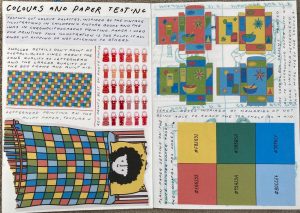
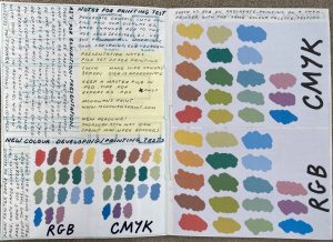
These is my complete a5 sketchbook from this illustration module. I have also created two digital sketchbook/colour development books that are featured in the previous blog post. I wanted this sketchbook to be a place that I could write and sketch what my ideas were, do printing tests or figure out concepts that were easier to be thought through on a page rather than just in my head. On the front inside cover of my book, I stuck down all the little scrap paper notes that I had made over the course of the topic, as I sometimes didn’t have my sketchbook to hand. I used my sketchbook primarily for figuring out traditional concepts, or how best to bring my digital work out of the screen, which is why I have gone into more detail on my process of creating each illustration into my blog posts and other development digital sketchbooks, as I was worrying less about the neatness of my book, and trying to figure more about practicality. I personally tend to do a lot of writing in my sketchbook, and there were definitely moments I realised I was writing a lot. However, this writing is meant for me rather than writing about technical skills, and so all the relevant information about how I created each illustration is written on my blog, so you don’t need to struggle and follow my handwriting. I learnt a lot about printing this year, figuring out RGB vs CMYK, and the difference that different papers make in the final result. I also wanted to use the back of my sketchbook to create a mockup of what my final submission layout plan was for my final examination. I have also included a YouTube video of me flipping through my sketchbook and zooming in on some of the more relevant drawings done within.
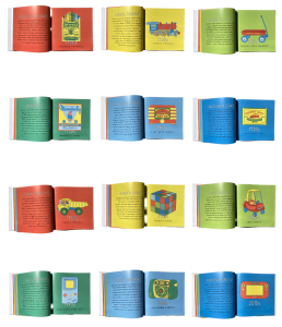
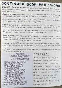
Before I sent my book off for printing, I wanted to create a few mockup books for development and tests. I find it difficult to spot mistakes that I’ve made when looking on a screen, and also I wanted to get a rough guide of how the colours would look.. I had a bit of difficulty in double sided printing, and making sure that each page had the right page beside it, so it became easier to print it in the order that I wanted, and then glue each page together rather than printing and stapling. This was time consuming, but ultimately easier than arranging documents by staring at a screen for hours. For this blog post, the relevant images and the links to the video will be above the text, as there are approximately 100 different photos in all my development books combined (plus more duplicates), so I thought it would be easier to show a flip through version online.
All large videos that will be on my blog, will have to be in the format of a YouTube video as the blog only hosts 50mb videos, and any compression software either ruins the quality of the video, or is too large a video to even compress. I have made them so that you can only access the videos with a shareable link (the link on this blog).
I created a black and white version with the line art that I had used for my final book, and the accompanying black and white text, with the greyscale version of my book cover. I really liked how this looked, as it printed correctly and was very similar in layout to how I wanted my final book to look, only the line art version. I kept the scale small, first printing the inside pages and measuring the width of the spine, I scaled up my cover by that measurement of approximately 0.6mm, so that the cover image could stretch to fit the full width of the spine, front and back cover. It felt very resolved, as it was clean and neat, and due to the black and white nature, there was clear consistency throughout.
I also made a colour version with all of my final illustrations and coloured text, but forgot to switch it to landscape mode when printing, which resulted in a more calendar-like effect. I didn’t like this book as much as my line art version, as I was quite disappointed with the colours and how the black writing showed up on the text. My final book will be printed with the text to the right of the illustration, as that is the way that western books are formatted. I hope that in the finished book, the colours are more accurate to how they looked on my screen. I decided to use a solid colour red card page for the cover, rather than my book cover design, as messing up the format originally, had created a different style book and I thought that a solid cover would show the development better. I used my toggle case handwriting and stuck it to the front, ultimately having to add a band of yellow to the spine as I had slightly mis-measured and it didn’t fit quite right.
When looking at my peers illustrations, I was conscious of the fact that a lot of my development for both my final piece and earlier digital pieces, was entirely online and not a lot of it was printed out. I wanted to create two little printed books that showed some of my development in a way that was easier to see than only being able to view it on my blog or computer files. I started off by arranging my development pages into a folder, in the order that I wanted them to be in my book. I then created a pdf version, printing it and folding each page in half, and sticking those sides together. I had originally planned on making this into one book, however I found that it worked better when I used one version as a copy that had my rough sketches and line work, and the second one with my different colour versions and a few select layers. Although these were very time consuming to make, I’m really glad that I made them, as I do believe it makes my work stronger by being able to visually see and hold the development books, rather than just online. I plan to display them as accompanying sketchbooks for my final submission.
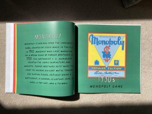
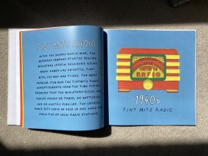
This are my final book pages, with each page being completed in cmyk, 300 dpi and 7016 x 7016 pixels. I ultimately decided not to include the dots in the final book pages, due to the fact that I could not do a print test with the book manufacturer/company as they were based in the UK, and was unsure if it would appear muddy and blurrier like it did when I printed from the university or at home. I had previously used this company, and with expedited shipping it was estimated to arrive within a week, so I wanted to make sure everything went smoothly. There are illustrations that I really loved during all the stages, and so it would be a shame for the final book to come out worse than every other stage. I had also considered adding a white border to every second page of text, but on the company website, they only had only one width of border, and it would have been too large for proportional illustration to text balance.
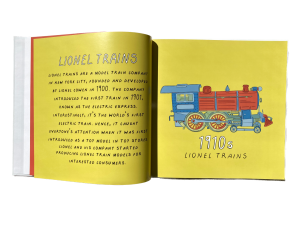
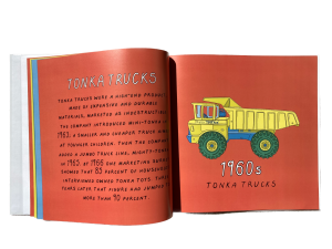
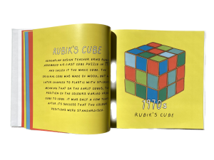
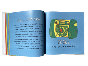
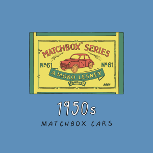
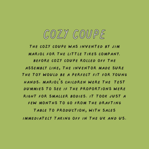
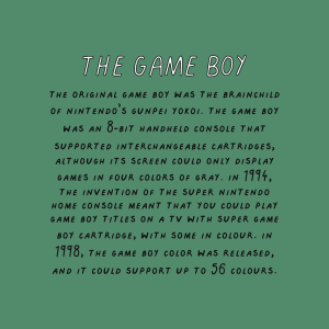
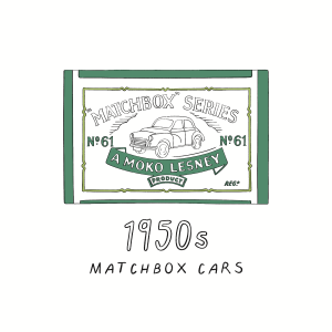
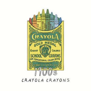
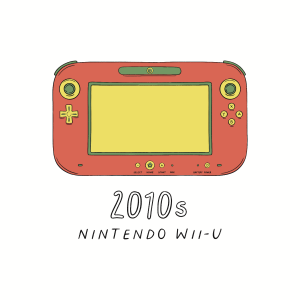
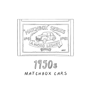
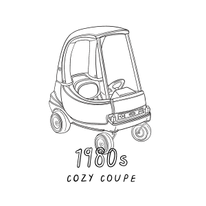
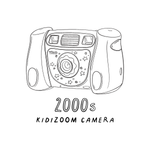
Beside each illustration, I will be placing a page of text on the right side as that will allow the readers to learn a little bit about the history of each toy. It also allowed me to learn more, and explore text-accompanying illustration and have the book be a little bit more padded out. I used the same background colours that each of the toy illustrations had in order to create that cohesive link and mental association. I used my handwriting font to create both the title and body of text, deciding to keep the title white in the same way that the decade was white on the page with the illustration.
This was my final a1 poster design that will accompany my book, as well as my front and contents page. I’m really happy most of my book, and I look forward to seeing how it will look in print.
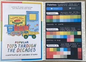
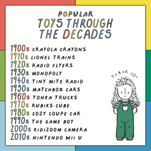
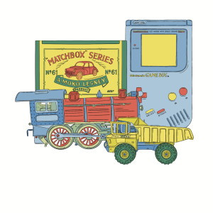
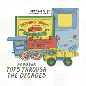
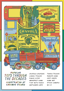
For the foundation degree show exhibition, as well as our final examination, both graphic design and illustration had to use a new or previous design to create an A1 poster. I had initially thought that I wanted to print out a poster that featured all 12 of my final illustrations, or one of the two versions that featured six of them. This was discouraged as using a large size for small designs wouldn’t be a very strong choice. This was understandable, so I began rethinking how I could incorporate a few of my illustrations into the poster in a new way. I had also considered doing my ABCD flashcards poster design, however I felt this was not quite right for explaining what my theme was in one design. I went back to the drawing board (the iPad), and started to create a digital collage of a select few illustrations. I started with my 1950s matchbox, and layered the 1910s train over the top. As it wasn’t quite balanced, both in colour and scale, I then added the 1990s game boy and 1960s tonka truck. I was really happy with the balance of colours, as I liked the proportion of yellow, the way that the blue was on both sides and that green was a nice accent colour. I used my handwriting font to create thee title, using the outline tool and then filled it in with my colour palette. I wanted to add a little slogan to the top of the page as it looked bare, and made it into more of a proportional poster as I wanted. I also used an earlier grid that I created to make the six colour border, which allowed a sneak peak into the background colours of my book. I created two more versions as a test, one without the colour border, and one with black where the colour was, with white lines. I really liked how the black and white looked, especially the wheels of the lionel train and tonka truck. I stuck with my original design as my book was full colour, and it made the poster more relevant to my project.
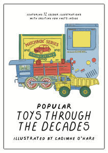
I was really happy with my poster design, and moved on to my final book cover. I wanted to use the little illustrative collage that I used for the poster as I was really happy with how it looked, as well as the fact that it would create a cohesive look. I initially wrote the ‘illustrated by’ at the very top of the illustration, but after taking a break from it and looking again, I realised it wasn’t balanced. I moved it to beside the title text of ‘popular toys through the decades’ , and it was immediately more even and easier to read I saved images of my development stages, such as testing whether the grid could be used for the full background, however it was far too unclear as you could not see the text or collage. My cover design really echoed the poster, and I was really happy with it. I also created a small, linking contents page where I added one of my characters in as a link to my earlier projects.
ADDITIONAL NOTE 09/05/23 – I wanted to include an a3 poster beside my large a1 design, however I had a lot of difficulty in choosing a current illustration that I liked. I didn’t want to enlarge on of my illustrations from my book as I didn’t want to highlight one particular toy over the other. I considered using one of my recipe designs or flashcards, however although I was happy with them as development leading up to final project, I knew I also wanted it to be toy linked. I started creating another poster, but this time my goal was less of a promotional poster (as in my a1 poster I wanted to only feature a select few, like a trailer for a book that didn’t spoil all the illustrations). I thought about my interest in the Where’s Wally books by Martin Handford, and the category of ‘search and find’ illustration. I decided on creating another collage which was entirely experimental, copying and pasting each drawing in one-by-one and trying to imagine where the next one could go. I was actually really happy with this final product, and I think it would have worked well for my a1 poster too. I have attached a video below of my video of me piecing together the illustrations, however I’m not sure why the quality is so low. I thought that this would be a fun concept for a kid to search and find each of the corresponding illustrations from the text, and then read through the book to learn more about each one.
I have really enjoyed exploring interactive illustration in this module, it has been such an interesting way for me to work that pushes my creative boundaries in a way that is new to me, and while difficult at times to figure parts out, has even incredibly rewarding to have a finished piece that I’m happy with. Although I chose not to explore an interactive final project/piece due to the expense of producing it and difficulty in finding a local company, I decided to make a few more small pieces instead.
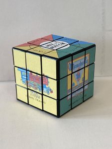
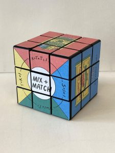
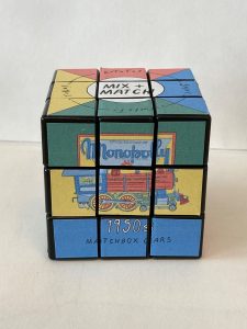
MIX AND MATCH CUBE
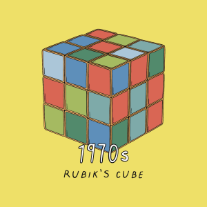
I had a vague memory of a large mix and match cube style that was on display on Ikea when I was a kid, and how much fun it was to spin and create different combinations. I wanted to explore my own version of this, using an old Rubik’s cube that I had that no longer had any stickers on it. I also thought that this would be a good association with my childhood, a more objective toy that others could still interact with and could also combine the drawings that I had done for my final piece book. I was unhappy with my final drawing of my Rubik’s cube in my book, so making a Rubik’s cube myself was also for a way for me to ‘redeem’ that version.
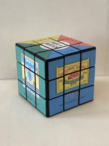
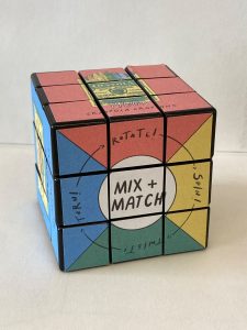
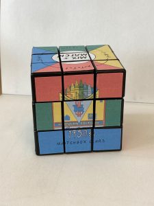
Like a traditional Rubik’s cube, I did want this to be easier to visually solve by having large areas of coloured background space that made it clearer what colour the solved cube would be, rather than a zoomed in crayola pack or monopoly box with lots of different colours. As my final pages were square, it was pretty easy to plan this, as I didn’t have to rescale or edit any of this, only cropping it slightly. I had some little a5 postage sticker sheets, that I thought would make it easier to adhere to the plastic sides, rather than double sided tape or glue. I set up an a5 Microsoft Word document and printed each square. I then split that square into nine different individual squares, and stuck them on. I got better at cutting them out evenly by the end, however I was happy with how it looked. I also had to create a small mix and match ‘title’ square for the top and the bottom of the cube, which could be twisted in addition to the other four sides if necessary. I have included eight photographs of the solved version of the cube, with six of the possible combinations that you could twist the cube to make.
The top mix and match title of the cube, featuring the theoretical catchphrase of ‘twist! turn! rotate! spin’ which I digitally hand wrote in toggle case, and ‘mix and match’ in my capitalised handwriting-turned-font for consistency.
The bottom of the cube, which I had to swap the yellow and blue sides as when it’s upside down, the colours are on different sides.
3, 4, 5 and 6. The four sides of the mix and match cube, I wanted to use the primary colours and green for the childish effect as well as being similar to the original Rubik’s cube. (more detail on the individual drawings on my other blog posts)
I turned these drawings into little flashcards by printing them on thick photo paper and adding a thick cardboard base to them, which allowed them to turn into robust, child friendly educational tools.
MINI ALPHABET ACCORDION
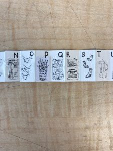
I actually made this piece a few weeks ago, but had accidentally lost it inside one of my mini cereal boxes as I put it there as to not lose it, and thus forgot about it. I had begun exploring sequential collection illustration, such as alphabet or number flashcards, but was a little daunted by such a task, and wanted to make a smaller version. I went for a much smaller version, deciding on creating a tiny accordion book. Each page was a different letter of the alphabet, with the total book being approximately the 1 centimetre/ the size of a penny. I used a 0.03mm pen to do each drawing, and was going strong until plant, which I had to redo, but the rest worked out well. I was really happy with both the little illustrations and the scale, as it emphasised my childhood theme due to the miniature nature.
the illustrations are as follows – Armchair, Backpack, Candlestick, Dice, Envelopes, Fish, Globe, Headphones, Ink, Jumpers, Kite, Lamp, Markers, Newspaper, Origami, Plant, Quilt, Radios, Socks, Teapot, Umbrella, Vase, Watercolours, Xylophone, Yo-yo, Zip
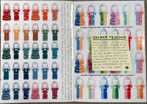
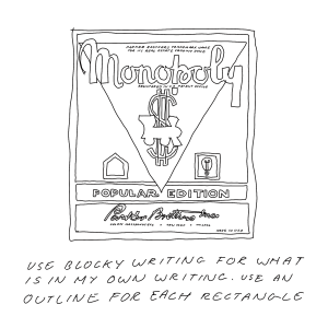
When it came to adding colour, it was quite easy to tell where I wanted everything to go as I had made the notes along the way that told me clearly about where I wanted certain colours to go, as well as what colours were commonly replaced. I knew that I didn’t want to use any black or white in the inside of the illustration, only for the text and the line work, and that whatever colour was in the background, could not be in the toy. I had to break this rule for my crayons, as the colourful nature of them meant that I wanted the crayon set to almost be a colour introduction to what I would be using in the book that followed, however I tried to make the red crayon as small as possible because of this. I still used my original colour palette but created a few more in-between colours as the detail on some of the lines meant that it was more difficult to draw the line between some colour accuracy to the original real life toy, and my interpretive illustration version.
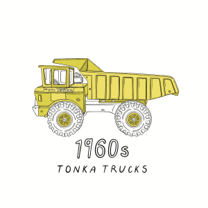
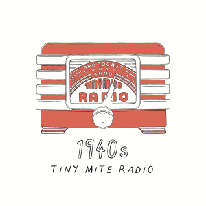
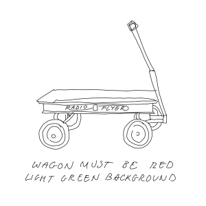
This was a selection (narrowed down from about 50 images, nobody wants to scroll through 50 images), of some of the layers with one colour (or in the case of the game boy and train, shades of one colour). I surprisingly liked how a lot of these looked, especially the yellow and red ones, however in some of my illustrations as I only had six layers to work with due to making sure my canvas size was maximised most efficiently for printing and reducing pixelisation. this meant that I would do all of the colours of the same shade on the same layer, e.g how in the radio flyer wagon, there were multiple tones of red, and in the tonka truck there were multiple tones of yellow.
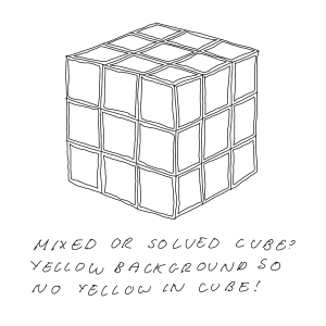
These are the toy illustrations with colour, and I will be posting the versions with the background in my following post, due to the fact that the final illustration will accompany a body of text beside it with the same colour background as the toy version. I also do like how these illustrations look on a white/ blank background, however I am still not completely happy with the Rubik’s cube due to not being able to use yellow as that was the designated background colour, however seeing it beside all of the other illustrations, you can see a consistent palette that while limited, doesn’t look too repetitive (I hope).
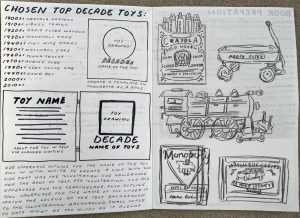
I now knew what toys I wanted to include for my final piece book, which meant that I was ready to move on to the sketching stage. As I had twelve toys that I wanted to get done in approximately ten days, my goal was to quickly draw out each toy to make sure that these were what I definitely wanted to do. I used a black colouring pencil, giving myself a time limit of max. 5 mins and no rubber to complete each drawing, resulting in some drawings being less thought through proportionally. I was really happy with some of my toys such as the train, matchbox car and tonic truck, as they were fun to draw due to the mechanisms and less boxy nature. I then moved on to the iPad, and used a thin brush to repeat this process, however I focused more on proportions this time. I had a bit more difficulty with this, so for some of these designs, in order to speed up the process, I used the image as a background in procreate to make sure everything was spaced out correctly. This meant that when it came to doing the final line art and colour, it was historically accurate and didn’t look lopsided. I also quickly wrote beside or below each toy some quick mental reminders based on the ideas that came to me when drawing, focussing on getting the idea down rather than the neatness of the handwriting (evident by some of the more illegible sentences that made sense at the time, and less so two days later).
With these drawings done, and the proportions mapped out correctly (if roughly), I was ready to do the final line art. I had originally planned to do these with a pressure controlled digital pen, however I found it difficult to do that quickly, and with digital art comes a lot of wrist pain, and pressure control would have exacerbated that. I was worried if I went down that route that I either wouldn’t be able to get them done, or I would get them done and not be able to do the colour or lastly that I would get it all done but not in time for printing. I settled on a textured pen that imitated a sort of crayon-pencil line as it added a bit more texture than the rough sketching brush, but also was slightly pressure controlled due to the stabilisation. I spent quite a while on these as line art is my favourite part of illustration, although I am super lucky to be able to have access to an iPad rather than a drawing tablet, as it meant it was similar to drawing on paper rather than a drawing tablet where you can’t see it on the screen, only on a connecting monitor. My rough sketches were very useful as I was able to put them on a lowered opacity on a lower layer so that I could draw over the top. Some of them worked better than others, such as the symmetry tool coming in handy for the crayons, and the duplicating sides on the radio for even spacing. However there were some I really ended up disliking, such as the cozy coupe car and the simplicity of the Rubik’s cube. I decided to keep going and saved all of my line art in preparation for adding colour.
An explanation for how I turned my handwriting into a text font file. I had been creating my recipe illustration when I had realised that if I tried to digitally write a whole recipe, it would be uneven and inconsistent as freehand digital writing is harder for me to do than traditional writing. I considered writing everything out on a traditional page, scanning and then writing digitally over the top, but kind of dreaded doing that. I began to look up how to turn your handwriting into a font as it would be quicker to type everything, as well as making it all line up straight and be the most readable as possible. I came across the calligraphr website and followed the guide there.
This was the website and guide I used, however rather than printing it out, I drew them digitally to reduce pixelisation and scanning time, as well as the fact I wanted to create a lowercase and uppercase font. the longest part was building the font, and making sure everything was roughly in line, however as a human naturally there were some letters higher to lower than others, but I like that it’s not completely perfect and has some quirkiness to it. I then installed it on to procreate so I could type directly into a cmyk canvas and get it to the right size.
I knew that in order to create the most consistent book, I had to create a template for both the text and illustration page, which meant finding one that would work for any size of toy or text bodies that had different sentence lengths. I started with my drawing template, having approved with Ashling that my handwriting-turned-text was okay to use (as I was worried that maybe it would be unreadable and thus rendering the text completely useless). I wanted to use a circle in the background for my space, as it meant that tall thin toys, like the game boy had a top point for the maximum extension, and the long thin toys like the train, had a maximum width. I also used the lowercase version of my font for the description for my toy as it was a little bit more loose and randomised, which leant itself well to my project. For my text, it was a little bit more randomised, and I chose to use an approximate five lines of text. I did standardise the title and body of text size, writing the PT number as I have a tendency to forget incase I accidentally rasterised the text. Strangely, I really really loved the look of the text template (image 3), and I considered re-evaluating my whole final piece into a black and white again, but I got back on track.
Note: I know these pictures are small, they are uploaded to show my attempt at a rough consistency in length and how I used the template to guide that. I was very glad at this stage that I had converted my handwriting to a font as it saved so much time, however, I forgot to add punctuation to my template so every comma, apostrophe, full stop etc. had to be added in manually with a digital pen, and so it took longer than I would have liked to type it all up. I tried to keep everything in the past tense, and have written in my sketchbook my source for each of the pages, of where I got the information from.
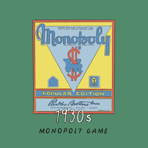
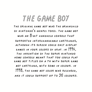
I wrote down in my sketchbook where I was getting the information on each toy from, as I was not including the links or a bibliography in my final book, I wanted there to be credit somewhere. For some of the toys, I was able to go on to the company manufacturer website, however others involved specialist pages or articles. I then chose select lines and combined them to make the text relevant to the year I was drawing from, with a combination of biographical about the company or historical about the time period’s attitude to certain toy manufacturing processes in a summarised way.