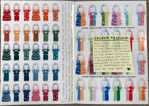
I have been inspired by the illustrations in vintage children’s books that used chromolithography printing to achieve cheap colour prints. They are typically of a limited colour palette due to the expense of producing ink and colours, however chromolithography used stone plate with acid etching that at the time allowed for illustrations to be broken down by hue, to create full colour prints that were cheaper and less time consuming than previous hand-coloured methods. I wanted to use these six colours as two greens, two blues and one red and yellow seemed the most common colour palettes that I had seen in old children’s literature. I included the hex code as I plan to do most of my illustrations digitally due to the colour accuracy.


Final Colour Palette inspired by these vintage educational children’s postcards and Jessie Rathbone’s ‘Look and Learn Pictures’, however I wanted to increase the saturation and brightness of the yellow and green, making my blues lighter for a more cheerful palette and a more complimentary lighter red to those editions. I also wanted to have two greens and two blues as I wanted a childish, vintage inspired scheme.


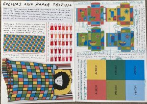
I wanted to test how well these colours worked together with a simplistic quilt illustration as it allowed for a way of using all of the colours in one subject. I used the face that I had begun designing for a character, as I thought it would be a nice symbol of my theme of childhood, with a child tucked into bed with messy hair.