I personally enjoy doing illustration projects that have an interactive element, even if the actual drawing is flat, or making parts of a drawing more 3D than others by using widths of card underneath. I wanted to experiment with the flat illustrations that I had developed, and turn them into two thing that could potentially become an interactive toy or learning tool for a child.
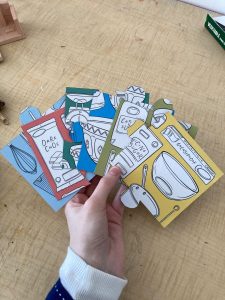
I created this jigsaw set, using an experimental design that I had done for development purposes during the final colour stage of my original drawing. I wanted this to function as a simplistic jigsaw that would be able to be completed by a child without needing to match patterns or be overly complicated. I created the design by overlaying my line art with a page I had created that showed my colour palette, and used a white solid fill for the recipe items, as I thought it was a good balance of simplistic and engaging, as well as allowing a child to be able to potentially colour in their own version of what they wanted the utensils and other items to look like.


I printed this out using a4 paper and traced around it on a cereal box, which was ultimately smaller than the a4 page, meaning I had to create half my illustration at a time. The cutting was accurate enough for a prototype model for my jigsaw, although if I decide to continue developing this idea for my final piece, I would use thicker cardboard and a laser cutter or get it professionally printed by a custom jigsaw company. I was overall very happy with how it worked, and I enjoyed seeing how this could also be developed further with different designs.


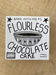
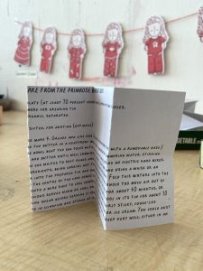
I also included a little recipe card inside, which I made by scanning my handwriting into a .TTIF file, and using my handwriting as a font that I could type with, however if I was to do another handwriting font, I would include punctuation as I had to manually add it later as I had forgotten to add that. I included a lowercase and uppercase version, with the uppercase being cleaner and more even, and better for consistency, and the lowercase a little bit more childish and loose. I also followed a template on how to make a box, and made a quick mockup of packaging in which to store the jigsaw. I ended up liking how it looked, however as I don’t plan on going down the packaging route in illustration, it was good to learn about some of the ways that a product could be developed.


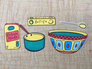
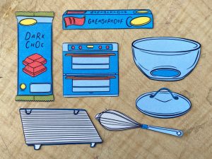
I also made a secondary version with my illustration flat lay, this time with the final flat illustration of my recipe poster. I had extra paper from my print test, and rather than having repetitive posters stuck in, I used the weight of the photo paper to be able to use each element as a little interactive paper toy. It was designed as a little ‘bake with me’ tool, where an adult could follow the recipe, and the child would be able to tell what goes next by laying out the ingredients and equipment that was necessary for each step. This would be helpful if they were not at reading age or found it more helpful to understand instructions through pictures or needed visual aids that they could engage with. I also photographed each element by colour as I wanted to see how they looked without the other colours beside them, and found interesting patterns such as red being primarily supported by yellow, and how light green was pared most often with dark green.