This week’s focus was on colour.
homework

In Sleeping Beauty the colours are very cool and desaturated. This helps create the feeling of calm.
Whereas in Hercules the warm reds and yellows show that these characters aren’t human but gods.
Then in Ponyo the reds contrasting the blue creates a sense of excitement.
I took my previous ‘cats on the moon’ thumbnail as that was my favourite one and recreated it using a triadic colour scheme and a monochrome. I really like the monochrome one as the purple creates a mystical atmosphere the triadic colour scheme just doesn’t read very well and the cat gets lost in the background.


I read this article before I started the second task to really help me consider what colours I chose.
https://londonimageinstitute.com/how-to-empower-yourself-with-color-psychology/
The second task was to colour in an image considering the palette to create a mood. I thought of serene so I chose quite desaturated earthy tones to try to make it as close to life as possible. I don’t think I managed to achieve this but it is a positive atmosphere so I got close.
in class
We were told to come up with some colour palettes that may fit into our worlds environment/the characters
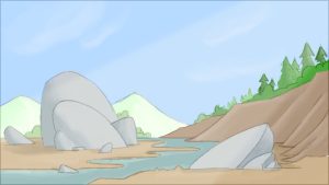
We decided to go with a warm orange tone environment as that suits the desert/cavernous place. we also thought using blue as an accent colour will be good as it adds more visual interest and it is complementary to orange.
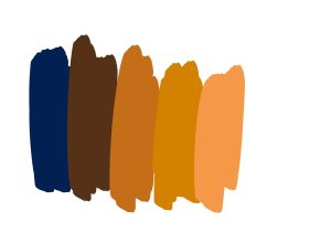
Then we wanted to play about with an analogous palette and this is what I thought may work.
While this is nice and is whimsical/magical my group want to do a more realistic scene
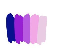
Then we thought about a colour scheme for the dragon and something that signifies danger to the audience.

While this is an interesting colour combo we went against it as the dragon would not look like it belongs in its environment so we decided to colour it the same as the background just maybe changing the saturation so it doesn’t completely blend in. The colours while being monochrome just don’t look appealing together.
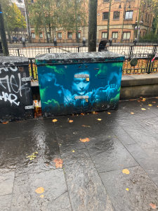
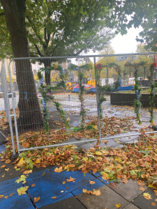
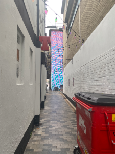
We were told to go around the city centre taking pictures of any interesting colours we could use as a colour scheme.

We continued to brainstorm and to come up with ideas. For the protagonist we were thinking of the character being a young boy so I took elements of the design I made last week and made It look more childlike.

I feel like this character looks too young for an action sequence so next time I need to design a slightly older pre-teen.
I moved onto thinking about the dragon once again.
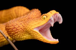
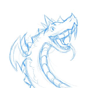 This design was inspired by the pictures shown below.


 I then moved on to more loose sketches playing about with proportions and shape.


I feel like all of these designs could turn into something interesting with some refinement but they feel too snake-like rather than a dragon. For the scene we didn’t want a traditional European dragon but the Chinese style dragon would not be animation friendly as they are incredibly detailed.
I thought maybe if I focused on the baby dragon and got its design down then I could use that to inform the design of the adult dragon.


I think the shaping of geckos would be really good to use for the baby and that could translate into a larger monstrous dragon.
