As I finalise my idea for the travel app, I thought it did be a good idea to research/revisit some illustrators/illustration styles in order to decide what kind of graphic I want for my own app.
I say revisit because as a huge lover of illustration I have collected many art books over the years, I will revisit a few of them in this blog.
Another thing that I need to mention is that I already have a loose idea in my mind of what kind of “feel” I want my travel app to have. Since my app is associated with quests, I think it can go in one of 2 directions;
1. clean, more mature goal hitting app. Such as the one below, it is a bit more serious;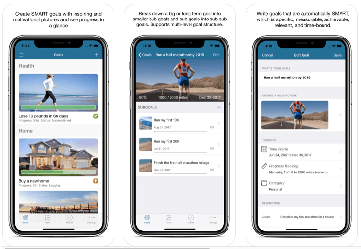
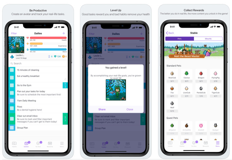
2. A more “childish” and “fun” approach, rather reminiscent of video game quests. But the overall app will still be clean and cohesive, but with a hint of childhood nostalgia. I really like this idea because as children we have all gone on “quests” to the nearest shop with our friends or played quests based games where a goal had to be archived. The example I found below just happens to be the game style, but I’m sure that there are other ways to make the app more “child nostalgia”;
Currently, I leaning towards option 2, I think the idea is a bit more unique. However, since the most important thing about the travel app is that it is easy to use, overall usability is an important factor. Adding too many quirky elements may hinder usability. Another thing is that I want the app to be for the general public, too much video game style or childish style might not suit everyone’s taste. In the end, maybe I’ll have a mesh of options 1 and 2. I’m definitely keeping my options open till I do more research on illustration styles, but since I have an idea of what kind of illustrations might suit my app, I’ll mainly look at variations of these styles.
Online research
The first thing I looked at is of course one of my favourite visual game of all time – Monument valley;
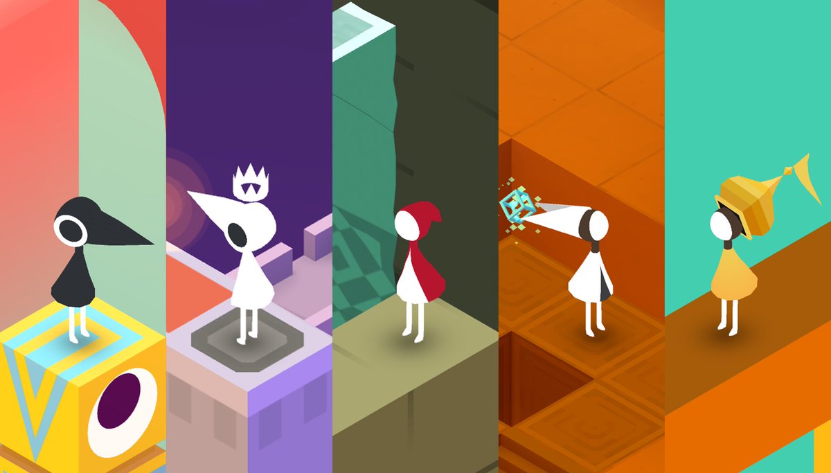
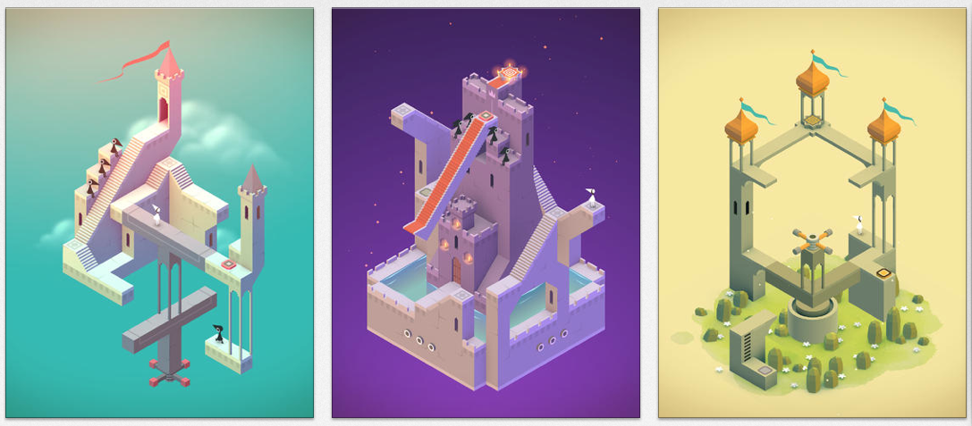

It has been a while since this game has been released, but I have never gotten over just beautiful it is, no other game has had this much visual impact on me since. I can’t even pinpoint why exactly I love the style so much, it is possibly a combination of reasons;
- the geometric shapes are so very satisfying
- the gradient background with the right amount of negative space
- soft colours
- I also love things that seem very simple to begin with structurally ( the simple geometric shapes and lines), but when you look into them you can see a number of amazing details such as the plants, flowing flags and shading etc
I think this style will be very difficult for me to replicate for my travel app, as I would need to learn how to draw the 3D style in illustrator and the learning process will be too time-consuming for the schedule that I have got. However, I have decided to look at this style first because it really matches what I want the “feel” of the travel app illustration to be. This style has got a hint of childishness to it, but it is also very fitting for adults too. What I can learn from this is that although I want to have more childish graphics, I need to keep the overall style clean, gave an appropriate amount of negative space and not overcrowd the graphic.
Another rather simple art style that I’m really fond of is made by the game developers of Toca Boca. One game’s graphics really stood out to me, and I just had to redownload the game and take screenshots of it;
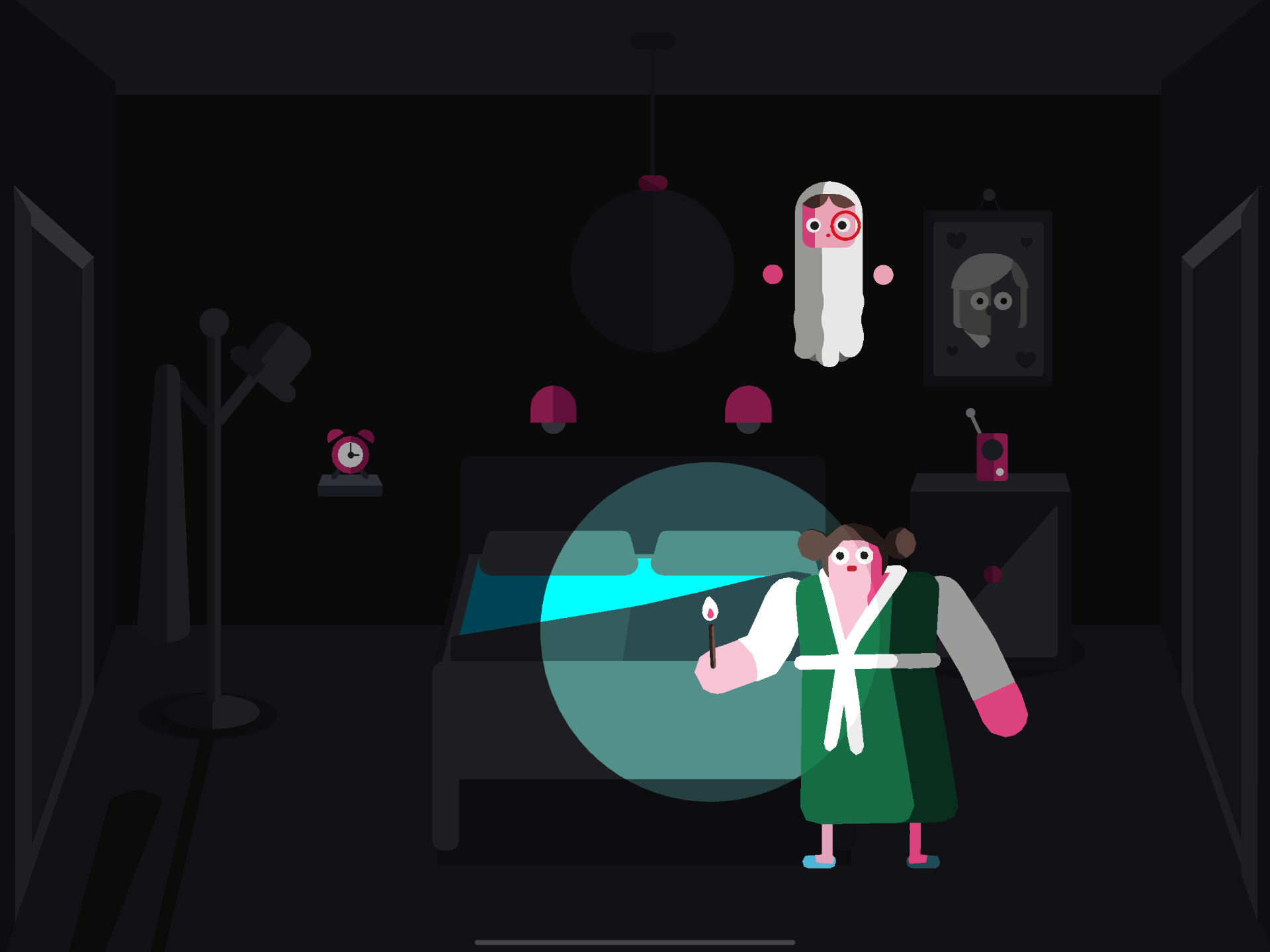
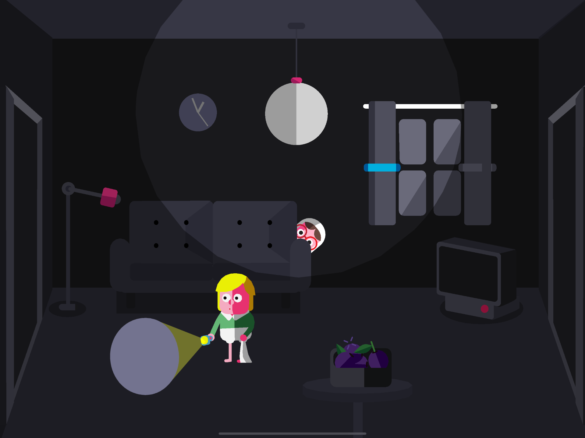

I have played this game since I was in primary school, but somehow I still remember just how lovely this game is. And not just for its graphics, this game was amazingly interactive.
Most of the illustrations feature simple shapes that build up to more complicated objects. This really reminds me of my master apprentice icon excises. Even though the “people” in the game are also made of simple shapes they are so very expressive. Agin, I am featuring this game in my research as I feel like this is a step in the right direction on what I might want my travel app graphics to feel like. The graphics are made for children, but without the context that this is a children’s game, I can easily see the people and objects being placed in a more mature travel app due to how clean everything looks.
Although the style of this graphic may lean towards being too simple for what I want in my app, I can definitely appreciate its building of shapes and simple colour scheme. Having one main colour makes the whole game very memorable and unique, but the game doesn’t forget to highlight important things/people with contrasting colours. ( seeing that the main character is white and the background is black/dark)
Another art style that I want to explore is actually made by a science youtube channel – kurzgesagt;

I have been following this channel for a while on youtube and looking at its content this art style is made to be educational and targeted towards teens and adults. This is a more colourful, more detailed version of the Toca Boca game graphic, but the style and the principle of simple shape building remain very much the same. This is what I mean by, that if the Toca Boca game graphic is taken out of its children’s game context, I can see more mature audiences appreciating the style on an app too.
I’m definitely a fan of this more detailed, colourful style, but like the Toca Boca game may be having 1 or 2 main colours in my graphic is better suited for an app? Since kurzgesagt is made for moving media, this much colour on an app may cause eye fatigue.
research from my book collection
Now I just want to quickly view the art styles that I think may suit my app from my collection of illustration books, they are mainly hand-drawn instead digital art. A weird thing I noticed is that when it comes to digital art, I find it with saving on to my iPad/phone etc and look at it on a digital device. However, when it comes to hand-drawn illustrations I always like a physical copy of the book with me.
The first artist I want to look at is Beatrice Blue. The following photos are taken from her book called wonder;
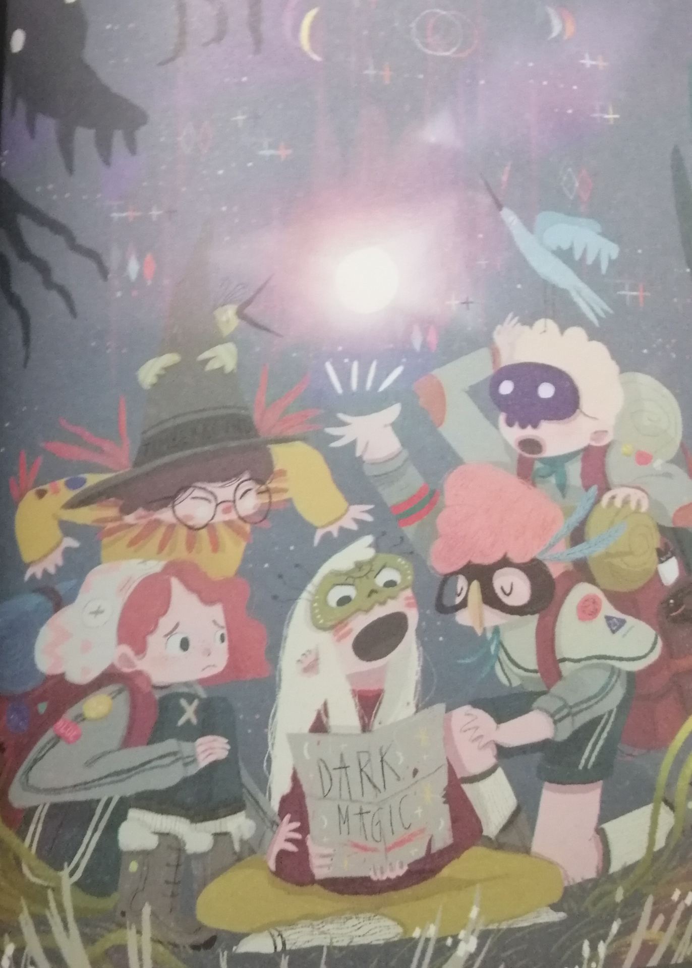
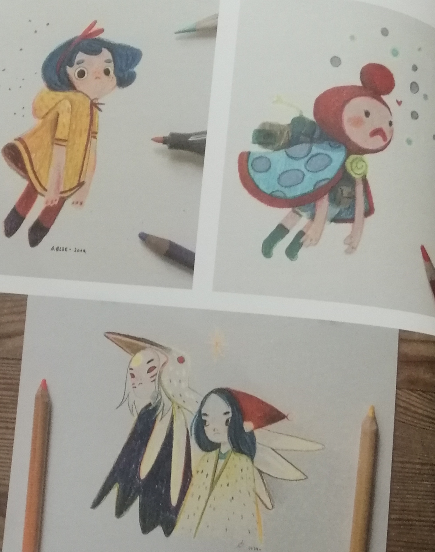


Really love her art style, even though her main focus is on children’s books, I often come back to her book to look for inspiration. There is a cosy feeling associated with her work, and also a hint of adventure and mysticism, possibly due to the more muted colour scheme ( more muted version of bright colours) Above anything else, I do love the way she draws big eyes, it is so simple yet so expressive; and also how the dresses/capes have a floatiness to them, nothing too dramatic, but captures the moment well.
One thing that really resonates with me while reading her book is how much she struggled when she first started to learn digital illustration. I’m thinking about using digital illustration for my app for a more clean look, and also vector art is going to be much easier to manipulate. However, I have never hand-drawn a full and complicated illustration digitally before, all my more illustrative artwork so far has been done with pen and paper. It is a little daunting and I’m a little put off by it, but Beactice stated the importance of taking the first step and allowing yourself to be a little uncomfortable in the beginning.
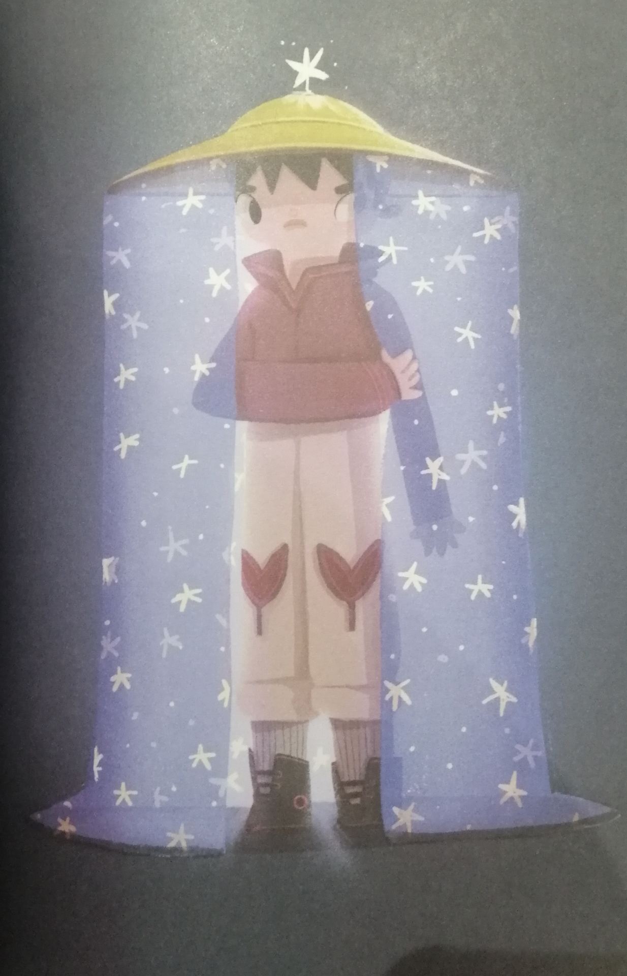
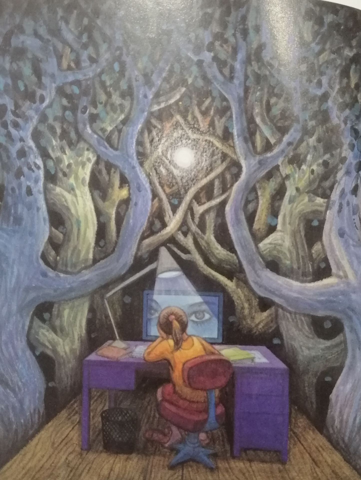
The next artist is called koyamori, and I love how serene her artworks are, The following photos are taken from her book called grow;
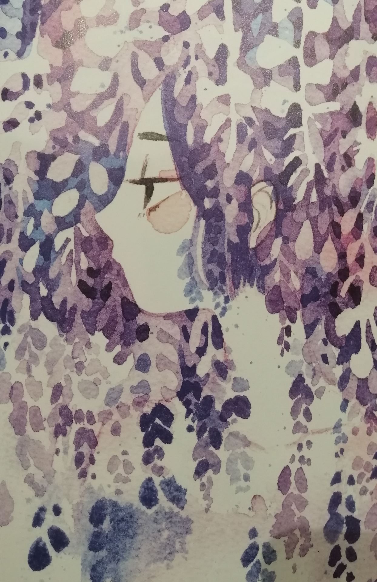


Koyamori’s artwork is a great example of one of the very popular styles of Illustration in east Asia. I can’t exactly pinpoint what the style is, but it’s usually done in a watercolour medium, the characters are very “cute” and I can defiantly see an influence of manga art style infused into the characters.
Perhaps her art style is a bit too serene for what I want in my travel app( if I was doing a nature hiking travel app this would be perfect), but her art style is so unique I feel like I need to revisit her work and maybe take some inspirations form her. Looking at her work, I am again reminded of the importance of keeping my colour palette as simple as possible, and also negative space is very much needed to give the eyes a break.
The following artwork is by a Chinese artist Jimmy Liao;
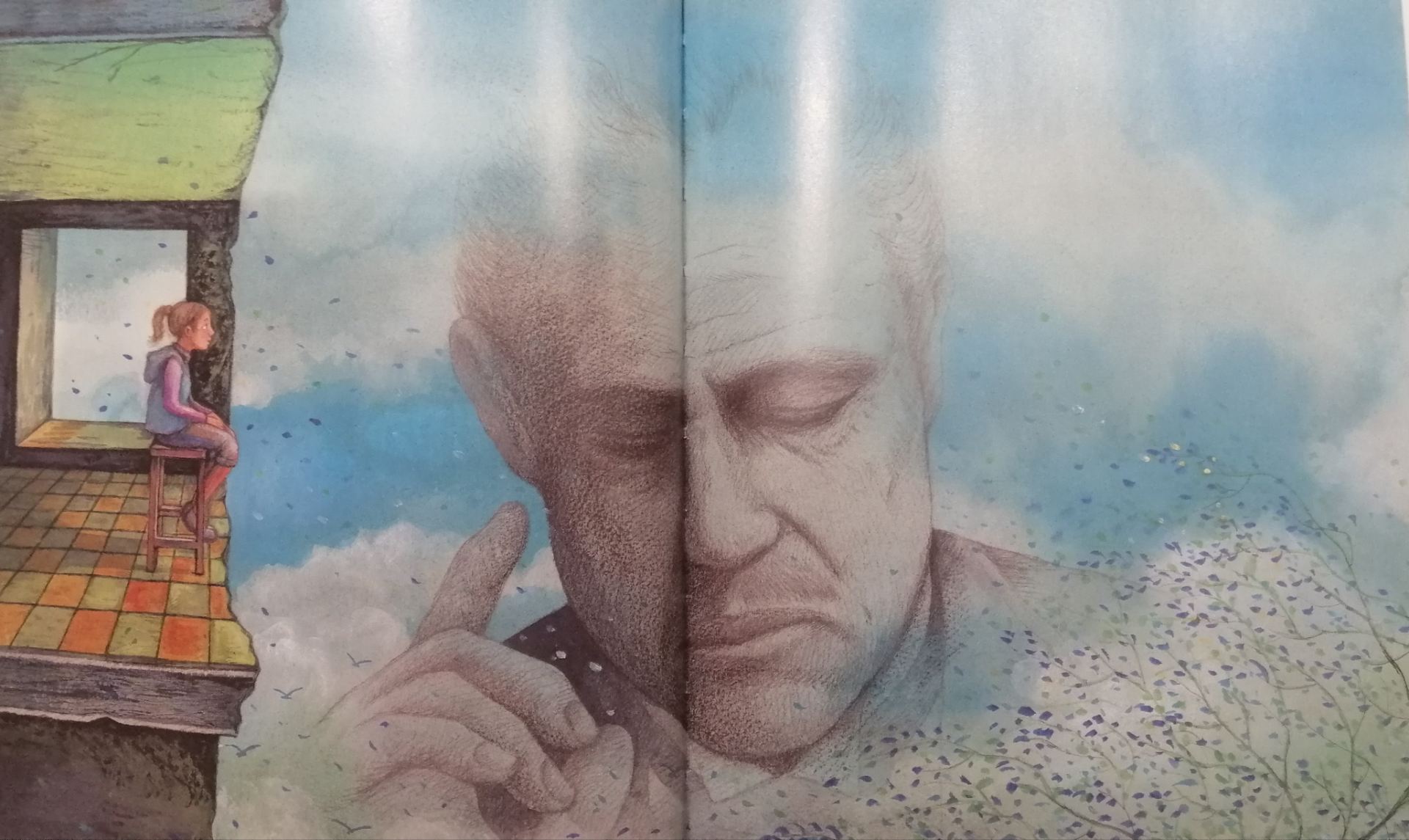
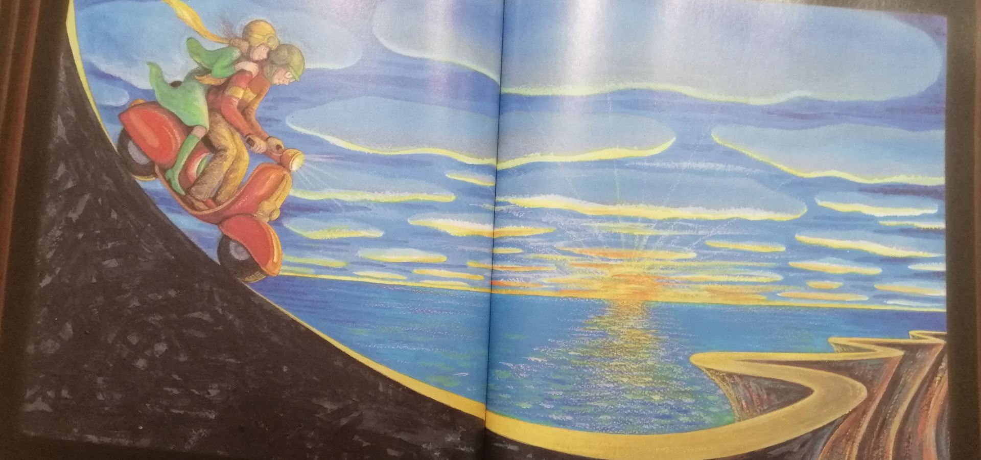
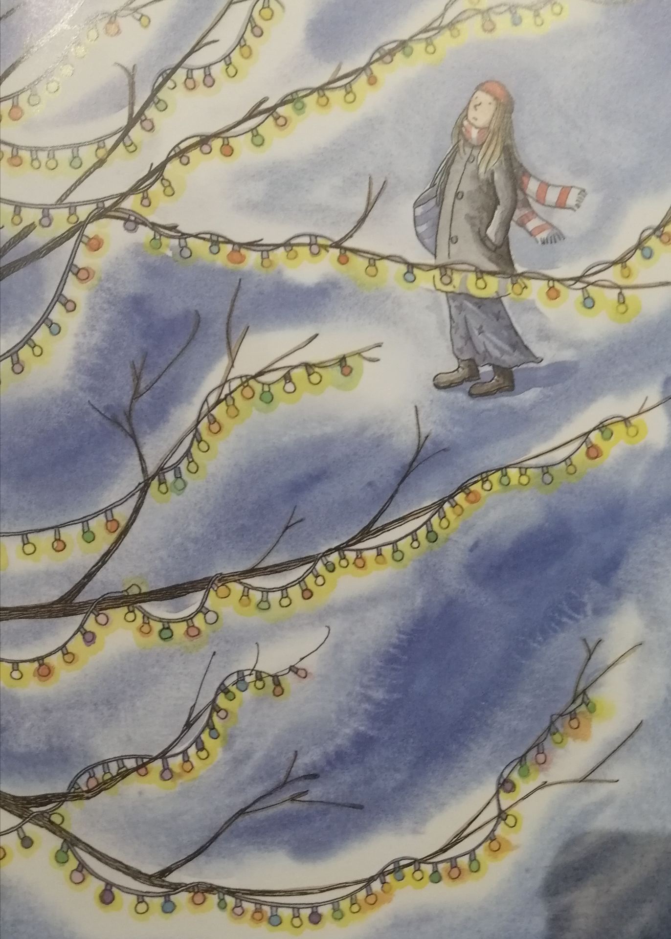
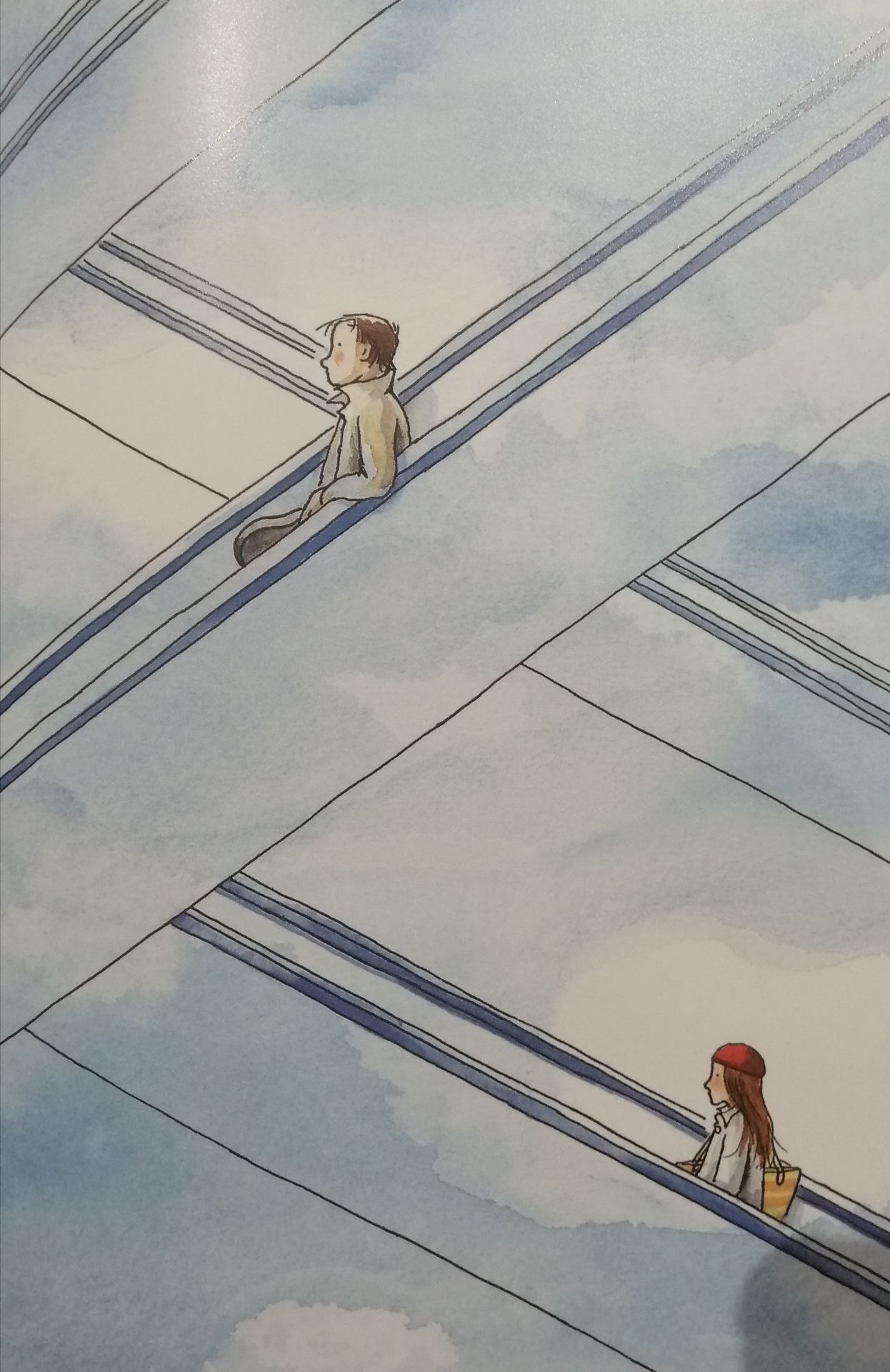
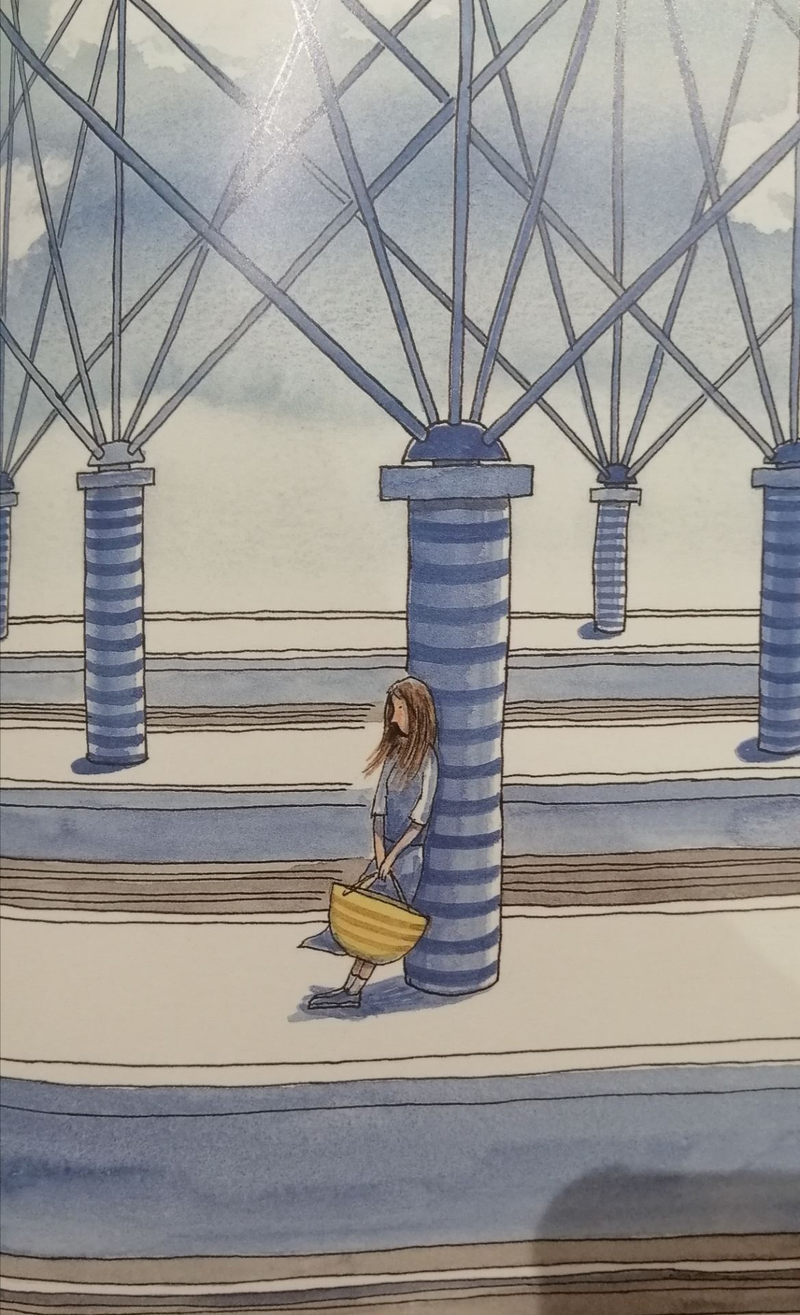
When it comes to Jimmy Liao, there is literally no style. I can’t do him justice with just my picture collection, because he has over 25 books published. And in almost every book he uses a different median/different style of drawing. As for comparison, the first 3 photo is from 1 book, the last 3 photos are from another book, and the style differs quite a bit. It is refreshing to see that in a world where almost every successful Instagram artists I see have a distinct style. Jimmy’s artwork comes with lines of poetry or quick stories, which I appreciated more and more as I got older and began to explore the intentions behind his work (i did not include the text with the art as they are in Chinese.)
I really like how his drawings are very lose, when he outlines them it is not intentionally “imperfect”, and it adds and sense of originality and authenticness to his art.
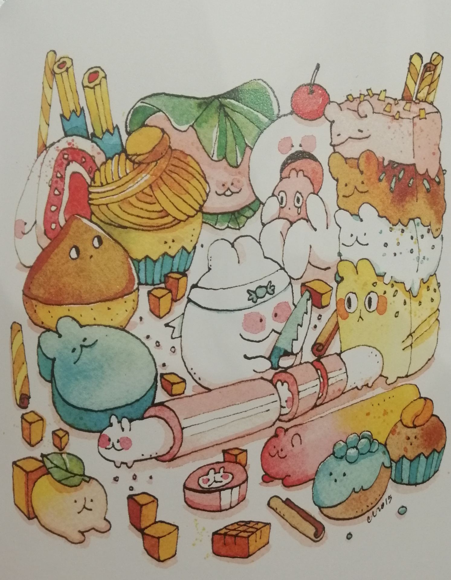
The last artist/designer I want to look at is Aaron James Draplin, one of the few digital designers I have in physical book copies;
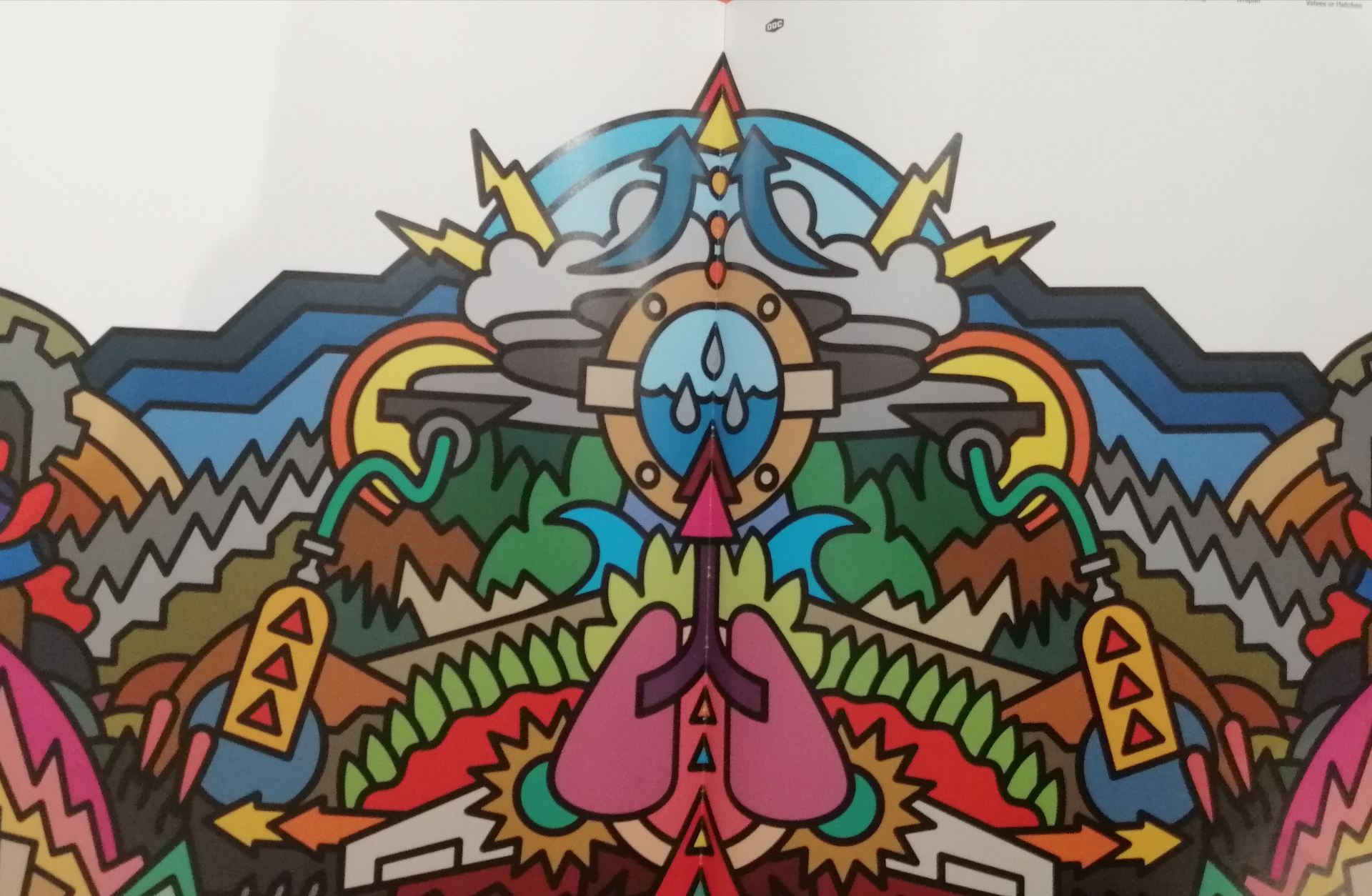
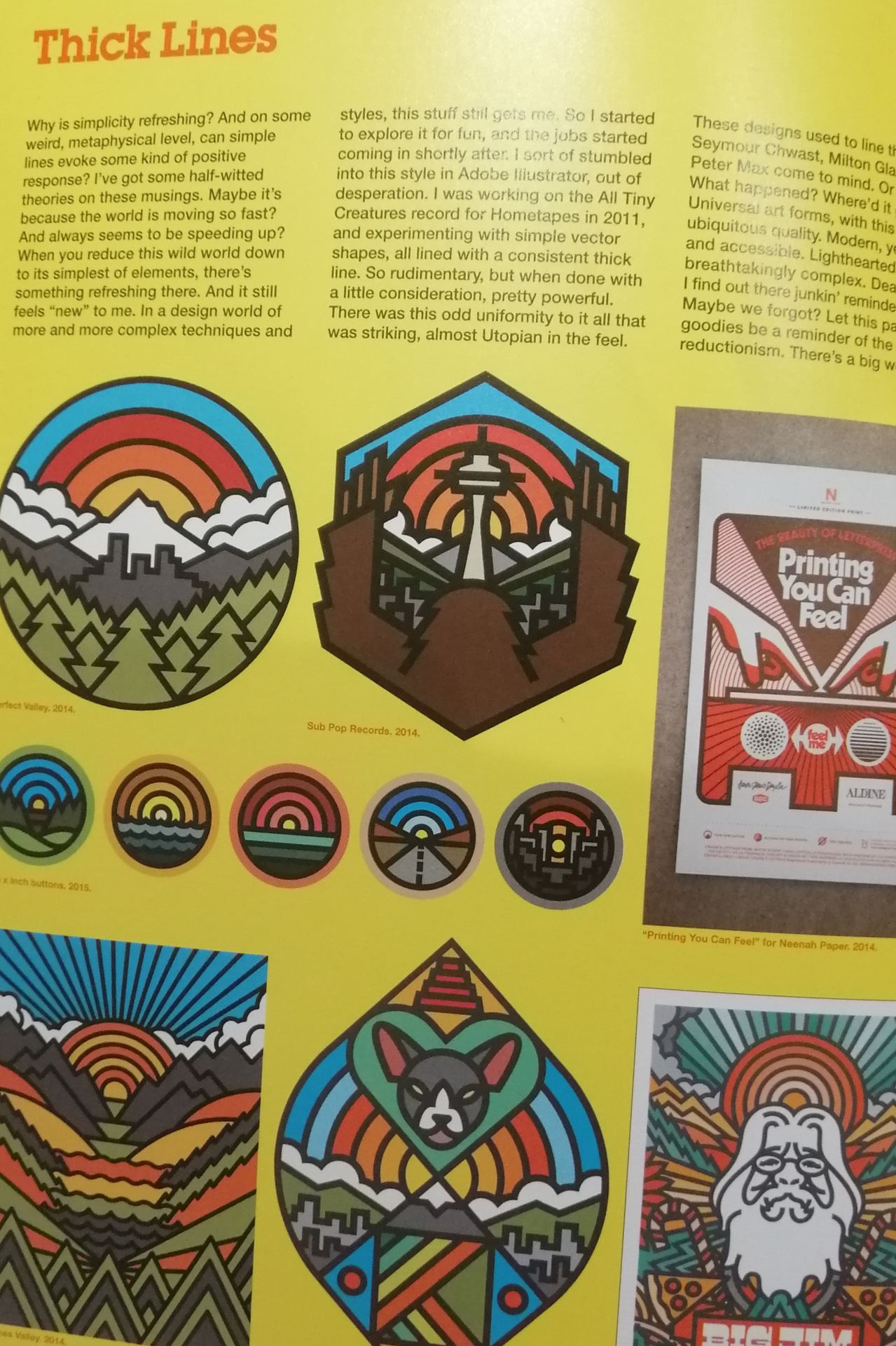
I decided to purchase Aaron’s book because not only has he a unique art style which I love ( bold lines and blood colour – the opposite of koyamori you could say), but also his book is so versatile; containing advice from logo designs, shirt designs to print.
For this specific blog, I just want to quickly highlight the “thick lines” in his artwork. Aaron has a whole section about the thick lines, and it’s so interesting to read. I agree with him in many ways, I like how the uniform bold lines make everything simple, clean yet complicated at the same time. It is eye-catching and can stand out in the room. The uniform lines are also satisfying and make all the colours pop. I’m definitely considering adding some thick lines to my own illustration for the travel app to make them stand out.
Conclusion
After my research, I’m more aware of what I want/don’t want in my own illustration for my travel app. However, having seen an amazing array of different artists and different styles, ranging from hand drawn to digital paintings, I’m a little overwhelmed.
I think first I’ll need time to make some mock up designs of the Ui screens, to know exactly what kind of illustration and how many illustrations I’ll need. Then I’ll be able to decide what kind of art style I’m aiming for.