This post is the official start of my research and ideas generation for IXD104 project 1 – Designing user interfaces for a travel app.
Just quickly I want to take a closer look at the project briefs out by my teacher Paul, It always helps me so much to understand what exactly is required of me in a project before I start the research.
After a rereading my briefs, I understand that my project should contain the following;
- an emphasis on illustration, icons, diagrams and charts
- a minimum of at least six screens, which should include: a home/app launch screen, destination/journey screen (whatever range of locations the app may include), at least three screens illustrating three destinations or one destination with two additional screens providing more information.
- An icon set for app navigation
- Illustrations/diagrams showing the places the travel app will take the user.
- Appropriate selection of typographic elements to support visual content
Having understood what I need to include in my project, the first thing that I’m going to do is idea generation. After all, there is no point in starting to prototype in Figma if I have no idea behind the concept of my travel app.
And for Idea generation, I feel like I first need to look at existing travel apps/app prototypes to get an idea of what I want for my travel app. One of the places where I found loads of inspiration and ideas is from looking at the project brief and the slides from week 1. In these places, my teacher gave us many examples of past students’ work, and they had some amazing designs;

This one is by Rachel Donaldson, the idea of a space travel app is so cool and I love the space background. The idea of space travel or exotic travel is definitely on the top of my list for my own space app. looking at the function of the app, it seems to be recommending different planets that you can travel to, and different Spaceships can you can use; it also gives information on specific planets. One of my favourite functions of this app is the badges you can earn. I feel that it has the availability to gain awards and looking back on these awards really keeps the user more emotionally invested.
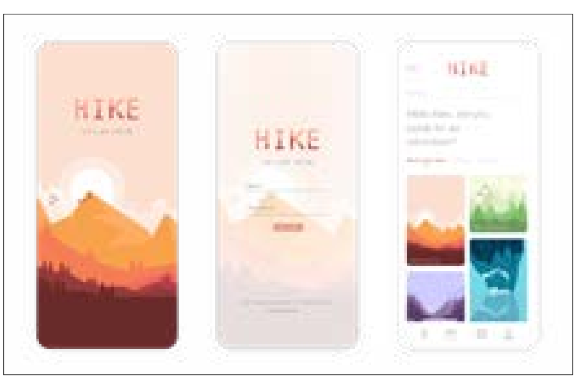
This is one by Rachel Donaldson, what attracts me the most about this app is how serene it is. Perfectly matches the nature/mountain/hiking theme of the app. It also reminds me of one of my all-time favourite IOS games – monument valley. I will keep the design of this app in mind if I ever decide to do a travel app that relates back to nature or hiking, I think I too would like to do something in a similar art style. Lastly, I really like the 3rd screen where it shows off all the main attractions in a simple and easy manner, I think that is a really important element of a travel app.
:format(png)/cdn.vox-cdn.com/uploads/chorus_image/image/30281207/monumentvalley_gdc_650.0.png)
(Monument valley game)

This one is by Garry Irwin. I like how “clean” this app is at the first glance, but as you look closer, you can see all the lovely details of the images. similar to the first two travel app that I have shown, the machines of this one is recommending good places that you can travel/skate in. I really like the map function on the 3rd screen, seeing a physical map in the background really helps.
Now I want to show 2 more apps with a different approach to perhaps the traditional travel app, these case studies are also provided by my teacher Paul;

This app is really interesting, by the looks of the app, it allows you to “metaphorically” travel to different interesting places in the app and allows you to explore the interesting story within the app. The colour scheme is really fitting, the dark colours and the eerie-looking moon would suggest that the story has a hint of horror to them.

Instead of a travel app, this is more like a weather app. I guess it’s still within the travel products as one of the things that I always look at when travelling is the weather, and it does show different places around the world. What I like about the app is the coherency of design ( White background on the lower half, the Sun being on the top right etc ). Another very nice detail I notice was on cloudy days, On-screen one, the sun and the background are whiter! It is a really nice touch and really differentiates itself from a lot of other apps with this very realistic detail. It makes the app so much more immersive.
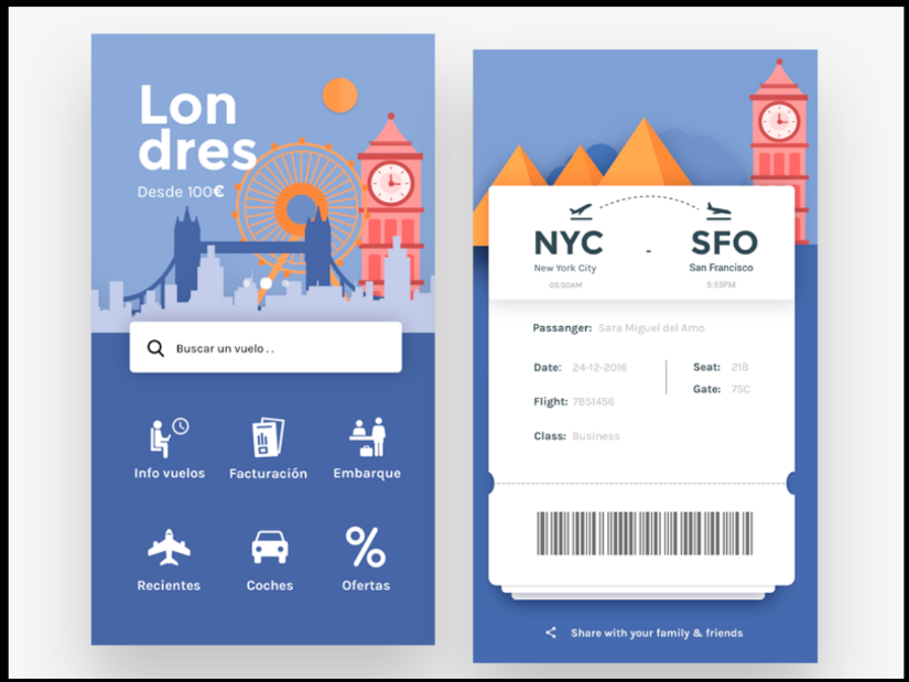
This one is also lovely, it seems to be more centred around travelling between airports, getting car hires and locating the information desk. The idea might be simple, but to have everything kept in one place is really practical, and I would imagine that the information about airports and lifts would be really useful if your travelling abroad and don’t speak a foreign language at the airport.
Now that I have looked at the case studies that my teacher has given us, I want to look at an actual on the market travelling app;
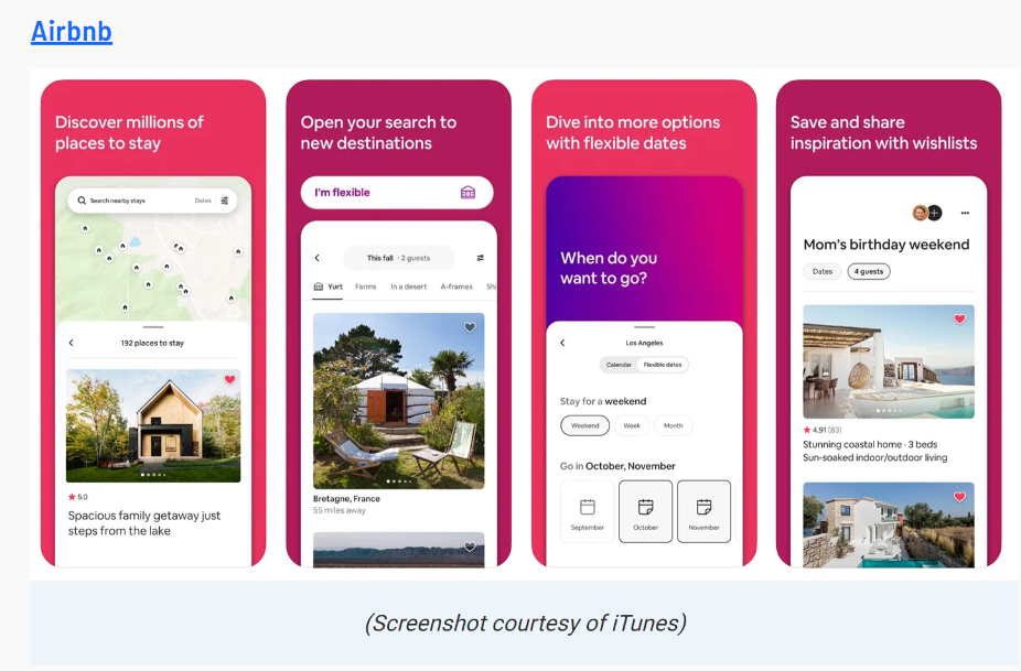
This app is for Airbnb. Even though at first glance I don’t see anything special, I think that’s the point. A travel app first and foremost must be easy to use. As a physical tool, there is no point in the tool looking nice if it is hard to use. Plus, I can see the branding of the app comes in the form of colours, the purplish colour is the colour of the Airbnb logo. Another feature I really liked is the wishlist function
I now see those travel apps come in different shapes and sizes, I can choose from topics and themes such as;
- exotic travel/space travel/hiking/skating etc
- weather-related app
- the more normal genetic travel app where it recommends places
- stories and travel
- apps that keep travel documents and travelling info in the one place for easy access
- accommodation focused apps
etc.
Now that I have looked at a few case studies, I want to summarise a few things that I like in these apps and would possibly want the same for my app;
- possibly a reward system
- simple yet eye-catching – possibly through a nice and colourful graphic paired with a simple white/black/grey background
- A map system – where users can interact with a real map and see places they have been/ still want to visit
- informational but not overbearing
- a wishlist?/ recommended page?/upcoming trip page?
Now that I have done my research, I have come up with 2 ideas for my app. These 2 ideas are a bit unique and something I haven’t yet come across while researching.
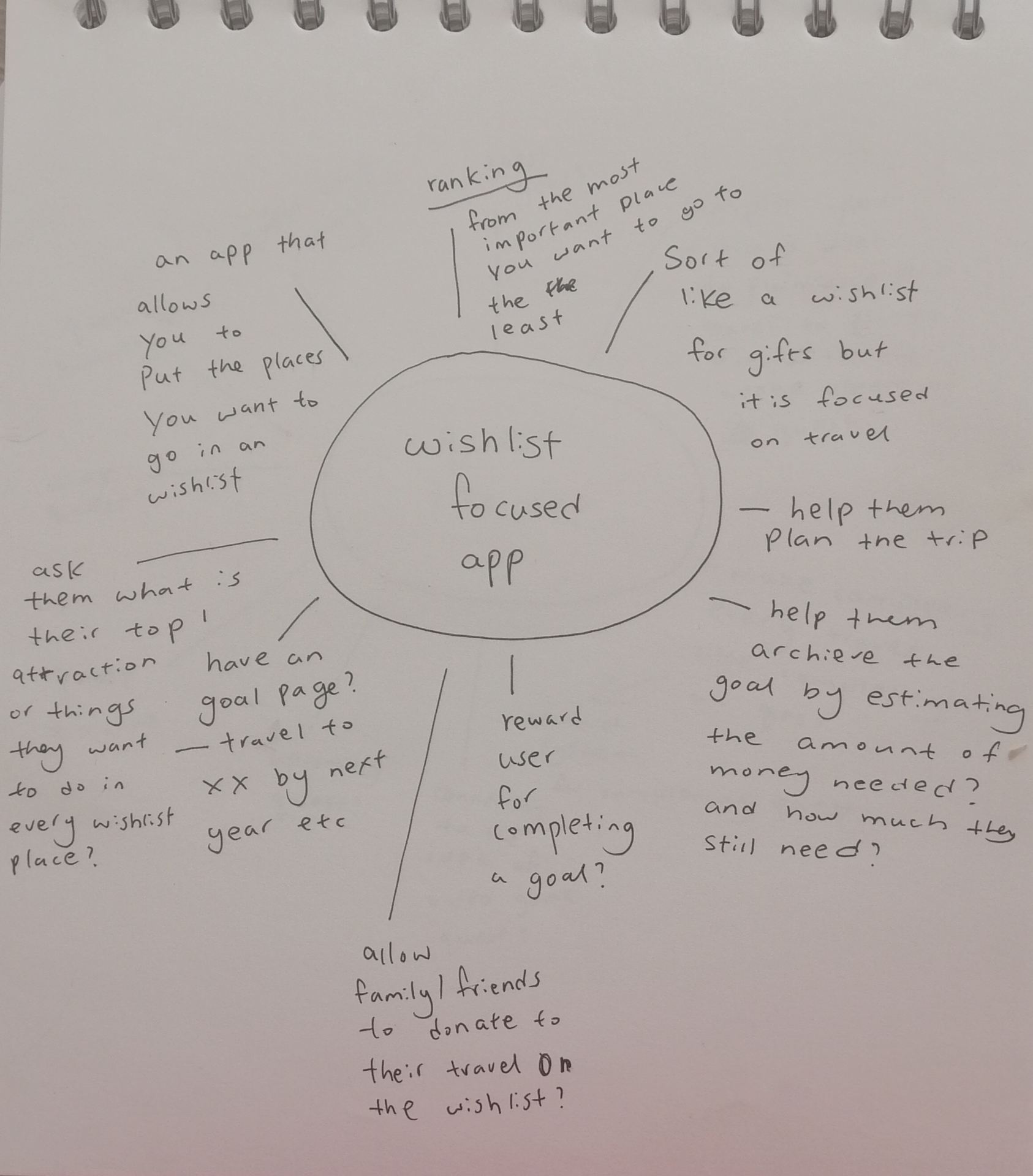
The first was a travel wishlist app idea, where people can have a bucket list of where they want to go and what they want to do there. Perhaps I can have the list rank by the order of importance, have an “archive by date” or even help them roughly calculate how much the travel is going to be and set up goals for savings/allows other to send money during their birthday etc to help them get towards that goal ;
The next idea is a travel app set up like a quest. I came up with the idea because as a young child/teen and even now I love playing adventure type games. Most of the games have quests and maps to guide you;

conclusion
In the end, I went with the second idea, it was a hard decision but I felt that I had more confidence dealing with the concept of a quest like a travel app.
In the coming weeks, I will properly do my research on Illustrators and decide on the type of illustrations/graphics that I want on my travel app.
I will also be deciding what functions my travel app will have, but since I have explored quite a few of them in this blog, I know it won’t be too hard for me to decide once I finalise the core concepts of my travel app.