So, after completing the animatic last week, we all got stuck into making the animation. Most of us started with the backgrounds, including me. My first background is a corner scene as Una’s section ends with the main characters running out of an alleyway. I want an angled view of the background as I thought it would a good look for the scene.
Sketch of inital background idea:
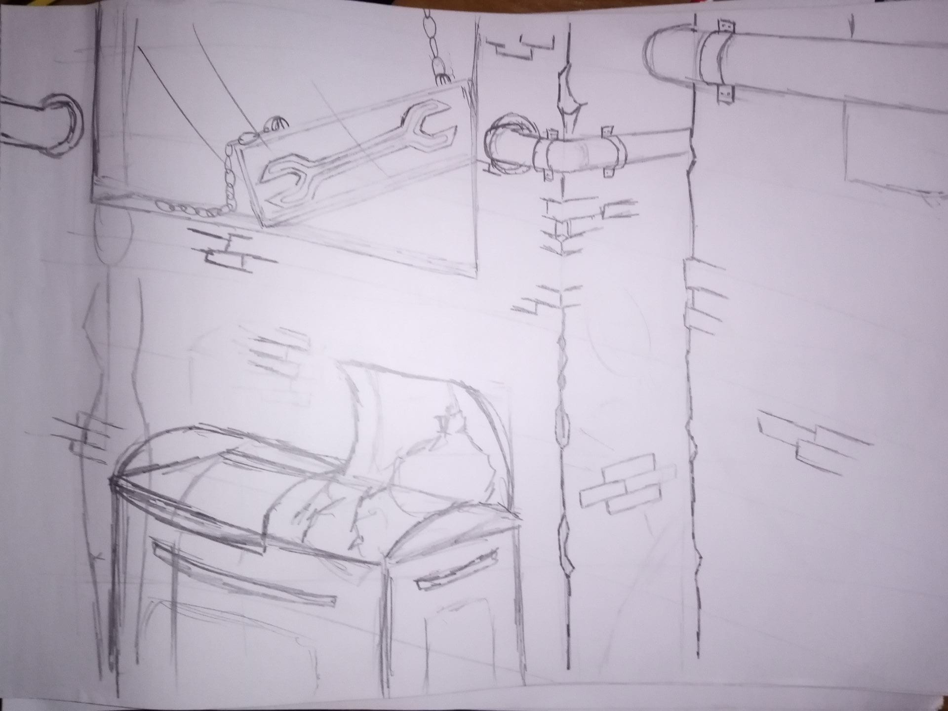
Using the inspiration from below I created the above background design. Initally I was pleased about the look of this, but further inspection caused me to see that the perspective and angle is a bit off, but I left it thinking that I could fix it in the digital version.
Images that I looked at for my background idea:


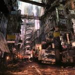
I tried looking at some real life back alley references and some fantasy ruin down outskirt areas to get a sense of how this should look. According to what’s in my head about the scenery.
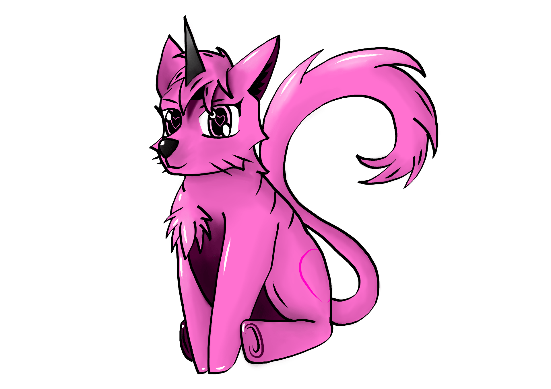
The image below was created by Jodie using Tish’s character design. She did this for all the areas as to match up the character to the background, to ensure that the colour palettes were compatable. I don’t think this is the lighting me and Una were going for but we might include some of it if we think we can.

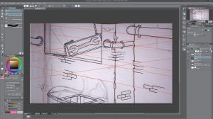
Process of digital version of background:
The collection of images below shows a quick process of the stages I went through to create the background. I have to say it is quite nice seeing this process as you don’t really see it when you are working on it.


Completed Digital Version:

My completed coloured background I think looks great, but it’s only to start off with so there might be changes. The lighting I am really happy about and I think I managed to create a 3D feel to the background at least.
Feedback : It looks good but there are some things that need changed. First thing was the far left pipe, I need to be more careful with it as it doesn’t look good as it is. Second is the mechanic sign, it was said that it is hard to tell if it is in front or behind the window, so to correct it, as it is meant to be behind the window, I was advised to make the window streaks longer or move them in front of the sign. Thirdly was the walls. I wasn’t very sure myself it was going to be all brick or concrete, but they did like the idea, I just needed to do a little extra thing and that was to draw cracks around the brick to make seem like it’s layered. Overall I think I can work with this feedback as I knew the background wasn’t perfect.