Background Research
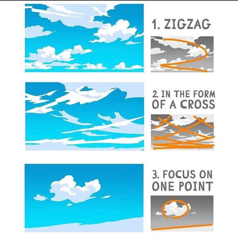
Backgrounds aren’t exactly my strong suit so I looked up how to create backgrounds, mainly in the way of composition as that’s the main skills in creating a good looking background.


Protagonist Village
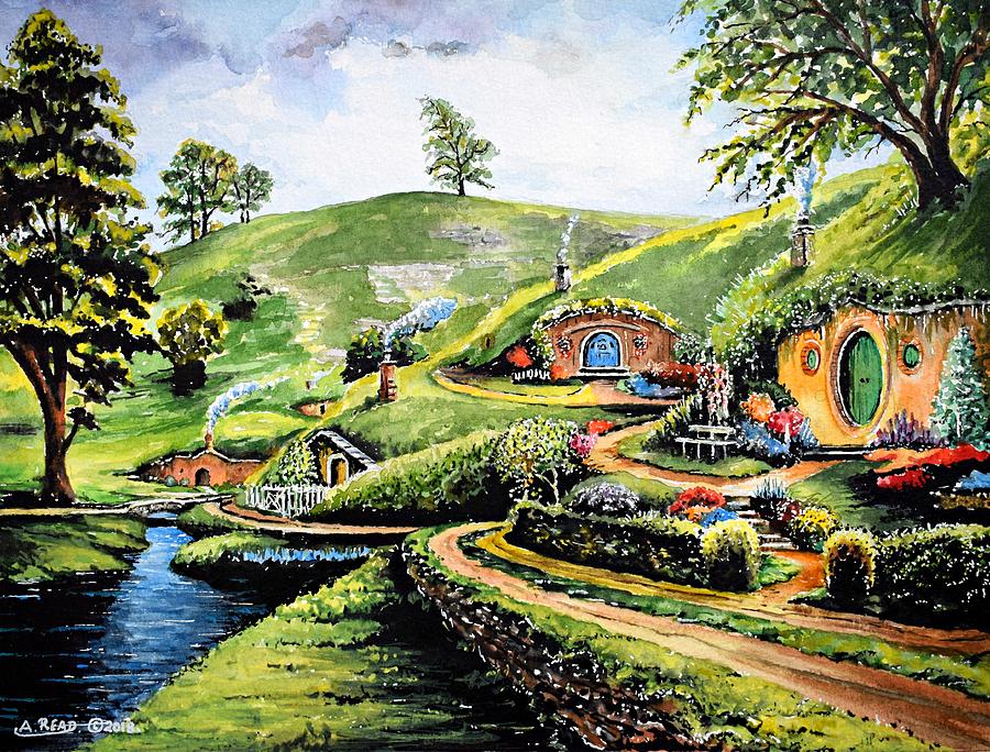
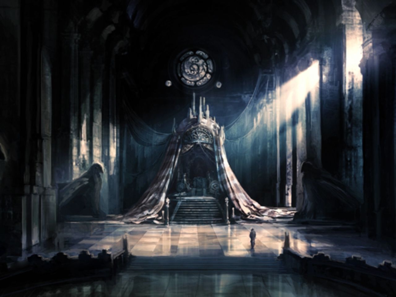
For the Protagonist background I decided to go for a hidden village type, to match her hunter backstory. Thinking of what kind of village, I wanted it to look natural to the environment so possibly houses, buildings built into the hills or something similar. This thought led me to thinking of the ‘Shire’ from Lord of The Rings (Middle Image). The way the building and environment are led out is exactly what I want to achieve with my environment.

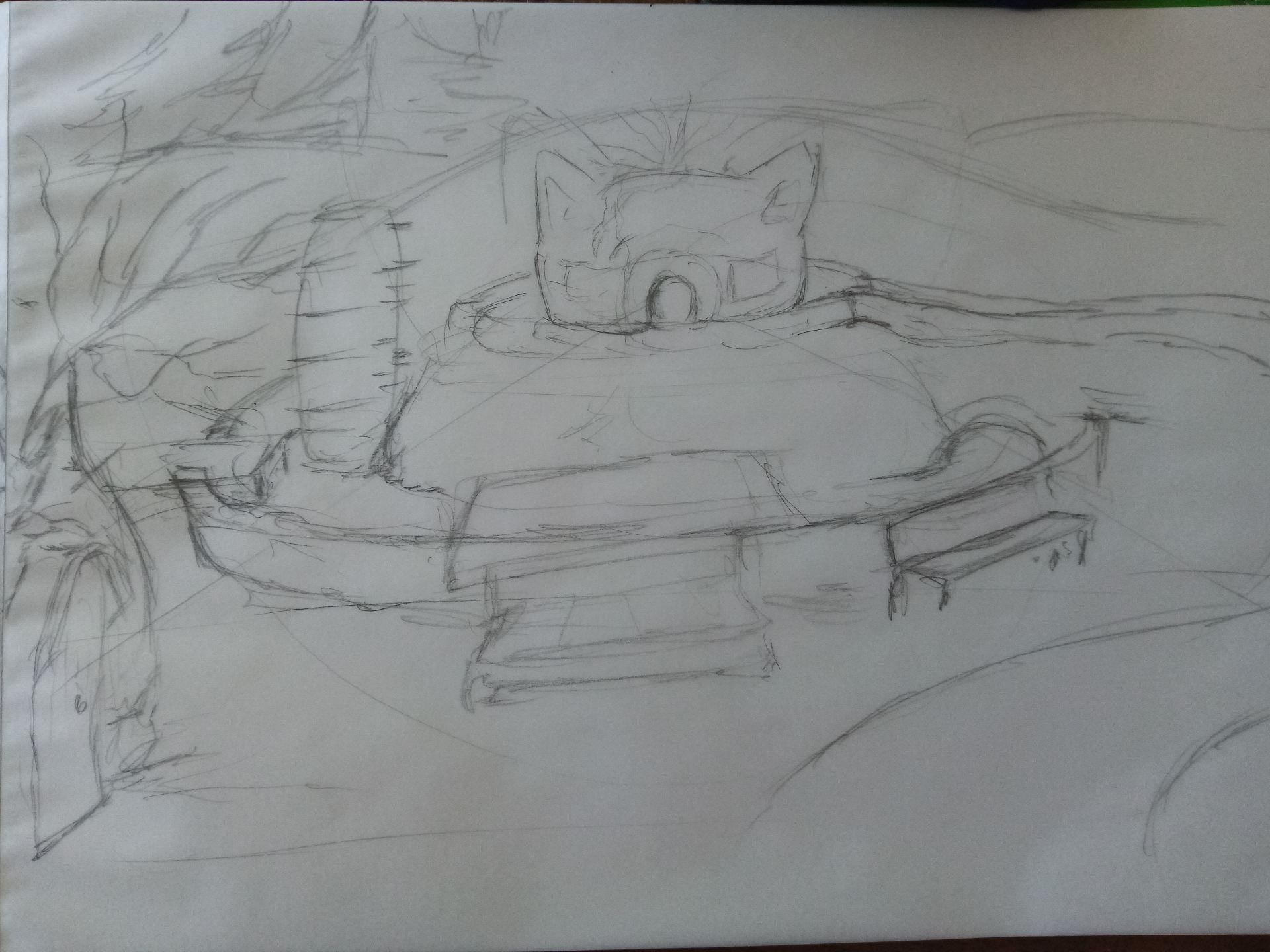
My intial sketch of the environment mainly focused on having the protagonist’s house as the centre and environmental pieces surrounding it, like a water wheel, a food stall, a river and the like. Anything a fantasy village may have. My second sketch was a clean up of the first, also adding some other details to try make the village work.

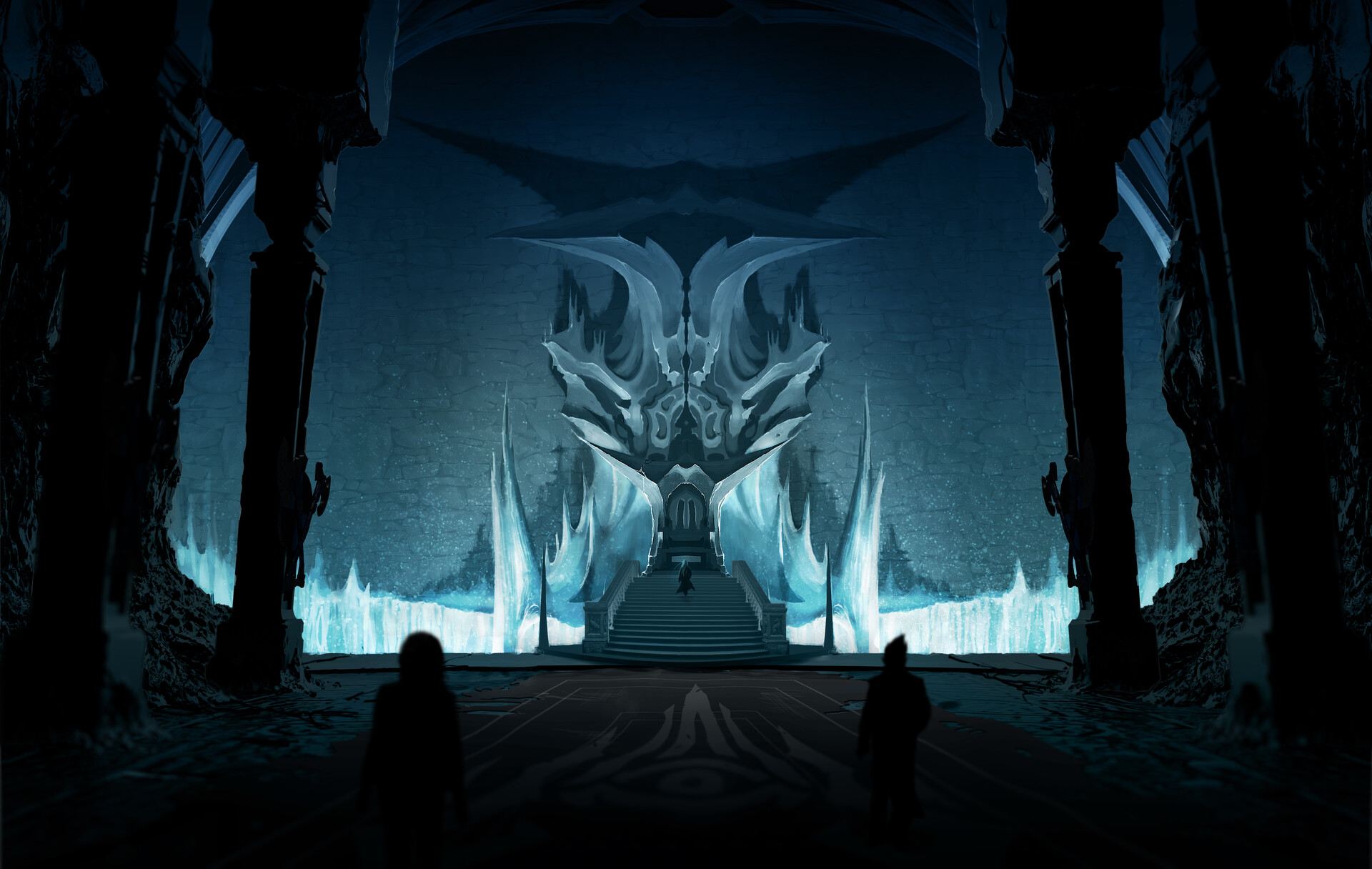
After that I realised that what I was trying to do wasn’t in the style of hidden village. So I used the top reference image as a composition reference to create a more in the deep look with bushes at the forfront of the environment and having the houses incased in hills and forestry.
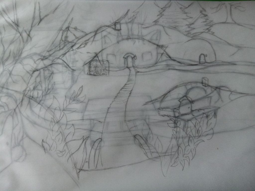
When it came to doing the digital piece. I started off working on the bushes at the front using solid block colours to get the shape before adding shading for more definition. I used this process for the entirity of this background. For the outline I used the ‘For effect’ pen tool, this gave me a nice stylised effect for the leaves and it just works. I continued using this pen tool for the remainder of the environment to have an overall stylised look to it.
I had the most trouble with the field of green as it makes up for the majority of the background. Trying to blend and shape it to look nice and natural took some effort. Lastly I added a gradient of black to make the background seem dark like it was deep in the woods somewhere, erasing some of black to look like light shining through the trees surrounding it.

Antagonist Throne Room
When thinking of what to do for the Antagonist, I still had the Hunstman as the main figure so I wanted to have an environment that would display him and his evil side. Like he was better than everyone else. So naturally I thought of a throne room type of background. Only issue is how complex or simple should the environment be.

So first thing first is to get the size of the throne and space that I am going to work with. Again I am going with a centre focused camera angle for the environment. I am really not a fan of scale and use of the horizon line so my angles were a bit off for a couple of sketches. Really needed to nail down the vertial angle of the throne so I know what I would be doing for anything else in the throne room.
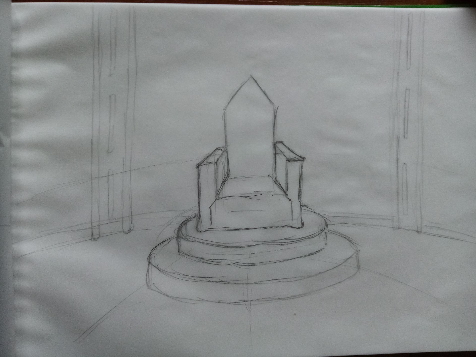

After getting the throne sorted I worked on the rest of enivironment. To make things somewhat easier I decided to make both sides symmetrical, so I only sketched one side as I can duplicate it when it comes to the digital work. I wanted to make it look ruined and destructive to relate to the character, adding it jagged rocks and ruined banners and a ruined carpet. In the back I just added a pillar and some stripes to the wall.
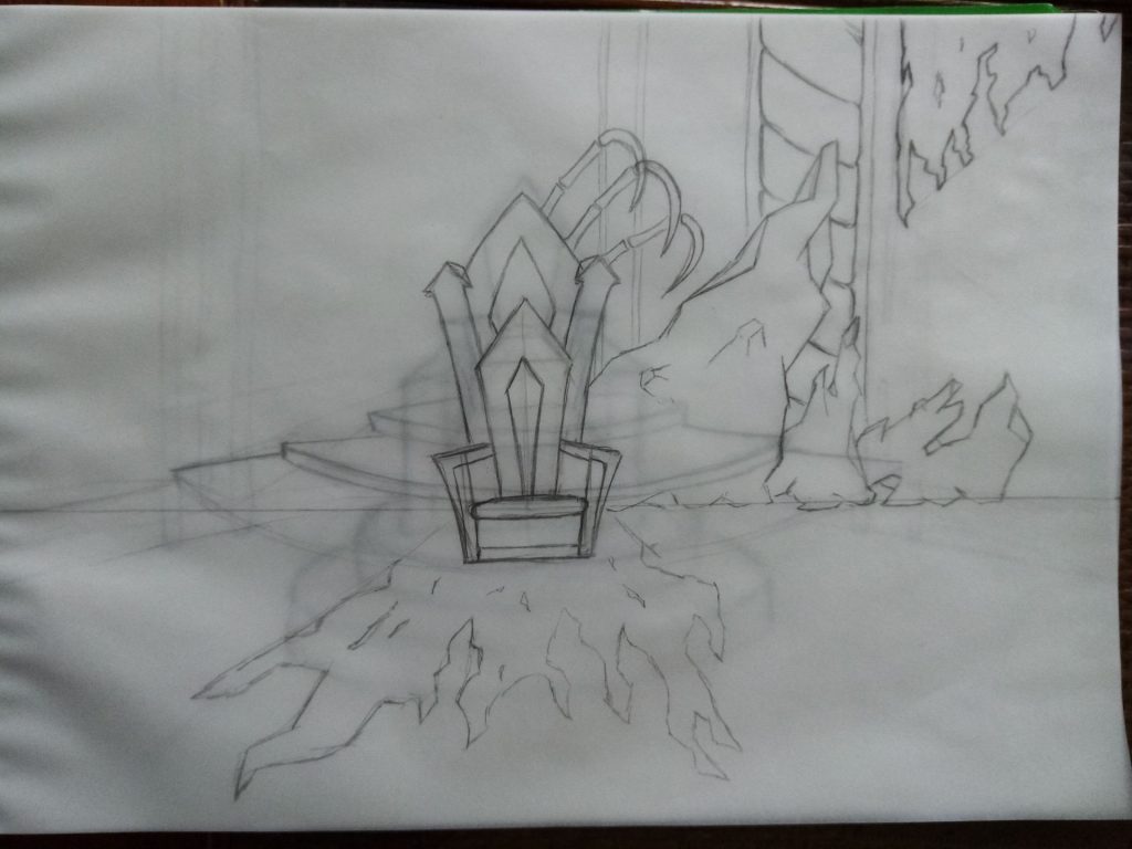
So the symmetrical thing I think really works for this background and it does have the evil/bad guy vibe that I wanted. I think the dark colours and dark lighting really helped create this vibe. Also added some bones to go for that creepy look. I do think a villian would be in this area. Does it suit the huntsman character I’m not sure, the shadow character would suit this environment.

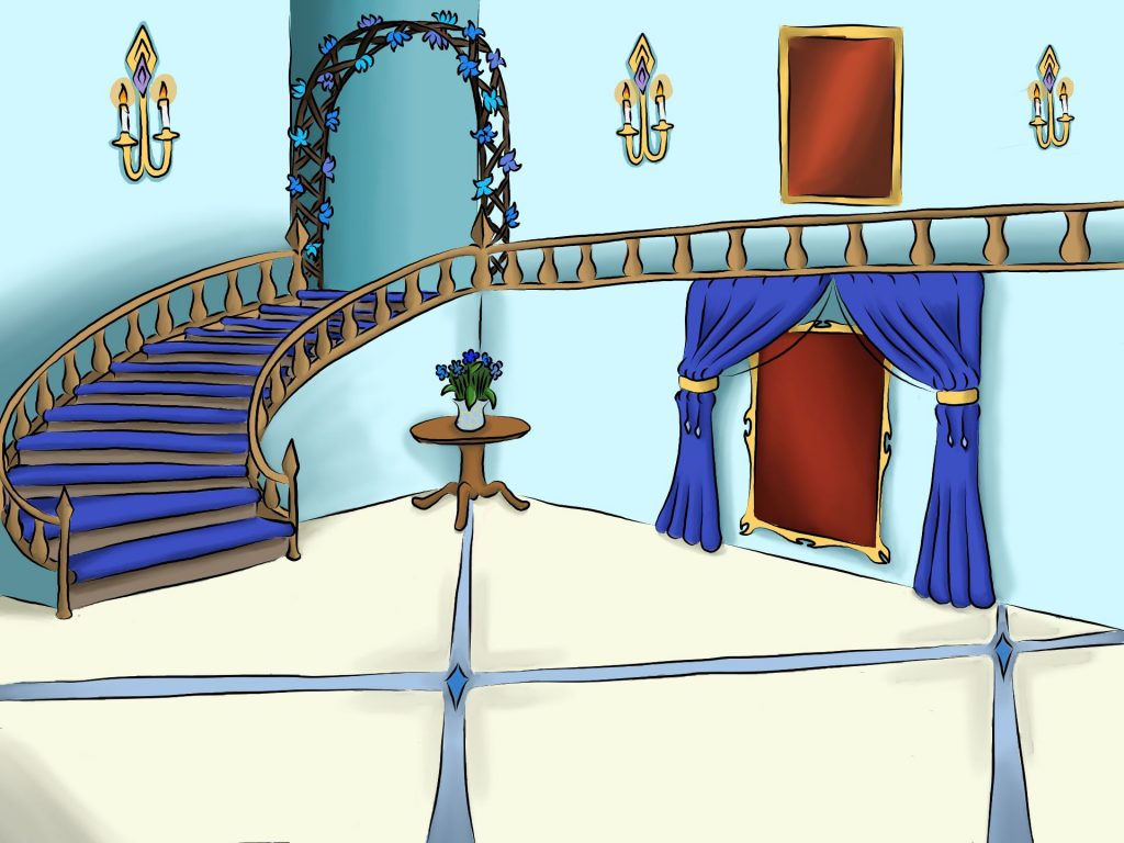
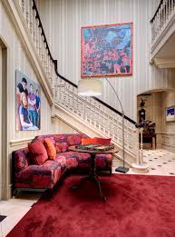
NPC Grand Hall
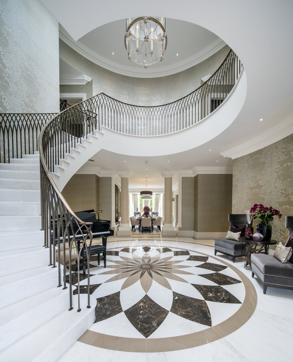
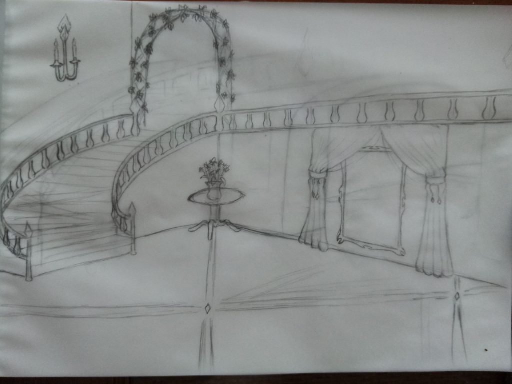
The NPC is a noble type character so I needed a environment that would show money and expensive. A lot different than the Protagonist’s background. Really want to show how different their Status is compared to each other. So for the noble background I though about a Grand Hall. It would be the first thing a visitor would see and a staircase for the noble or person of wealth to walk grandly down them to make an entrance.
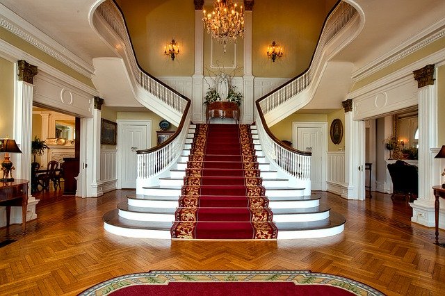

I decided to go with a curved staircase and view it at a 45° angle to go for a more prespective look. I also sketched an arch which afterwards was not a fan as I would then have to come up with what would go in that space. The first sketch did not work.

My second sketch really fills the space more and gave the enivironment a more wealthy appearance in my opinion. I think this really works with the big portrait hanging on the prominant wall.
For the digital version I wanted to keep it in theme with the colours I used for the NPC. Primarily using blues. I wanted the room to be light but still feature rich colours. I think the deep blue helps with that. I added an extra portrait painting on the upper floor to fill in space as I had neglected to utilize that space when sketching. To save time I didn’t put the NPC in the portraits, instead just coloured it in with colours that would be used as a background of a portrait. If my time was used properly, I would have created some imaged that could have been used for portrait paintings.