For my project I had an idea in mind that I wanted to create that I had been thinking about the summer before the semester began , at first I was going to work in a group but when our ideas kept clashing and didn’t work very well together we decided to go our separate ways, my idea was three bounty hunters that used cards which where inspired by tarot cards, to tell them who exactly they are hunting for through magic (never stated wether the magic is good or bad magic as it would be up to the interpretation of the viewer).I was very inspired at the time by art styles that where more realistically proportioned, I looked into the short film ‘Louise’ because its style really inspired me, I really liked the shading of the short because it’s shadows are constantly wiggling and moving which I thought gave the characters a very alive look even when they where just standing still.Also night in the woods was another animation I took inspiration from because of its nonsensical fantasy spooky setting. When it came to my research I would look into other short films that had a similar aesthetic to what I wanted to go for.I would also make mood boards that depicted the certain aesthetic I wanted to go for.
inspirations-
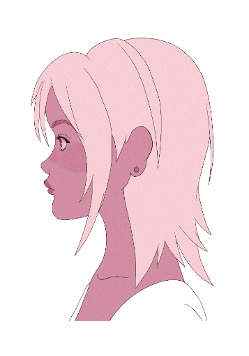
Louise
Moodboard-

Plot–
Two mysterious women use the power of the cards to hunt down their next target they have been hired for, They have both been summoned to a tavern and it is there that they begin using the cards, the card that is pulled from their deck is the ‘rotted man’. Not long after the card has been pulled a a fly enters their field if vision, one of the women follows the fly only to find the rotted man himself hiding in the corner of the tavern, a chase ensues and he is subdued when caught, he is then sucked into the card.
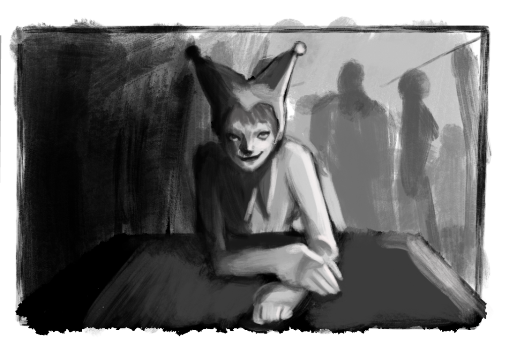
I want my short film to be more of a fake ‘pilot episode’ for a show that doesn’t exist, some things in the animation may nit seem very clear at first but this is because I wanted whoever was watching to have a sense of wonder as to why the characters in the film are doing what they are doing, therefore I was hoping that it would intrigue them to want to tune into more episodes of the ‘show’
Characters
I started by drawing up designs for four main characters , each character would serve a purpose, the one who can use the cards who would be more comical, the strong stoic character and the one who hold the group together, when I gave a presentation which incorporated these three characters I was told by the tutors that four characters would be too much work to animate so I decided to go with the first three characters I had in mind which was the comical ,the stoic and the rotted man character because I thought they might be able to bounce better off each other. Originally I also wanted this short to be three minutes long because in my mind that was doable, but then the tutors gave me the advice that 3 minutes would be too long for one person which I agree with so luckily I decided to cut it down early.
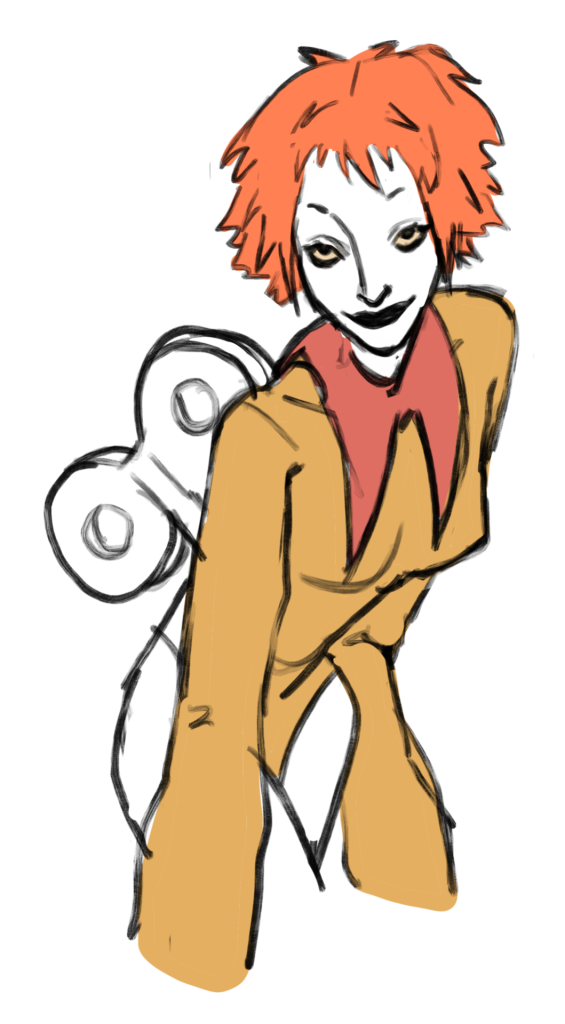
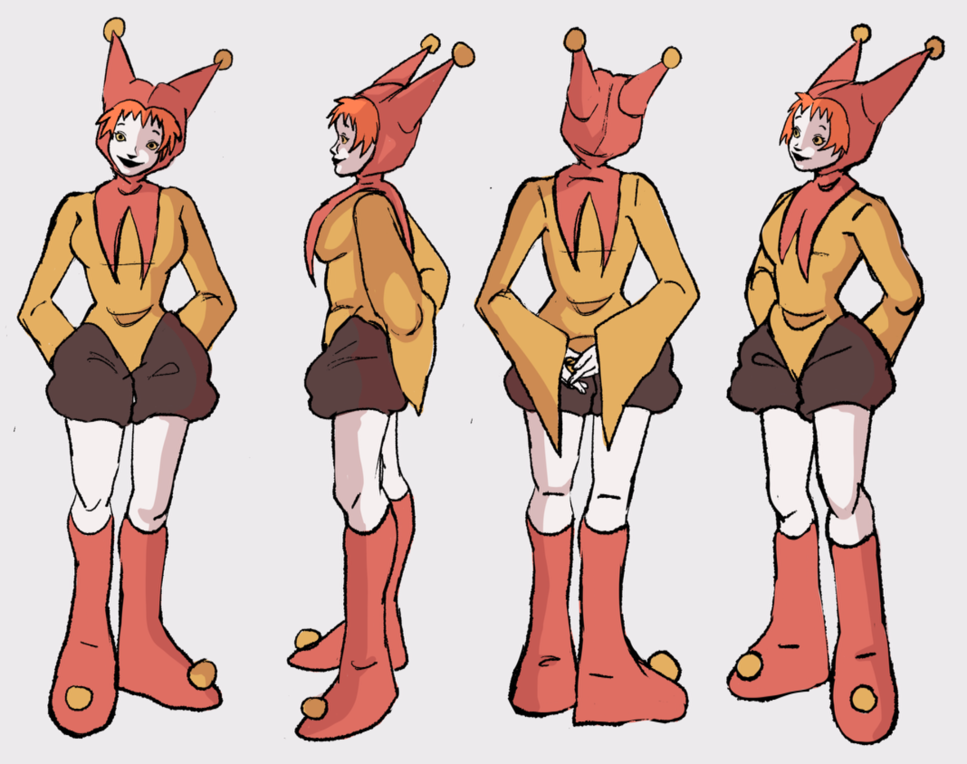
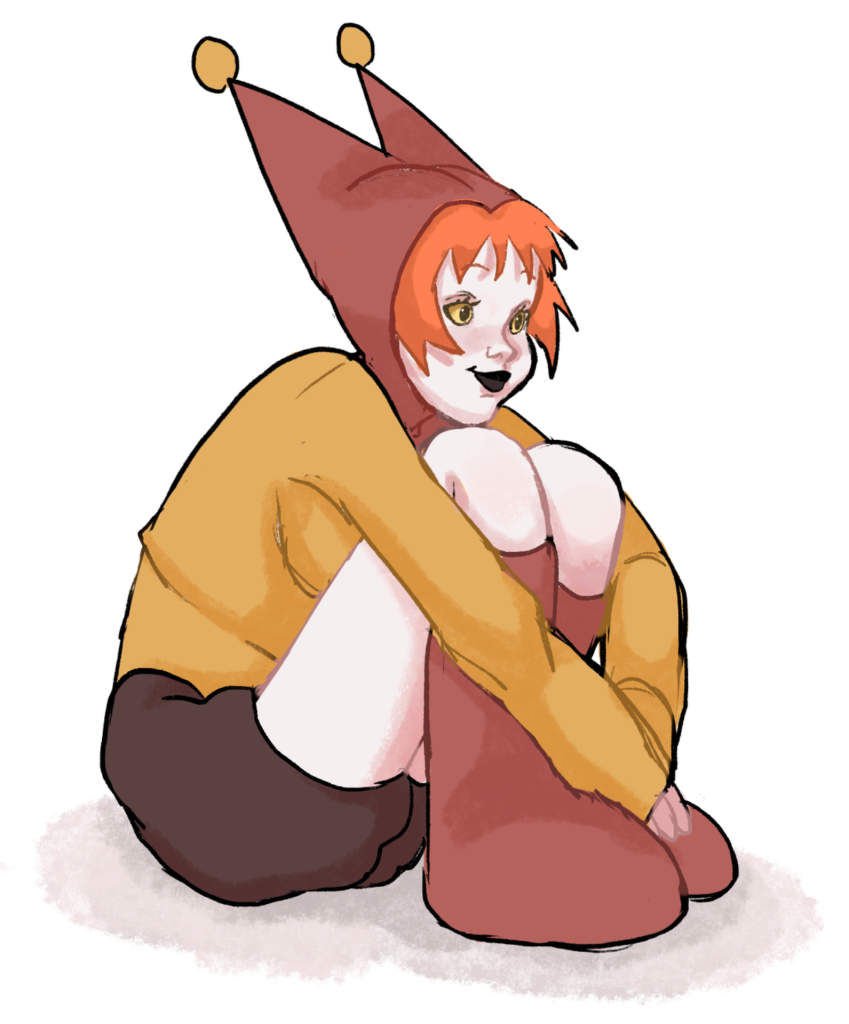
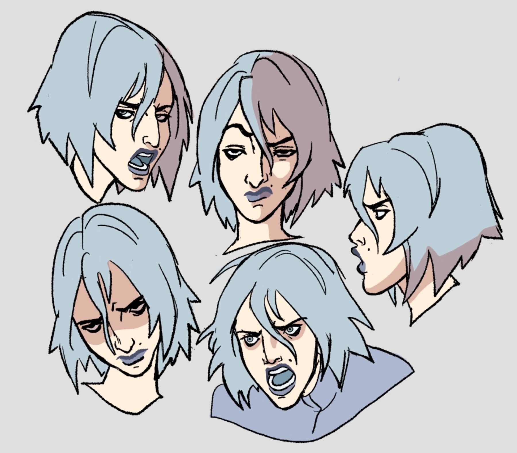
Jackie
The first characters is ‘Jackie’. The names are never directly said in my short but I thought I should name the characters anyway. Jackie I decided should be a jester since she is the comical one, I also wanted her to give off a medieval vibe since this film was going to be more of an old fantasy setting.Since my short is technically a ‘pilot’ for a show that would never exist I thought about fleshing out her character more just to get a better idea of her and her design, she is a living doll and was brought to life by the same magic that can wield the cards which is the reason she is the only one who can use them. For her jester hat I decided to go with the design that has pointy bits as it almost gives a devil like appearance, she is supposed to look unnerving so she rarely blinks and has wide eyes that stare. I wanted the three characters to have shape language so I gave her larger shoes on her feet since it made her look goofy but also she would stand out more beside the other characters.As for the colours Iv whose I wanted her to look out of place and unique in a way but also looking like she belonged with her counterpart who has the opposite colour scheme from her.One of her colours is also red to maybe hunt that there is something sinister about her nature.
Concept art-

![]()

final designs-
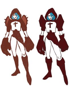
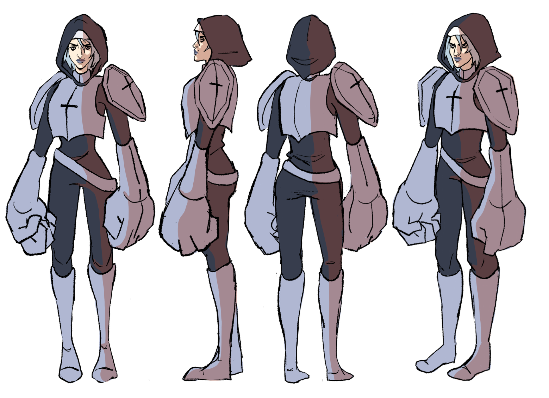
Stoic woman
For the second character I wanted her to be bigger at the top than the bottom so she would contrast with Jackie, I wanted her to look like she would be a bounty Hunter so she is armoured, again so she would also give off a more medieval vibe , she has big gauntlets for her work and I also think they just make her stand out.She also has bags under her eyes to give her a bit more character, make the viewer wonder why she is so exhausted looking. Her backstory like jackies is a mystery to the viewer , so the viewer will not know why they are both bounty hunters and why they are the way they are which will make them curious and want to tune in for the ‘show’ .When it came to her and Jackies colour pallet I wanted them to go together since they are a duo so I made sure their colours would contrast each other but would also go well together.Jackie is the colourful one mean while stoic woman is the more dull one since she is more practical and serious.
concept sketches-


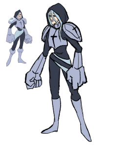
Final design-
Fairy
The third character was going to be a little fairy who could literally sniff out who they where looking for after the cards would give them the name, her design was to fit the look of the cards and since fairies are naturally magical beings her magic was again like most of the other characters, going to related to the magic that the cards emit hence all of her purple colouring.Of course she had to be taken out because 3 characters was already too many but she would have been the least unhinged out of the two characters and would of been able to give them more clear directions, technically she was later replaced by the fly in my animation who ends up showing the characters where to go instead.

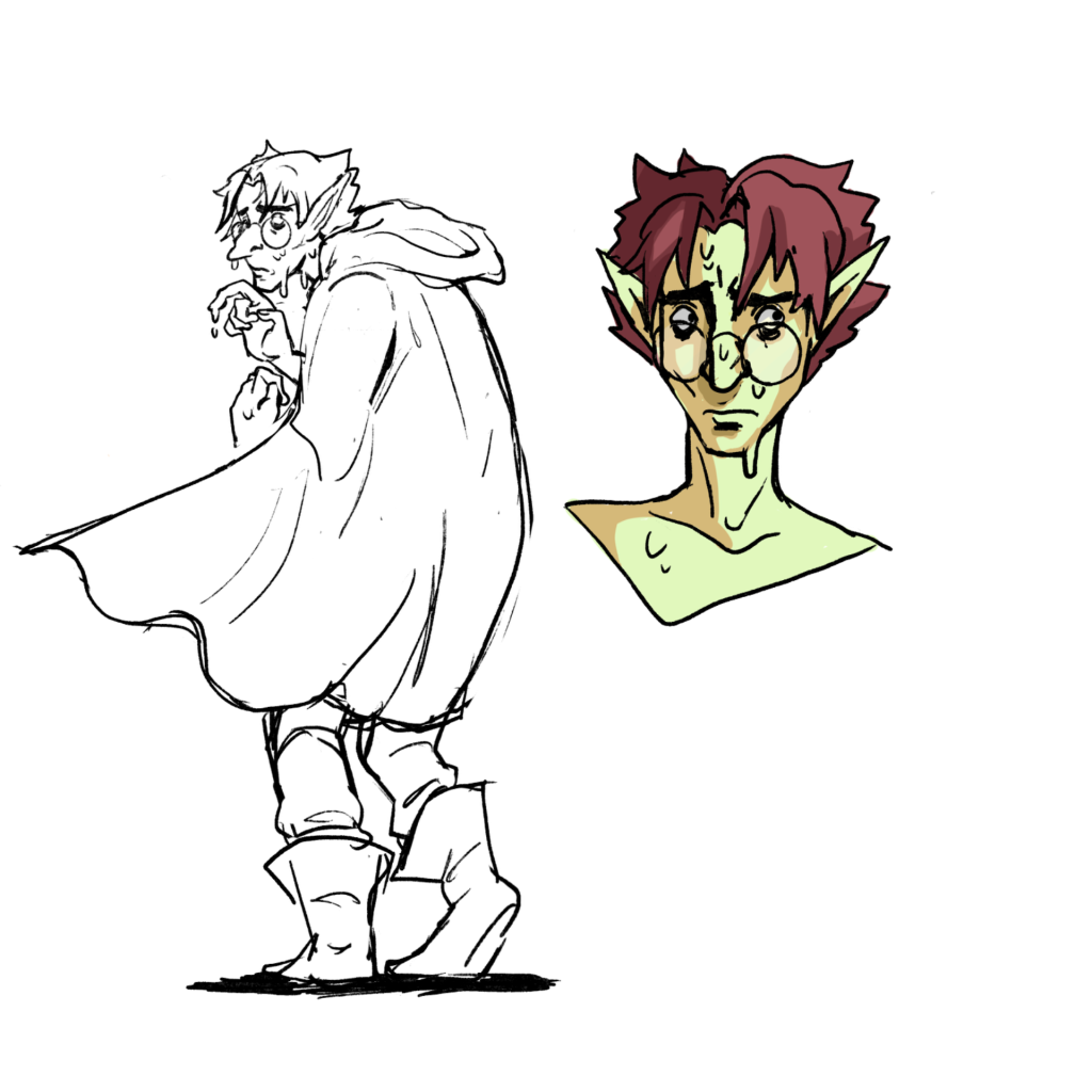
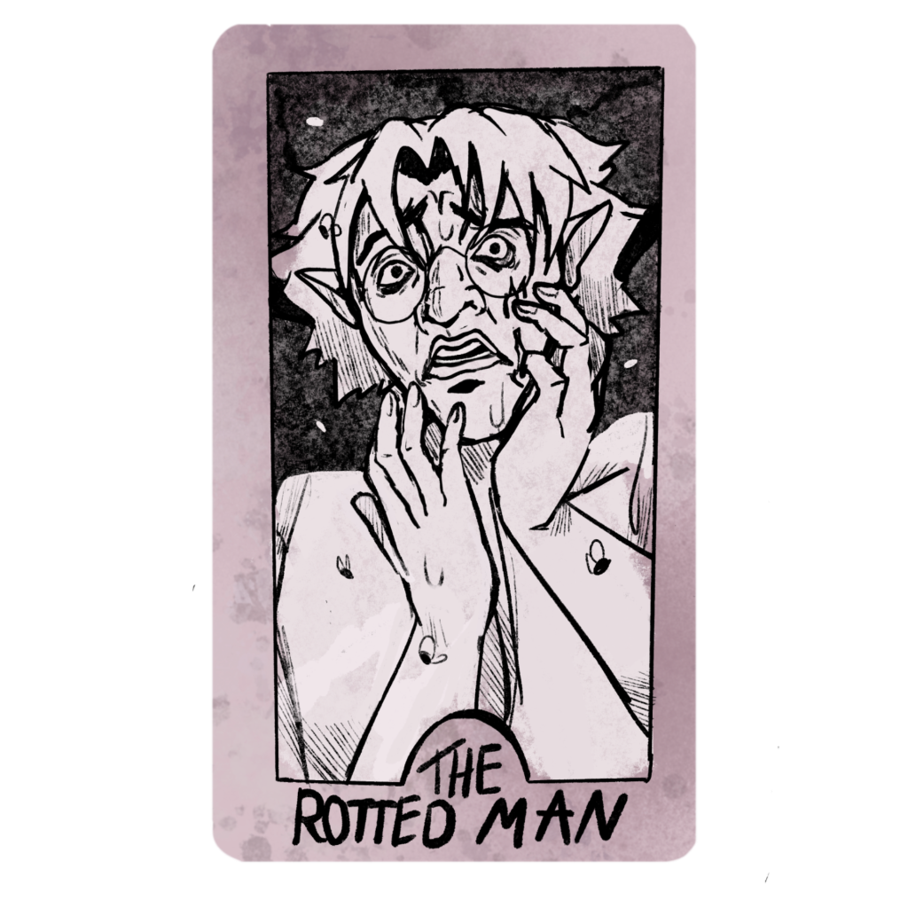
The rotted man
The rotted man is supposed to look weak and cowardly, he is a man who has been cursed by the same power that the cards use, he is a man who is rotting but is still alive, I wanted the viewer to question why is he being chased and what did he do ?. He wears smart clothes but still keeping in with that medieval vibe. I wanted to give him the look of he could just be any guy, nothing much about his design really stands out apart from his yellowish green skin, which is there to show that he is rotting.he also wears a cape which he would use to try and keep himself hidden and not stand out ok much. Another reason he is in the tavern to try and blend in with the crowd.

After I had designed the characters I needed to give them a turn around sheet , Jackie is the shorter one out if the two, I also decided to draw the characters a face expression sheet for any of the Potential facial expressions they may make in this short, I tried to show off their personalities as well while drawing these facial sheets, Jackie is usually always smiling and rarely ever blinks, the other one always has a furrowed brow and never smiles.
Background characters
I designed a few background fantasy characters who could potentially show up in the film. One of them being an orc bar tender, the others where just other people drinking and talking in the tavern.they would of basically been silently judging the two main characters the whole time.

Backgrounds and props
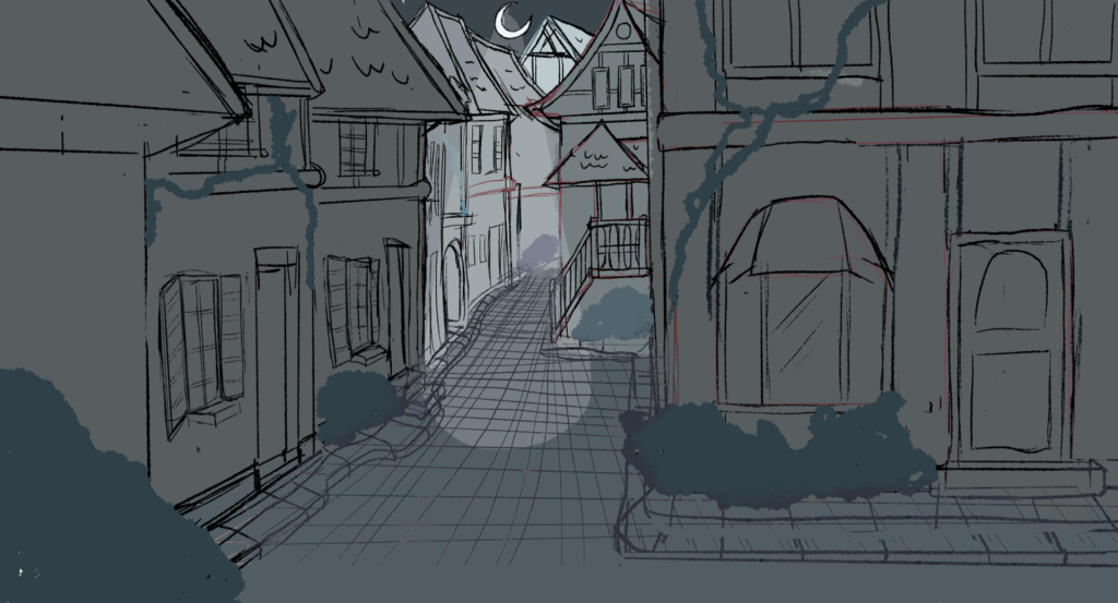
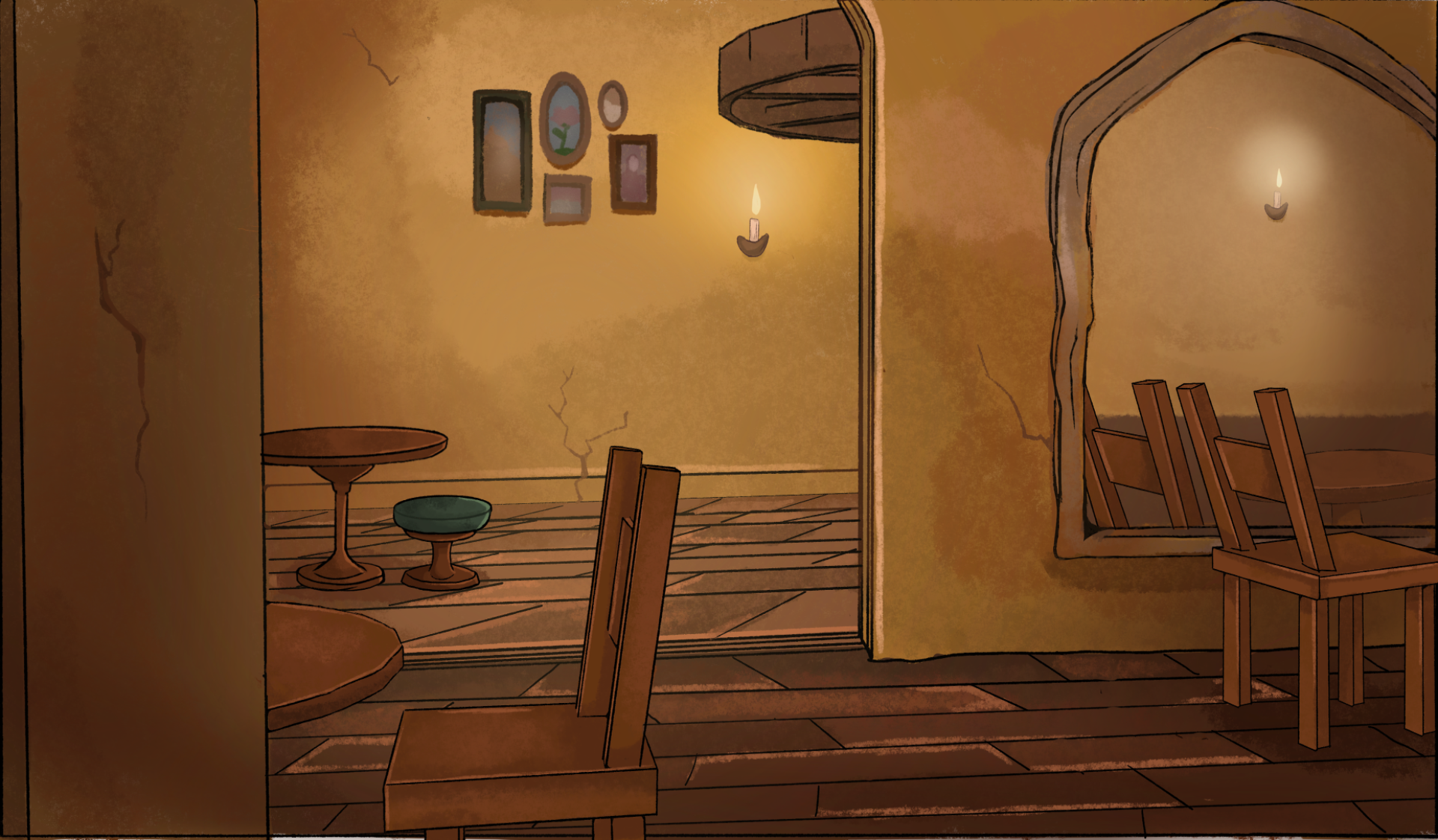
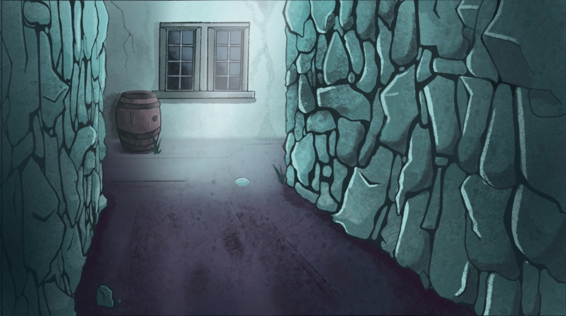
I drew a few concepts for backgrounds to get a feel for the vibe I was trying to go for, I drew the streets outside in a town because at the time I had the idea that the characters where going to chase each other through a town, i later changed this idea as constant drawing so many building would have been really challenging.I still liked the idea of the scene being bathed in moonlight so I tried to keep that idea for my future background scenes.
the second concept was me trying to figure out the colours that I wanted the tavern to have, and I wanted the tavern to have a greenish yellow undertone.

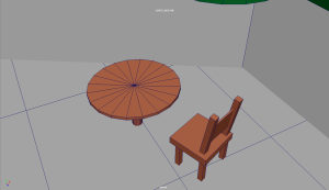
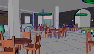
When it comes to backgrounds I tend to really struggle with the perspectives of things and what ways I could render, so to make this easier and faster for myself I decided to 3d model the inside of a tavern so whichever way the characters where going I could just take a screen shot from the inside of my tavern and use it for the background and just trace over it. I made a few chairs and tables and lights for the ceiling, these weren’t very detailed as I was giving to render the detail in myself to make it look more natural. I wasn’t sure exactly where the characters would be going or what they’d be interacting with at this point in time so I just modelled everything.I didn’t model the streets and alleys since I thought they’d be easy to draw without the reference.doing this type of process I think has actually helped me improve at backgrounds a lot and has made me feel more confident in how I draw backgrounds.
3d modelled tavern-


For the backgrounds I was inspired by a few artists. Alarko creates very sketchy backgrounds but manages to make them look complete and alive, I also really loved the colours they would use in their artwork, however when I would try this technique I could not execute it properly and the unclean lines did not go well with the polished animation style I was going for, I decided to mix how I render backgrounds with different techniques from alarko and Louise which I think ended up working well for me and blended in well with the animation style I was going for.
Alarkos artwork-

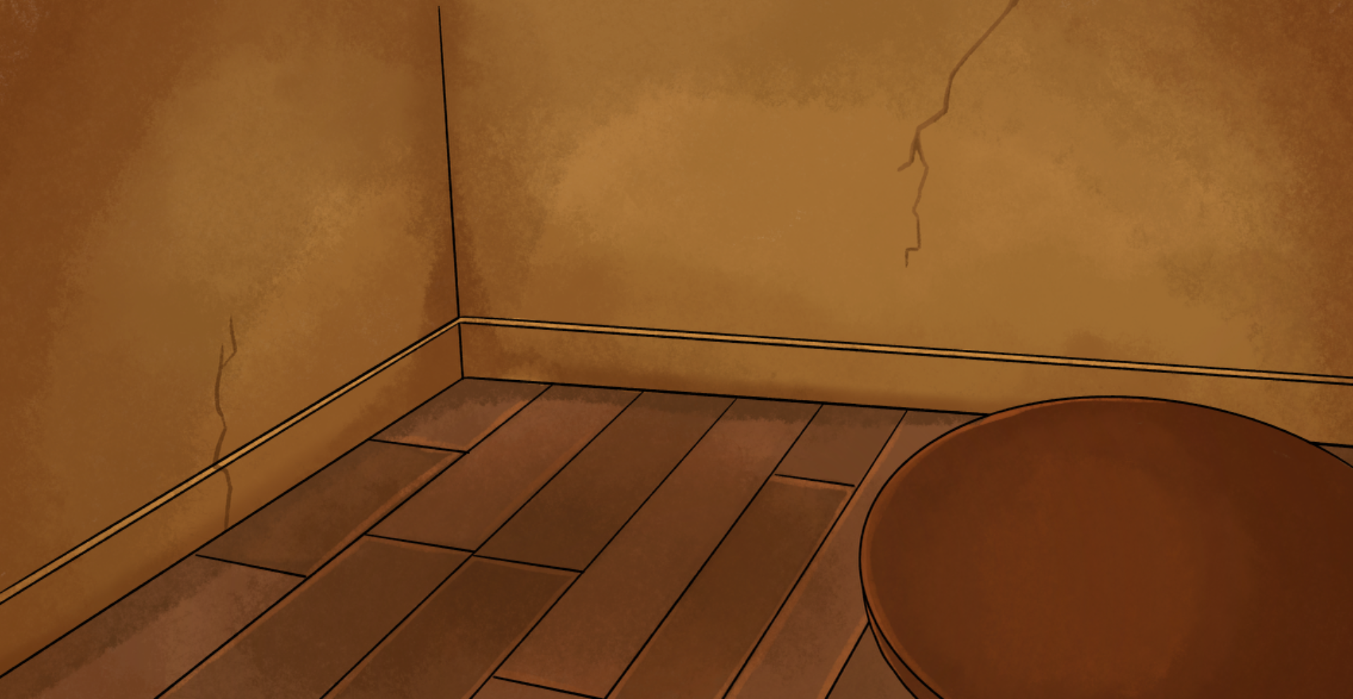
The backgrounds are of a tavern, I wanted the tavern to look barren and a bit run down with cracks in the walls and discolouration on the walls.I didn’t want anything in the tavern to stick out too much so I tried to keep every-thing and plain as I could while still have the tavern look polished since I wanted my animations to be the thing that sticks out.This is where I think a bit of alarkos influence comes in because I was inspired by the way he would render the inside of building with leaking wallpaper if discoloured walls.
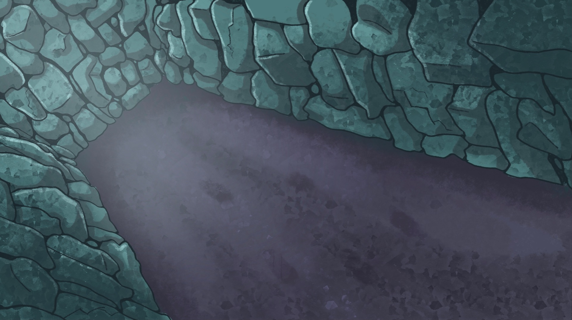
I drew up to 10 backgrounds for my final film, some of the backgrounds where reusable for a few of the shots with a few adjustments.the main colours used in my backgrounds has been yellows and oranges for the inside of the tavern to give it a warm but also eerie feeling with lots of dimly lit corners, meanwhile the outside streets and alleyways are very blue/green to give the sense of isolation and suspense under the moon light.
Finished backgrounds-


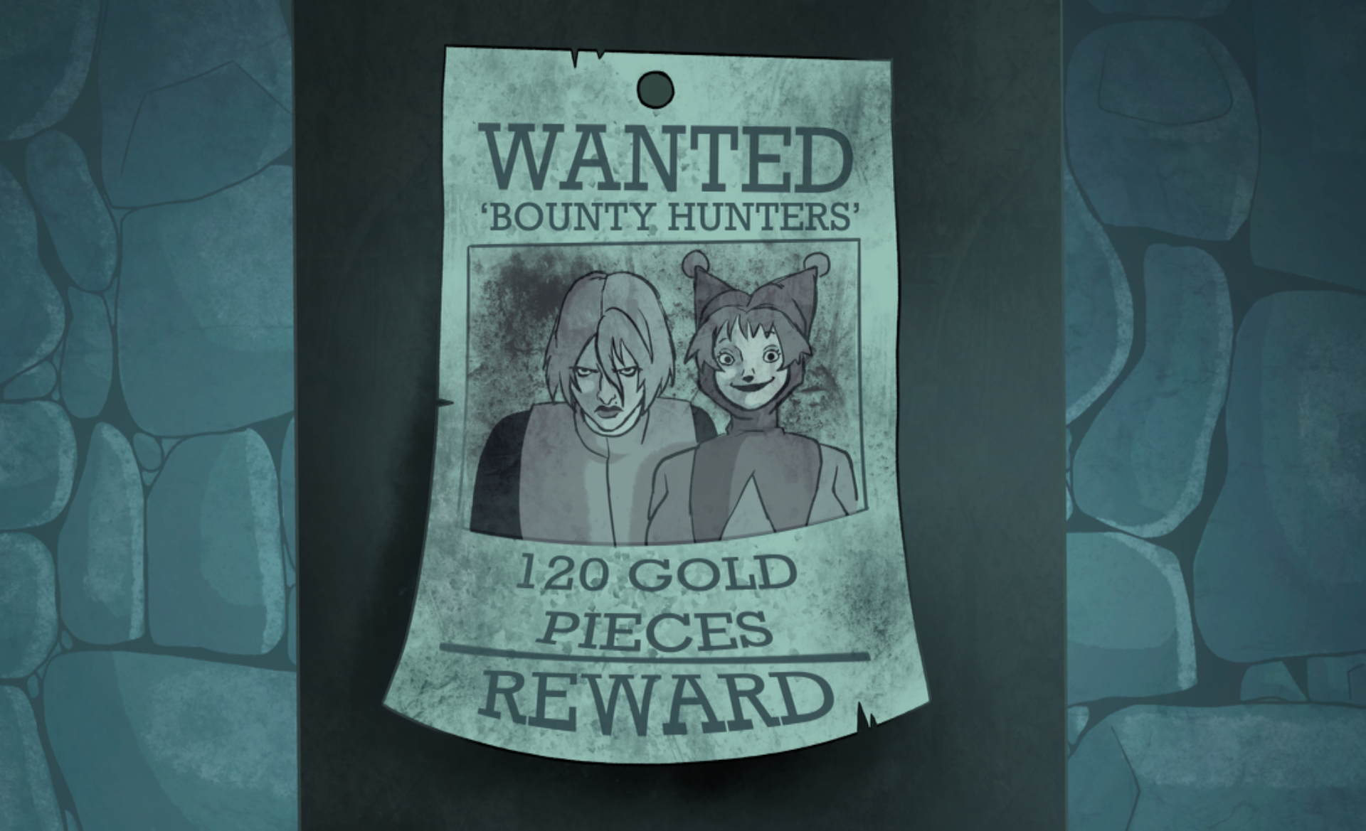

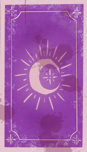
For the props that have been interacted with in the film I drew a magic card, with advice from tutors I was told that making the card purple was the best the best colour I could use if I wanted to express that the card itself was magical, I also wanted the card to have a simple yet iconic design which is why I chose a moon card, the moon can be seen on a lot of these types of cards.
I also have drawn this card again but form the back, there are two separate versions of the back of the card, one which has nothing on it and then the other which has the rotten mans face trapped inside.
Another prop was the chair, I only drew two separate images for the chair, one of the chair falling half way down and the other of it standing straight up.