Concept art


game art and textures-
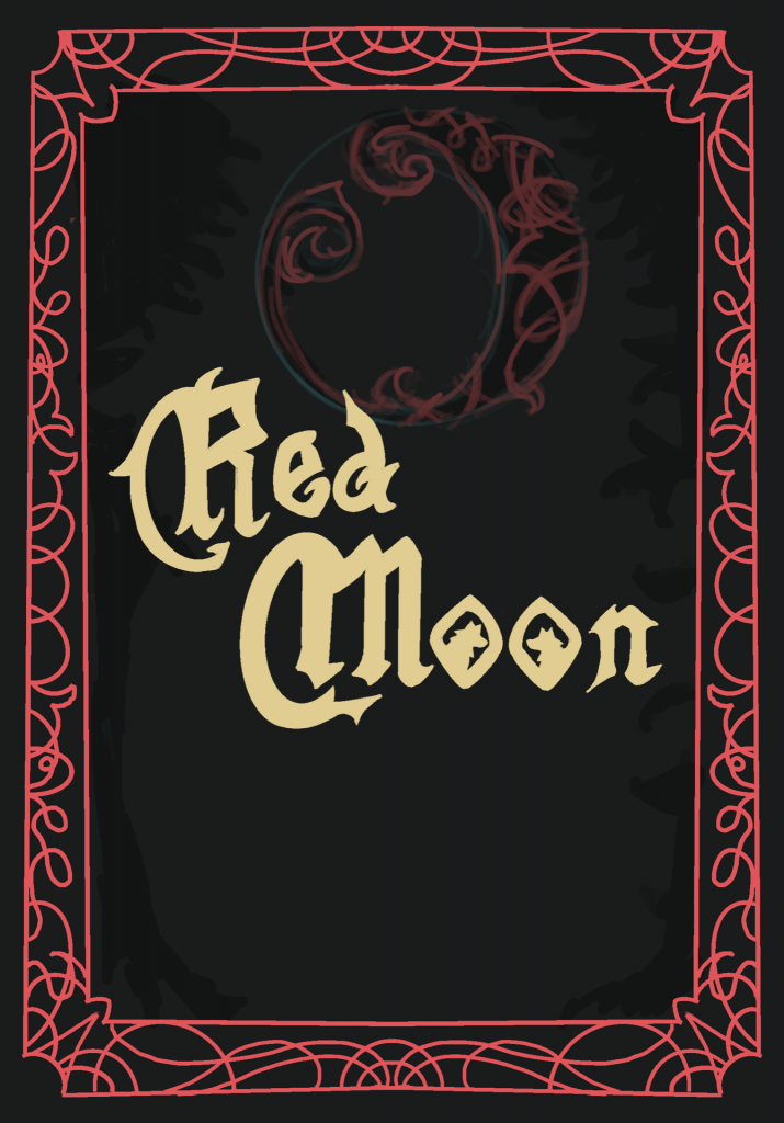
(Front cover collaboration with Una)


3d models

 animations-


youtube playthrough-
Concept art
game art and textures-
(Front cover collaboration with Una)
3d models
animations-
youtube playthrough-
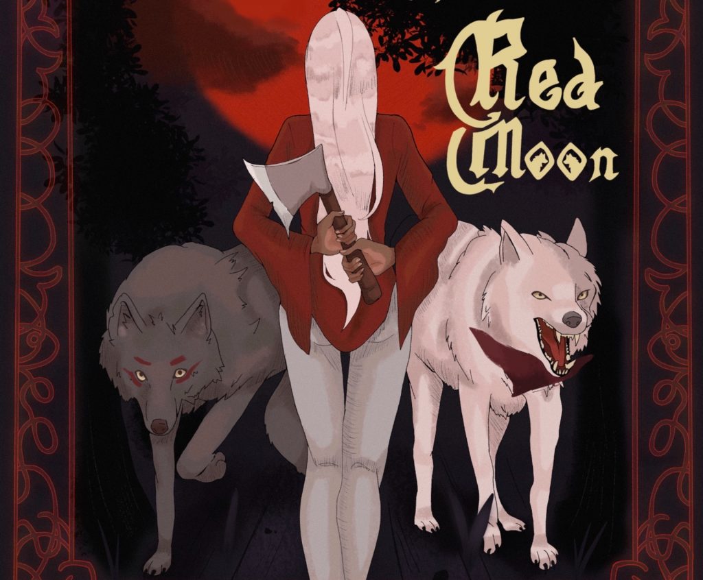
I didn’t get much done in the last few weeks as I was working on my other assignment, the last thing we needed design wise was a front cover for the game, maybe displayed in the main menu, I wanted to incorporate the wolves and also the red moon, which is also the title of the game ” red moon “, and of course the main chapter red.
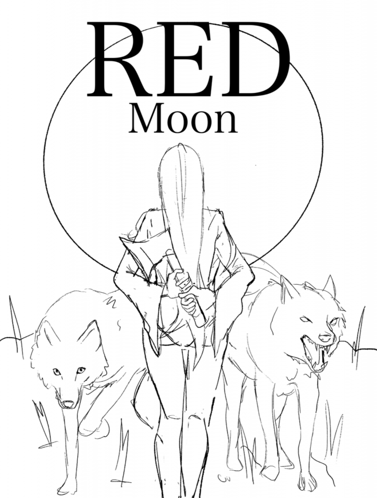 I drew up this sketch which creatures red facing away from the viewer and her two wolves coming out from in front of her, she’s standing on a cliff looking out at the big red moon, I drew her holding her axe behind her back because I liked the idea of this girl who appears normal and who has an innocent red riding hood vibe actually be harbouring a more violent side, and instead of the wolves being against her they work with her, so the axe is behind her back.
when I showed my group to get feed back Una suggested their design they had also created-
 they sent the idea to me so I decided to combine both of our ideas into one, their idea was having a story book aesthetic to the front cover that fit in with red riding hood aesthetic.
 I combined the two by keeping Una’s border and text, and added in my illustration of red and the wolves along with the big red moon, I thought this was a really nice improvement to my first idea and really fit the theme of the game much better.
This is the cover after I rendered and polished everything, I tried to make the art style more scratchy and textures to fit with this grim fairytale style cover and overall I think it turned out quite well, a teammate pointed out a had accidentally used a previous version of the wolves design so I quickly got that fixed up to the current designs you see in the wolves here.
I also made a cropped version so it could be used in the main menu of the game with the title just slightly off to the side instead.
During these weeks our group realised that the enemy animations had not been created yet, the group member who was assigned to these was no longer able to do them and the lead animator was very busy with the main chapter animations, so I decided to do the enemy animations, I was able to get two of them completed-


the first one is a purple skeleton figure who’s main attack is slashing, this enemy is one of the most powerful common enemy types the player can come across, so I tried to make it look menacing, the design was created by Jamie in our group.I animated this in Procreate and I tried to add in a smear frame to make his swipe look more fast and powerful, it was also fun to animate his chains moving with his arms going up and down like that, the arm movement is meant to be saying “come at me” as this enemy wouldn’t be afraid of a fight.

 this enemy is a bit different, it is instead blue and has a more nervous squirmy animation,this animation is meant to show that this type of enemy is more hesitant to attack the player and therefore probably does less damage, this enemy has a ranged attack in which it screams at the player and shoots some sort of beam form it’s mouth, it’s kind of like the enemy is nervous so it vomits up its attack.
We had decided early on in our development that the enemies where only going to be animated at one angle as it would be so time consuming to animate them at 4 angles like the main character ‘Red’. I also sadly was unable to get the last enemy finished as I was doing these very late in the project due to unforeseen circumstances.
and lastly I finished the death animation I had created, I wanted to make it a little dramatic so she’s falls to the ground, then does a dizzy motion like she’s trying to stop herself from falling, then with her last bit of strength is trying to hold herself up, but eventually falls to the ground and succumbs to her injuries-
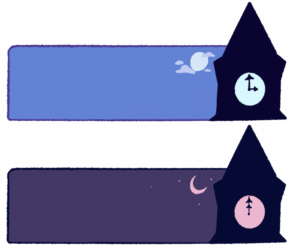
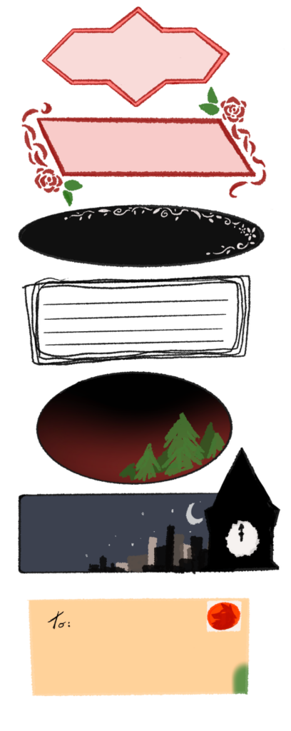
 Finalised text boxes-
these are the final rendered text boxes I finished to be used in our game, the tutors had advised me to change the colours of the text boxes to fit in more with the style of the game so I tired to colour correct the original designs and make them slightly bigger so that their was more room for text-

Animation –
I got working on a death animation for whenever the character gets defeated by an enemy , this is the sketch so far, she falls very dramatically, gets dizzy and then falls to the ground-
 and also a dash animation since the character has a dash movement to help doge enemy attacks.

3d models-
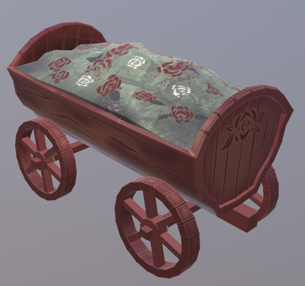
I decided to create some 3d models just to help the 3d team out a bit since there where many assets that needed to be made, I created a flower cart since I thought that type of asset would fit really well into our Victorian town, I created the cart in maya and textured in Procreate, i hand drew the textures directly onto the cart and tried to use our world of Warcraft inspiration to help me, I made the flowers in the kart roses as I thought it fit really nicely with our red theme.While making the cart I got some assistance from class mates who help me figure out how I should make things such as the wheels, they where very helpful in this process.
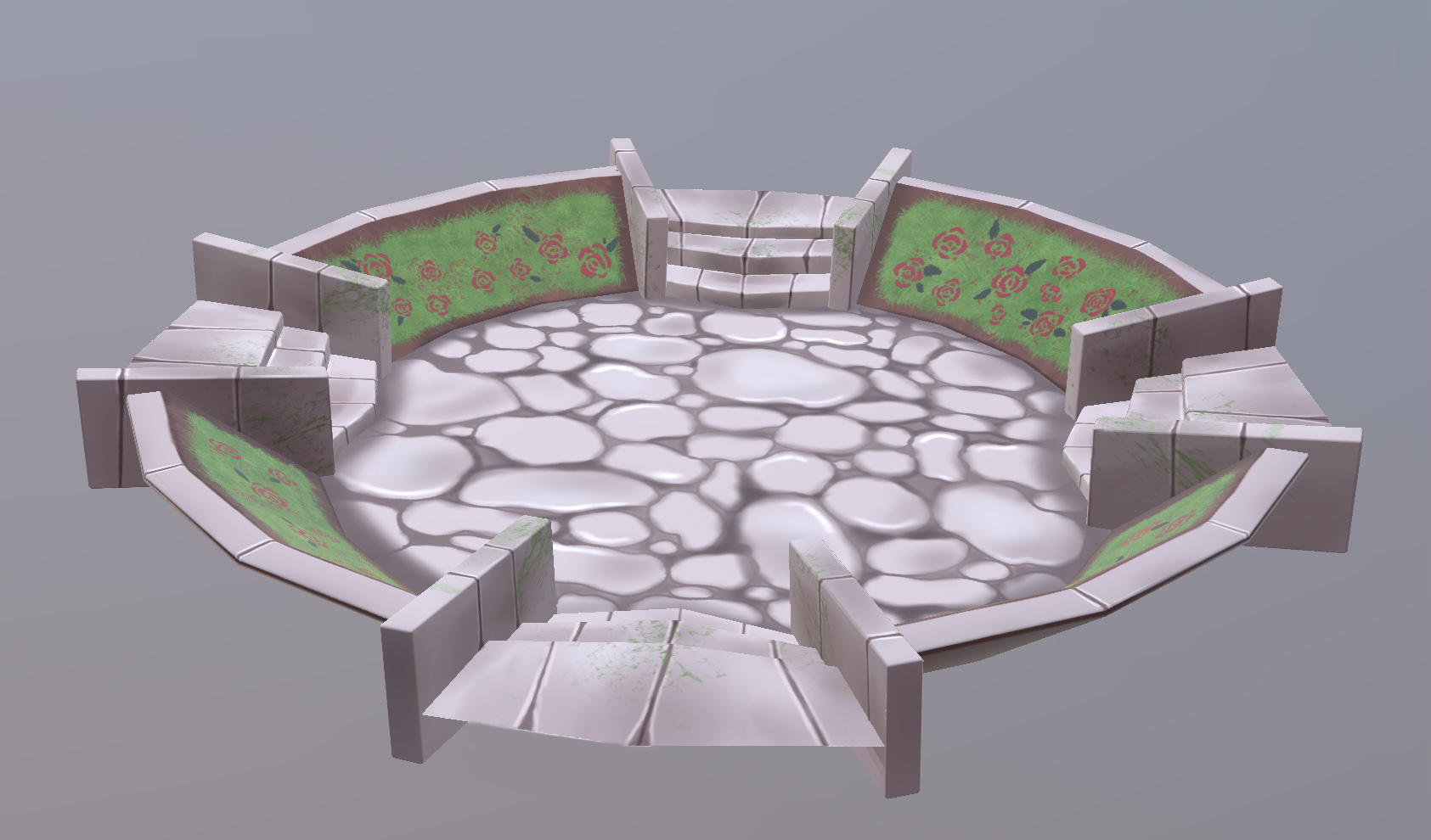
I then created a circular fountain area where the fountain could sit in the centre, i gave it stairs and little flower beds on each side, I created this so the town could have some variation and places were the characters could go up and down, I did the same process of following the ‘world of Warcraft’ texture inspiration and painted it on , getting assistance from class mates again because I wanted this model to be well made since it was going to have to also run in a game and I didn’t want to cause any bugs.Again having red roses around the circle in the flower beds.
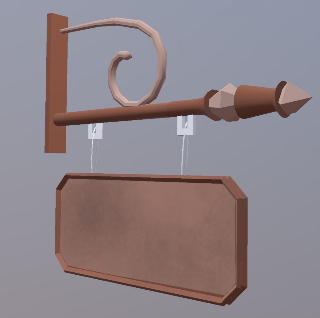
I created a little hanging sign post for a potential shop that could be in the town and some tree concept ideas-
the trees are using a texture I made of leafs, I created a plane and then extruded it slightly so that when I added the leaf texture wit would look like the leafs where rounding off going around the tree. I also did the same thing with the pine tree but it has the leaves pointing upwards.
hand drawn textures
During these weeks I created many hand drawn textures for the project-
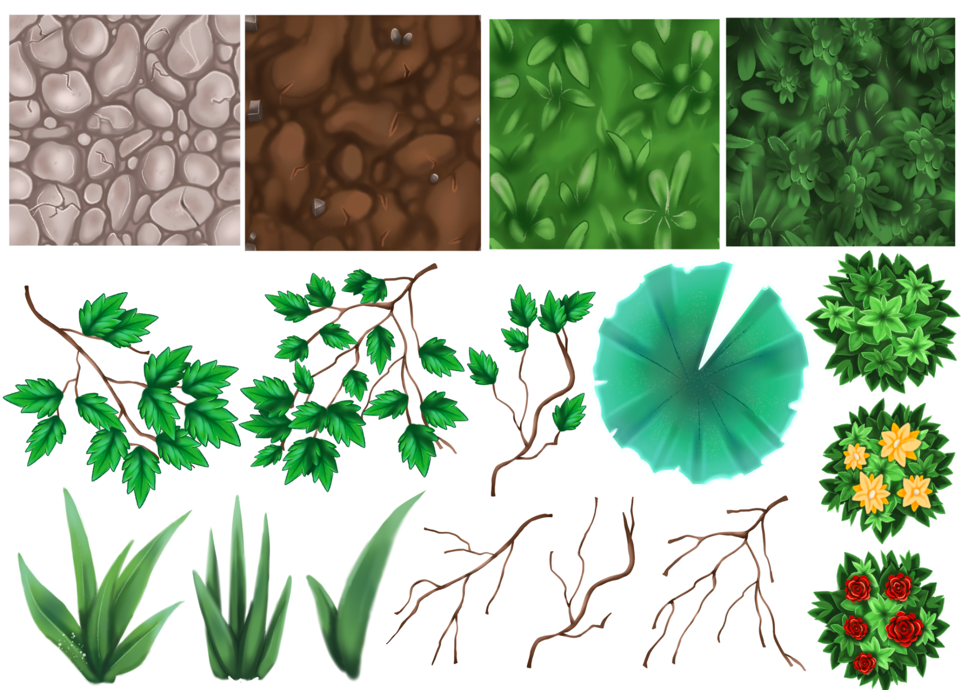
i created cobblestone roads, dirt roads, grass and foliage textures so it would fit in with the style we had originally wanted,also I created different leaf textures and the added on designs like roses and yellow flowers that would fit in with the colour scheme of our game, these where intended to just be 2d planes and not actually models, i then also created stems and different leaf patterns so we could have different types of over growth everywhere, also grass textures to be placed as 2d planes on the ground for different variety’s , and at last a lily pad for our areas with water, the character could potentially jump on these lily pads to get across things.
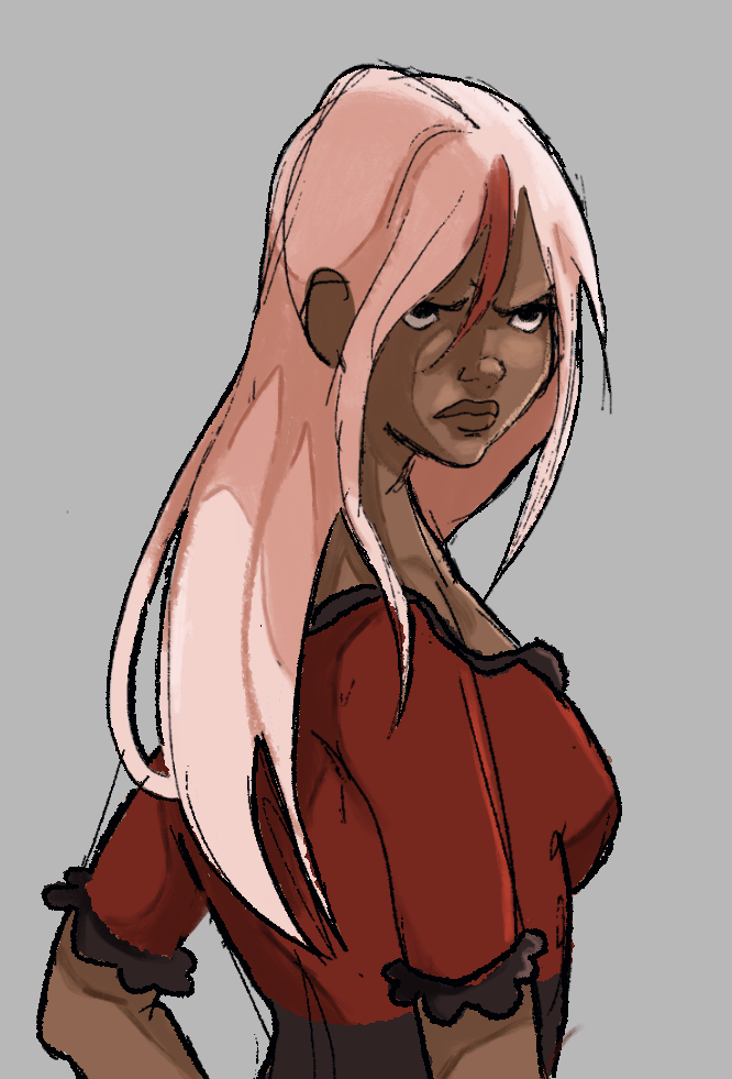
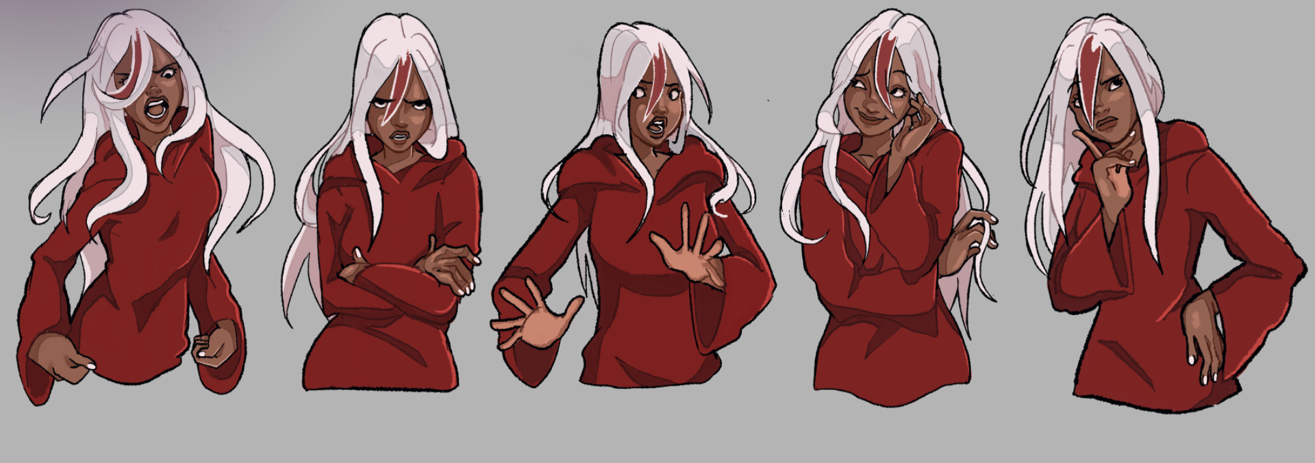
during these weeks I finished my sprites in the style I had previously spoken about,I tried to show off her more serious personality in these sprites but I also tried to add her being ‘happy’ as well as it is an important emotion to show in sprites for a character. Her main emotion would be the second sprite where she just looks very stern. I also gave her another detail of white nails as I thought it just added something to her characters design and it would match her hair.
Animations-

I created a jump animation for the charcter Red so that the player is able to jump, we decided against having a double jump because it would be time consuming but also there wasn’t really any extremely high places in our game that would require the character to have to jump that high.
i also finished off the bow and arrow animation that could potentially be used in the game, the reason the arrow is red and magically appears is because we are thinking of having Red use magic in some sort of way, and it would be better if she could cast magical bows instead of having to collect them.
character design-
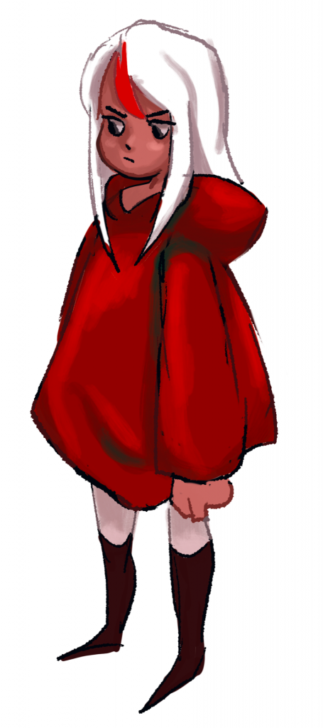
For this week I was working on many different things, for instance I created this full character turn as seen below so that the animators could get a better understanding on what the main character was supposed to look like from every angle, previously ‘Red’ had stripes on her leggings but I took them away because they looked quite awkward and would be a pain to have to animate over and over.she also now has a little red stripe in her hair as some of my team mates thought would be a nice addition to her design.
 i designed this little simplified version of red as an idea for what the animation style could look like (minus the detailed shading) as it was very simple and could make the job much easier.
I also created this illustration as an idea for the style of our sprites, we are going to have sprites to go along with text boxes so that when ‘Red’ speaks she will be emoting at the same time, I thought this style looked nice for it and fit in with the theme of the game itself.
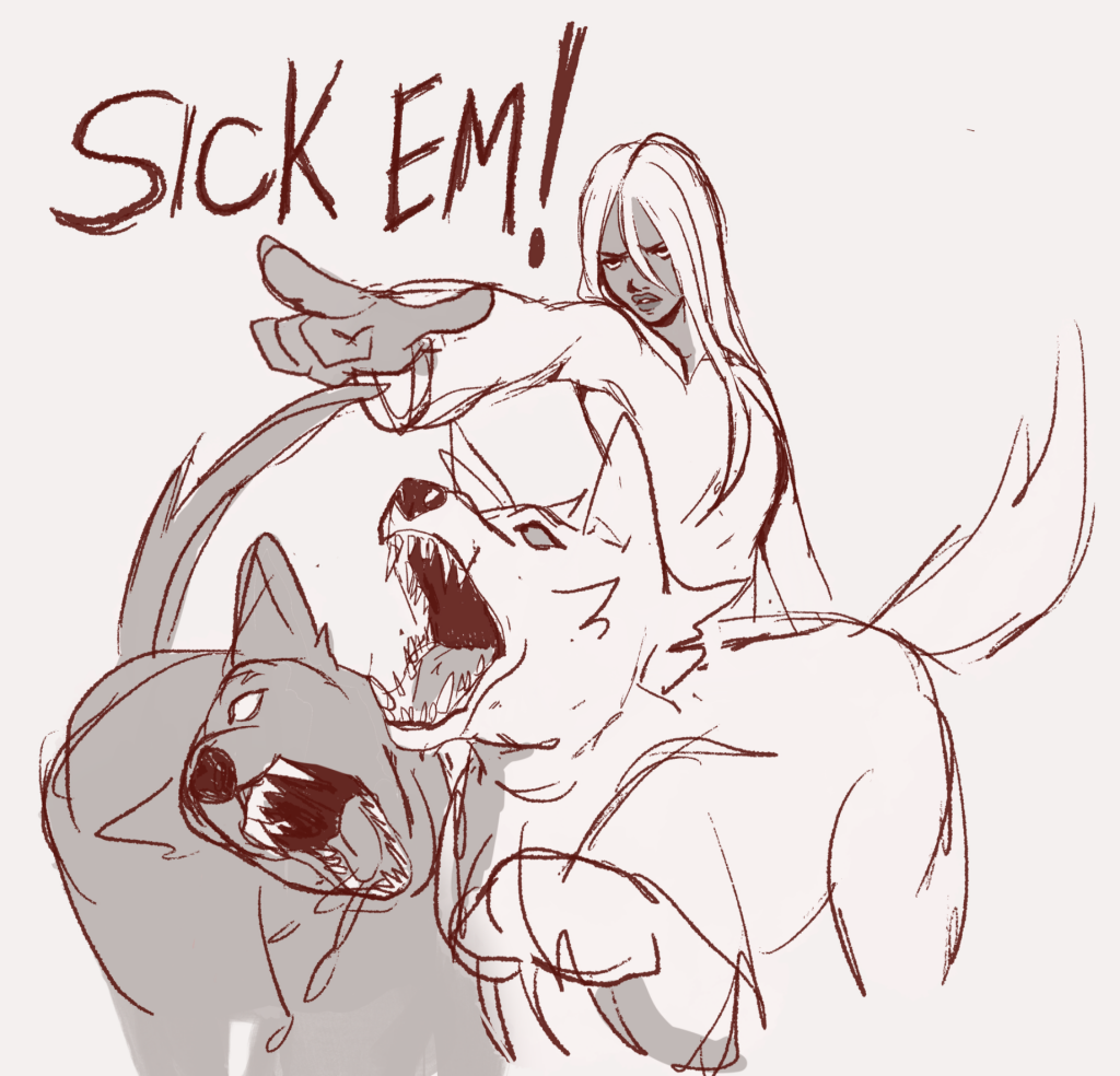
This drawing Iv created is meant to help illustrate a potential attack that could be used in a fight using Red two wolf companions , Yang and Yin, where Red calls them to attack an enemy.
text boxes-
 I also began creating the text boxes to go along with the sprites-I tried to keep them in theme with the game,I asked my team to vote on which text boxes they liked the most for the game and they decided on the second text box that would pop up during the forest area of the game, and then the 6th text box which would appear at the town section of the game.
the idea is that it hopefully comes out something like this-

bow and arrow animation-
I’m also helping with some of the animations that will be in the game so I began working on a bow and arrow animation our team had discussed which could potentially be in the game, I made two different versions and I think I’m going to go with the second option-

 weapons-
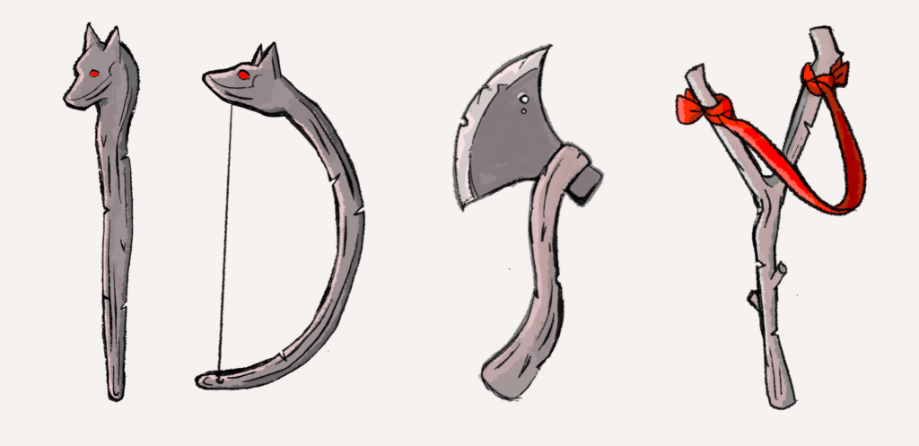 this concept art was created to try and work out exactly what type of weapons our main character was going to use, our original idea was that she was going to use the cane in the first drawing, which would then have the ability to bend and turn into a bow, but then we decided her main weapon would be an axe and she would just switch between the two weapons when unlocked through upgrades, personally I like the idea of the axe more since ‘red’ is a subversion of the original red riding hood and having her be the one to wield the axe instead of the hunter is interesting.
environment concept art-
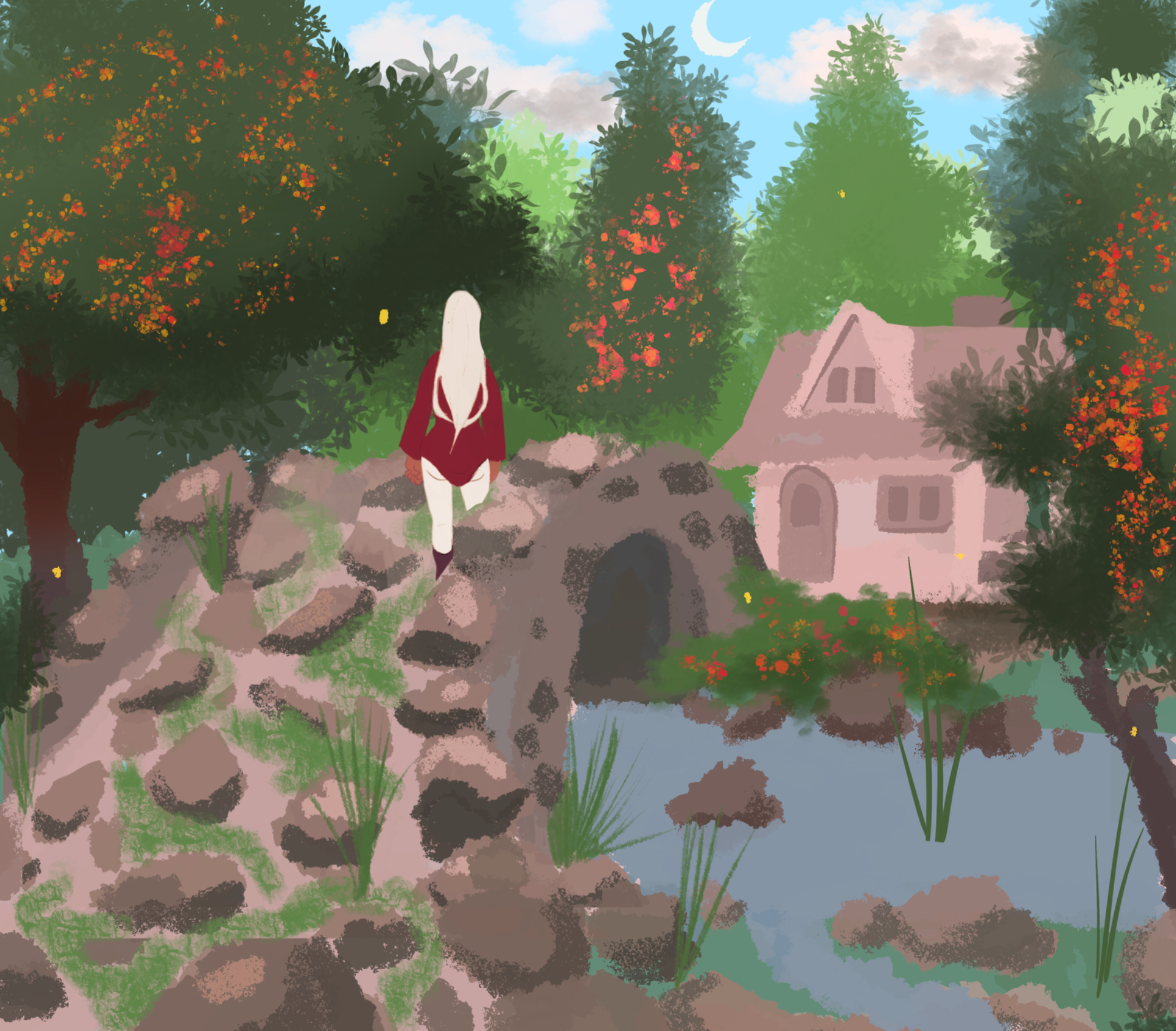
This is just simple concept of what the forest area could potentially look like, I’m trying to illustrate a specific vibe for the game where everything looks very inviting and nice but then when it becomes the ‘night world’ the player is pulled out of that Emersion. The team wanted some sort of bridge and maybe a little log cabin so I tried to put that in the concept, also I’m making a lot of the plant life in my concepts red as I like that it would fit in with the main characters aesthetic but also be a foreshadowing of the night world.
For these weeks I mainly focused on concept art for what the town that our main character -who we now have named ‘red’- will be roaming Around, it is a Victorian style town so I tried my best to make a pleasant and friendly looking town court yard, so that when the inevitable change happens and it becomes the other world it will have a jarring effect.so the town goes from a nice town of blues and greens to an unfriendly hellish red.
I wasn’t sure if this design I made was going to be used or not but just incase I made a little layout map so it would be easier for the 3d modellers to work out and I tried to clearly label everything, I also hoped labelling things would make it clearer what type of assets would be needed for a town like this one.
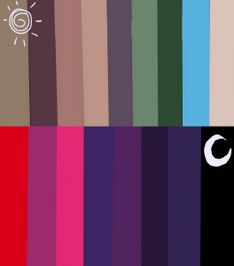
I made a colour palette as well so that when texturing it would be simpler to figure out which colours would probably be best to use.
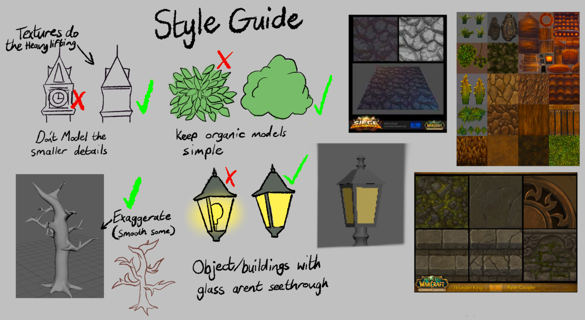

since was lead concept I made a style guide with the help of my team mates to help the 3d modellers have a better understanding on how they should make their models, we decided on a more simple style that would rely more on the textures creating some of the smaller details, our group also decided on a ‘world of Warcraft’ inspired texture style as it is very illustrated and stylised and it would blend well with a 2d character.I also created a little world of Warcraft inspiration board that I hoped would help guide the 3d modellers whilst creating their textures.
I created an animated logo for our groups name ‘Big Teeth’ , the reason it was named big teeth was so that it tied in thematically with the game where we making.
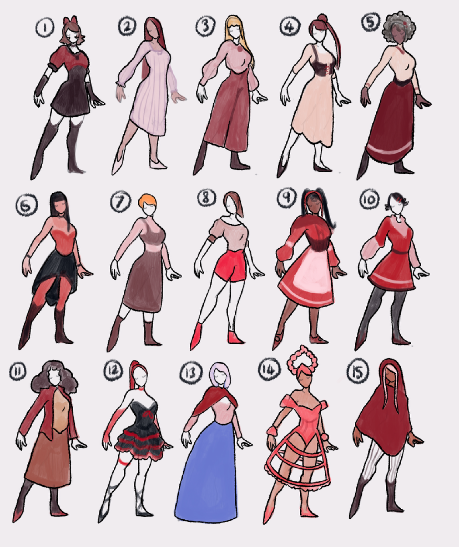
During the first week of this project I was assigned the role of lead concept artist, we had decided that the game was going to have a red riding hood theme where red riding hood has two wolf companions and she has to defeat the monsters she comes across when sucked into ‘the other world’ .It was going to be a 2.5D game and for that we needed a main character which I then started to make concept art for-
I made many different designs with the main theme being red reading hood, and I tried to incorporate red into almost every design, the game is also set in the 18-1900 so I tried to keep her design period appropriate, Also we had an idea to have her change outfits when going into the night world so I designed some outfits for that as well in this concept art .
I asked my group which designs where their favourite and we had a vote, design number 15 won so that was the design I lead with going forward.
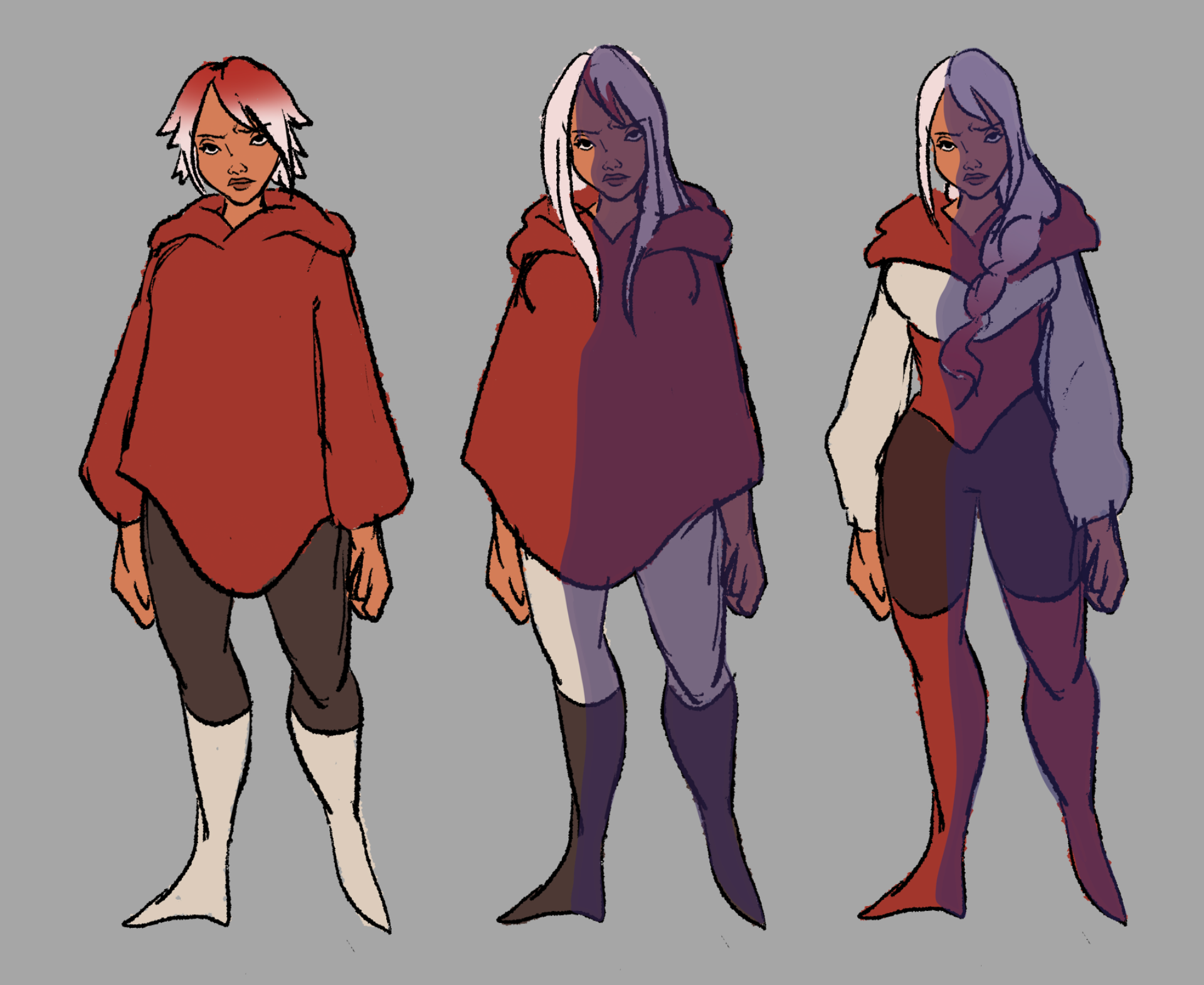
I was trying to decide of a design that would be easier to animate than a poncho so I created this design,I thought of maybe switching around the colours or trying a new hairstyle, our group decided in the end we would keep everything the same except for making the poncho into a hoodie, so now when the character movies her arms with be more visible and it will be less inconvenient to animate if she very pulled out a weapon.
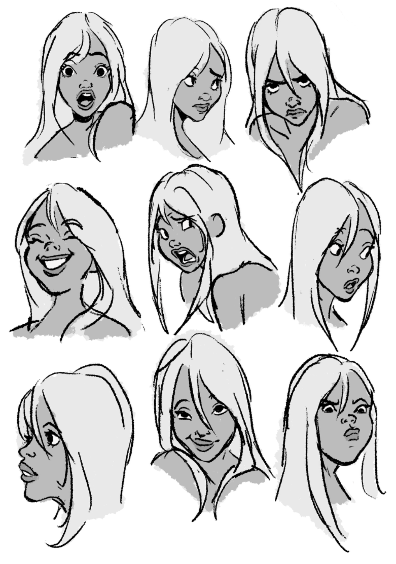
I drew up an expression sheet as I thought it would be good to try and get a better understanding of the characters personality since in this game she was going to speak, we all decided in the end she was going to be more stern and more serious but at times she could be goofy.

I drew up this concept for her outfits in the ‘night world’ (on the left) and in the normal world , we ultimately decided not to have her change outfits at all as we realised we would have to animate her again but in an entirely new outfit which would be extremely time consuming.