Business Card Designs
When it came to the research of business cards I looked into some helpful YouTube videos which gave me good tips on how to make an eye catching and clear business card.I then looked into other people’s business card designs that I liked and tried to base some of my business cards off the same kind of look.I liked the business cards that had either very nice illustrations on the front of the card or very simple business cards with a character or just the sketch of a character.It is hard to choose between wanting a detailed business card with a big illustration or just something very simple because I think both just work so well.


When it came to business cards I wanted to promote myself as more of a 2d animator/concept artist , since I would say those are the two things I specialise in the most . I started out with putting some of my work from my major project animation onto a business card , I thought maybe having business cards that related to my major project would be a good idea, I also played around with just using illustrations I have made which I thought encapsulated what I’m all about ,and then I played around with just illustrating myself and putting it on a business card, I’d like to design maybe a few more before making a final decision , a few more based on a tarot card layout is what I’m leaning towards. If I where to pick out of these designs I would probably choose the second design since I like the idea Of an illustration filling up the entire front of the card , or the last design since it’s so simple and easy to look at. I plan to make a business email to put on my business card and also I will put my art station account on the card. The business cards are not completed yet so the text is very rough but I like the idea of it being in the Center of the card, I know that text is a very important thing to think about and to make sure that whatever don’t I’m using isn’t copyrighted.Also I need to wether it go for the regular rectangular business card or a more square alternative, it will depend on the design I end up using.
Inspiration Animator And Designer
meppity-
I looked into the animator “meppity’s” portfolio website for inspiration on how I could promote myself and also layout my work, on her website she also lays out all of her contact information like her social media’s and email addresses and has a section on her website where you can give you’re email and add a message .


I feel as though meppity’s method of promotion and layout would be beneficial for me, I like that she does a bit of everything but mostly focuses on design and animation which is what I’m leaning more towards.Another thing is meppity has promoted herself in a very personal way that still looks professional and clean , I would like to recreate something similar to that kind of vibe. They also have a very short and easy to remember email address.when it comes to promoting her animations she posts them on YouTube and will post about the upload on her Instagram with reels to give little teasers.
At the moment I only promote my work on art station since the website is laid out in a very professional way and has been specifically made for artists, if I where to branch out and promote my major project more I would probably make an art instagram since I use that social media a lot and I know a lot of artist use Instagram since it’s a good way to show off you work in a neat and aesthetically pleasing way, Instagram would also be easier to find other people on I think , art station feels very isolating.
Michelle Lam-
Another artist who I think is good at promoting herself and I’d like to take inspiration form is Michelle Lam, she makes sure her resume is on her website and also her link to her portfolio is on her resume, also links to all of her social media. Michelle’s website is more focused on story boarding and animation rather than the design aspect of things.I research birth of these artists because although I think I’m more design and animation focused I do still enjoy the story boarding part if things so if I ever switched up my focus I would like to know how to promote and market myself either way.
New CV Design Idea
![]()
I did some design research for how I wanted my new CV to look , I really liked the designs which had illustrations and pictures to go along with them, also I enjoy when the CV has more colourful aspects in its design since it makes it stand out more.I definitely think in some of these designs the colours could potentially strain the eyes and the text can be too small so I will be trying to avoid those mistakes.
Old Design
![]()
New Design

I decided to try redesigning my cv, I wanted to try and give it a more open feeling lay out , in my older version I feel as though it looks very cramped and I really started to dislike the colours I had used , it feels tacky now . I also decided to try and make it look more eye catching and interesting, I feel as though with my newer designs colours the text may be harder to read , if I where to finalise this design I would probably change the colours around a bit so it would be easier to read. This newer cv I think is more reflective of me and is likely to match with my business card ideas to make a cohesive look, however this is a very ‘playful’ design, i may look into making a more professional companion cv and just pick one depending on where I’m applying.
Poster Design Ideas

When it came to looking at poster designs to inspire me in creating posters for my project, I found myself looking at more horror based posters or psychological film posters.I would say the overall feeling I’m trying to convey in my major project is a more serious one , however because of certain characters it does have more of a quirky vibe, I like the idea of having a poster inspired by ‘table for two’ having only red and black bring the colours and the characters being a silhouette feels very fitting for the type of animation I’m trying to make, I want the two main characters to come across mysterious with unclear motives so who ever is looking at the poster or watching the animation will want to know more.I also watched some videos and read tips online for how to make a good looking poster.
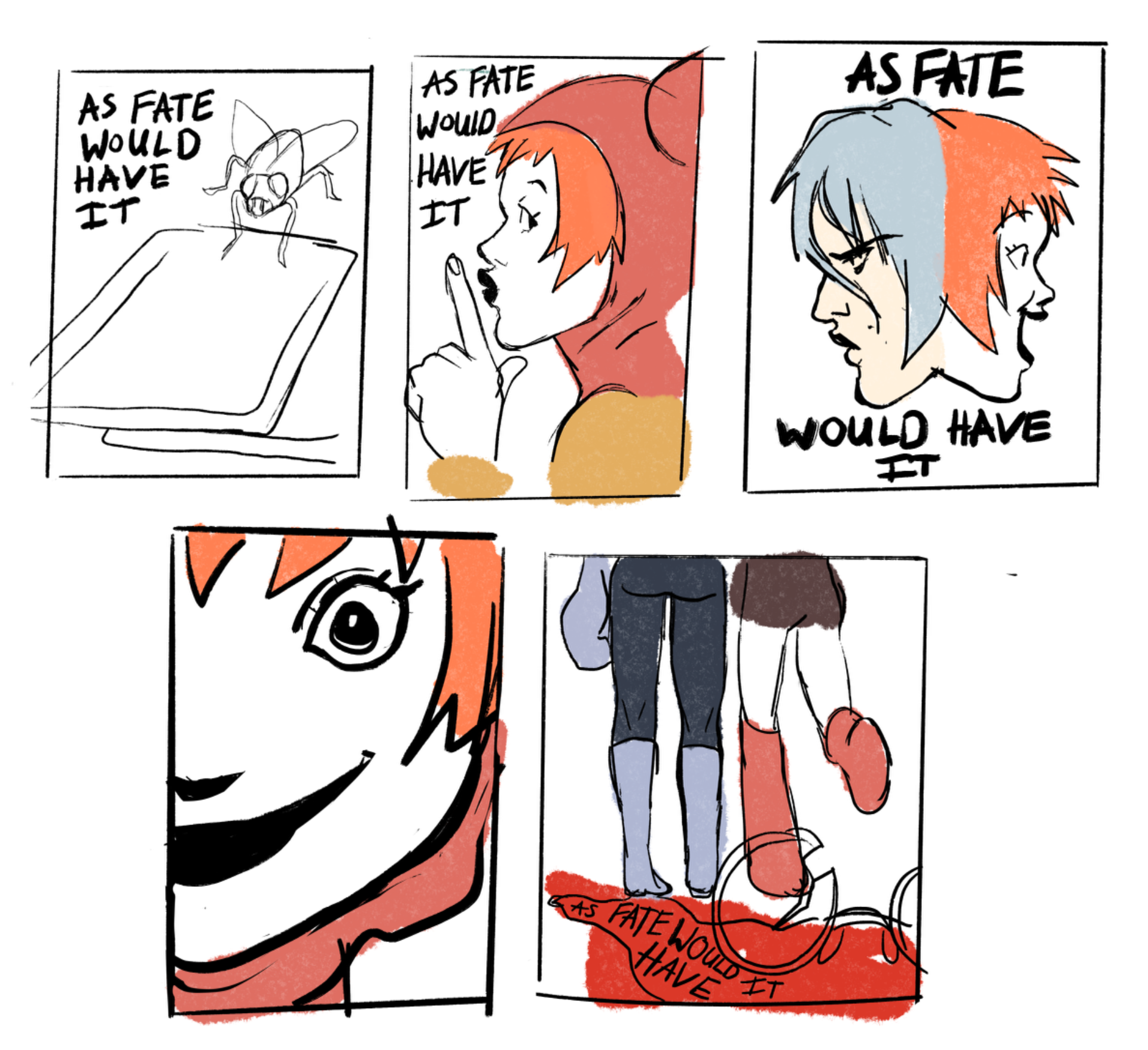
![]()
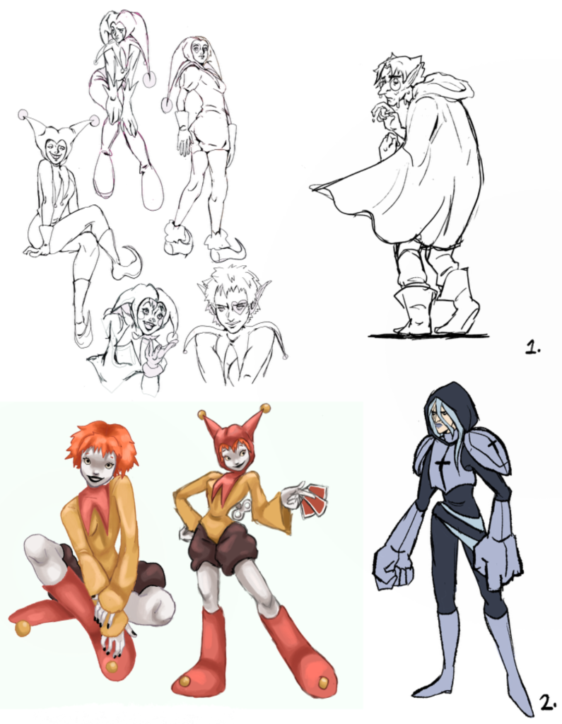
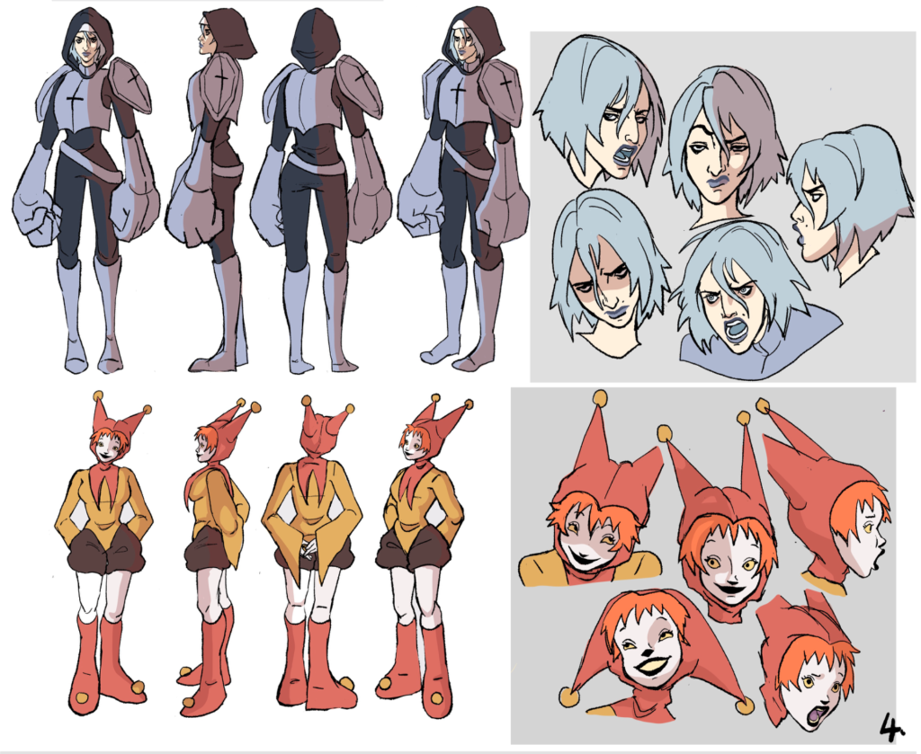
Whenever it came to deciding on poster designs I got feed back from multiple tutors on my thumbnail sketches , on one hand the up close fly on the card poster idea would be better at conveying the vibe of the animation subtly without giving the entire plot of the animation away , but the thumbnail of one of the main characters holding the cards or shushing the audience is more flashy and eye catching and probably makes the plot of the animation more obvious. At the moment I am personally leaning towards the second poster idea, the third poster idea and the very last poster idea , if I where to render them out I would give them very dramatic lighting to cement the vibe of the project. Iv been using my jester girl a lot in these posters since in the plot of the animation she is a huge driving force of why the characters are even in their situation in the first place, also because she has the most eye catching design.
Design Deck Page Ideas
For my design deck I wanted to incorporate a lot of the design work Iv done for the project, A lot of it is charcter based design since I tend to focus on that the most.When I purchase art books I love to see artists sketches and process so I wanted to put in what I thought other artists would enjoy to see. I want to incorporate more background work so I hope to insert more finished and polished backgrounds when I finish them. I may even incorporate some of my story boarding process. Also I would like to do a page where I collage the colours of each scene to make a colour concepts page.


Eoys Layout Idea
For the presentation of my major project during the end of year show , I’m thinking of having a mystical medieval vibe , I have many crystals , a cauldron and a crystal ball I’m thinking of decorating the space with , since the theme of my major project is based around magic and tarot inspired looking cards and the idea of fate , I feel like a crystal ball for decoration would be appropriate , I also want to print out my designs for the cards that are seen in my major project and have them spread out on the table , if I have time I may draw designs in the back of each card to make it more interact-able and interesting.The screen showing the actual animation would be behind the Crystal ball and cards .I also have a porcelain jester baby doll which would go perfectly to give it a creepy vibe but also hint at what the projects overall vibe is. I am collecting images of tarot card layouts to inspire how I can pay everything out.I also was speaking to some of the tutors about maybe painting the boards, I’m not sure what colour I want to go for yet but definitely something with mystical/tavern vibe.

Conclusion
the next step is that I need to start finalising all of my designs,I plan to ask for more feedback on some of my designs before making my final decision on which ones to use, At the moment I like the ideas for the poster designs Iv came up with so far , however I would like to design more business card designs as I’m unhappy with how some of them look so far, I still don’t know what text I’m going to use for my business card yet, but for my posters I might use my own hand writing , using my own hand writing would be to make the title look more sloppy, scratchy and hastily written to fit in with the aesthetic of the animation. I might make a mock up of what the layout of the eoys could be using the objects I have. I need to print out tests of the cards and the design deck as well just to see how they will look physically in real life and to check if the layout is good .Before I can actually add the text onto the business cards I’ll first have to create a new email made specifically for my Animation branding , then making more social media accounts to go along with that email address.I think I would like to make an actual website as well.