


Fairy Strange is about Naomi Sato, a Japanese American 18-year-old girl who struggles to make and keep friends due to her bad attitude. One day a shooting star falls from the sky towards the ocean and Naomi runs to the scene only to find that it wasn’t a star, but a magical fairy called Star Berry. Star Berry tells Naomi that she is the chosen one and takes her to a magical fantasy world called Twilania, where she defeats evil and at the same time learns about the value of relationships, friendship and how to be a better person.
my inspirations for creating the project where shows like card captor Sakura , sailor moon and Tokyo Mew mew. These shows are focused around magical girls and friendships which are stories I personally really enjoy . My target audience would be 10-18 year olds as it has elements that can be enjoyed by those ages. I was going for an art style reminiscent of the more western anime art styles such as avatar the last air bender and totally spies. I felt as though this art style really fit the story as it is light hearted but also can have its more serious moments.

Bible production-
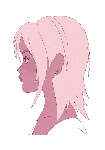
I had a few early design exploration for Naomi the main charcter which were mostly me trying to figure out the art style. I was going for art-styles which were either a little too detailed or too simplistic for my liking . But I eventually landed on an art style tat I felt met both of those needs and I also knew that I would be able to anime it. I felt as though the main character having pink hair was essential as a stereotype on magical girl anime is that the main character is usually the pink colour coded character.
For the final designs I drew Naomi and Star in their simple casual outfits , Naomi lives near a seaside town where it’s usually sunny and I wanted their outfits to reflect that. Then there is the magical girl outfit . I made it so The magical girl reflected what classes they were , so Naomi is a wizard , Star a Druid and Pipa is a type of Imp. In magical girl fashion they needed to be really girly and over the top . This is one of the things that makes magical girl shows so appealing so these outfits were going to be important as turning into something so absurdly feminine to become more powerful has a very important meaning for many young girls and women.
Naomi and Star-

about Naomi-
Naomi Sato is an eighteen-year-old Japanese American girl who lives with her single mother. Naomi is a loner who prefers her own company and doesn’t care about other people (or at least that’s what she would have you think). Having no friends and a very strained relationship with her mother Naomi dreams of escaping her reality. When a shooting star crash lands on earth this dream may come true sooner than she expected. It would be hinted that throughout the show Naomi’s attitude is mostly due to her mother having a poor relationship with her and her father passing away. I wanted the show to show a complicated relationship with a caregiver for children who maybe struggle with that type of issue, and to show how having friends and other people close to you can be important for healing and coping.
about Star-
Star Berry is a magical fairy who has been sent by her home world on a mission across the galaxy to find the chosen one on earth. Star herself is very fun loving and free spirited, during her mission she also intends to attempt to live as a human on earth to learn as much about human culture as she can. Star loves that Naomi is complicated and enjoys being able to help her be better as it it is her nature.
Pipa-
Sophie-

Pipa and Sophie are two of Naomi’s classmates who Naomi secretly wants to get closer too but due to her own issues she feels as though she cannot. Pipa is her rival as sometimes their personalities can clash and Sophie is so shy Naomi finds it hard to approach her.
One of the next steps I took was creating the poster for the show, I looked at a lot of magical girl show posters and a lot of them are the main character the focus of the poster and had them looking very pretty and posed so I wanted to do the same.I really wanted some references to dnd in the poster since that’s a big inspiration for the fantasy world she travels too. Naomi’s wizard abilities are very Moon and Star themed for aesthetic purposes to call back to her relationship with star and how she stares at the moon every night from her window. (Also a reference to sailor moon)
Rough –

rendered-

The next step was the background. I was aiming to finish two backgrounds, one of the beach beside Naomi’s house and the inside of Naomi’s room . I chose these places because I feel as though those backgrounds would be seen a lot in the show . I looked at many backgrounds from animated shows but one of my inspirations was Steven universe . The backgrounds are simple and have really nice colours but I could also see them in a magical girl show because of the vibe they give off. I also looked at the backgrounds in totally spies to be my inspiration.I wanted Naomi’s room to very feminine and reflect how Ben though she’s so hard on the outside the inside of her room shows how she likes the softer girly things.Meanwhile the beach background shows the shooting star that falls from the sky.
rough-


rendered-
I then wanted to work on some assets for the pitch bible , I drew decorative Stars and d20 page numbers to add to the aesthetic I wanted the pitch bible to showcase, I was going for something cute and magical. I also drew some images to depict the relationships between the characters to get a better understanding of their dynamics. Some pages are done like a note book as of the characters where either writing about themselves for someone else or even drawing someone else through their own eyes.
Iv thought through Naomi and Stars dynamic and it’s your typical night vs day friendship where one is the sunny bubbly one and the other is cynical and sardonic. However their opposites attract and while Stars personality opens Naomi up , Naomi’s personality helps keep Star grounded.
I made a contents page so that the reader knows what pages to look at onto find specific content and I also tried to make a realistic time chart of how long production if this project would take without using any specific dates, the thing that would probably take the longest amount of time is the actual animation process since my idea for the show is that it is 2d hand drawn animation.


the episodes themselves are going through the story of Naomi in the beginning has a bad day at school and comes home to see a shooting star outside her window. When she goes to the beach to find it she discovers a girl in the sand and this girl is Star Berry, she at star go to the magical Realm of Twiliania and Naomi is told she is the chosen one. Then she fights baddies who often represent real people in her life like Pipa or her own mother. When she learns a lesson from each battle she can go home to earth and is able to use this lesson to make a friend.I had the last episode end of a cliff hanger potentially hinting at a season 2.I also wanted the ending to not show her making up with her mother as that is another potentially realistic way that those kind of issues can happen for children in real life, so it is left unresolved.
In conclusion I really enjoyed working on this project , I felt a little overwhelmed since there were two other projects to be handed in around the same time but I managed. I feel like Iv really learned about what goes into a pitch Bible and being able to do my own idea was very enjoyable.


Animatic-
My additions-
animations-
Final video edited together by Shannon-
Now that the designs for the characters where complete we could movie on to creating more detailed story boards with the characters designs implemented and also move onto the animation process.
When it came to the story board Barney was the one who did a lot of the work and Shannon added in the Audio and sound , we got some feed back that the story board during the scenes that involved Poppy spiralling into misinformation online was a bit slow so I edited the the storyboard slightly to include some scenes and some copyright free intense music to try and amp up the vibe of the story board and show the tension. I included Rose doing a product placement instead of her just proclaiming that water was poisonous , I think this was another suggestion by a Tudor which worked well and added more context to her video . I then I added in some dramatic phone scrolling and a press conference with “Donald Turnip” which we thought would add to the comedy of the animation, also some picket signs on the news about water being poisoned. Finally, I included a scene of Poppy have a melt down and hyperventilating then a few hours later they dry up due to not drinking water. Me and Barney did the voices in the short so sometimes poppy’s voice changes from his to mine…..
picket signs-
Donald Turnip-
Phone scrolling-
Hyperventilating-
dried up-

animatic before-
animatic after alterations-
A shot list was created by Barney and Shannon so we could all keep track of which shots we would all be taking on, I decided to take on the shots of –
-rose saying water is bad
-Poppy hyperventilating
-Poppy knocking the water off the table
-water bottle getting crushed
Since I was unable to get a rig done for Poppy I instead opted to make assets that could be copy pasted to make animation easier, I drew poppy’s head from many different angles that their head might move around and I also took poppy’s turn around and took apart this limps in order to make it so he could just be used as a sort of puppet.

When it came to animating rose, I took reference videos of myself and looked at gumballs animation style for inspiration, I wanted her to movie in a Really exaggerated over the top way. Iv been trying to work on keeping a more consistent character through my animation without any wiggling lines and iv learned that copy pasting many of the shapes instead of redrawing them into the next frame really came in handy for achieving this look. I had it so she cried at the end of her exclamation to play up how dramatic she was. At the end she takes on more of an exaggerated anime look as she robotically tells the audience to drink diet kelp instead which is an in world fizzy drink. This is to imply that she is telling the audience to not drink water for the sake of this product placement instead.Rendering was simple enough and it just involved cleaning up the lines and copy pasting some shapes.
Rough animation-
Finished animation-
I used poppy’s body that I took apart into pieces to create the hyperventilating animation, since they where just sitting down there wasn’t need for much head movement or body movement, I made it so that the head and the chest would rise and fall at the same time and I gave Poppy an expression of breathing in and out very intensely, since I was just using pieces of the body there wasn’t much rendering that needed done since the character was already coloured and lined.
For Poppy knocking the water bottle off the table I was able to copy and paste poppy’s head since it turned to the right during the swing of the arm, I tried to exaggerate the swing so that it came across very powerful and over the top. Since Iv copy pasted the head there was no need to to render that part so it was just a case of lining and colouring the body.I tried to give Poppy a silly expression trying once again to use that gumball inspiration. I also drew a cup asset to be hit across the table and fly off the screen. Courtney drew some very nice backgrounds and for the final part I just added in the backgrounds she created.
rough animation-
Finished animation-
Assets-


Final animation that Shannon edited together-
In conclusion I feel as though I learned a lot by doing this project and getting to experience the pipeline of the animation process was very helpful in my understanding. I really enjoyed working with my group and I feel like we worked well together. I wish we could of finished the animation for the deadline but I think considering everything we did well in the amount of work we created.
We where put into a group of 4 and started brain storming ideas that where relevant to the two topics of “don’t judge a book by its cover” and “internet safety”. I came up with an idea to combine internet safety with false information where a child is on the internet and finds a video of an influencer claiming that water is poisonous, this makes them spiral and the video causes tons of false information to be spread online, eventually their friend tells them to use a trustworthy search engine and they find out it isn’t true .As a group we decided to go with that idea.We called our group “3 and a half girls”
We used the white boards in the room to brain storm all of our different ideas and keep track of who was doing what. We also used the white board to do a rough of what the story boards looked like , doing this in person made it easier for us all to contribute our ideas for the story board, in the story board we see an establishing shot of Poppy sitting at a desk scrolling in their phone and then then seeing the influencer online saying that water is poisonous, then we get the montage sequence of things escalating and Poppy dries up. In the end we get the nerd coming into the room and telling Poppy to search it up online and it comes back that the information is false.The idea to have all the characters be humanoid plant people was Shannon’s idea.

Rough story board-

While doing our planning we also kept in mind the professional pipelines we where going to be following so starting with the ideas stage and pre production with the storyboard/ animatic and concept art. We had many inspirations for our project, and it was mostly all inspired by shows seen on Cartoon Network, especially shows like the ‘amazing world of gumball’ and ‘Steven universe’.
Inspo videos-
Script created by Barney –
![]()
Poppy first design –
rose and the nerd first designs-
I was in charge of designing the characters and I thought it would be interesting if as a group we all made some designs of the characters and then afterwords I would take all the working elements and mesh them together. We had at least 4 main characters that needed to be designed, Poppy who is the cowardly main character who is susceptible to false information online, the “ nerd” who is the more reasonable friend who enters at the very end to help Poppy, the “yes man” one of Poppys friends on a face call who encourages Poppys freak out, and finally the influencer who is very over dramatic but fashionable.
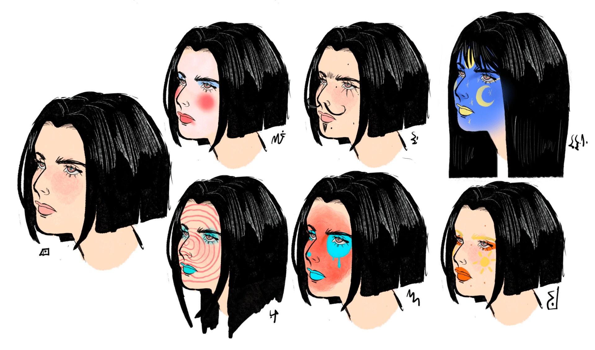
For Poppy I decided to stick with my original design since I thought it wasn’t too complicated, they are based of the pansy plant due to their cowardly nature and his colours are yellow and blue, I wanted them to really stand out, so they have a very different head from the other characters. They also don’t wear clothes because I didn’t want their design to be to cluttered and I felt as thought they stood out just fine without needing unique accessories, I was thinking of the logic used in shows like “gumball” where many of the characters are very different from each other and some characters wear clothes while others don’t.I felt as though their design gave them more of a main character look.
For the Nerd I combined my design idea with Courtney’s design idea, in Courtney’s design the character has a very cute and unique hairstyle which really fit the characters vibe so I combined our two designs together, I gave her a bow tie and glasses since I thought it fit into that nerdy vibe but then she’s wearing overalls dress to give her a more casual look. This character will be a rigged character by Courtney.
nerd mixed with Courtney’s design –

The Yes man is a very playful type of character and in one of Barney’s designs he drew a character with a flowerpot for clothes, this was very cute, so it was implemented into the yes man’s design, he has a sunflower head as being a sunflower adds to this sunny bubbly personality he has. Once again, this character is very different from the other characters due to his shapes in his design.
Mixed with Barney and Courtney’s design-

For Roses design we were conflicted between mine and Courtney’s design, I made two variations using elements from Courtney’s design which I really liked both but ultimately went with the original as a rose fit more into this fashionable persona for the influencer, she’s very “ Gen Z” influencer inspired so she wears a crop top and bell bottom jeans, she’s very differently proportioned from the other characters due to her being a fully grown adult.I also gave her heavier makeup in this newer design because I liked Shannon’s makeup look in her design.
my design and Courtney’s version design –

Line up-
The next step was creating turn around for Poppy and “nerd” since they are the only characters that move their entire bodies, both of the characters were supposed to be rigged but unfortunately Poppy wasn’t, and we decided to just go with hand drawn animation for Poppy like the rest of the characters. When creating the turn around I tried my best to make sure everything was lined up together to keep the characters consistent throughout so that the rigging and animating process would be simpler. I also created an expression sheet for Poppy since he is one of the characters that has the most expressions, the expression sheet was inspired by gumball with its very wacky over the top expressions.
first draft-
Turn arounds-
Expression sheet-
Video test turn around-
designs


animations
final animations with sound-
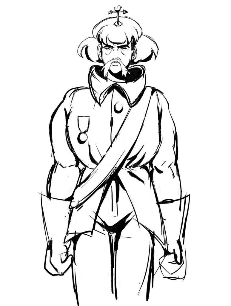
for the final animation I made a few little animatics to try and get an idea of how I wanted the gun animation to look , i designed a character who would load the bullets in his arm and then shoot , I wanted him to look silly and over the top since I feel as though that’s how a lot of the characters in the book appear , he appears as some sort of soldier . I wanted the camera for this animation to be interesting and for the animation to show the mechanisms of how loading the bullets work
With a character design of a soldier I created with the world of the codex in mind I started animating the gun hand. I thought it would be interesting if the little arrow on his head blew in the direction he was supposed to shoot working as an alert and aiming system. I had him load in his bullets into his arm and then caulk his arm like a shot gun. I gave him a very ridiculous over the top hairstyle since since in the book it has a way of making characters that are supposed to be serious or even mysterious look ridiculous .
I’m happy with the way this animation turned however if I want to add it to my portfolio I’ll definitely zoom in and go into my detail of him loading in the bullets, also looking back I think I should add in a bang animation or perhaps even smoke coming from the hand so you can defiantly tell it has shot the gun .i also would have like to render this animation and give it some clean lines but sadly I didn’t have enough time. I had fun doing the secondary animation for his hair as it was very poofy and floaty. When he realised that his arrow has turned to the left he has a reaction and in turn his hair floats up , I did this because I was inspired by ghibli and how when a character is angry or surprised not only does their body tense up but so does their hair .
Final animations with sound –
for the next section of my assignment I moved on from animation to design. I was trying to be experimental so I ended up creating my own ideas for how I think the society inside the book would function, I didn’t wanna go too exaggerated since I still wanted the ideas to be easily understandable but I still tried to keep it weird and random since since looking through the book the rules in which the world works are very loose and unclear.
I designed a character that would act as the model for this part of the assignment, I gave them a Bob haircut as I feel like if a model did exist in this world they would definitely enjoy have that strange haircut. wanted to showcase the model in different looks , in a part of the book they show one of the people wearing makeup so I decided to design some ideas for everyday makeup looks that they might wear in their strange society , the makeup is very over the top and sometimes makes no sense why they would even wear this since it isn’t necessarily very appealing, but I think it shows how their world is different from ours and how culturally what they find appealing differs from us. (I added in the fake language to try and imitate the books fake language).
makeup –
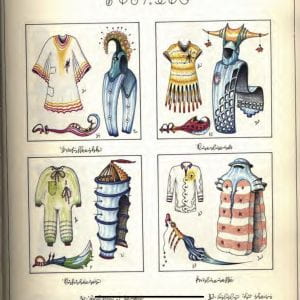
I wanted to design some outfits , in the book it appears to showcase outfits with a wearable item for the body, hat and then what appears to be a weapon maybe even a statement piece at the bottom. I tried to make the outfits look surreal and impractical since a lot of the outfits in the book are this way , they don’t seem fit for any occasion and in fact seem impossible to move or walk in some cases .I’d say the first two outfits Iv drawn in the image below are more accurate portrayals of the fashion you would see in the book, however the other two outfits I drew where to replicate the comedy that the book portrays with its random nonsensical society.something else I noticed is that the outfits in the book have a lot of tony details and many colours however sorting I noticed a lot of was stripes so in a lot of my designs there are stripes and ramdpm
little details so I could try and make it look more like the outfits seen in the book.( I also tried to my it look like they where actually on the physical book)
I drew my model in a few of the outfits . The green onesie outfit is one seen in the book and the other outfits I made up .I wanted them to pose on different strange ways because I felt as though in this universe , if models even exist they would definitely do things in uncouth ways unlike models in out society . I feel like this way it fits the fashion better.
overall I’m happy with the way this assignment went and I had fun exploring the possibilities of the world that these people and creatures live in. My favourite part of the assignment was the design aspects since it gave me a lot of freedom to just draw whatever I wanted and make up my own theories . The creature design I’m happiest with would have to be the rooster chick , I really enjoyed coming up with a weird and unique way for it to move and really being able to exaggerate the art style and try something new since I feel as though the other animations where far less exaggerated . I would like to have things more fully rendered even after the hand in so I can add it to my portfolio.
When it came to this project I started out being slightly lost on what exactly to do , but I decided to focus on the things I would like to specialise in like animation and design . I looked through the codex book during class and decided I would like to give animating the bird looking creatures a try and also the bullets loading into the arm . I also decided to design a few fashion designs based on the logic of the books universe
references from the book-


I made two very simple looping animationsin preparation for a presentation we had to do showcasing some ideas we had , I had a few art styles in mind and I wanted to experiment with textures and the way the animations moved in general , I wanted to try the melting egg I saw in one of the pages of the codex however I couldn’t think of any creative ways to make it move and ended up just being the melting egg as seen in the book but animated and I didn’t like this since it wasn’t animated in a unique way so I decided to move on to another idea .
rough egg animation –
During a lecture we were shown an artist named h_tabasi who animated very unique animations that showcased animals who moved in strange exaggerated ways , this inspired me so I chose two of the birds from the book and began animating . I wanted it to be surreal and funny since the tutors were pushing the idea that maybe the creatures don’t move in the way normal creatures would . I made it so that the rooster chick creature wouldn’t move with it’s legs but would instead move with it’s wattle, the wattle is very elastic and also sticky , it sticks to the floor and pulls the body forward making the creature backflip and then it’s back to square one to move forward again .
In this animation Iv drawn up the bird backflips and then lands on its back and that causes it to bounce back up into a standing position , i was given another idea on perhaps making the bird do a roll instead of a bounce once it hit the ground and after testing it out I decided to go with the bounce instead. When it came to rendering I wanted to experimentand go for a fluffy ,wiggly line less colouring style . Once finished I can say I am happy with the way this animation has turned out .
For the other animation of a bird creature I went with this fluffy feathered one with three heads , I brainstormed and thought of the idea of it moving like a jellyfish because of the shape of its body ,for this animation I wanted it to appear more like a textbook example of how this creature would move in the codex world so it isn’t very exaggerated and more just surreal , I looked at a lot of jelly fish references . In my version of the bird I think In the context of the world it’s actually a sea creature rather than a land creature to add to its surreal nature.
During the animating process I was struggling when it came to the three heads , I wasn’t exactly sure how they would move.In my quick test Animation I had the heads rag doll around as if they weren’t heads at all but useless appendages, I was given the critique that it just didn’t work and that it would be better if the heads had some form of direction and I agree with this note. I made them go in a side to side potion as of the creature is trying to waft it’s way through the water , the creature also had to legs but I decoded they wouldn’t move and would just dangle , perhaps the creature uses it’s legs like appendages to graze the ocean floor looking for prey .
Rough animation-
When I rendered this I was inspired by shows like chowder , chowder has this texture art style where when a character moves their colours are like a wall paper that moves by as the character moves , I really like this so I tried doing the same for the creature and crested a texture for its colours so that when it moves the texture is just a wallpaper in the background.

texture I created-
 finished animation-
I think I’m happy with how this animation turned out as I feel as though it accurately depicts the idea I had in my head even though it isn’t perfect , i added a blue hue to the animation and also some bubbles so that the bird would appear as if it were under the water. if I where to do this again I would definitely fix the heads , I feel like the head may be a little unclear on what they are supposed to be doing and I would try and make the direction they are swaying look more intentional.
Concepts and character designs-


Animation tests-
final animation-
For this assignment I already had an audio in mind that I could use to create my animation. My other ideas were very basic and not as well thought out and I felt as though I was already making a decision on using the audio I first had in mind. The audio is from Disney’s live action musical into the woods where the wolf sings to red riding hood. I thought about scenarios in which I could put characters into relating to the song, so I began story boarding. The story boards are extremely rough, and I added in some parts that would fit in time to the music, in my animatic the wolf tries to distract red riding hood as he attempts to steal her basket, ending with red riding hood pulling out a comedically large bat and hitting him with it.
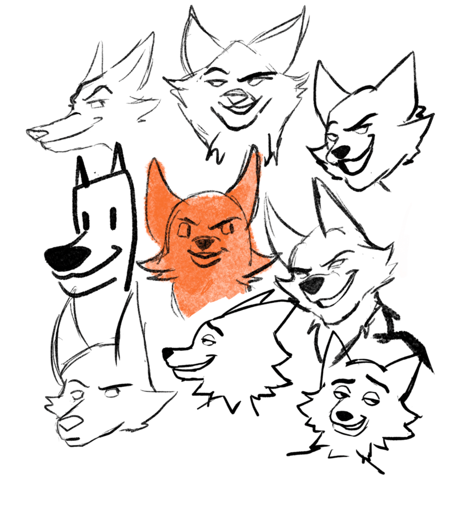
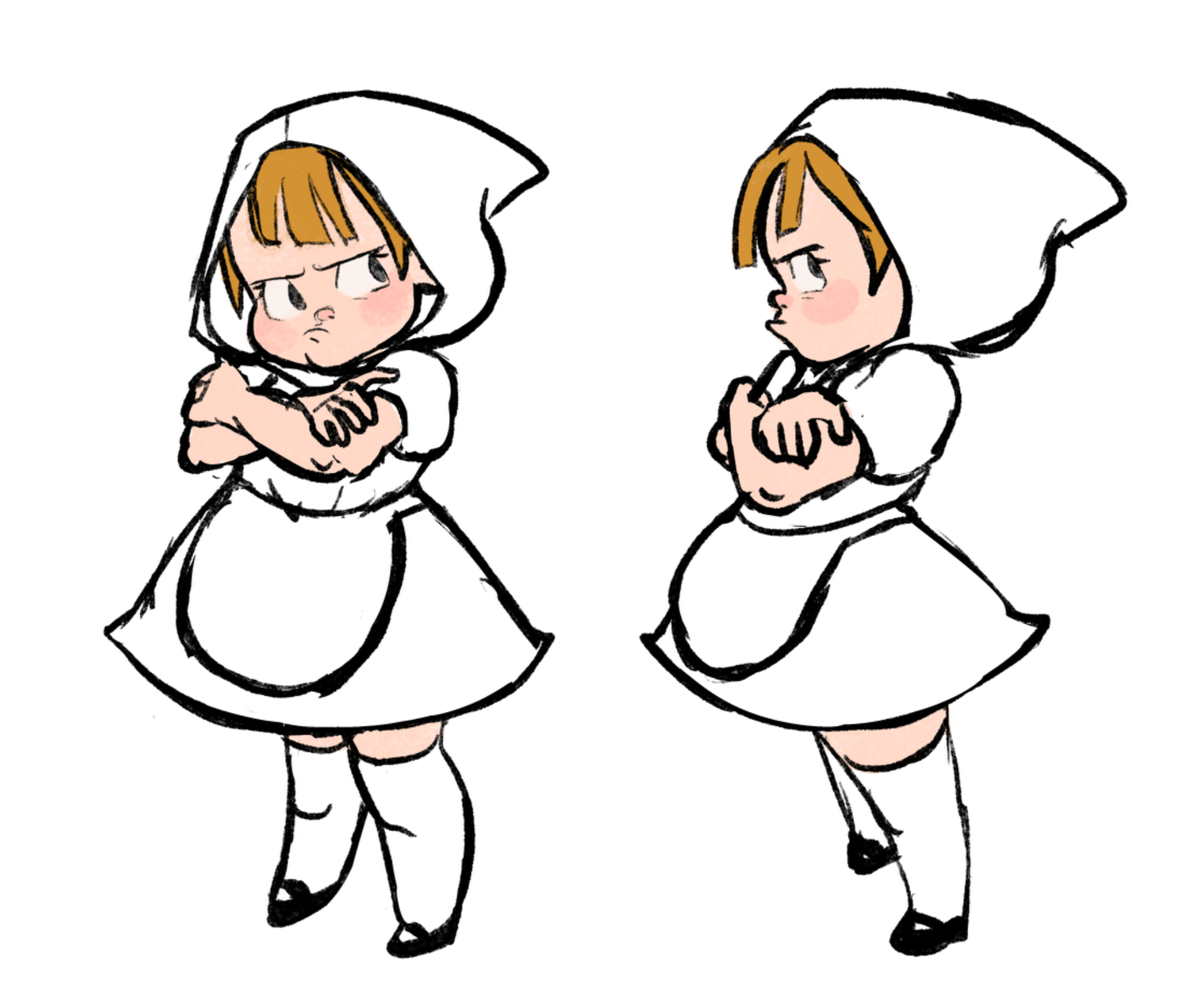
When it came to the character designs, I wanted to make very simple cartoony designs so I could try and push the animation, drawing red riding hood was the easiest design as I already had an idea of what I wanted her to look like in my head, and I gave her the classic red riding hood dress and red hood. The wolf was the more challenging design, I wanted him to look shady like a con man and to have a wolf’s head and a more humanoid body. Trying to make a stylistic wolf head also have a personality was very challenging, I realised I might have trouble drawing this wolves head over and over again since I’m not used to drawing this type of character, so I decided to draw his head from every angle to make it easier for myself in the long run.


test animations-
story board-
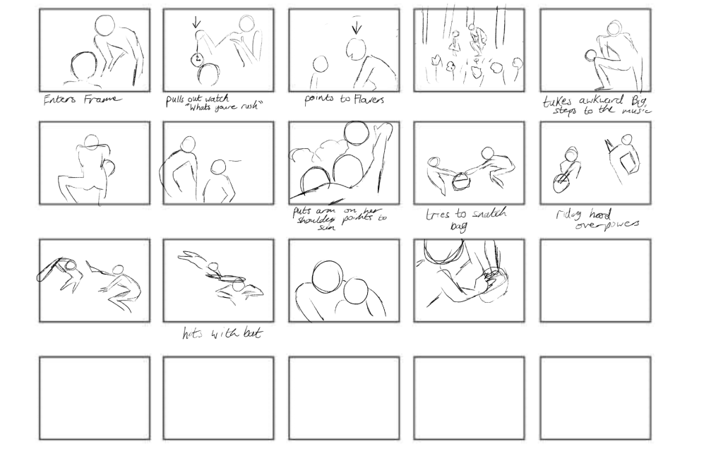
(Some frames in incorrect order)
animatic-
For the animation I would film myself doing whatever action I wanted the character to do, of course some of the actions would have been impossible for me to try and recreate in real life but I tried my best to act out the basic movements. I wanted the animation to be nicely timed up to the music and to have a nice flow. Following my story board, I made sure to have the audio playing as I animated so I was able to Time the movements correctly, every now and again I would take the heads of the wolf I drew and pasted them onto my animation instead of having to redraw them every time, I think they ended up working pretty well. I also was given a tip by one of the tutors that when it comes to lip syncing, I don’t need to have the character sound out every letter the characters says, as long as I get the basic mouth shapes of the main sounds it would look synced up and this too helped me out a lot during the animation process.
The wolf in my opinion was the most fun character to animate which I was surprised by considering I’m not used to drawing animal characters, I really enjoyed animating his shady personality, like when he greets red riding hood, he slicks his fur on top of his hair back and gives her this big sort of sleezy smile.
feedback and notes-
I was given a lot of notes while making my animation. a note I was given which I have now attempted to fix was that the ending of my animation didn’t look coherent with the rest of my animation since In the beginning I had the camera moving and zooming in and doing something interesting, whereas at the end I just had a very straight shot of the two character facing each other and it was a bit anti-climactic. I fixed this by doing as the tutor instructed and having red riding hood very dramatically pulling out the giant bat with the wolfs shocked reaction in the background and then doing a huge jump from a Birds Eye view to hit the wolf and I think this ended up making the animation look way more interesting.
before
After-
When I began animating my first shot of the wolf stepping in front of red riding hood I was told that he was stepping in from the right a little bit too much and that he would look better if he was walking into frame straight forward to greet red riding hood. I think this looks way better now that I have fixed it and I added a camera edit where the camera moves up from his feet until you see his face to try and show off how tall and intimidating he is in comparison to red riding hoods tiny stature .
before–
after-
Another note I received was that in the shot where the wolf is pointing at the flowers, I had the wolf point at them and then it would cut to a shot of them in the field with the flowers. To fix this I was told it would be better if instead of a cut it would zoom out to the show the flowers, I like this edit because I feel as though it helped to ground the Characters a bit more and show they are in a forests field.I also later added a butterfly flying around the character just to Try to set the scene a bit more. A similar edit I made was that whenever the wolf points to the sun the clouds in the shot were still , this was annoying me because it didn’t look right so I just subtly made them move across the screen like real clouds
before–
After-
as I was almost finished with my animation I asked Sarah if there was any small things I could change to improve my animation before submission-
– the animation with the music when the girl is on screen feels static as there no lip synch
– clean up the step of him around the girl (the timing of motion is good)
– add frames/ smooth the girls lines at the end
– the last shot with the basket feels a little off , not much changing and the very end expression of him could go even more shocked.
I did my best to fix these before the submission.
before-

after–

One thing I regret is that I ended up not having enough time to add in some simple backgrounds that I had originally Had planned. However, after submitting this assignment, I plan to render out my animation more for my portfolio by adding backgrounds, cleaning up my animation and adding lighting and shadows.I would also like to add an establishing shot of red riding hood walking through the woods .
overall I think my animation turned out well,I feel like I really tried to do something a little bit different than what I usually do. Trying a more cartoony style and really pushing the body mechanics of the characters and also the added challenge of animating an animal character.
final animation-