Pocket Profiles- Week 5

I choose to research the following 3 designers and from the Netflix series the Abstract the art of design.

Ian Spalter

Ian Spalter was born in New York United States. Ian Spalter graduated with a bachelors in Multimedia Design & Cultural Studies from Hampshire College.

Ian Spalter was Instagram’s head of design from 2015 until April 2019 then took up a new role in August 2019 as the head of Instagram in Japan working in their Tokyo headquarters. His role involves leading a team responsible for designs ranging cross-platform app experiences to brand and Identity. He previously worked for Foursquare as a director of UX and design and YouTube as a Senior UX Manager.

He features in Season 2 of Netflix series Abstract: The Art of Design.

Jonathan Hoefler

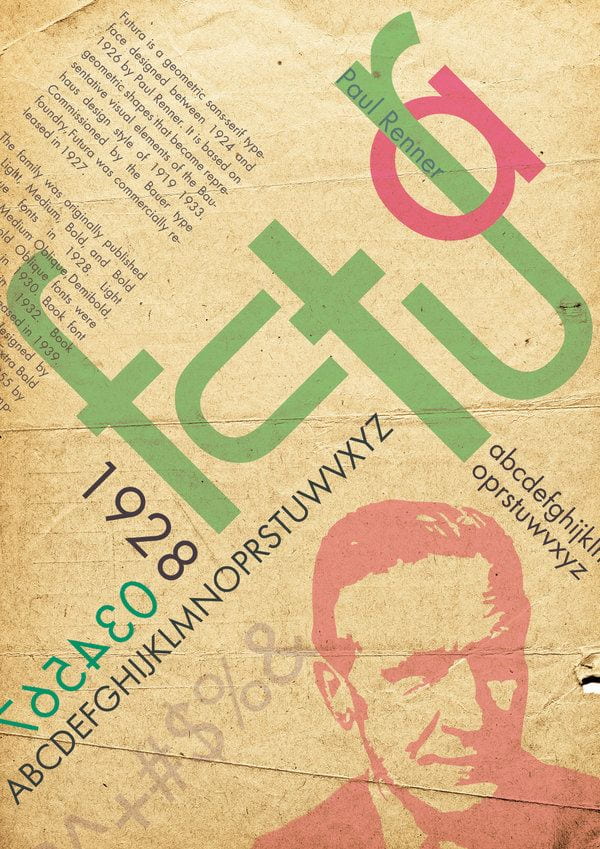
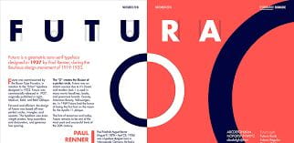
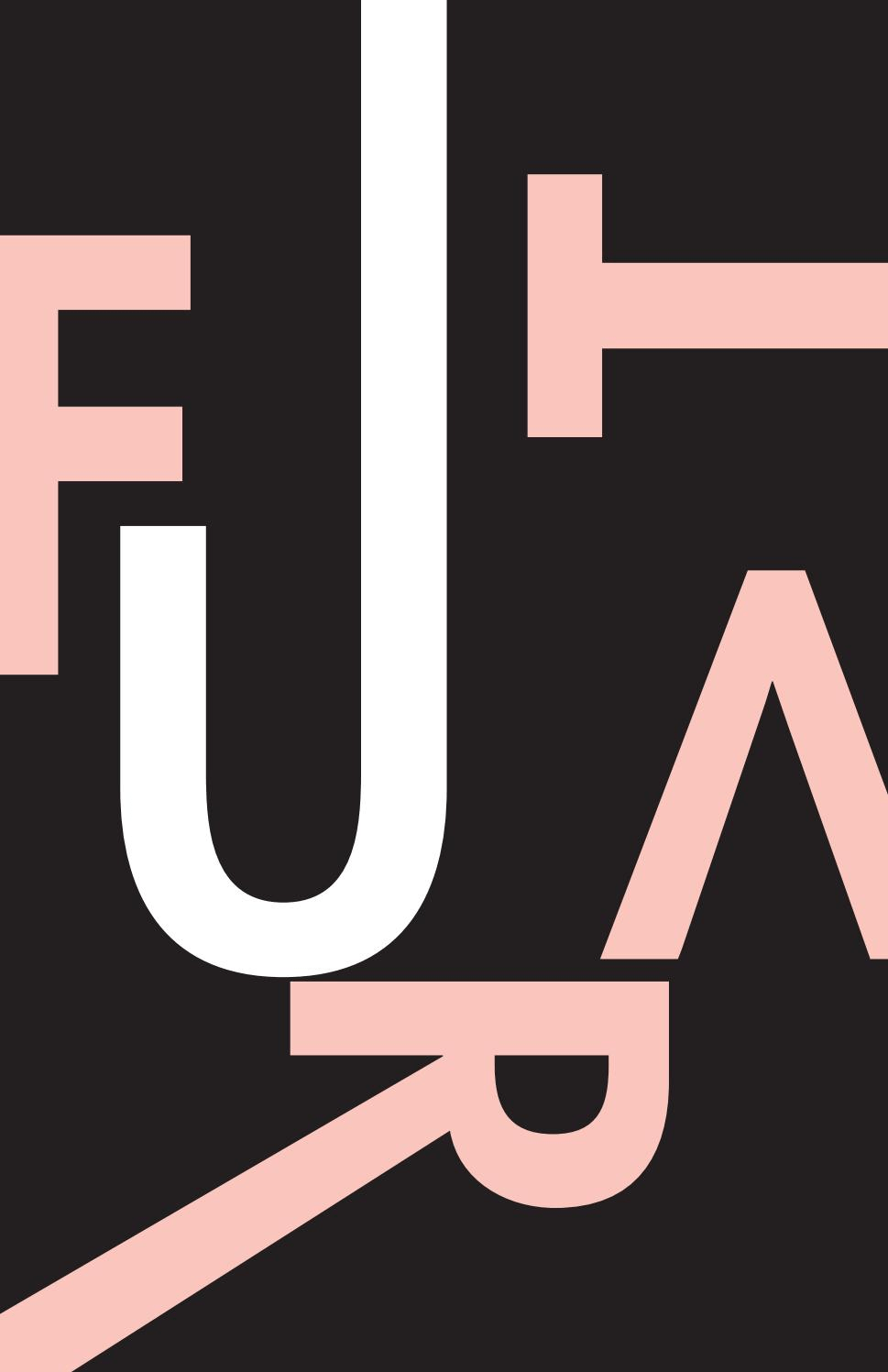
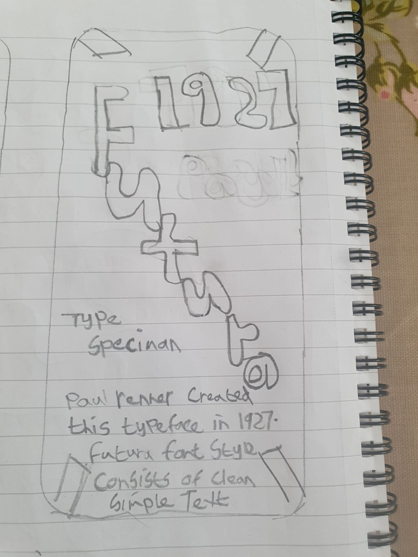
Jonathan Hoefler is an American Typeface designer/Typographer also known as a Graphic designer and Artist born in the 22nd August 1970, New York, united states. He has dedicated most of his life to his work. He got inspired to go into typography design by the Gill Sans text on boxes of Custard.

Most of his work is self-taught. He started his career back in 1989 and is currently working on different typefaces.

He has received awards and recognition for his work. In 1995, I.D, magazine named him one of the forty most influential designers in America. Then 2002 he was recognized for his contribution to type design by being awarded the most prestigious award, the Prix Charles Peignot.

His work is displayed permanently in the National Design Museum’s collection. Back in 2011, the Museum of Modern art acquired two of Hoeflers typefaces: Mercury and HTF Didot.

Again in 2013 he was given another award along with Frere jones- for their contributions to the typographic landscape.

Johnathan Hoefler features in the final episode of season 2 in the Netflix series Abstract: The Art of Design.
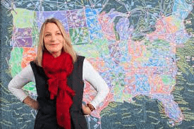
Paula Scher

Paula Scher born on October 6, 1948 in Washington D.C is known for her work in graphic design. She is one the world’s most influential graphic designers. She is described as the “master conjurer on the instantly familiar”.  Scher’s work includes a mixture of pop culture and fine art. It includes Iconic, smart, and accessible, her images have been displayed into the American Vernacular

She achieved a bachelor’s degree in fine arts in 1970 at the Tyler school of Art, Pennsylvania.

In 1991 she joined design firm Pentagram where she developed brands, promotional materials, graphics, worked on packaging and publication designs. In 1992 she decided to become a design educator, teaching at the school of visual arts in New York where she taught for over 2 decades.

Scher’s work includes a mixture of pop culture and fine art. It includes Iconic, smart, and accessible,

Most recently she featured in season 1 of the Netflix series Abstract: The Art of Design about leading figures in design and architecture.

Week 5 –UI Cards

On Monday’s class we had a look UI Cards on webpages. As a group we collected images of buttons and UI Cards on Miro. Then we were given a task to create our own UI cards on Figma using a similar layout for the UI cards on material.io/components/cards. The cards we created were for advertising our favourites artists music albums or tracks. Once we did it we posted it up on Miro. I decided to choose the album “The Marshall Mathers LP 2” by Eminem for my UI card as it is one of my favourite music albums.


Separately I used inspiration from Spotify to create a UI Card for the artist the killers.

Type Specimen Futura – Updated

Following feedback from Pauline and Kyle in Friday’s Group Critique Session, I went back into Figma and made the specific changes to my type specimen screen which were necessary in order to make improvements. I played about with the text and layout. I felt the simple designs where the best.

Here is 2 decides images before and and after the feedback i recieved. I think it defintely is a improvement. I will continue to work on the overall layout and text of my type specimen screen.


IXD101- 100 Iterations

As a group together, we collectively choose 100 images relating to nature and building’s which feature lines from the internet and our own camera then saved them Pinterest. I posted this images onto my Instagram.

There is so much inspiration around us we need to learn to appreciate the wonders of nature.

Here I’ve selected my favourite 9 images relating to this project.

This image was taken at Killeavy Castle County Armagh as I really liked the stone work.

This is an image of a corn field in Ireland which I found on Pinterest . I quite liked the lines in the grass.

This is an image of a group of Pine Trees in Tollymore Forrest park. I liked the veritcal presentation of the trees.

This is an image of the stepping stones across the Simian River in Tollymore Forrest park.

This is an image of a Spiders web which showed lines. I imagine this was photographed on a frosty morning when you can se the wonder in nature and the unique lines of the web.

This is an image of Liverpool Fc which was designed during the first lockdown to play tribute the NHS workers.

Lines are found everywhere even as patterns on animals. This is an image of Zebras coat.

This image of a leaf which has nice line patterns

This is an image of the stone wall at Hare’s gap  in the Mourne Mountains Co Down


Typography

During Monday’s class Paul  give us a few exercises relating to typography by asking us to experiment with text according to size, colour, effect and shape, etc.

First task Paul asked us to recreate this line by resizing the text according how we felt it fitted on screen. Making certain sections bigger and smaller to fit the importance.

This next task Paul asked us to choose letters we liked and make changes to the letter form. I choose S and D and cut a few chucks out of them to create a new look and feel to the two letters. I felt it looked well.


Next he asked us to combine two letters. Here is a examples of a combination of 2 letters or numbers which I felt fitted well together. I experimented by placing letters beside, below and above each other and changing the rotation of the letters. This give it a new dimension.


Point, Line, Plane

Week 1 we were introduced to figma application and were asked to create a Play, pause and stop button using the different shapes available to us on Figma.

Week 2 we were asked to create experimental designs for point and lane. Here’s what I came up with.

On Monday during our online class, Paul asked us to create experimental designs for line, point and plane using a square grid on figma. Although I didn’t fully understand it I felt the session was very interesting and useful. It was good to get a basic of using figma as it help us with future designs throughout our course. Each one of us came up with our own unique designs. The more we use this on the course the more familiar it will be to us.

The first one we did was the point. You start off with one point then progress to 2 and continue with more points. By doing this you’re building a story through the shapes.

The second one we designed was line grid using different line I chose vertical and drew different lines and changed their thickness.

The third exercise Paul asked us to do was to experiment with the squares and rectangles to come up with a plane design.

Here is my designs of point, line and plane.

At the end of class he told us to make sketches of our 3 favourite app’s of how they were brokedown into sections and then design them on figma.

Typeface Specimen- Futura

Typeface- Futura

Introduction

We were asked to research type screen specimen by choosing our favorite typeface and talk about and create a design for an iPad or iPhone on this.

Research

Futura has been developed from the 12th century Geometric Sanserif.

This typeface was created by Paul Renner from Germany who came up with the idea back and released in 1927 and since then it has been displayed everywhere worldwide. Futura’s style was based on the Bauhaus movement which was simple and modern.  Futura font style consists of clean, simple shapes that give the style a modern and future feel to the design.

Paul Renner

Paul Renner was a German graphic designer and typographer born in the 9th August 187 in Weringerode. He was artist which created with the Futura typeface, which had grown to become one of the most popular and used types of the 20th century. His legacy and work have continued to live on since his death in April 1956. He probably did not realize how big his work would have become.


Futura is under the Sans-Serif category.  In 2017 Futura turned 90 and has been widely used in the modern area and throughout history. It was believed that Futura was importantly used on a plaque left by astronauts from Apollo 11 who landed on moon. It is thought that the Nazi’s used the Futura typeface as a way of shaming modern art. The American military may have also used Futura typeface during the World war 2. They probably chosen the text as it stood out. Recently Futura is being used in Advertising and on film posters.

This image above shows the plague used in the Apollo 11 mission.

Most recently it has be used on film poster’s most recently on poster’s for blockbuster film Gravity and previously in 2001: a space odyssey. You can see it has created an impact.

There are different types of Futura weights such as bold, regular, and light, etc.

The use of Futura has increased in recent year. Many famous brands worldwide such as Nike, Dominos, PayPal, Gillette, etc, use different styles of Futura typeface in their logos. Futura typeface helps make brands and items stand out as it grabs the viewers’ attention.

I Choose Futura because I really like its simplicity and it is clear to read. The style of text is interesting and looks modern. Also, I found out some of my favourite brands use this text which makes me like it even more. I probably have seen a lot of Futura text before without even known from my movies and brands I like.

Examples of inspiration futura typeface

Here are a couple of examples of futura typeface which I found inspiring on the internet.


Below you can see a couple of my favourite brands which use Futura typeface in their logos.


Sketches 

Here I created a few sketches of Futura specimen typeface man for a mobile phone device.

Digital

I then made a few digital versions based on my sketches of my chosen type specimen futura using Figma on either ipad, iphone and MacBook templates.


Bibliography

https://design.tutsplus.com/articles/all-about-futura-font-and-its-history–cms-35382

https://theschedio.com/famous-logos-futura/

Type in History: Futura

Skip to toolbar