Project 02: Infographic
The second project for this module is to create an infographic focussing on a subject specific to the world around us.
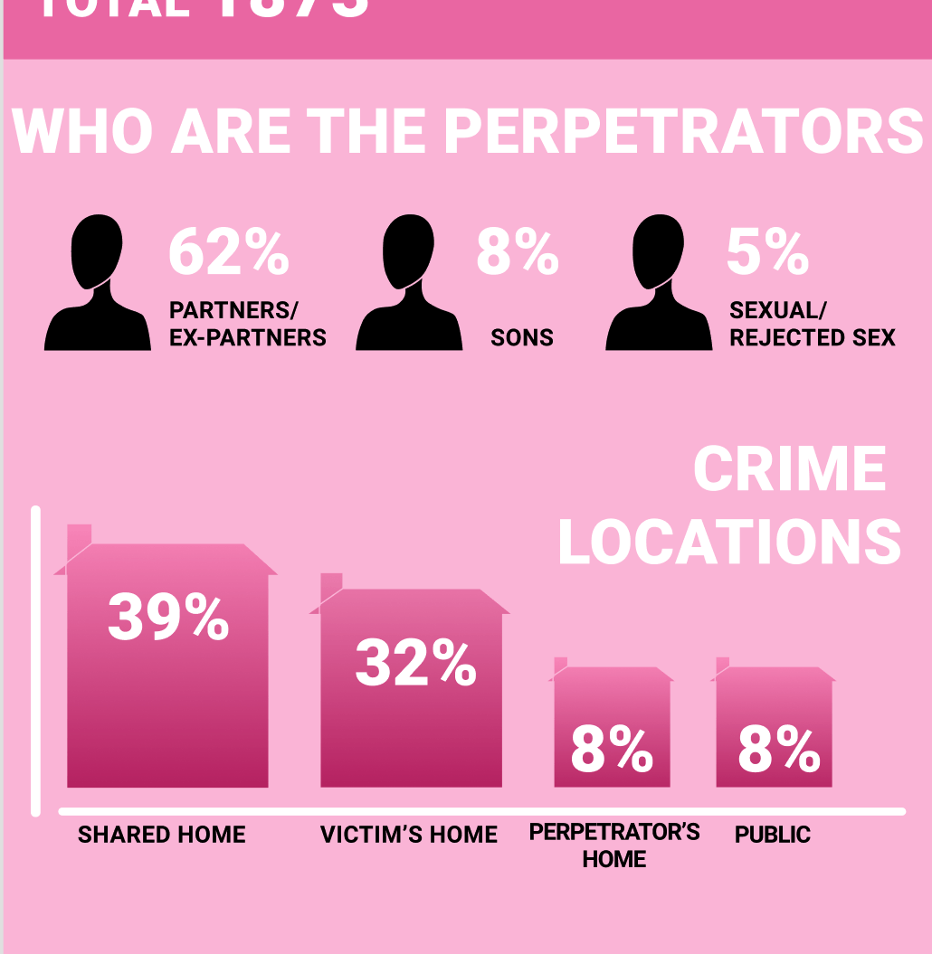
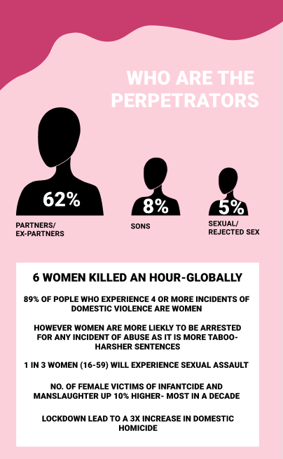
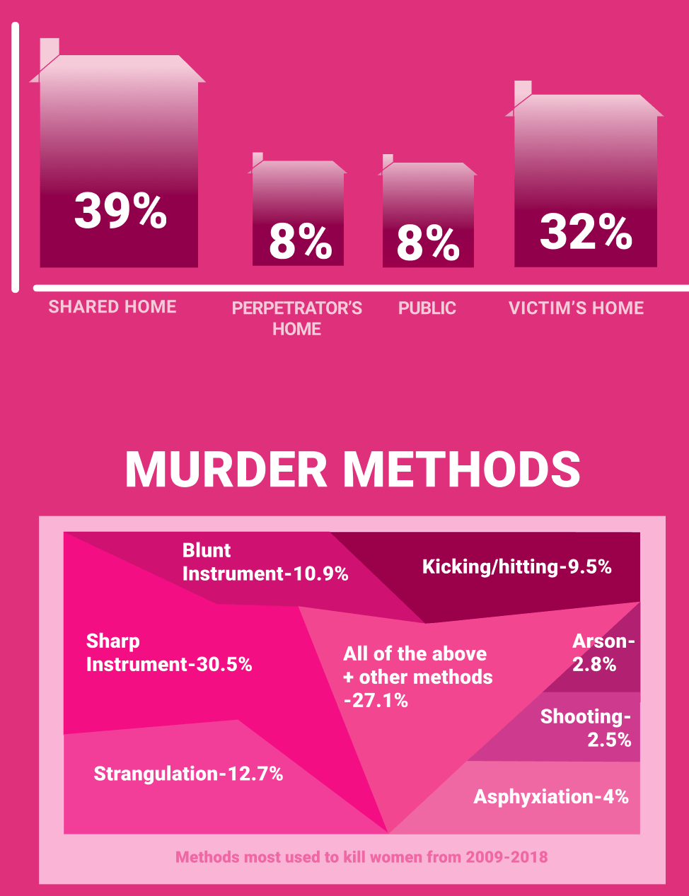
The subject I chose was ‘Femicide in the UK’ . Femicide is defined as ‘men’s fatal violence against women’. This infographic will be made using statistics found in the Femicide Census, which is the first in the UK to analyse the murder of women and girls, from the age of 14 to 100, at the hands of men from 2009-2018.
Femicide is different to just male homicide in specific ways e.g. most femicides are committed by partners or ex-partners and usually involve consistent and ongoing domestic abuse, intimidation and sexual violence where women have less “power” than their partner.
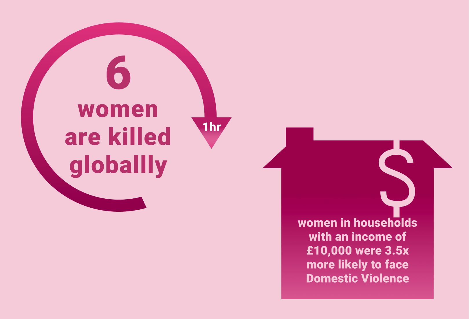
Femicide is a worldwide issue and this was validated in 2012 when the World Health Organistaion created a short report declaring femicides increasing prevalence: ‘35% of all murders of women globally are reported to be committed by an intimate partner, compared to only about 5% of all murders of men are committed by an intimate partner. In those cases where a man is killed by an intimate partner, they were mostly killed in an act of self- defense’
Even though Femicide is clearly a global epidemic, I decided to limit the data I would use for my infographic by localising the issue to the UK for a more clear and influential effect. Therefore people won’t be overwhelmed by deaths and stories in the millions worldwide as that makes it easier to brush away the issue. When you are faced with important data and figures that are also taken from places and people you may know it makes it harder to look away from the issue and easier to get involved in the fight.
Before designing my final infographic I gathered the statistics and data I was gonna use. I wrote them down in a journal to keep track of them and the websites and reports I got them from.
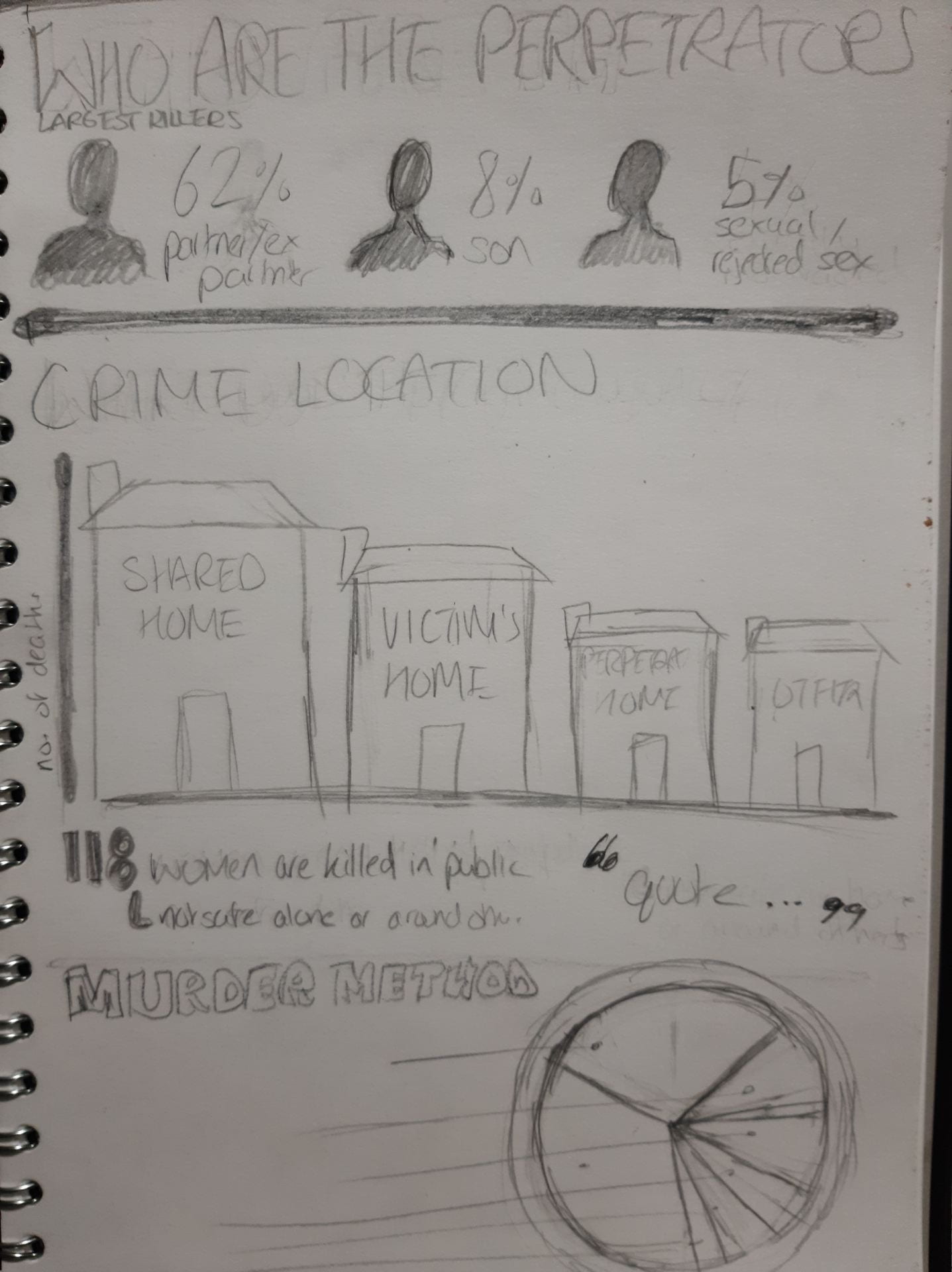
I then did some research on pinterest for how to present data to get some ideas. Using this as inspiration, I drew some quick sketches of how to present some of the data I wrote down.
After this, I drew a template of what I would like my infographic to look like. I decided to go for a more minimalist design using easy to understand and clear data visualisation and messaging as I believe an important topic like this should be presented in a clear way. A more illustrative route could appear cartoonish or tone- deaf considering the subject, however I would like to incorporate more illustrative concepts in a minimal style throughout the project.

I haven’t drawn a template for the whole project yet as I felt I needed to begin digitising to to get a real feel for how it would look with colour and correct typefaces. This would save time if I decided I need to change a whole new concept and it allows me to make improvements on the digital version while I finish the paper template.

This was my first draft including what I had originally drawn.
These next images show the development of my infographic over time:


The colours used for backgrounds and text changed a lot, I went through lots of pink tones to find some that would both be aesthetically pleasing but allows text to still be readable. There were lots of other changes over time, I decided to remove black from the colour palette all together and stuck to a monochromatic range of pinks with white being used for emphasis or to make certain element stand out. I also added a new section along with my bibliography:
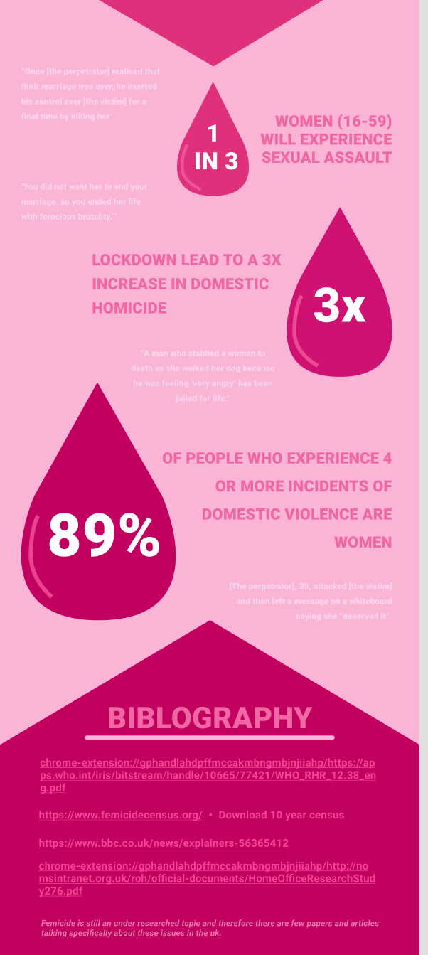
This section uses statistic I found which I presented in a droplet that could be inferred to be blood or tears to emphasise the point. To this section I added quotes I could find form real life cases of femicide to drive home the concept that this is real and happening around you, close to you. Too often data can feel cold and disconnected from real life but I wanted this infographic to present all the data we’ve been hearing about domestic violence for years, with context.