One Week Project
For this project we had to design a brand for a pizzeria (either existing or made up)
The first thing I had to do was decide which pizza company I would rebrand or decide to create one of my own. I chose to rebrand pizza express as its a fairly popular pizza compnay known for not been very expensive or luxurious but still a nice place with a strong tone of voice which I thought I could work with.
To gather information about the company to know what I would use and what I would change, I first went to their website. I used their ‘about’ page to learn when and why the company was created and where. From this I could work out the companies tone of voice and from there I can decide what to change so I made a list of these things in my notebook:

I made two lists, one using words and information I got from the original brand and another list of what I would change these things to
I decided the type of company I was going to rebrand ‘Pizza Express’ from authentic and approachable experience to an authentic and more luxurious experience, focussing on the idea of handmade and original italian food.
Once I had that decided I began working on the new Pizza Express’s logo and wordmark. I got inspiration from real italian restaurant on pinterest and made this board: pizza moodboard
From these I created a page of sketches and ideas:
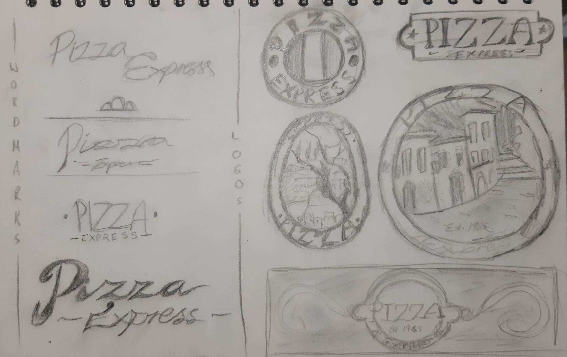
I started out with the word mark, I wanted a formal style typeface, joint letters and more decorated main characters to emphasise the idea of a high end experience.
I really wanted a heavy italian influence on the logo to convey the idea that the pizza sold there is an authentic almost local italian experience. Therefore, I thought of a more illustrative, complex design for the logo, this would be harder to copyprint or market but I think it fits the tone of voice and style I was going for better. I also designed a more simple logo of just the title of the company on a chopping board. I liked both of these ideas and thought to digitise both of them along with a couple of the wordmarks before I decide which I would finally decide on.
Logo idea 1.1 Logo idea 1.2


Logo idea 2.1 Logo idea 2.2


wordmark 1 wordmark 2


wordmark 3
I decided to choose Logo 1.1 and wordmark 2. I next decided to design the uniform the waiters/waitresses would wear in the company. I started with a rough drawing:

I’ve decided on quite a formal look to fit in with the tone of voice. The girls must wear their hair in a bun and both waiters and waitresses must wear black shoes.
The logo will be on the left upper chest of the shirt and the bottom right corner of the aprons.
From this I colourised what I thought these uniforms should look like using colours similar to the logo.
Uniform- Women Uniform- Men


The final part of the project was to create a digital touchpoint and for this I designed a home screen for what their app would look like:
App- Home Screen

I used the wordmark I designed for the header of the app.
I placed the brand story under this and in a prominent position to express the authenticity and personable nature I wanted the brand to have.
I placed the call to action ‘order now’ quite big so users can jump straight to that screen if they know what they want but I also placed a section under that of pizza’s that are selling well at that time to help users that aren’t sure what they want and entice them.
I also designed a couple of icons for the app, I kept them very simple and in the same colours already used to keep the colour scheme very minimal and consistent to fit the high-end tone of voice.
Colour
This week we also had a short lecture on colour. In this lecture we were taught about colour systems (CMYK, Pantone, RBG and RAL, Hexadecimal) and how these colours can be used in branding.
Colour Systems
CMYK- is used for the printing process, it is four colours (Cyan Magenta Yellow and Black) These for colours are 4 colours in a printing press.
Pantone- is a standardised system that manages colour from design to production and is used in printing as well. Pantone is specified as a brand colour and being used throughout the production allows for consistency of the. brand colour reproduction.
RGB- is used in screen and electronic display. The colours are formed using 3 light beams of various intensity to compose the colour. All colours mixed up make white and is an additive colour system. RGBa is an extension of this with an alpha channel- which specifies the opacity of a colour.
RAL- used in power coating/varnish and plastic coloring. This colour system is used for physical products and this could be used if our brand creates physical products.
Hexadecimal- used in displaying web pages and is displayed with a # followed by 6 digits. These can be specified as an RGB colour displayed in a hexadecimal format to be used in CSS and HTML.
Colour Schemes
We were also taught about basic colour schemes and how they are balanced.
 Monochromatic colour schemes are one colour in many shades. These can be used to create a sense of consistency in more minimal design.
Analogous schemes involve few colours close to each other. This creates warm or cool colour schemes which produces a sense of temperature in design and colour harmony.
Complementary are schemes were the colours used are opposites on the colour wheel. These can create good contrast on designs as it draws in the eye.
Triad colour schemes are formed from creating a triangle in the colour wheel. These can create a vibrant design if used in a balanced way.
Colours in Branding
Colours can be used to evoke emotion, there is a psychology behind them and this can be used to an advantage in branding.

As colours can evoke the emotions, shown in the poster on the left, brand can use this to inspire their logo and brand colours
Depending on the tone of voice the company they can use guides like this. For example the company Coca Cola uses a primary brand colour of red which according to the guide evokes energy and excitement which really coincides with brand values coca cola likes to promote.
![]()
Emotions provoked by particular colours can differ among cultures, the way we view colour in western culture is very different than far eastern culture, for example; the colour black evokes feelings of death and intimidation in the west but feelings of health and prosperity in far eastern cultures. This was very interesting to find out as we in our own culture are so used to how we perceive colour it seems crazy that the colour black could mean something positive and hopeful but this opens my eyes to how brands could be perceived across the world and how you can use colours to communicate your ideas effectively.
Individual Study – Wassily Kandinsky
Wassily Kandinsky was born in 1866 in Moscow, Russia and became one of the most influential abstract painters. He began his career in art later in his life but he quickly became a teacher at the Bauhaus in Dessau, he started teaching abstract form elements and analytical drawing in 1925 to 1932. He was head of painting in 1926 and from 1927, he directed the free painting workshop and free painting class.
Kandinsky enjoyed art theory and thought it was important that art can be subjective. He actually wrote a piece called ‘Concerning the Spiritual in Art’ in 1911 where he talks in depth about the psychology of colour and the language of colour.
“But to a more sensitive soul the effect of colours is deeper and intensely moving. And so we come to the second looking at colours: THEIR PSYCHIC EFFECT.
They produce a corresponding spiritual vibration, and it is only as a step towards this spiritual vibration that the elementary physical impression is of importance.”


Wassily Kandinsky loved music and wanted to evoke emotions and create an ultimate sensory experience from listening to music through pure colour and forms in his paintings. This lead him to refer to his paintings as compositions.