Josef Albers – Pocket Profile
Josef Albers (1888–1976) was a German-born artist, educator, writer and color theorist. He taught at the Bauhaus and Black Mountain College, headed Yale University’s department of design, and is considered one of the most influential teachers of the visual arts in the twentieth century. Albers was best known for the Homages to the Square he painted between 1950 and 1976 and for his innovative 1963 publication Interaction of Color.

As an artists, Albers worked in several disciplines, including photography, typography, murals and printmaking. Albers taught at the Bauhaus, where he also met his wife. Albers’s 1963 book Interaction of Colour provided the most comprehensive analysis of the function and perception of colour to date and profoundly influenced art education and artistic practice. His series Homage to the Square, produced from 1949 until his death, used a single geometric shape to systematically explore the vast range of visual effects that could be achieved through color and spatial relationships alone. Albers’s art and theories were widely disseminated to generations of artists and art-school faculty through his teachings at the Bauhaus, Black Mountain College, and Yale University, and they provided the theoretical basis for the development of non-objective art during and after the age of Abstract Expressionism.


My personal favourite of Alber’s work has to be Two Portals, which he completed in 1961. After retiring from Yale in 1958 at the age of 70, Albers’s former teacher and colleague, Walter Gropius, invited Albers to design a mural for the interior of the new Graduate Center at Harvard University, leading to other important mural commissions. Two Portals at the Time and Life Building, pictured here, features alternating polished nickel and bronze squares, surrounded by alternating bands of tan and white glass, to suggest receding planes, providing the illusion of depth on a flat surface.
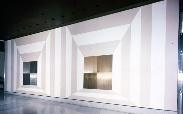
I just adore the illusion effect and feel that the powerful platinum colours really stand out. I love the concept and the composition.