Visual Grammar

Visual grammar are all the parts that make up a website, eg buttons, typography, illustrations, windows, etc… and just because a UI is not complex, it does not mean it is not beautiful of functional, there is beauty in simplicity.

Perfection is achieved not when there is nothing more to add but when there is nothing else to take away

A great example of this is seen in “If the moon was only 1px

Now not only is the type simplistically gorgeous, it really draws you in and the way how you scroll to go and search the rest of the website is very intuitive and engaging.

Once you start scrolling towards mercury he gives little pointers of text along the way to make sure you keep scrolling and also to alert you that this is just the illustration of the space in a funny and simple way.


Reflection

  • Simplify as much as possible – focus on the essentials
  • What can you do with constraints – think of how Instagram only allows the 1 size of images for posts and how they have stuck to it. It has been highly effective.
  • Focus on re-using elements and minimizing visual complexity. Think of how you can re-use the design of the main navigation and the footer. Think of adding a home button to cater to all audiences and convention

Language and typography

How did you write the content for your website? Is it in the 1st person? How did you speak? Is your language super friendly? Energetic? Calm? Basically, what is your tone of voice and your tone.

Ask yourself

  • Who are you? (As an individual or a business)
  • What are your values?
  • What’s your mission or purpose?
  • What do you hope to achieve? — In my case maybe add that you are looking for a year-long placement
  • How will we know if you are successful?

Think of Dropbox and how when a download is going to take a long time, they jokingly say “Grab a snickers” this is great design, it humanizes it and makes it easier to understand and maybe even alleviates a stressful situation.

“Typography is the craft of endowing human language with a durable visual form”. – Robert Bringhurst

I learned early on that I tend to find something I like – like a typeface – and stick to it instead of branching further out and continue to investigate the other options.

something I want to strive to achieve with the typeface I choose for my website is that it:

  • Optimize legibility, through the appropriate choices of typefaces
  • Improve accessibility by considering contrast between the foreground and background colours
  • Improve usability through a considered typographic hierarchy. – Think of how you structure the typography as this will guide the user on how to read the content and in what order.

Considering the visual grammar for my website

I started considering the visual grammar of the content of my portfolio site. I need to consider visual aesthetic, colour, typography, layout, …

I need to make the content work for me. Be expressive, to not be limited by my skills. Be as imaginative as I can.

While in class we were given a task that was great for getting my ideas flowing – Crazy 8s:  8 ideas in 8 minutes. Here is how I got on:


What makes a good CV?

NI Design chat (on slack) nidesignchat.com. This was used to ask experienced designers what they are looking for in placement students. This was a great help as it helped me better understand what information I needed to prioritize when creating my CV and portfolio.

Tips from experienced designers 

  • Apply to as many companies as possible as it might pay off afterwards.
  • Paudie Fearon – employer feedback – personalize your application. The ones that stand out are the ones that go through the company website/ blog and reference their work and what you like about it.
  • Be passionate the employer knows that your portfolio isn’t up to industry standards yet
  • Shylands – Make a bespoke cover letter, this will help you stand out. Students with side projects move to the top of the list
  • Rachel Burke – sometimes it comes down to personality and showing that you are eager to learn.
  • Paul – be proactive

How to make a good CV

  • Do not put your picture in your CV
  • You can design it but keep it classy doll.

Must include:

  • Short bio
  • Contact details
  • Skills
  • Work experience
  • Education
  • Awards and additional info
  • References – Use Stephen as a reference here. Remember to call back and ask him to write one

Tips:

  • Keep it short – it should be concise and use simple sentences; the aim is to convey information as quickly and effectively as possible. 1 page, no more than 2 sides.
  • Add page references so nothing is missed.
  • Spell check – the employer will discard it if it is riddled with spelling mistakes.
  • Work backwards – most recent education/achievement/employment first then go back. GCSE just add the grades.
  • Avoid obnoxious competency indicators – eg 80% proficient in Adobe – they do not work.
  • Use a limited colour palette – either 2 colours at most or just black and white.
  • White space – make sure it is easy to scan
  • Typography – you could use one that helps you stand out – but be sensible.
  • Keep it as its own document – 1 file in PDF format – don’t include it in your portfolio. A link to your portfolio should be in there, make it easy for them.
  • Tail it to the job were possible – read the job description and match your bio to it.
  • Be honest
  • Use a client who speaks well of you as a reference.

Cover letter

  • It’s an into to the person receiving your application, explaining what attracted you to their company, summary of what you are good at, your experience and your aspiration. Make them feel special.
  • Match the style/design of your CV.
  • Personalize it to the company and the role.
  • Find out who you are addressing it to – it goes a long way. Make it look like you are specifically addressing them – if you cant find the name use their job title. If you must call the office and ask
  • Tone of voice – Respectful and natural, not too formal. Have someone read it for a second opinion. Use active voice https://bit.ly/2ZNAalc Use the hemingway editor.
  • Be enthusiastic – make sure you show your passion and excitement. That you are a good fit to the company and how you found them (Can exaggerate a bit here LOL).
  • This is not just an application – Cover letter are great even when sending your CV to a company that has no available posts atm as they might send you to other companies or remember you. You never know what may come from doing this. You could email them and say that you are aware that there are no openings but that you admire their work and explain that and that you just wanted to put yourself out there, also offer to let them view your portfolio.
  • Be consistent across all platforms.
  • Make an impact – maybe consider sending the company a physical letter and a physical CV, even if you also send a digital one, why not also send them a letter? This could be a postal tube? This would be an interaction they would have to do to see your work. Use your wax seal for your letter.
  • Even if it is an arranged interview send the CV in advance and a link to your portfolio as this will make an impact.
  • How am I going to stand out, be noticed and remembered by an employer?

After class I started considering how I would design a professional designer CV. Up until now I only had a word document CV; which  had served its purpose but now needed to evolve, so I started off by researching CVs of other designers and creatives, along with some info on how to create a good CV.

How to Craft a Powerful UX CV

I found this very helpful article by the Interaction Design Foundation which offered me the following tips:

After carefully reading the recruiter’s specifications, you should include everything they request in your resume. This typically includes:

  • Personal details: Your name, job title (if appropriate) and contact information (e.g., email).
  • Your photo: In a professional environment or a LinkedIn-style headshot picture.
  • Work experience: Your current and previous jobs listed in reverse chronological order (latest first). Only include relevant roles (though some non-UX activities can show valuable personality traits – e.g., skydiving).
  • Education: Only university/college/vocational-school-level achievements.
  • A self-write-up: A brief professional summary of yourself. Highlight achievements in a few, objectively worded sentences that tell your story.
  • Your skills and tools: If you have niche skills (e.g., in UX research) or are skilled in a broad range of UX tools, declare them but prioritize your skills.
  • Relevant miscellany: Mention any experience you can leverage – e.g.,
    • Teaching experience;
    • Fluency in another language;
    • Authoring of UX articles on (e.g.) Medium;
    • Relevant achievements as a volunteer/hobbyist.
  • A link to your LinkedIn profile: Recruiters consult LinkedIn to learn more about applicants. So, ensure your resume is consistent with your LinkedIn presence. You can create a viable (if generic-looking) resume using LinkedIn if you:
    1. Go to your profile;
    2. Click on the “More…” button; and
    3. Select “Save to PDF”.

Recruiters often use bots to scan resumes, so you should include valuable key words.

Overall, your resume is a story summarizing an impressive image of yourself like your achievements should speak for themselves. The words you choose portray your attitude. So, convince recruiters that you’re a powerhouse without openly declaring so, but show you know the value you can bring them. Credibility is all-important, and your resume should lead users (recruiters) to a call to action (to examine your portfolio) just like anything else you design would.

I then moved on to visual research to decide what I wanted my CV to look like. I knew I needed it to be consistent with my branding but at this stage there was wiggle room.

Here is a link to my visual research.

This was a great way of quickly finding visual inspiration to not only learn from but also to compare visual styles and what does and does not work.

This is a CV I found while researching impressive portfolio websites. I like how her CV is consistent with her website and branding. It is simple, clean and effective – everything I would like my CV to be.

I also found this graphic designer CV – this one was lovely and simple. I also thought it would be a nice idea for a physical CV.

Where does content and visual grammar come from?

This week what I need to focus on is the design of my portfolio as next week we will have a critique for our portfolio – we must have 3 pages done (especially the home page and case studies).

I need to create a high resolution mock-up; which is an image/prototype of how my website will look. It should look like the real thing whilst only being an image. I will most likely use Figma for this as it is the software I am most comfortable with.

Where does content come from?

  • Client:  A client can sometimes give the designers in any form; however, it may not always be in the right format, so it is up to us then to fix or suggest changes.
  • Self-generated: eg our portfolio. Blogs, design, branding,
  • Third party sites: eg Wikipedia,
  • User Generated content: eg YouTube, it creates the content for the user. Things that people make and then share. Social media in general. We are all basically content creator now. Instagram – we don’t realize it but within one post the amount of content offered is massive! Not only does it have the initial content but also ways to interact with it eg comment, like, tag …

Content has (or should have) a purpose

What is the acceptance criteria? Eg can people find my content or in my case can people find my portfolio in my website?

The acceptance criteria/ condition for satisfaction defines the criteria that must be met to suit the requirements of the user.

The 3 C’c: Card – conversation – confirmation.

Content curation

This is the process of sorting through the vast amounts of content on the web and presenting it in a meaningful and organized way around a specific thing.

Doing this is a must as we are living in an era of oversaturation of content and having someone that can sort through that is vital. Think fake news and how negatively impactful they can be when they are not called out.

Good content should be appropriate, useful, user centered, clear, consistent, concise and supported.

It is important to get good sources of information to better inform your design decisions.

Here are some great sources of content

This is a great resource for good UX content. I have actually read a few of the articles and learnt some tricks from them.

I really struggled with coding last year so this is a good resource, although there is so much information out there on coding that I was not short of information – it was kind of overwhelming actually. So the way the website was layout made it easy to find content. Now that is good content curation!

The great thing about this magazine is that it is centered towards UX designers so the content there is very relevant information here for me – this could be something I could bring up in interviews.

This is a great example for self-generated content.

Apart from being extremely beautiful and effective it is incredibly engaging – something I must strive for my portfolio website to be.


Idea

This is something as a designer that I could do, send a newsletter each month, it doesn’t have to be ground breaking work, it can be useful content, an update on your work – this can help grow your audience. This would actually be a great idea for when I am doing placement?


User and job stories

User story is a way of pinning down what you need to do. It helps you identify the users needs to better design around their wants and needs.

An example of how this would work, would go as follows:

As a [person in a particular role]

I want to [perform an action or find something]

After conducting some more research on user stories and job stories I found that Sarah Winters explanation was the most helpful.

According to Winters user stories and job stories are ways of capturing what a user wants to do. They are often written on little cards and stuck up on the wall so that the whole team can understand the user’s perspective.

User stories can look at follows:

As a [person in a particular role] I want to [perform an action or find something out] So that [I can achieve my goal of…]

User stories are great if you have a number of different audiences who might all want to consume your content. But there’s an alternative to user stories that might be better if you only have one audience, and that’s job stories.

User stories are a great way of figuring out what the different user categories are. These should NOT be specific as they restrict creativity.

After some more research I found a very interesting article by Alan Klement on ‘Replacing The User Story With The Job Story’ – his idea is that we design problem in a Job, focusing on the triggering event or situation, the motivation and goal, and the intended outcome: When _____ , I want to _____ , so I can _____ .

Job stories always start with:

When [there’s a particular situation] I want to [perform an action or find something out] So I can [achieve my goal of…]

Here is an example:

How would you design a fracking website? Maybe talk to home-owners, community groups, geologist people that work in this industry. It could have a scientific area with raw data as it would interest a geologist

Job stories are all about context and causality.

Here is an example he provided on his website that really helped me understand how to best use these  design tools.

1 – User Story:

As a moderator, I want to create a new game by entering a name and an optional description, so that I can start inviting estimators.

2- Job Story:

When I’m ready to have estimators bid on my game, I want to create a game in a format estimators can understand, so that the estimators can find my game and know what they are about to bid on.


Task 01:

Create 2 user job stories

Remember it is not about the designer but about the user.

Eg When [ ] I want to [ ] So I can [ ]

Results:

As an employer I want to assess a student’s potential

As an organization I would like to easily find the contact details so I can show my interest in hiring them.

When I want to find out more about interaction design

IXD104 Icon design – Week 2

Research/Inspiration

Icon design

Understand how they are created, they are a big part of design systems – even if we don’t design them ourselves. It is about trying to capture the essence of an object in its simplest shape.

Try to restrict yourself to a tight grid – eg 10×10 to push your creativity. Only use circles, squares, triangles and find out what you are able to create. Using a limited pallete can also be helpful.

Icons have History – eg the stone age, the Olympics

Icons are language Agnostic – understandable globally. Think IKEA clear.

When making icon set make sure they are consistent in colour, line width, fill, thickness, etc.

You find icons on your phone, the airport, they are everywhere.

When using icons for a navigation system, it is a good idea to have the icon window you are currently in to be filled in as it aids navigation – eg think of how Instagram fills in the house icon when in the home page.

Icons are now an integral part of visual identities, program interfaces, information systems, websites and mobile applications.

Using mind maps as research are  a great way to show your thought process.

Remember when creating forms, different forms and gestures that are accepted culturally in your country may not be accepted in theirs. Be respectful. Do your research.

Style

  • Outline icons
  • Glyph icons
  • Han-drawn icons
  • Filled icons
  • Flat icons
  • Skeuomorphic icons

Scaling

38mm – 48px — 80px — 172px

Consider scaling carefully as it needs to retrain its shape and detail if made bigger or smaller.

Required reading

  • The icon handbook
  • Material design

Task

  1. Make an icon set for your travel app
  2. Where am I going with my idea? eg travel through the body? time? Space? the Ocean? the world?
  3. Mind map like crazy
  4. Create a simple paper/Miro wireframe – or both?

Monogram progress

Why do I need a wordmark or word monogram

It makes you recognisable, It forms the basis of a lot of our communication. It can form the basis of everything.

Initial monogram designs

I created these initial ideas using Figma; I was really interested in the layering of the letter as it produced quite an interesting design. These are my favourite designs; they consists of my initials.

Tutor feedback

It does not have to be a monogram, it could be a watermark.

I should maybe try to use sharp shapes or points – make it different. Shapes can form part of the visual language later on.

I need to start on paper first, it will give me more freedom to experiment and broaden my ideas.

The typeface I used for my initial design ideas is too thin, it makes it look not fully formed. The typography used is doing me no favours, It’s like I am fighting it. It is restricting my creativity. Bold lines can come across as more confident and sophisticated.

Daniel likes the rectangular one in the middle ( 3rd row) It is one of the ones I liked the most also.

Avoid trying to do a name instead of your own as you may not like it in later years. Stick to your own name.


Pinterest moodboard:

After taking the feedback on board, I started sketching out some of my ideas.

Here is a link to my Figma logo draft.

Here is what my final monogram design looks like:

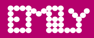
I created this monogram by joining my 2 initials (E and U). I liked its abstract nature as it kind of looks whimsically inventive . I would love to create an animation out of this monogram, I think it would be a great way to apply my logo to as many aspects of my brand as possible.

I could also use the logo design as an illustration design.


I decided to create an icon illustration, I started off by sketching out some ideas. I decided to focus on creating a simple line illustration of myself focusing on my defining qualities.

I then tried to explore my idea further using Procreate


Although I like the idea I am not sure I will be using it as part of my brand. I feel like the monogram has enough character and that adding this illustration would only take away from that.

Having said this, it was a fun learning experience.

Typography moodboard

We were tasked with gathering inspiration, identifying all different types of typography.

Create 2 mood boards:

  • Magazines and Ephemera
  • Digital (photos, online) go for a walk and look for type in your environment, finding letter forms in different applications.
  • Typography based shapes – a ladder, a desk, a window, etc… and identify what makes that shape recognisable? Bold and curved? simplified?

Moodboards are a good way to convey information and inspire. They allude to a tone of voice and briefing. Pinterest is great for this.


Click here to see my Pinterest moodboard.


Magazines

I really enjoy the playfulness created by overlaying squiggle like letters on top of bold, attention catching typography. It made me smile when I saw it. It effectively conveys an aura of playfulness and child-like innocence that I found very visually appealing. One typography contradicts the other – The white is structures, bold and organised whilst the quirky letters on the top are whimsically weird.

I would love to integrate some of this into my own designs, make it more abstract and interesting to look at. I tried out the style with my own name in my sketchbook (shown below). I think it’s a really friendly approach to typography that I would like to integrate latter on if it fits the theme.

Bellow are some other magazines that I really enjoyed researching, they used playful and at times abstract typography.

Typography based shapes

Feedback:

Work within the constrains of the shape you decide to work with – he likes this idea. Look up Paula Sher and the monogram she did for The New School – a modular, elongated letterform approach. Matched up letters. Stretched letterforms.

The overall theme that stands out in my moodboard was stretched letterforms and playfulness. I should explore this further.

Quirky and eye catching.

IXD103 – Monograms – Week 2

Personal branding

The logo of a brand can be thought of as the starting point for describing it. Your bios are open to change and that is ok – they are not set in stone. A brand is an evolving process – even established brands evolve – a good brand is fluid, it will evolve and adapt. Weaker brands will need to be re-branded. Monograms are open to change as we develop as designers and fine tune our skills. Reviewing your work continually and adapting it if necessary is a key aspect of design.

Simplicity. A simple concept for the mark makes it easier to understand and ensures durability. This is something I will strive for in my own personal brand.

Personal branding is a way to not only communicate with consumers but also with the world. What is my work about? What kind of designer/person am I? What is unique/special/drives me? something that can evolve over time.

Workmarks and Monograms

They both use letterforms to make unique, identifiable marks. The choices made for these will visually demonstrate the tone of voice established in the writing stage of the branding process.


Task 1

Write your first name using letterforms made out of circles, squares and triangles only. We were given 1 hour to complete this task.

Things I will be considering:

  • What is necessary to make the letters recognizable?
  • What can be left out?
  • How do you differentiate the letters but maintain a consistency?
  • Should I do it digitally or on paper?

Click here to see the completed task.


Resources and references to research:

Books

  • Symbol by Angus Hyland – In library 741.6/HYL
  • Marks of excellence by Per Mollerup – library
  • Logo by Michael Evamy
  • Logo modernism by Jens Muller
  • Logo design love by David Airey

Artists

  • Wim Crouwel – Dutch Typography
  • Armin Hofmann – Swiss Designer

Websites


Monograms and Lettermarks

It’s a motif made by overlapping or combining 2 or more letters to form a symbol; they are often made by combining the initials of an individual or a company, used as a recognisable symbol or logo.

Daniel’s Pinterest monogram board link.

Examples

Asymmetrical words, vertical, horizontal – you can play around with it, place a line over them, etc. We can abstract letters – reductive language for visual communication.

  • HP – they have removed aspects of the logo and are hoping to remove more to the point of it being an angled line. Complete simplicity. It provides also the tone of voice – simplicity and efficiency.

  • London Luton Airport – their use of multiple colours works perfectly as the logo is made of squares.

  • MIT media lab – they are a great example of versatility and consistency. When compiled all those monograms create an appealing visual experience. It is very Memorable and it was all created from a basic colour pallet.
  • Canadian National.
  • Jessica Hische – Daily Drop Cap project.
  • Hope Meng’s monogram project.
  • Early Greek and Roman coins that bear the monograms of rulers or towns.

  • Albercht Durer’s monogram from 1502 is one of the best known monograms from the world of art history.

  • Paul Rand’s IBM logo. Rand successfully created an iconic logo for IBM that ties the letters together using nothing more than equally weighted bands.

  • CNN logo – a logo that has truly stood the test of time.

Case study

  • LW theatres – Andrew Lloyd Webber’s LW Theatres ( previously Really Useful Theatres) owns and manages 6 West End theatres. The new logo is meant to represent the stage and the spotlight but its a stretch of a connection to make for anyone that see the logo without the explanation. It is elegant though. They kept the negative space consistently with their 6 other brands. This establishes the consistent language, whilst maintaining the individual originality of each theatre. It provides a high-end, simplistic and consistent design.

  • Gatwick express – they removed the previously cluttered logo and replaced it for a more simplistic logo which resulted in a clearer, calmer and more luxurious looking design which for the customer translates to the products. They made it recognisable. Their previous logo was outdated and it caused customers to feel that their high price point was not justified. They lost the clutter and made the new logo all about clarity. The mix of cusps and curves conveyed a sense of calm to the brand that the previous logo was not providing. The ‘G’ and the ‘X’ now looked seamlessly connected and simplistic in its approach. It brought a sense of clarity to all the brand communications – including tone of voice and photography.


Task 2

Gather inspiration, identifying all different types of typography.

Create 2 mood boards:

  • Magazines and Ephemera
  • Digital (photos, online) go for a walk and look for type in your environment, finding letter forms in different applications.
  • Typography based shapes – a ladder, a desk, a window, etc… and identify what makes that shape recognisable? Bold and curved? simplified?

Present at 3:30pm!

NOTE: mood boards are good to convey information and inspire. They allude to a tone of voice and briefing. Pinterest is great for this.

Blog post for this task link.


Monogram design brief

Practical requirements -Book- Mollerup presents 24 ‘practical requirements’ linked to graphic marks. [Mollerup, P., 1998, Marks of Excellence. London: Phaidon. pp. 90-91].

A good monogram will have all of these:

  1. Simplicity – is the mark simple and easy to understand?
  2. Attention value/holding power – does it draw you in and hold you attention? ( compare yours to the Pinterest ones and see if it stands out/holds its own )
  3. Application (including scale) – does it work when very, very small? will it work on a small business card? is it just going to be screen based or both?
  4. Competition – Does it distinguish itself from other marks? it is clearly mine?
  5. Tone of voice – is the feel of the mark keeping with my brand?
  6. Fashionability/Timelessness – will it evolve beyond fashion, be more than a trend? is it likely to lose relevance over time? Is it contemporary? Will it evolve as fashion changes and transcend time? Fashion and culture changes, we move quickly, it will have to last longer than 10 years.
  7. Focus on form (no colour) – Work within the constraints of black and white as this forces you to explore form. Colour will be added later on. Even when working with black and white the constraints are removed. Consider whether some parts of the letter need removed or does the negative space hint at it better? Paper first!!! Digital once you have fully explored it. Start with fast sketches then move unto more refined ones. Do plenty then narrow it down to your favourite, develop them further on paper then digitalize. Animate it if you can.
  8. Animation – consider how it could be animated or come to life.
  9. Research – To start with look at —> Wim Crouwel ( Dutch typographer ) Armin Hofmann ( Swiss Designer )
  10. Attention to detail – it is vital, use a grid, avoid a dreadful execution.
  11. Think uppercase, lowercase, adding middle name or a middle initial?
  12. It HAS to work in black and white, single colours, multi colour, etc., as you never know who will use it and reproduce it so if it is simple and easy to use it will be successful.
  13. Typeface into the monogram? or just a simple monograms?
  14. Visually represent your tone of voice presented in your bio.

——————< Brief on blackboard explaining it further >——————

Geometric typography

Task

1 hour – write your first name using letterforms made only out of circle, square and triangle.

Consider

  • What is necessary to make the letters recognizable?
  • What can be left out?
  • How do you differentiate the letters but maintain a consistency?

Can be done digitally or on paper.

I decided to create mine using Figma, I originally wanted to create my name using all the shape options given and these were my results:

This is my initial idea, I used only circles, I wanted to play with negative space and stick to my favourite colour – pink.

It kind of reminds me of lights shinning in the dark or lightbulbs forming your name.

This was my second attempt, I wanted to allude to the letters whilst still using negative space and the circular shape, I like it but it is not quite there. I darkened the pink to give it a more mature look.

For my 3rd attempt I took inspiration from one of my favourite Disney movies – Monsters inc.

Bellow is shown my final outcome.

I am quite pleased with the final outcome as I think it is quite quirky, unique and energetic – which for anyone that knows me – describes me perfectly.

What really appealed to me about the monsters inc aesthetic was the starting colours against a black background – This is something I simply had to incorporate into my design.