Before I started to develop my website I needed to think about how I will present it. From previous experience in working with webflow for my portfolio site, I know that I would not be able to completely recreate the immersive prototype I created on adobe XD. Things like auto-animate transitions can not be recreated on webflow so some of the more immersive interactions I’ve used in the prototype will have to be changed for my website. Another constraint on the development of the website was that on a free plan of webflow you can only make a single page website. Therefore there was some changes and reorganising that needs to be done.
To begin these changes, I took to webflow to look through all the different interactions and elements available to me and wrote them down.

This is what that looked like.
After I had wrote down every possible interaction and element I started sketching some ideas of how I could incorporate them into my website.
From this week’s lecture on ebooks, I became more interested in the layout of my website and prototype. Layout was not something I had focussed on during the development so far. I had thought about it and sketched out options but I hadn’t thought about why I would chose a particular layout and gathered inspiration for layouts. Therefore I started to look at different layout options for my website, with the added constraint for the website to be single paged.
For inspiration I researched single paged immersive websites and this is where I found the website, https://kubrick.life/ . This website gave me an incredible source of inspiration. When going through the website mysely, I thoroughly enjoyed the immersion and interactions involved. I really wanted my website to create the same kind of experience.
The Kubrick website focuses on a short timeline of Stanley Kubrick’s life and biggest movies. Between sections of movies, the website hosts some really fun animations describing the movie they will begin talking about.
![]()
![]()
This is one of the transitions before the section about the movie Spartacus.
I really enjoyed the simplicity of this animation. The user can control how fast the sword moves across the screen to view the title. The interaction also works in reverse and I thought this was such a fun immersive way to introduce a new section.
There were some other things in this website that I loved such as this animation before the section about the movie Dr Strangelove.
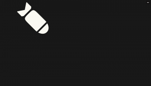
The animation begins with a rocket at the top of the screen that the user can move back and forth by scrolling. If the user continues to scroll forward this red explosion would appear.
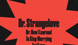
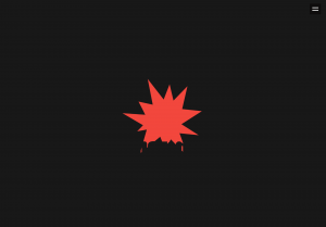
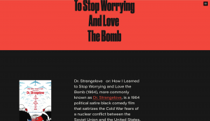 The red explosion would then get bigger as the user scrolls and the title of the movie would then appear. The last photo shows how the animation transitions into the next section.
I then looked into what I would be capable of doing for my website. I realised the closest thing I could do give that same effect as the above interactions would be for me to create an animation with Adobe After Effects. These animations could then be exported as ‘lottie-files’ which are animations that can be triggered or controlled by the user. This is something I would be excited to try as it is something I have never done before and I think it could give me some good experience.
The next thing I did to prepare for the development of my website was to sketch out the layout I am thinking of, taking into account that the website must be single-paged.

This is the layout I drew for what I think the home page and some of the sections would look like. The icon with the play button would be where I would place the lottie animations.
This was a basic layout to get me started in the design of the website. Next week I will start building my site.