This week I wanted to develop the interactions between some of my content so far.
I started off with the saturn V image in the numbers section. I want this image to look like it expands and rotates.
I realised I couldn’t do this with the image how it is right now as I can’t edit or change the sizes of each individual section of the rocket. Therefore I went back to the figma file that I drew it on and exported every section separately.
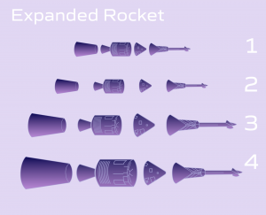
After I exported each separate part of the rocket I arranged them to the same size and scale of the original image. The next step was to make the padding between each part so that it would spread across the 2 screens. I realised that the rocket had to be a lot bigger to get the full effect that I wanted so I enlarged each part and then arranged them to the correct scaling. I made a component out all the parts together, this way I could change the size and scaling of the component on one page from the other. This allows the ‘Smart Animate’ feature in prototyping to work more seamlessly.

This is how this section looks with the new rocket images.
The next thing I wanted to complete this week was drawing a new image for the moon section.
Using the placeholder image I had as inspiration, I recreated the wireframe sphere. To do this I made a circle and repeated it many times, moving the left and right sides of the circle further in each time to create the vertical latitudes. I repeated the same process with another circle this time, moving the top and bottom sides further in each time to create the horizontal latitudes.

This is how the moon looked at this point
I then combined them…

This is how it looked.
I wanted to add more dimension to the image and make it feel more realistic, so I added some craters.
 To create these I used the same technique of repeating circle and moving the sides in more each time. To create these I also moved them slightly over each time, to create depth. The last circle I made a solid white to stand out more against the moon’s shape.

This is how the moon section looks with the new image.
I made the opacity 40% in the first screen and also rotated the the moon in the second screen. When the ‘smart animate’ transition is applied, it looks like the moon rolls in as it brightens into its full opacity value. I really like how this looked and I enjoyed the level of interactivity it gave the prototype. However I was still unsure of what I wanted to do with the 3rd screen. At the moment I just have the distance the moon is from the earth written. I wanted to put that data into context with the drawing I made but I wasn’t sure of how to do it.
I started looking through Space X’s website again as they are very good at presenting visuals along with technical information.

This is a section on Space X’s website about the Dragon Spaceship.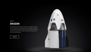
When the users scrolls down the page the image fills with colour.
I really liked the size of the image used as for a lots of my screens I have a similar layout to the above screens. I think how big the image is lets it be the focus of the screen and I think the background helps emphasise this. The filled image also rotates around to show all angles of the rocket. I think I could try a similar effect with my moon image.
My first thought was to try to have the moon appear to be rotating.
I tried flipping the rocket and rotating it slightly between screens. I used the transition options to try and soften these changes and blend them a bit better but it just wasn’t giving the desired effect.
I read through my content again and I realised as I was talking about how the moon related to the earth, it would be more visually interesting to see the moon and the earth together.
I started drawing the earth, using the same technique as I had for the moon. However this time instead of craters I made countries. With a reference image of the earth pulled up beside it, I drew a circle and manipulated the edges until I got a shape that looked similar to South America. From there I repeated the shape and changed the edges’ position and angle until I got the desired effect.
 This is what this finished drawing looks like
I wanted the earth to look like it was moving into the screen to position from the moon. I was then going to draw an arrow between the images with the correct distance under it.

To do this I kept the original screen the same but made the moon’s image very small.
 I then added the image of the earth and the arrow.
I made the earth take up half the screen as I think this puts the size of the moon into perspective.
To create the animation between these 2 screen I put both the arrow and the earth into the first screen, made them very small and turned the opacity down. This means that when the smart animation transition is applied, the earth will appear to roll out from the side of the screen and so will the arrow.
I’m happy with my work so far and next week I will focus on the ‘Silver screen’ Section.