Intro class- Week 01
In this class we were told what we would be covering this term. A portfolio website and preparing for a placement job was made a crucial point of this first module of the year.
To prepare for this our first task was to create a content audit of professional websites and the content they included. Content audits can be useful at the beginning of a project, it can improve upon any gaps and overall quality in your content before you start developing the website itself.
Insert content audit image here
“this is one i created for my portfolio project, as you can see……”
Adding onto the content audit I created a sitemap of what pages I should include in my website and the hierarchy/ user flow of these .

For further research into what I wanted from my portfolio I looked at the same professional portfolio sites but this time looked at their aesthetic choices and the design of the website to gain inspiration:
Studio Lovelock

I made sure to look at what they include in their case studies to learn from them. Studio Lovelock talks about the brief/project mission, finished photos of project, breakdown of what they created, showing project on different devices, brand guidelines and client testimonials on each case study.
I really enjoyed navigating through this website it felt like I was exploring it and that’s the type of feeling I want to emulate with my website.
Xavier Cusso
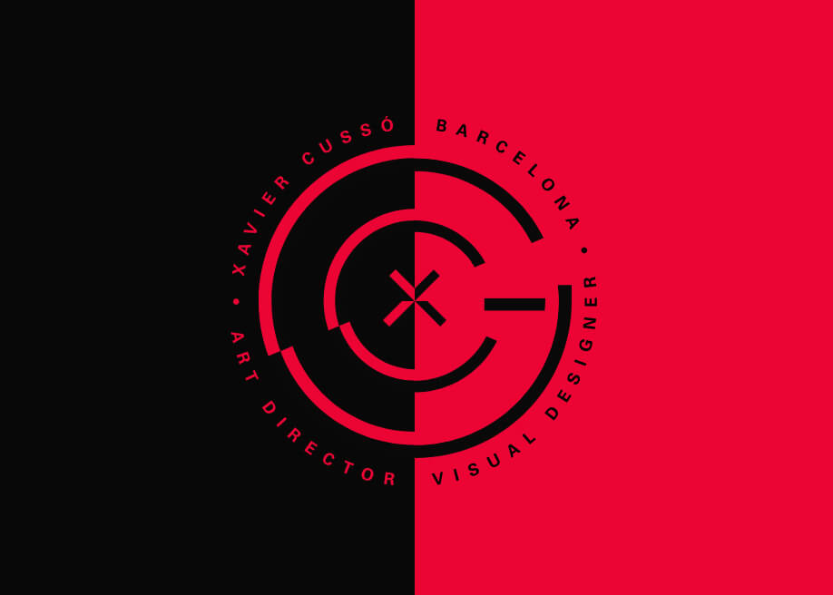
As soon as you enter this website the case studies are shown immediately. Different projects appear after each other taking up the whole launch screen. I liked how this throws the user straight into the point of the website. The middle of the screen shows a call to action(+ icon) when clicked, navigates into each case study. I liked that at the end of each case study you had the option to navigate straight to another case study, this makes it easier to move through the site.The launch screen also has links to ‘work’ ‘about’ and social media links to allow the user to navigate through the website. Cusso also had links to his social media on every page which means it is always easy for employers to get in contact with him.
Xavier Cusso’s website was something I had never seen before and it really inspired me to get started on my own portfolio site.
Olivia Truong
![20 Essential UX Portfolios [2021 Edition] | 20 Essential UX Portfolios [2021 Edition]](https://images.prismic.io/quintessentialwebsite/4ec7a032-d80e-4dff-adb2-9c9d99567597_20.jpg?auto=compress,format)
I really enjoyed the homepage of Truong’s website- the bright colours and fun photography. The website looked simple in design but the placement of images and text was very interesting.
Case studies are shown on her homepage which brings the user straight to the point. The layout of her case studies involve a big header image of the product’s name and identity. She uses blockquotes to explain the original problem with the product. She begins her process with research- looking at the old product and analysing. From this she gets her objective and project mission. She then goes through the project step by step. Truong then shows the product and the feedback she received . She the fixes these problems and to finalise shows final images of product and her thoughts.
I really enjoyed the way she laid out her case studies, the process made sense and was easy to follow and it shows the steps I want to create in my own case studies.
Writing my own content…
Insert images here of writing in workbooks