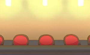
For the tenth week, we created our backgrounds for our section of the animation and began to rough out the animation.
Backgrounds
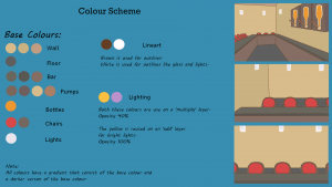
Colour Scheme
I chose to pick a warm colour scheme for the bar setting as I wanted it to feel welcoming.
I chose to use brown for the outlines as I didn’t like how harsh the black outlines looked and the brown makes it look softer.
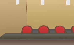
Line art
Base Colours
Gradients
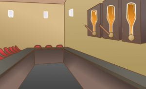
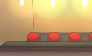
Lighting/Final Backgrounds
I like how the final backgrounds turned out. They have the warm and cosy feeling I wanted.
Animation without Background
I found the timing to be too quick in the first on so I adjusted the timing of the animation.
Animation with Background
I feel that with the adjusted timing the animation looks a lot better now and is easier for the viewer to see what is going on in the animation.
For the next week, I intend to have the secondary animation completed.
References
pouring pint:
https://www.youtube.com/watch?v=F3wPWxXfoao
