Initial Ideas & Sketches
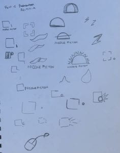
After our lecture on week four about visual identity & drawing, we were asked to start developing ideas for our own visual marque. So I went and quickly sketched out the first ideas that came to my head.
One thing I was really focusing on was the “out of the box” and “unique” parts of my tone of voice, and I really wanted to try and make this come across in my visual marque as well. I drew a small sketch of my monogram and a couple workmarks onto the same page to try and get an idea of what certain things would all look like together.
The one I liked the most was the one that looks like a sun with sunrays made of N’s.
I think this could represent bright ideas, and also bring a little colour to my brand, so I started to digitally draw this design on Illustrator, and then experimented with different colours because I am still not entirely sure about this idea and I might try some new iterations depending on the feedback I receive in the upcoming group critique.
This is the original design in all black.
Colour Ways:
The main colour I focused on was the purple I liked when using colour in my monogram because of how it connotes creativity.
I am not sure about colour on this at all because the yellow is the only one that clearly shows the sun imagery.


Leave a Reply