Amplifying Data
This week was all about amplifying data, and presenting our stories in a beautiful way.
Data is everywhere, and there are so many different ways to present it, including:
- Bar Charts
- Line graphs
- Pie charts
- Scatter Graphs
- Tables
Kyle then told us about the Sanctions Tracker by Enigma, as well as telling us about David McCandless.
I remember looking up David McCandless’ “Information is Beautiful” website to research when I was working on my infographic in first year. I really enjoyed looking through his site. McCandless creates graphics so beautiful that you don’t even realise you’re looking at data most of the time!
It was suggested to us to look at this piece in particular by him (on the Miro board)
All of the data on here is either beautifully animated, or interactive. This creates a really interesting experience, that is also super immersive! Even just the use of colour, type and visual hierarchy is really interesting, and unique.
Here are some of my favourite interactions from this webpage:

The use of colour and type in the graphic above was what really intrigued me about it. McCandless used colour and type size to demonstrate how common each symptom is.

This line graph shows you some statistics, as well as which country they”re from, when you hover over a different line. I thought this interaction was a really nice touch, and I’ve been working on trying similar hover interactions in my site as well.
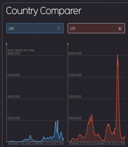
I really liked the interactive elements from this graphic, as you can change which country you want to see statistics from. There are five boxes in total, so you are able to type in five that you want to compare with one another.

The amount of average daily cases in this graphic are demonstrated by tone of colour. Just like the second graphic I showed, you can hover over each country on the map to reveal the Covid statistics within that country.
Thoughts:
I find the concept of designing data in an interesting way to be really useful for creating a better user experience. I think it would make your product a lot more memorable, and also make the information easier to digest – especially when you are actively interacting with the data involved.
I’d like to be able to try something like this out if I were to include data, either somewhere in this project, or with one in the future.
Leave a Reply