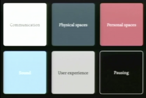
The Power of the Pause
I started watching a video of a talk by Liz Danzico about the “Power of the Pause”.
The video started by playing a suspenseful piece of music that is reminiscent of a shark in the water from the movie “Jaws” , she then explained about how the pause between every two notes added a lot to the story.
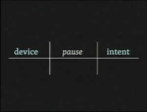
She showed this diagram and used it to link UX back to the pause:

She then went on to speak about the momentary pause problem, which I found to be really interesting. We love smoothness, and that is the same in UX, we like when things flow well, and go smoothly.
Danzico then spoke about how reluctant we can be to use a pause because of this. But that we need pauses to understand information better. She linked this to white space as well, and how we use that to break up content, and make content stand out.
The pause can enhance content; the meaning and the relevancy.
Redefining Space
Redefining space, can allow the content to take on a whole new meaning.
The hand pause – the moment where a users device is catching up with their intent. What can we do with the space while this pause is happening?

A pause can create a reward within the brain. When you figure out what’s happening with the music, or what the song is, you feel really pleased with yourself, and excited. This is a reward within the brain, and pauses within design can make this happen.
We can use pauses to give our users a meaningful experience.
We were then shown a video by Everynone, telling a story about many different experiences – without words, and without the clips being more than a few seconds long. “Everyone watching will create their own experience from this.”.
Going for a walk, and taking a pause, can reset your design process and get your creative juices flowing again. Adding a pause within our designs can do something similar for a user. It creates a moment for them, and can make the experience more personal to them.
Thoughts:
I found this talk to be very insightful. I always kind of thought that having too many pauses within a design can cause a user to get bored of looking at your product for too long, and then give up on it. However, using these pauses strategically and meaningfully can be very powerful. I will definitely be thinking back to this talk whilst working on my website and prototype, and possibly every other project after that!
Leave a Reply