What is a Style Tile?
A style tile is a design deliverable that references the UI components that are going into a website. These elements can include typefaces, colour, imagery and style collections.
Style tiles can be shown to clients along with a site map and wireframes – this means the client can be more involved in the design process, and it allows for discussion around the overall style to take place. With discussion involved, it’s easier to refine and clarify what it is that the client really wants stylistically.
Style tiles can demonstrate, to a client, how a designer is going to translate their brand and ideals into a website.
How Does a Style Guide Compare to a Moodboard?
Moodboards can be a good base to begin with, however, they can be too vague. As much as they can lay out basic ideas – a client will need a more specific visual to fully understand and imagine what the final outcome may look like/involve. In contrast to this, style tiles can enable a designer to efficiently (and effectively) communicate how styles will be applied across a whole web system.
Creating my Own
With all of this in mind, I decided to take a shot at making my own style tile.
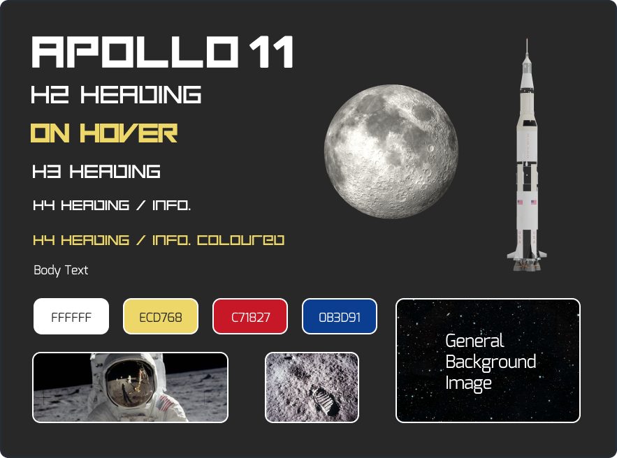
Since I’m planning to make my website navigated by clicking through sections – I don’t think I will be using any buttons within the site. I am also aware that it is very early on and this could change, however, for now – the content included within my style tile is mainly colour, typography, and some imagery.
Here is my style tile:
Type
For the type sizes on my prototype, I used a visual type scale. I wanted every visual element to be as consistent as possible – whilst also making sense in terms of hierarchy.
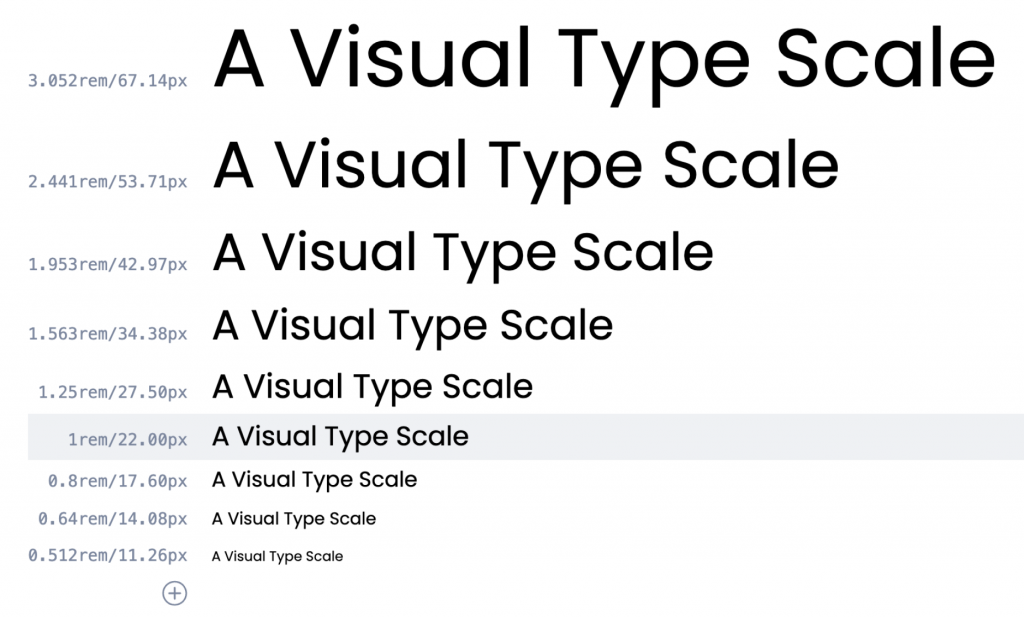
I started by deciding on 22 pixels for the size of the paragraph text. On websites, 16 pixels is usually the minimum, and I wanted my text to stand out, and also be readable to those who may strain their eyes reading 16px text. After this, I looked to the type scale for what the ideal text sizes would be for the headings etc.
Thoughts
Overall, I enjoyed creating this style tile and I know that I am not doing this project for a client – but I think that being able to see how everything looks laid out together has been great for making small changes to typography and colour choices. I also think that having a visual idea of my brand and general style will be useful to easily show Kyle where my project is headed.
The moodboard was good for gaining a general understanding of imagery and typography that may be good to use in this project – however, creating this style guide implementing my own brand and style has been a lot more useful in seeing everything together before moving onto hi-fi wireframes.
Leave a Reply