Visualising Data
This week we began looking at our next project which is data visualisation. During this lecture we were shown examples of diagrams and charts that display this data.
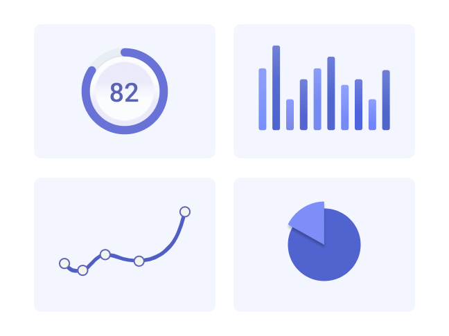
Our task for the week was to recreate some charts that we were given.
Original:

My Recreation:
Original:

My Recreation:

Review:
Overall I found this exercise to be both very fun, and also helpful. I decided to create these charts on Figma as I wanted to see how to do it without the graph feature on Illustrator. I also did it on Figma as I will most likely be using this programme to make my infographic so understanding how to make charts on it will be invaluable.
I had to look up a quick tutorial on how to create a donut chart for the second one, and it taught me a lot about frames and masks within Figma.
I think the skills I learnt during this exercise will be very useful to me in the development of my infographic. It has also helped me gain a better understanding of how to operate Figma, which will be useful going forward with other projects in the future as well.
Leave a Reply