Digital Iterations
As I was colourising my log-in screen, I had many different colour combinations and such that I wanted to try out before deciding on one.
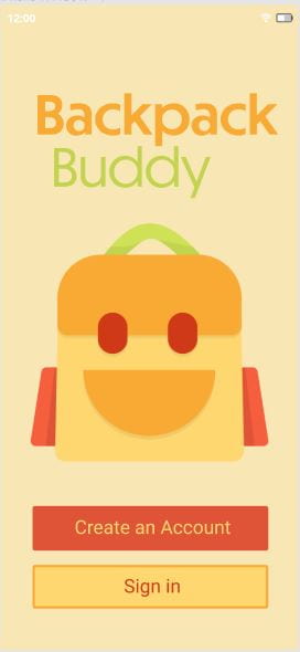


I think the orange and green title is my favourite combination, however I am still not too sure if the red button looks too harsh. Almost as if its warning you not to click. For this reason, I will most likely continue to experiment with colour ideas for this screen, and the rest, before finalising.
Update March 10:
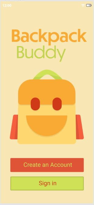
I realised after doing this that both the contrast in some of the button iterations, as well as the title and the mascot doesn’t seem to be overly clear. Because of this, I decided to darken the greens used and changed most of the colours overall from pastel hues to more bold tones.
Here is how this screen currently looks after reviewing and increasing contrast:

Leave a Reply