Following the critique I received from Kyle and Pauline, I made quite a few changes to my webpage essay before submitting.
The first change that I made was adding my name to the top of the page:
The next thing that Kyle suggested I do was to remove the yellow Borders I had placed on either side of most of my images. Once I did this, I thought the page looked a lot cleaner.
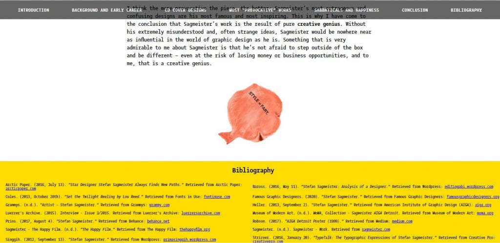
The final thing I did was add a background colour to the bibliography, as well as making the width 100% of the screen size.
I had planned to do something like this, but I wasn’t too sure how to go about it until Kyle explained a way that would work.
I also added a bit more spacing between the bibliography and my illustration of the iconic “Style = Fart” whoopie cushion.
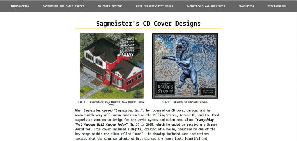
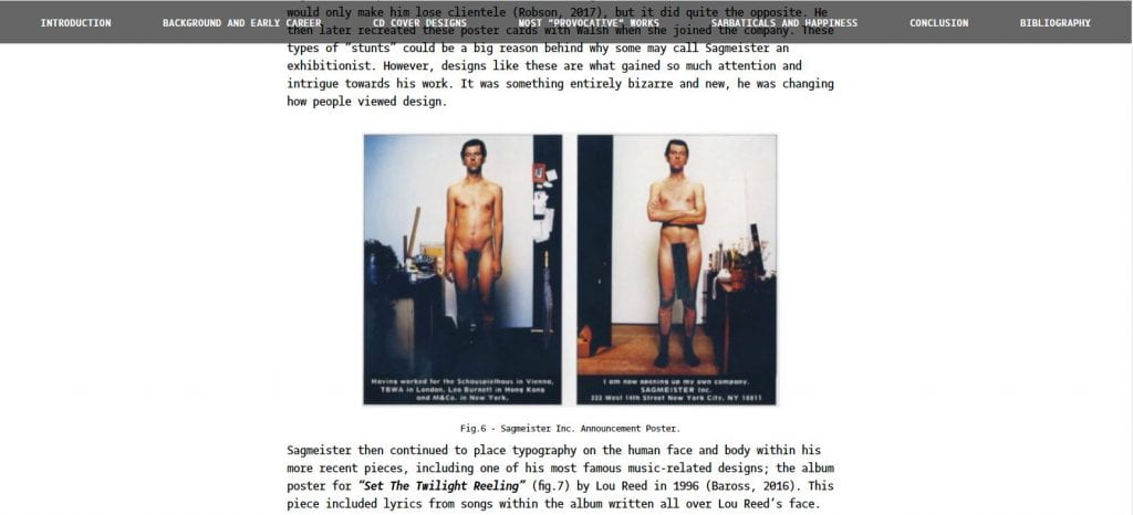
As well as this, I finally added figure captions to all of the images included within the essay and referenced them accordingly within the essay.
The last thing I did was changing the image sizes on HTML to percentages rather than pixels in order to make the images more responsive to any screen size.


Leave a Reply