Master-Apprentice bar charts:
I found this weeks task a lot easier than last weeks but I cant tell if that’s because I’ve been spending more time on illustrator than before.
Original: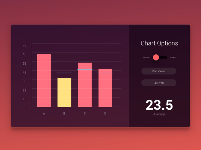

Mine: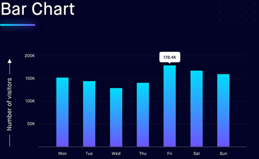

Research:
Do’s And Donts of Infographics:
DO’s
Do your research. It may seem like an obvious step, but far too many brands don’t take the time to do thorough research. Focus on finding relevant statistics that shed light on your topic and help build a complete narrative. Remember to use reliable sources, cite accordingly, and avoid outdated findings. As a best practice, any fact more than one-year-old is outdated. The last thing you want to do is dampen your brand’s reputation by misinterpreting or presenting outdated, incorrect information.
Do focus on content. It’s easy to get caught up on aesthetics and details, but remember content is king. Infographics became popular because they are a visually appealing way to present data and tell a story. Build a complete narrative that includes a beginning, middle, and end. Provide context for the viewer, present insightful findings, and close with a position, solution, or prediction of the future. Even if an infographic is beautifully designed, poor storytelling and copywriting will lose audience attention. If the content is not engaging, it will show.
Do look at the big picture. Take a step back and think, “Who is my audience and why should they care?” In today’s overflowing content ecosystem, it is vital that you have a point of view and help your audience connect the dots. What are your goals for this infographic, and how will you measure its success? Will you gain views through earned, paid, or owned tactics? Having clear answers to these questions will allow you to make more strategic decisions and build a more effective distribution strategy, resulting in a more successful infographic.
DON’Ts

Don’t overload it. “Quality over quantity” is a saying that applies to almost everything — infographics are no exception. A single infographic should not be the sole product of your content strategy, so don’t try to squeeze everything into one. We’ve all seen the never-ending infographics that seemingly scroll on forever. Does anyone actually pay attention to all that content? Probably not. So leave the fluff out. Include only essentials to fully and effectively drive your message. Remember, less is more.
Don’t make it all about you. Perhaps one of the biggest mistakes made when developing infographics is making it all about your product or brand. An infographic that is too brand-centric will come off as self-promotional (because it is). Yes, your message and brand story are important, but an infographic may not be the most effective medium to communicate that. Instead, make your strategy all about the reader. Give them information they desire and that will help them connect the dots on whatever topic you are an expert in. Incorporate found facts, results from a commissioned survey, or even competitor data that helps support your message. This will keep them engaged and help build a much stronger (and more natural) association between them and your brand.
Don’t force it. Infographics are a great way to quickly tell a story and efficiently communicate a message, but they’re not always the best solution. Evaluate your content and audience, and consider all visual content options. Motion graphics, interactive infographics, micro-content, and slideshows are a few of the many different types of visual content. Familiarize yourself with all options and choose the form that best fits your needs. Effective strategies usually involve a few different types of visual content — you don’t necessarily need to commit to any one specific type to communicate your entire brand message or story.
Sanctions Tracker:
Sanctions tracker is a website that displays infographic-style images that show the changing sanctions that restrict US businesses and how they change.

