Tasks:
This Weeks task was a master-apprentice of some pie charts:
Mine:
Master:

Mine:
Research:
Nicholas Felton
Nicholas Felton is a designer/artist whose work focuses on translating quotidian data into meaningful objects and experiences. He has completed a series of annual self-tracking reports detailing the events of a year which became part of the ideology behind Facebook’s timeline which Felton was one of the lead designers on. I think this displays the incredible scope and applications of data visualization and how it can lead to a great variety of career opportunities. While working with Facebook Felton changed the structure of the timeline to showcase an entire life resulting in redesigned elements such as the addition of cover photos and styling attributes like typography and map styling. This had a massive impact on the functionality of Facebook leading to the social media platform still in use today.
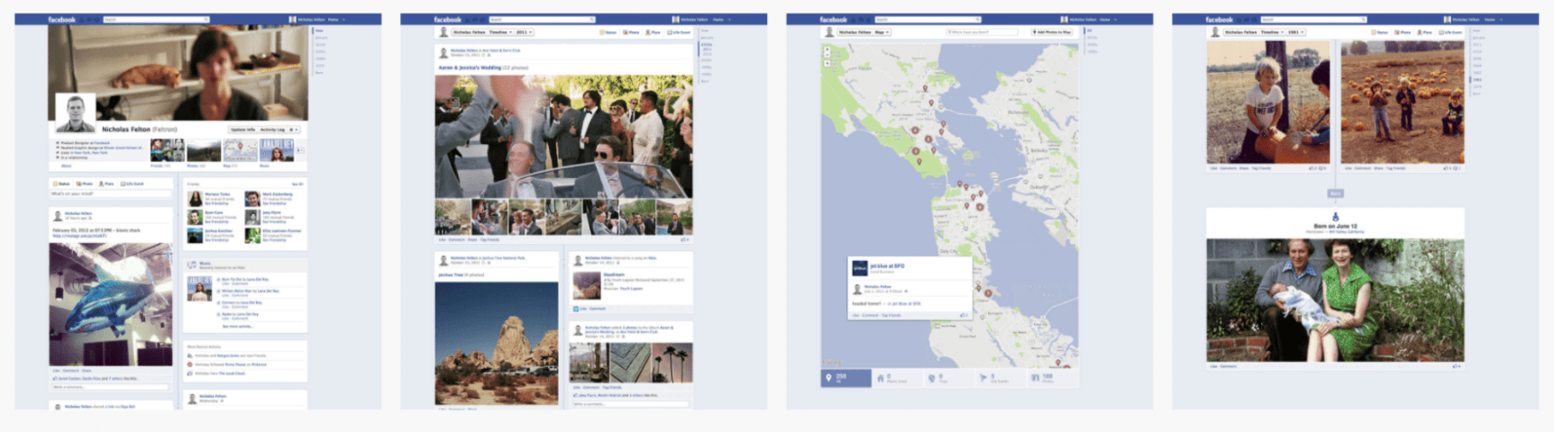
I also love his annual reports that he publishes. I think I’m going to do an infographic similar to these however make it about my training I do for sport as I have a huge log of all my information day by day for the past 4/5 years.
Giorgia Lupi
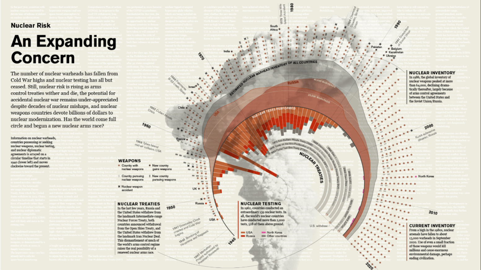
I really love the use of layering in the above outcome produced by Giorgia Lupi. While the white writing does reduce readability slightly it gives the outcome a collage feel as though it had been produced in the newspaper. This parallels nicely with the idea that the stats are shocking and newsworthy. I also love the use of imagery and how the cloud of smoke sits nicely behind what appears to be a combination of a stacked bar graph, stacked chart, and sunburst chart and a dot, bar, x pictogram providing information about countries with nuclear weapons. I love Lupi’s work because it presents the narrative in a beautiful and intricate visual, e.g. the data is presented in the formation of an explosion and disperses around the edges. However, a concern for me would be readability, particularly with the inclusion of overlapped writing. Yet I would still love to experiment with this style in my own infographic to see what elements could be incorporated without disrupting the readability of the outcome.
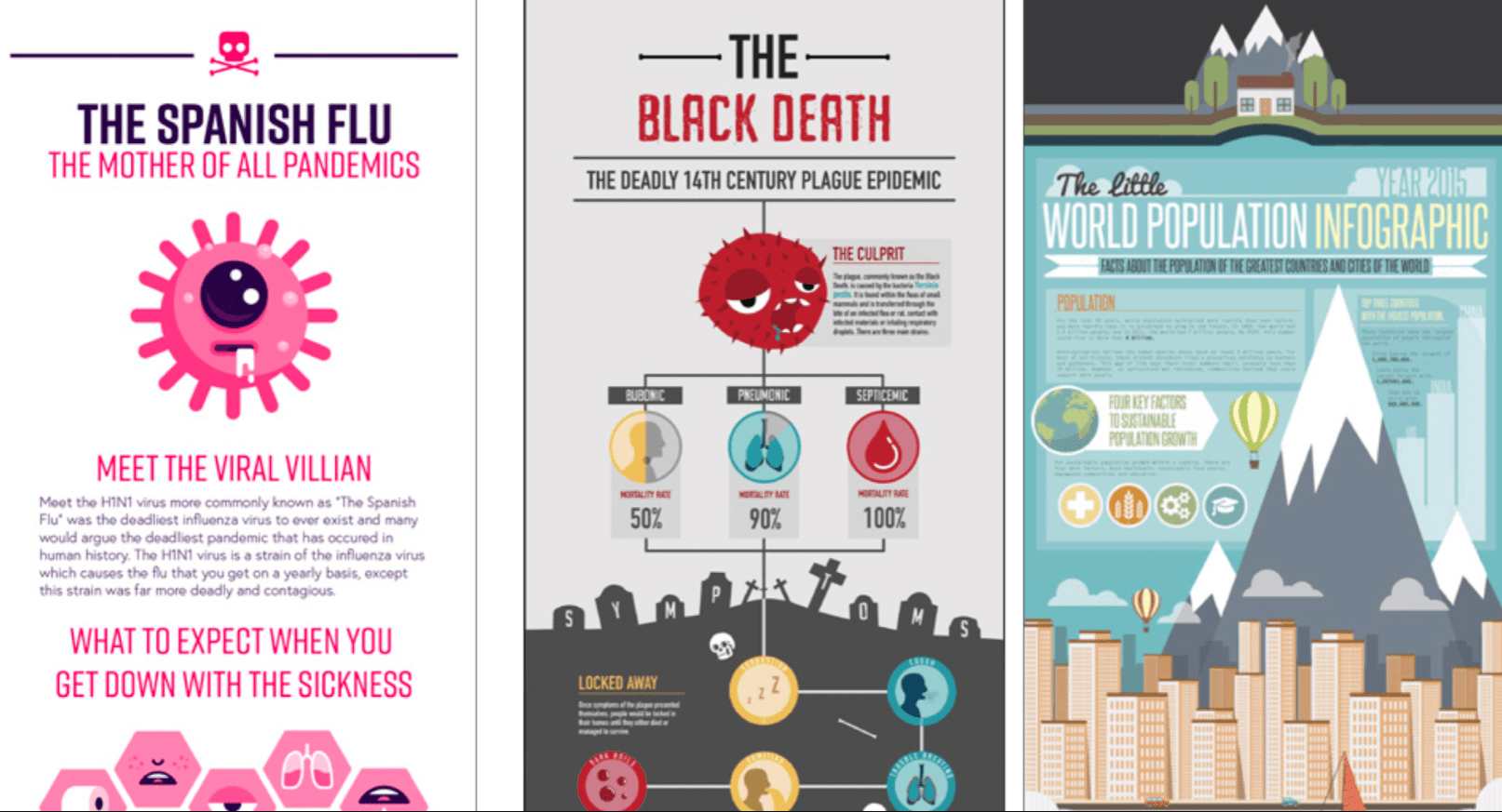
Past Pupils
Some of these designs are great. I love the simple color palettes and choice of topics along with the quirky illustration style on the flu posters.