Checklist:
Things to have done for week 5
- Icons Created
- Consider UI
- From Your Wireframes create 3 visual mock-ups/prototypes
From this list, all I have to work on is creating mockups from my wireframes:
Using these paper wireframes I’m going to take the first three designs and take them into Figma. To start I collected the icons I made for my planets.
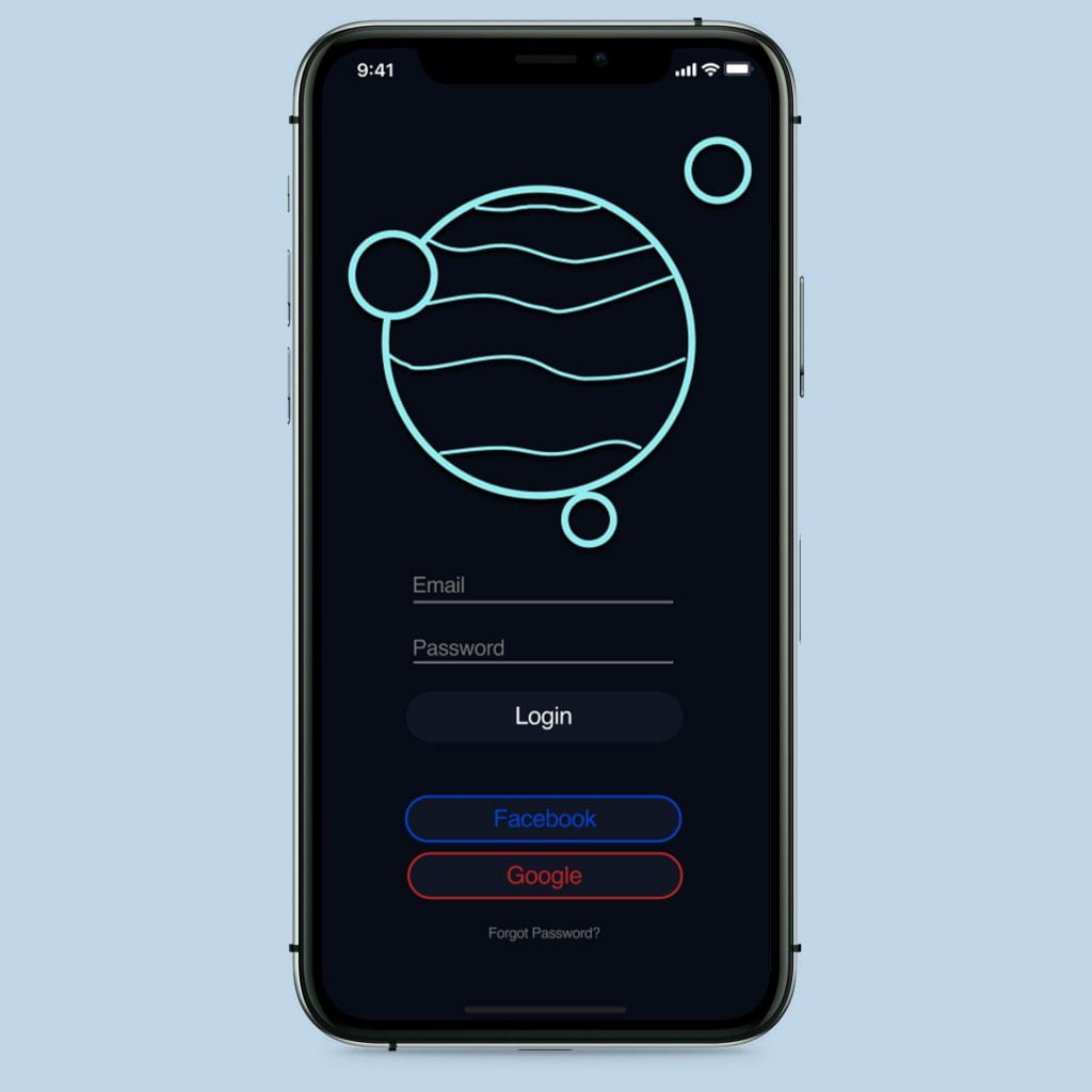
I then put these into my designs and used the color scheme I picked and matched to logos.
The main thought behind the colors was my dislike of the use of black due to the harshness that doesn’t match the logo design. therefore I have decided to use dark navy and grays commonly found in dark modes on apps such as youtube and chrome.
I created these two but after I made them I realized I was using the wrong dimensions for an iPhone. Along with this, we had a group critique and I got some great feedback on my designs, so I took any advice on spacing and sizing and made these changes as I took them into my new dimensions.
To create some of the iPhone features such as the time battery and bottom bar I used some community presets available on Figma for ios and android.
After creating these mockups I decided to take them into Photoshop and apply them to some iPhone mockups.


