Trying it all Together:
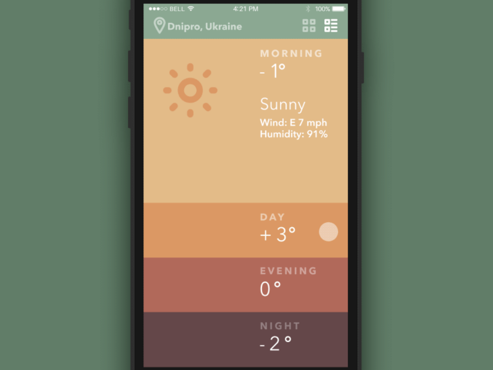
We started off by looking at some App designs and the use of color and icons within them. I took some screenshots of some of my favorites. These are mainly due to the great colors.

We then looked at good design practices such as contrast icon size button size and spacing to allow for the thump size and reach. We then had a look at color schemes and color standards such as monochromatic, analog, complimentary, and custom. All these have different outcomes and work well in different scenarios. We then looked at the impact of contrast, why it’s so important.
A good website for this is:
contrast-ratio.com
Contrast ratio:
- Small text – 4.5:1
- Large text – 3:1
von Restorff Effect
When multiple similar objects are present, the one that differs from the rest is most likely to be remembered.
