Getting Iconic
Today we looked at:
- Icon Design
- Inspiration
- Master-Apprentice
We looked at the history of icons and the development of specific icon sets such as the development progression and evolution of the icons created for the Olympics and how they changed over the years to reflect the state of design.


We looked at a quote from a designer and paul discussed how you can create icons and design from this other than just paper and computer graphics and that they can originate and stem from things such as origami and needlepoint.
“Bitmap graphics are like mosaics and needlepoint and other pseudo-digital art forms, all of which I had practiced before going to Apple,” —Susan Kare
We looked at the use of icons on current apps websites and designs and the simplicity of the logos that allows them to convey their purpose and meaning, for example, the apple product logos that are very similar but contain recognizable differences.
We then looked at how we can keep consistency in our logos with a couple of things:
- Level of detail
- Scale
- Detail
- Style
- Harmony
Designers:
We then looked at some Designers like Vic Bell

And how she designed logos for brand such as Burberry
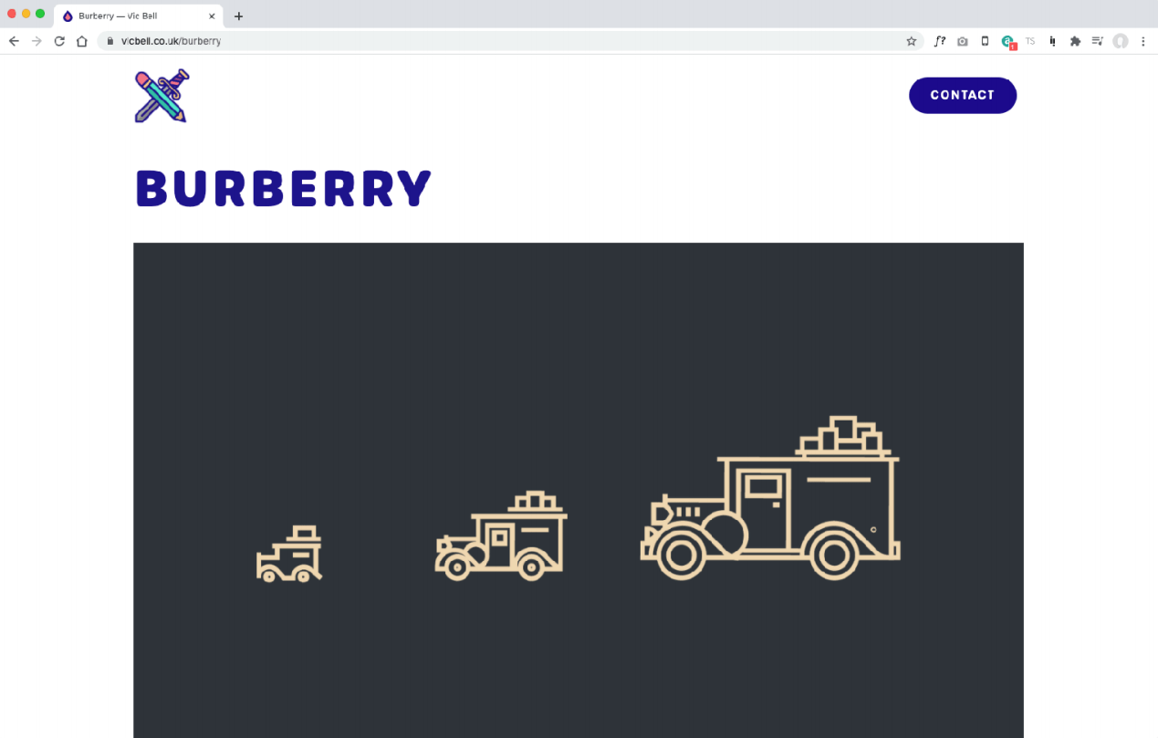
What’s very interesting in her work is she creates different designs based on the size of the logo and how it will be displayed, so for example in the image above she has 3 variations of the same logo reduced in detail and scale so when something smaller is needed the readability of the logo still remains and they keep a sense of harmony and collectiveness. This might be something I want to think about when I create my own logos.
Tim van Damme is another designer that works with the creation of logos and although he shares a similar work routine to Vic bell his logos are far from similar and almost break some of the rules we went over to create a harmony between logos.


These are some of the logos he’s created and these were created as a group, what I find amazing is the harmony that exists between all these logos although they are almost all different colors. personally, I think that’s quite impressive and something I would have thought of as possible. They still maintain a consistent line width and weight along with a consistent level of detail that helps tie them all together. I also think from looking at the longer the thing that helps tie them together as a collective set of icons is the color pallet. Although they are all different colors they are all slightly muted and not too painful on the eyes.