Creative Futures Blog
Introduction
I had been given so much information from first year to second year about jobs and placements with the amount of knowledge I gathered for myself to make it to final year in Ulster University including animation industries for our future success after graduation. I had a lot to think about future careers and the roles and skills I had gained these last three years to hopefully meet their requirements by presenting my best work whether it is sketches, digital art or any of the work I have done for our team project from the Major Project.
Poster Process
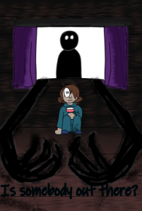
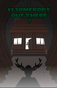
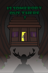
Starting our second semester with the introduction of the module creative futures, each team and individual had to make a poster to advertise our short film and to showcase for the industries themselves. In a team of 3 with Sarah Elliot, Dylan Short and I whom had our hands full with the major project, but we gave ourselves the goal of sketching concept designs for our short film ‘Is somebody out there?’. We first researched examples from films and tv shows that fit the narrative and theme of our project and used Miroboard for examples before sketching our concept design.
Taking the inspirations and references we collected for our major project with each of their official and alternative posters to help aid us in the way we see our short film in our own eyes. Especially the story been influenced by fairy tales like red riding hood and the three little pigs and warnings such as stranger danger to tell to the children of young age. We each did 3 sketches in our sketchbooks to show each other our concept designs so far in the in the early weeks.
- 1st concept
- 2nd concept
- 3rd concept
We then narrowed it down to two sketches and made a few amendments with more concept art and the merging of what we had while having similar appearances with each other. Then in later weeks we narrowed them down from two to one to then take each of our owns sketches to start onto the digital art stage. I took the movie Monster House as the main inspiration for one poster and for the other Mimic and Coraline where the danger is right behind them.
Fundraiser
When our lecturers had told us about us showcasing our posters in June for everyone to see and promote our short film, but in order to do we as a class must raise funds together in order to print and deliver our poster banners in our final year room. So our class created a Discord channel to get everyone on board for the ideas and plans for the posters themselves and how to raise money for this event. We later decided to hold off two events which includes a pup quiz and a craft fair which then our team leaders hosting these events created a name chart for us to put down our names for that event and the role we would be taking that day. I put my name down for the Craft Fair with the role of being a helper which includes guiding people, minding stalls when the buyer has left for a moment and making sure nobody steals anything from the stalls.
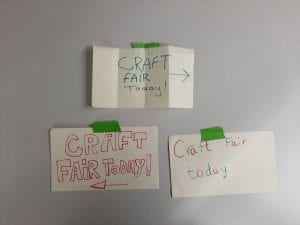
Sarah, Dayna and I worked on creating small posters for the front and back entrance that day to show people where the Craft Fair by making arrows from highlighters. Here is the pictures I took to show the three we made and stick to the entrances. During the whole day of minding stalls, taking breaks and keeping a eye out we had bought a collection from each being stickers, keychains, pins, zines, earrings and postcards. Afterword’s when the everyone was starting to pack up, we were instructed to take them off and give them to others who ran the craft fair and left.

3 small posters for the day of the Craft Fair
CV
For my CV form, I had updated mine for any progress I had this year before the end of our final year classes using Microsoft Word and Photoshop to create it. I had gotten feedback from my lecturers about my CV as I had researched ways to make it better and only for someone in animation industry to approve it. I did not add a logo since only my name or initials are significant for the CV and had added software I have used or a professional at from my three years in Ulster University. By rearranging subtitles and textboxes, then got advice of the colour of the CV since white did not go well with the orange and blue text. So I decided to have the page in a orange and blue colour scheme to brighten it up in display and be equal to the text but still in contrast. Which then I printed out and went to deliver it to our module class.
Portfolio
I had sorted my entire portfolio from clips of my major project, sketches from my book and previous year works from other assignments I did in the 3D and 2D area with the skills I’m showing for my future roles. I did not have much time to do a showreel since I did not have enough animation to fill in the gaps or have most recent other than the 2D animation from the major project. As I would be using a social media platform to showcase my work since I signed up to Artstation as companies can view my work and art skills put into each one with finding the role for storyboard artist, concept art, character design and animator of 2D/3D. Therefore I have even more chance of getting a specific job role for a company in need of my skills and qualities. Here is the link and my profile page with my best work showcased. laurenmaxwell7.artstation.com
Set-up
Before the showcase, we had set up our table in the final year room with everybody else where the banners and our work will be put on display. We arranged the tables with props, cloths and fake leaves to give it the dark forest haunted theme with monster displays and a flashlight. Here is our display before the Friday.

While this is the final version we put together with monitors, our Cv’s and artbook. However, one of our lecturers was supposed to put our banner up before 5pm what will continue with us and other teams on the Monday. It was a fun experience with the team on collecting the last of the stuff to see how it would look like for the latest display.
Promoting Work Online
Although I used Artstation for my portfolio, I had signed up to LinkedIn to promote myself with the skills and experience I had received from Ulster University, Volunteering at Cancer Focus and Work Experience from Jam Media. Here is the link to the page: https://www.linkedin.com/in/lauren-maxwell-340714309/
Artbook
For our artbook collection, Dylan had volunteered to collect all our pieces of work for what we had done for the major project which includes character creation, environment, storyboards and etc. Then he would give them to Sarah after printing where she would trim the pictures and buy the artbook by drawing the cover. She and I would then stick the images into the artbook taking turns and place onto our setup once finished with the pictures I had taken. Here is some off the pictures I taken from the artbook between images.
- Storyboard
- Storyboard 2
- Storyboard 3
- Concept art
- Concept art
- Character Sheet
- Character Sheet
- height difference
- Concept art
- Concept art
- Concept art
- Concept art area
- Beast Model
- Beast Model
- Tree
- Tree
- Beast Rig
- Frame Still
- Frame Still
- Frame Still
- Frame Still
- Backgrounds
- Backgrounds
- Backgrounds
- Backgrounds
- Backgrounds
- Backgrounds
- Backgrounds
- Poster 1
- Poster 2
Reflection
The Creative Futures this year, was an enlightening experience with me thinking about my future careers and promoting my work online and in physical form. I Volunteered at the Craft Fair which was a great event to attend for as I expressed good communication with other helpers and the sellers at the stalls as it was a great experience helping out. I loved making our poster design through the entire semester as I got better with the digital illustration on Krita and gathering all my research of references with my teammates. However, if I was too change anything at the start of the semester it would be balancing more time for the creative futures and the major project since the major project took up way too much of my time to get both done. Another note is doing more 3D animation with the 2D animation from our main project to create a better and improved showreel this final year and maybe create business cards. On the other hand I enjoyed the experience and can not wait for our showcase to have companies and families to see our best works with hopes of getting offers from companies who have interest in my work.


