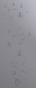
My visual marque/logo was the last thing I designed. This made it easier as I already knew the direction of my brand and my tone of voice. Firstly, I took some words associated with my brand and tried to represent them visually through sketches. I started with things such as, arrows and roads as these represent going forward, adventure and determination.
I then started to sketch mazes using lines and rectangles. These were some of my favourites, so I decided to develop them further and create some digitally.
I tried out different line widths to see which worked best. I used a grid to ensure the layout was neat and the shapes were consistent in size. I felt that the first one was too thin, making it less versatile. This meant if it was reduced in size, it would be hard to recognise. The third one was too wide, and I felt it didn’t really resemble a maze. The middle one works the best as its easier to see what it is and its versatile.
I then tried out different shapes and positioning with this:
This is the one I chose:
Turning it on a 45-degree angle gives it a nice shape and I feel that this one most resembles a maze. My monogram also resembles a maze so this ties in with my overall brand. It symbolises determination, adventure and moving forward. I think it comes across as confident as the lines are quite bold, making it more eye-catching. The colour is the same as my monogram and wordmark, so everything remains consistent.
If I was to use this with my wordmark, I feel it would be effective. This is because my wordmark is thin, and this is bolder, so it adds a nice contrast.


