This post shows the development of my travel app, from initial sketches to creating the first three screens and receiving feedback.
Sketches
I began sketching my initial design ideas just to get it down on paper and give me an idea of how I wanted it to be laid out. When doing this, I made sure to use the tips we learnt about sketching. For example, using a thicker pen which prevented me getting distracted by unnecessary details. I also added some colour to highlight certain aspects of the app, this would make it easier for others to comprehend.

Digital Wireframes
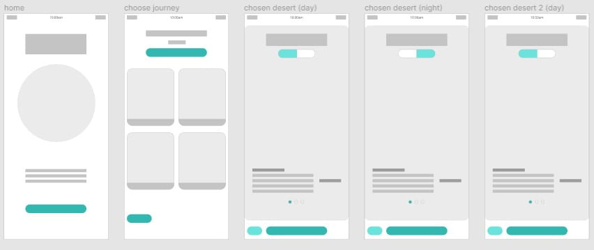
I then took this layout and created it digitally on Figma. I wanted to do this as I could be more precise and make any final layout changes before adding content. This was beneficial as I could be more precise with the sizing and make sure the screens were consistent. I decided to change the area for the illustration for the home screen to circular, so it was different for the rest of the app. There was a chance this layout could change as I added content, but this gave me a solid starting point.
Icons
Next, it was time to create my icon set. I will add to this if the need for more icons comes up. I didn’t feel my app needed many icons as I didn’t want to bombard it with too many as this could become confusing. Therefore, I kept it simple and created ones I needed. I have the basic home screen, back and forward and a play button. The play button could be used if the user wants to go through all the desert screens in order rather than choosing a specific one. I created one that resembles mountains in a desert that could be used on the “choose a journey” screen. I have sun and moon icons for my day/night switch. I then created a battery and sound icon for the top of the screen as this makes the app appear more realistic and that its on a phone.
When creating the icons, I used basic shapes such as point, line, and plane to keep it simple. It was important to make them similar in terms of line width and colour to keep it consistent. For example, I used the same curved rectangle to create the shapes of the home, back and forward, desert and play button icons. Keeping everything consistent and simple makes the icons more recognisable and understandable globally.
![]()
Creating the first 3 Screens
Now that I had my icon set and an idea for my layout, it was time to start adding content. I began by choosing a colour pallet for the overall app. I thought this one was effective as it had the bright blue and orange which could be used to make certain elements stand out. It also had the white to add simplicity and the grey colours for text.

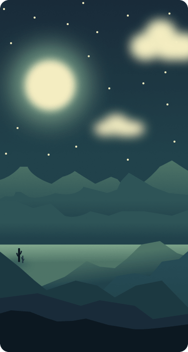
The next step I took was beginning the illustration for one of the chosen desert screens as this was the biggest element of the screen. Up to this point I hadn’t had much experience with digital illustration so it was important to find inspiration to get me started.
In a previous post, I looked at the work of Olly Moss. I looked back at this for inspiration and found other illustrations in his style. Here is a mood board I created:

I also created a Pinterest board of desert illustrations which I will continue adding too throughout this project:
https://www.pinterest.co.uk/lgilmore401/illustration/
Next, I did some rough sketches of how I wanted my illustration to look:
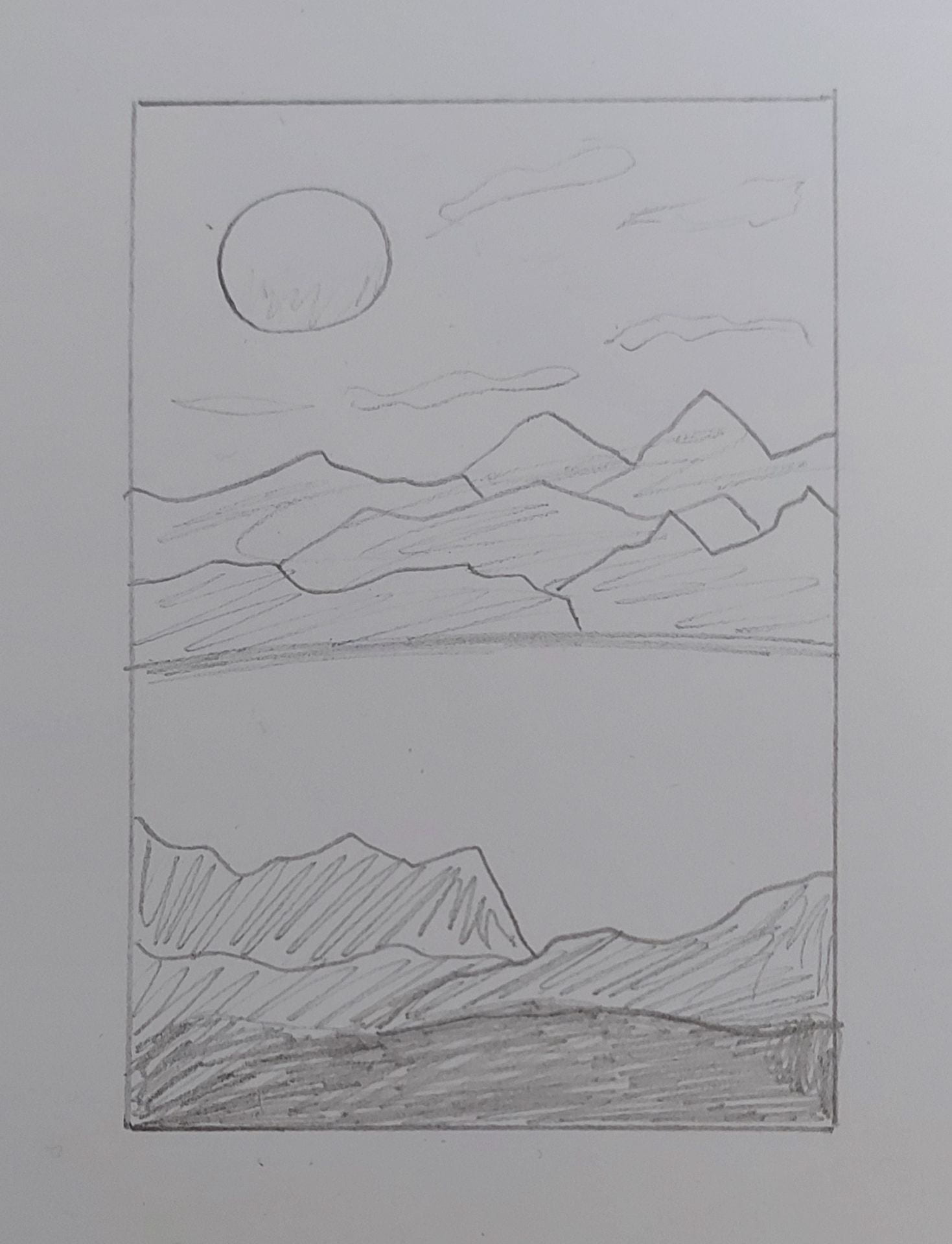
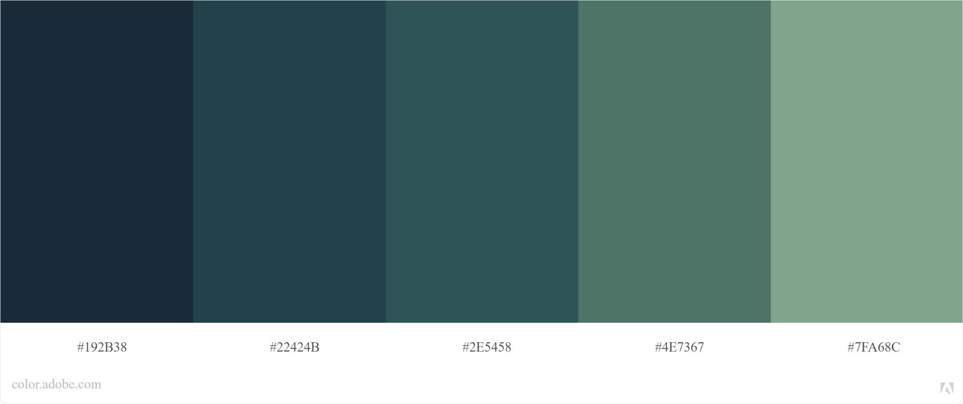
I then chose a colour pallet for the illustration, so the colours remained consistent throughout. I used the same illustration for the “night” screen and just used a different colour pallet. Here are the ones I used:

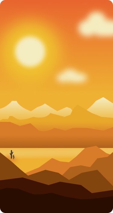
This is how the illustrations turned out:
I did the same for the home screen illustration by starting off with a sketch and a colour pallet:


This is how it turned out:

I think it’s quite eye catching and simple. I particularly like the curved rectangles cut out of it as this makes it more interesting to look at. It also means I could use these shapes on the home screen. They are also the same shape as the buttons on the app which provides a consistent look and feel.
Another element I had to create was the switch from day to night. Originally, I had the words day/night, but I felt haven’t words wasn’t necessary, so I changed them to sun and moon icons. This makes It quicker for users to understand what it is for and it makes it more visually appealing. I got the colours for these from my illustrations colour pallets.


Choosing typefaces
For the name of the app and other titles I used Spartan. I felt that this san serif typeface made it simple and easy to read and making it bold makes it stand out. I increased the spacing between the letters by 5%, again, to improve legibility. For other text I used Zilla Slab. This is a serif typeface, so it is more effective for longer pieces of text. When adding the paragraphs, I kept the line width quite short to improve readability.
Putting it all together:
When creating the call to action buttons, I made them the bright blue colour to draw the user’s attention to them. I also made them quite big to make them easier to click on.

Feedback
In class, we had a group critique session which gave me an opportunity to show my work and receive feedback from Paul and my classmates. I found this session very beneficial as my peers gave feedback through sticky notes which I can look back on.

Corrections
After receiving feedback, I went back to my app and started making some changes:
- I made the moon icon on the day/night switch smaller, so it wasn’t touching the edges of the rectangle.
- Buttons: I took away drop shadow, making it a lot cleaner. I updated the next and back buttons to clearer arrows. On the home screen, I made the call to action button clearer by moving down the purple rectangle and just having white space around it. I took away the “back” and “next desert” text as it was unnecessary and used icons instead.
- I centred the text on the desert screens to make it more visually appealing. It is still left aligned so its easy to read.
- I made the clouds of the illustrations less blurry. I feel this makes them stand out more, its clearer what they are and its more visually appealing.
- Originally, I had a slab serif font for the main content. However, I don’t think it worked well as it was bold, making it hard to read. Therefore, I changed it to “Marcellus”. This typeface, as well as increasing the size of the font, makes it easier to read and I think it goes better with the overall tone of the app.
- Lastly, I replaced lorem ipsum with real content. This gave me a better idea of how it would look.
As part of my feedback, it was suggested that I create a screen of the world map showing where different deserts are located across the world. I think this would be educational so I will consider this when creating my other screens.
Here are my updated screens:
