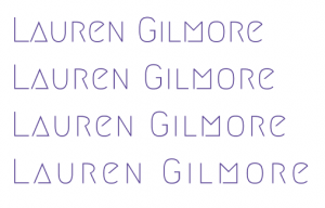
The typeface I chose for my wordmark is Megrim. The triangle shapes for the “A” and “M” make it unique and interesting. The capital letters make it appear confident which goes with my brands tone of voice. I feel that it is clear and minimal, making it easy to read. I added different levels of kerning to see what works best, these can be seen below:
This is the one I decided to go for:
This is at 5% kerning which I feel is the perfect middle ground. It was important that the letters weren’t too close together as this would make it more difficult to read. This gives the letters a bit of breathing room, making it more effective.
I think it works well with my monogram as it is thin which adds contrast. I made it the same colour as my monogram for consistency.
Update
Feedback
Some of the feedback I got on this was that the typeface was too thin. Especially when compared to my monogram it gives off two different tones. I want my wordmark to come across as bold and confident like my monogram, so I decided to make some changes.
I went back to Google fonts and started trying out bolder typefaces with my name to see what worked best. These are some of the ones I liked:
The typeface I liked best was Orbitron (in bold):
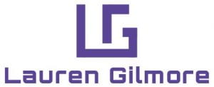
However, I felt that the letters were quite close together so I increased the kerning to give it a bit more breathing space. This is the result:
Overall, I think this typeface works well as it is bold and stands out. It ties in with my brands tone of voice as its confident. The geometric look goes well with my monogram and they suit each other more than my previous wordmark.


