Sketches
I started by sketching out ideas of what I wanted each screen to look like. Doing this allowed me to see how users would get from one screen to another and what the most suitable design was.
Home screen
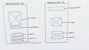
I did two sketches of what the home screen could look like. I knew I wanted to keep it simple and include the brand and a few essential buttons like “Alerts”, “Pandas” and “Add new panda”. I liked the first sketch the most as I think the wordmark below the logo will flow better. I also like how simple this screen will be.
Alerts screen
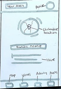
At first, I was going to give users access to multiple alerts at once. However, I think this could become overwhelming and it could also result in too many people responding to the same alert. Therefore, I like the final sketch the most. With this design, users receive one alert at a time which is unique to them. This is much less overwhelming, and it means they can focus on one priority at a time. This screen will have easy access to the panda’s location, their name, and the details on the issue. They can also look at the panda’s profile at the top to look at their vitals, medical history, etc.
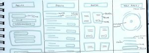
Panda’s screen
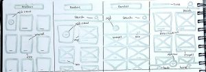
With this screen, I knew I wanted to display the registered pandas to give users an overview of them all. I also wanted to include the option to add a new panda here instead of just from the home screen. Of these, the one I like the most is the last one. It has a search button so users can search for a certain panda if they have any concerns. It also will have images of the pandas and a quick overview of them, for example, if there is an alert, it will appear here. The navigation at the bottom is where users can add a new panda through the + icon. This way, more pandas can be displayed on the screen at one time.
Panda Information screen


The first sketches show my first idea for this screen. I wanted users to be able to click through the tabs, showing the panda’s vitals, activity levels, etc. However, this seemed quite busy, and I wasn’t fully happy with the layout.
Therefore, I tried another layout which you can see on the second sketches. I decided to move the navigation to the bottom as it is quicker and easier to access for the users as it is closer to their thumb. I also decided to move the profile to the top of the screen on the right-hand side. This way, users can access it on every screen, and it leaves more room for the other navigation buttons at the bottom. This screen is another access point to the alerts which will make it as easy as possible for users to find.
Add new panda screen
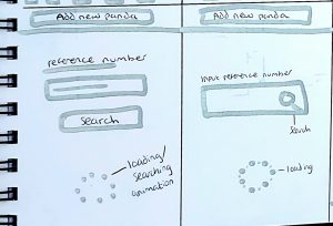
I kept this screen very simple as the user doesn’t have very much to do within this screen. They will just enter the reference number from the panda’s microchip and complete their registration to the app. I may design further screens in the future to show where the users go after this screen when setting up the panda profile etc. I also want to add a loading animation as I think it will be a nice interaction and will show users that their action is being processed. I hope to be able to incorporate the brand in some way with this.
Wireframes
Next, I created my final digital wireframes on Figma. This allowed me to take all my chosen sketches and be more precise with the layout, sizing, etc. I was also able to add text, branding, and some colour to give me a better idea of how it would look. So far, I have 8 screens and I look forward to designing these and adding the content.